
Until the nineteenth century, colours available in oil and other paints were limited by the availability of suitable pigments. Most artists worked with relatively limited palettes, yet seem able to have created paintings of great subtlety and seemingly unlimited colours. In the last two hundred years, a stream of new, synthetic pigments has swelled the numbers of different paints and colours available. It’s now not unusual to see artists’ oil colour ranges offering more than a hundred to choose from. This article looks at what happens when, for various reasons, a painter limits their choice of colours in a painting.
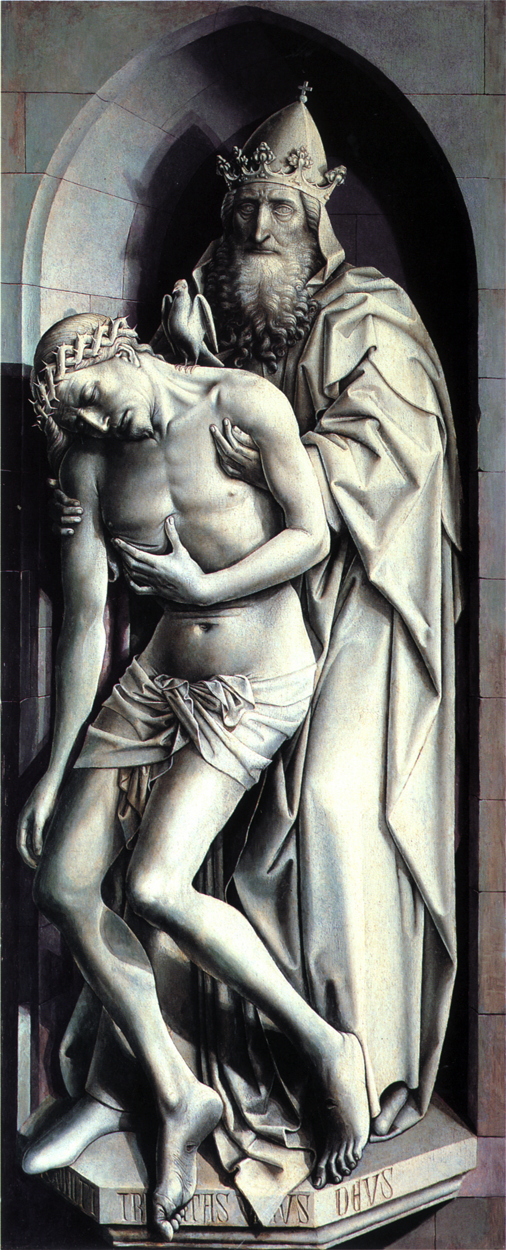
My first example is a startlingly realistic trompe l’oeil by Robert Campin, The Trinity of the Broken Body from 1410. This was developed from a grisaille, a monochromatic painting sometimes used to study the values for a finished work, or as an underpainting. Campin must have realised how close this came to a depiction of sculpture, added a little gentle tinting around the surface of the wall, and it just popped out, so real. It’s an excellent example of how, given a few convincing cues, our visual system can construct a 3D image from a flat panel.
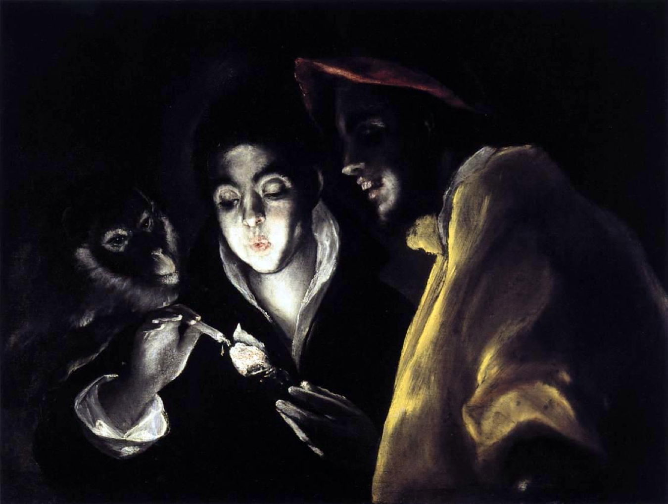
You may recall El Greco’s Allegory with a Boy Lighting a Candle in the Company of an Ape and a Fool (Fábula) (1589-92) from my article last weekend. It’s one of very few chiaroscuro paintings which accurately represent our colour-poor night vision. There are just three touches of weak colour, in the clothing of the ‘fool’ at the right, and the lips of the boy. As El Greco painted this several centuries before scientists started to understand night vision, it shows both his personal powers of observation and his determination to paint what he saw, not what he thought he should see.


Late in his career, Rembrandt created some of the finest of his paintings using very limited palettes. I have used software to show the main colours used here in A Woman Bathing in a Stream (1654). This is remarkable for being almost monochromatic, with all the colours being earths, ranging from near-black to pale straw. However these are quite saturated, particularly in the mid-range values, where they are fairly constant at around 75%.
A notorious user of limited palettes in the nineteenth century was James Abbott McNeill Whistler.

His double portrait of models Joanna Hiffernan and Milly Jones, Symphony in White, Number 3 from 1865-67 is perhaps his most remarkable. Its strongest colour is in their hair, and even their pale flesh looks rich against its whiteness. His critics seemed to hate these symphonies in white.

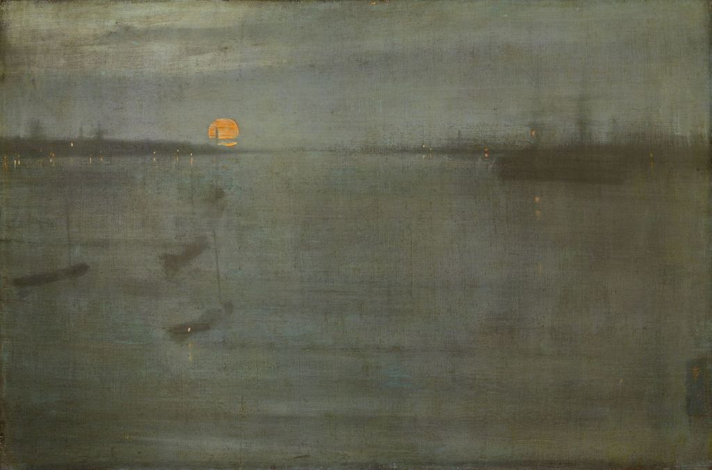
Whistler also did this with landscapes, for instance in his Nocturne: Blue and Gold — Southampton Water (1872). Its vague blue-greys make the pinpoints of light and the rising sun shine out in contrast, a very good reason for limiting his palette.
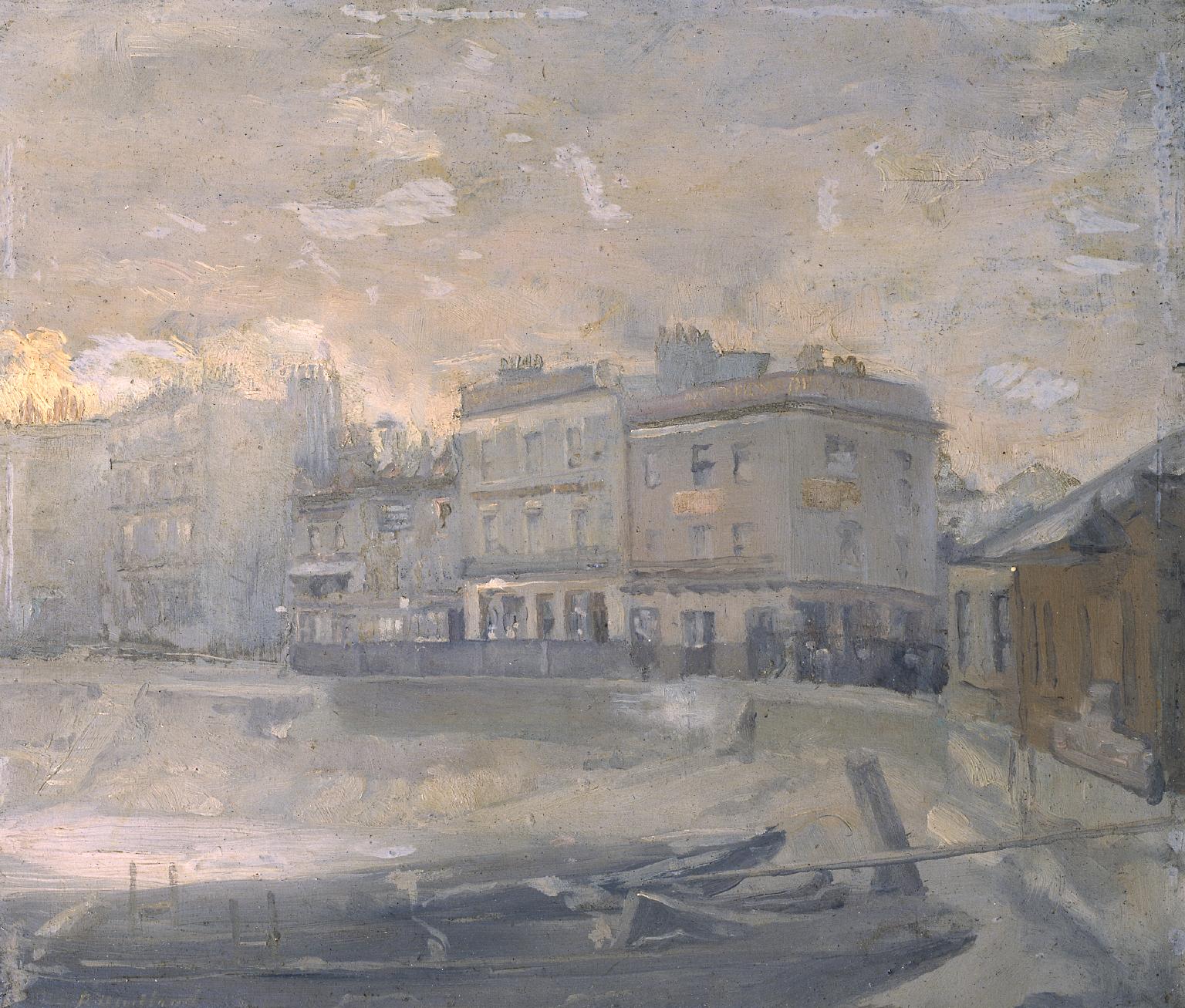
Whistler’s influence extended to other landscape painters of the day, including Paul Fordyce Maitland, whose Barges, Chelsea Riverside, the ‘Eighties (c 1885-90) is a detailed oil sketch showing the waterfront in fashionable Chelsea, London. This is a grisaille, though, without any use of contrasting colour.
When the Swedish master Anders Zorn was making his transition from watercolour to oils in Saint Ives, Cornwall, he was advised to limit his palette. For the next few years, many of his paintings were almost monochrome.

This wonderful double-portrait of The Schwartz Girls from 1889 is unusual among these for still being in watercolour.
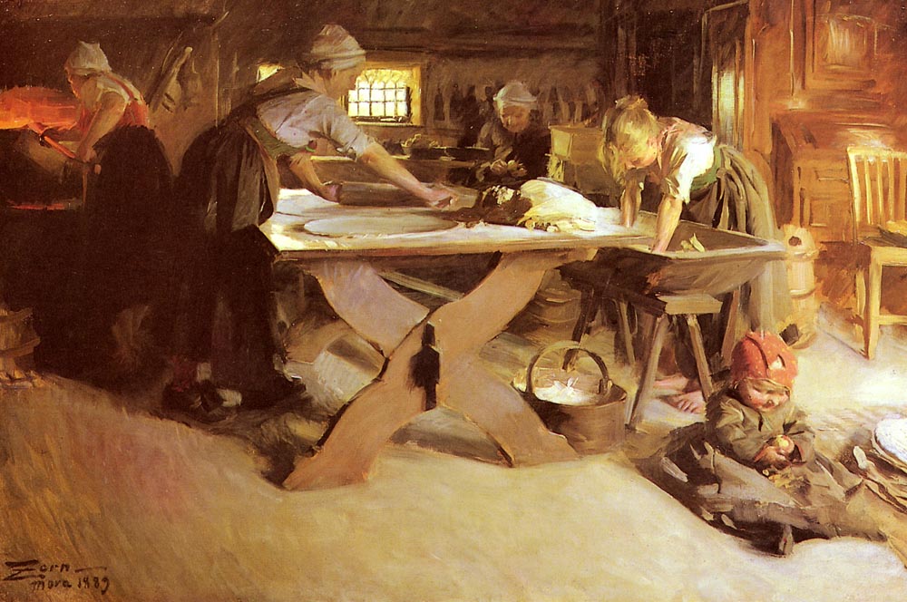
In Baking Bread, also painted in 1889, Zorn uses this characteristic limited palette derived from his early oils.
During the early years of the twentieth century, Ferdinand Hodler also explored limited palettes in some of his landscape paintings.

In Hodler’s View of the Fromberghorn from Reichenbach from 1903, most of the painting is either a bright yellow-green, or a darker brown-green, broken only by a few flowers, and distant red roofs.

In The Grammont from 1905, Hodler again uses a limited palette to show this mountain in the Chablais Alps, to the south of the eastern end of Lake Geneva.
Limited palettes are well-known in cinematography, where one of their most striking uses is in a single figure or object seen in colour against a monochrome background. A similar effect was used by Edward Stott in about 1902.

Stott’s Peaceful Rest uses a limited palette, with three splashes of colour standing out: the man’s face lit by the flame, the watchful sheepdog behind him, and something blue protruding from the shepherd’s jacket pocket.
Painters also use limited palettes as an exercise to improve their colour skills. Teachers often recommend that a student paints a still life using the fewest colours that they can. I show here an example I painted using oil pastels over a decade ago.
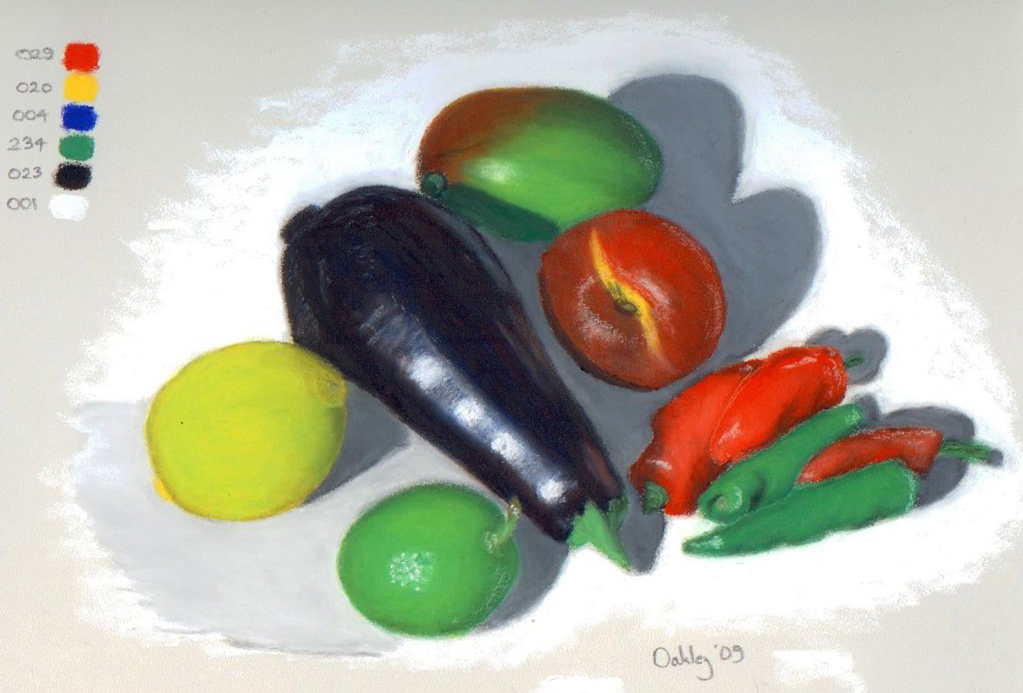
This was painted using the six colours shown at the left: red, yellow, blue, green, black and white. Oil pastels are considerably less flexible in mixing colours than either oil paints or watercolours, for which a green shouldn’t have been necessary.
Ordinarily, painters avoid using such a small palette as it requires the mixing of more pigments to generate certain colours such as green. Increasing numbers of mixed pigments tend to grey or brown, and weaken the colour you’re trying to generate. Some widely-used paints are already mixtures of two or more pigments. Perhaps the worst example is Payne’s grey, which was originally made from Prussian blue, yellow ochre and crimson lake, and is now likely to contain phthalo blue and black.
Finally, there’s always a painting by Paul Cézanne which stands alone.
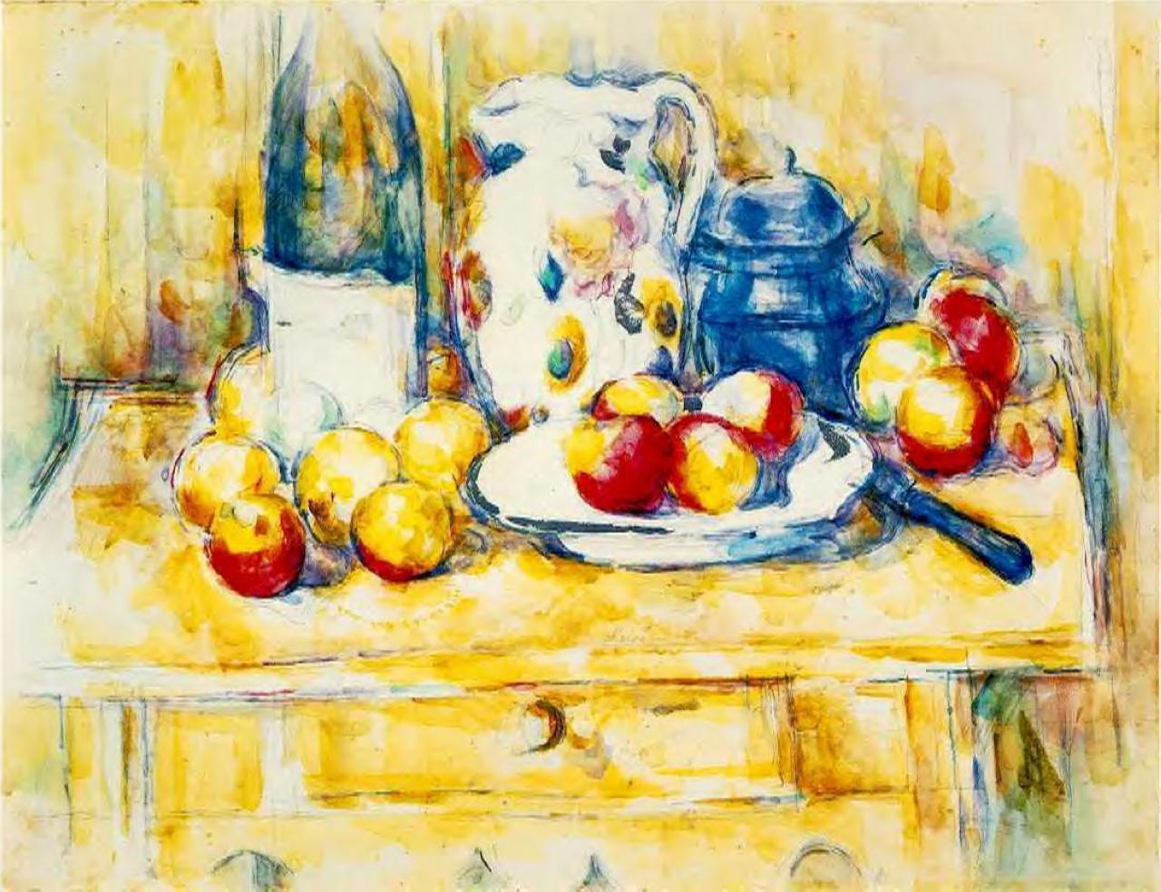
The vibrant primary colours of Cézanne’s Still Life with Apples on a Sideboard from 1900-6 make this a unique exercise in their use.
Limited palettes don’t make for limited paintings.
