

In the previous article, I explored the history of pigments used in painting up to 1700, and considered changes in techniques. This article covers the next 150 years, focussing again on oil painting in Europe.
Pigments
Prior to 1700, the great majority of pigments in use were those taken, more or less, straight from nature. Most were minerals, and the few vegetable products such as madder had to be treated (by the process of laking with alkalis) to try to improve their permanence. The period from 1700-1850 saw the introduction of the first pigments which could only really be manufactured, and the increasing industrialisation of pigment production.
Yellow ochre, lead antimonate yellow (Naples yellow), and orpiment (yellow arsenic sulphide) remained in use throughout this period. Although orpiment is often thought of as a very old pigment, some artists such as Chardin used it quite frequently. Lead-tin yellow was barely used after 1750. The major addition, which quickly became very popular and widely used, was chrome yellow, which dates from about 1804 and established itself as the dominant yellow in many palettes.
Red lead was little-used, and then mainly in combination with vermilion (cinnabar, mercuric sulphide), which remained a mainstay red. The laking and refinement of madders from plants became more sophisticated, and offered a range of different shades of red, generally of increasing degrees of permanence. Some use was also made of carmine, although it had even greater problems with permanence than the madders.
Natural ultramarine blue was finally replaced by a much cheaper synthetic version from about 1828, although Ingres is claimed to have used some in a painting the year before. Azurite blue, smalt and indigo were replaced rapidly by Prussian blue, the first truly modern pigment produced by synthetic methods, which started to appear by about 1710, and was generally available and in wide use by 1720. Among the early adopters of Prussian blue were Canaletto and Watteau.
Green earth, verdigris (copper acetates) and green copper resinates waned in popularity, being replaced first by mixtures of Prussian blue with yellow pigments, then by synthetic copper arsenites during the late eighteenth century. Of the latter, Scheele’s green was the first to be introduced in 1778, with the more successful emerald green after 1800. Turner and Constable used both.
Lead white remained universally popular in oil painting.
Carbon, ivory and related blacks continued in general use. Asphalt, bitumen and mummy, which had seen sporadic use before 1700, became increasingly popular during the eighteenth century and through much of the nineteenth; they were used by Reynolds, Turner, David, Delacroix, Courbet, Géricault, Ingres, and many others, often in glazes.
Pigments introduced (largely) after 1850 include cobalt yellow, cadmium yellow, orange and red, zinc yellow, Hansa and other arylide yellows, alizarin crimson, chrome green, chromium oxide green, titanium white, and the many modern synthetic organic pigments. I will cover those in the next article.
Examples and palettes
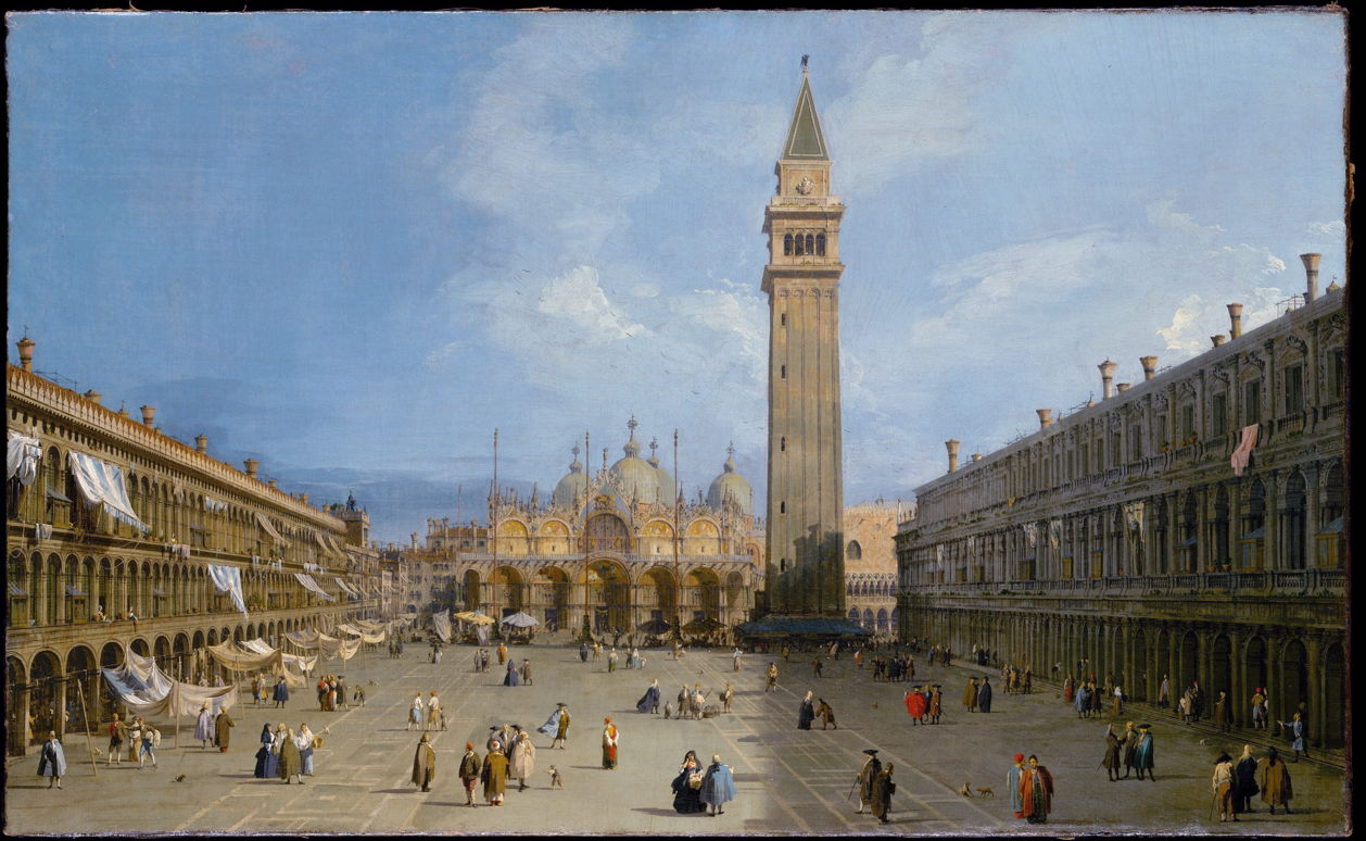

Canaletto’s Piazza San Marco (1720) may have been one of his first paintings to use the new Prussian blue. Although its overall palette is dominated by earths and the single blue hue, which reaches 50% saturation at its strongest, he has used higher saturation colours for the clothes of people in the piazza, which form too small areas to appear in the general palette above.
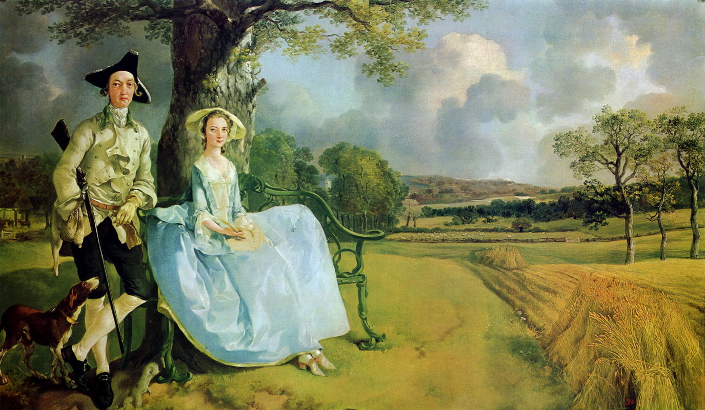

Thomas Gainsborough was another early user of Prussian blue, and it was probably the basis for the brighter greens in his Mr and Mrs Andrews (1749), mixed with yellow ochre to produce what was sometimes known as Prussian green. This was a more saturated green than could be obtained from earlier pigments, although Gainsborough was still relatively constrained by his yellow. His green-gold colours, most probably a mixture of Prussian blue and yellow ochre, reach 70-72% saturation, although his bluer greens are typically around 40%.
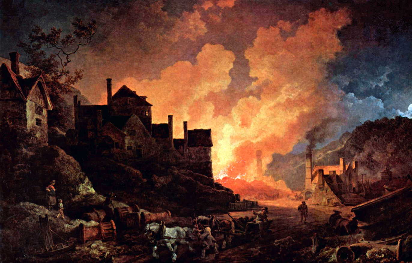

When Philip James de Loutherbourg painted Coalbrookdale by Night in 1801, he was able to use his limited palette to great effect. Although his yellows and oranges appear quite bright, they are still based on yellow ochre, as chrome yellow was not used as a pigment until 1804. Despite that most reach a saturation of 60-70%.
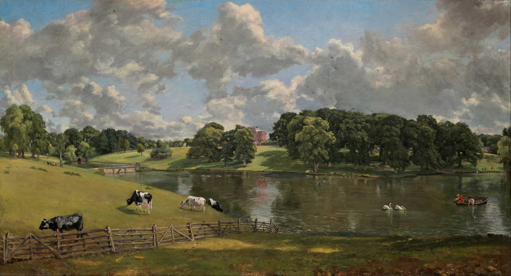

Although John Constable has been portrayed as traditional and conservative, particularly in comparison with Turner, his Wivenhoe Park, Essex (1816) probably used the newer greens available, both Prussian green and emerald green, together with Prussian blue, as did his later, larger and more famous paintings. As a result, the greens here range from 57-66% saturation, comparable with Gainsborough’s.
These rich greens were of considerable importance in the popularisation of landscape as a genre: as Anthea Callen has pointed out in her book The Work of Art (reviewed here), without them plein air oil sketching would have remained difficult. Constable’s extensive plein air studies not only informed his finished works, but he used similar techniques in the studio to undertake series of studies, culminating in full-size rehearsals, of his major paintings. The finished versions inherited some of the looser brushwork which dominates those studies too.


Unlike some of his darker paintings, Caspar David Friedrich’s Chalk Cliffs on Rügen (after 1818) features brighter colours, such as the woman’s red dress, which has 80% saturation, whilst browns reach 64-66%. Some of his later paintings used more modern and saturated colours.


JMW Turner was notorious for experimenting with different pigments and techniques. His Petworth Park: Tillington Church in the Distance (c 1828) almost certainly used more modern pigments in its highly saturated yellows and oranges at 70-82%. He is known to have used Scheele’s green before changing to emerald green, when that became available.
His later works were also very different in appearance from other finished paintings of the day, with visible marks, diffuse light and colour effects, scratchings and more. However the great majority of his paintings retained fine detail and sharpness in objects shown in the foreground, here the cattle and their long cast shadows, and those were seldom as gestural as became popular during the latter half of the century.
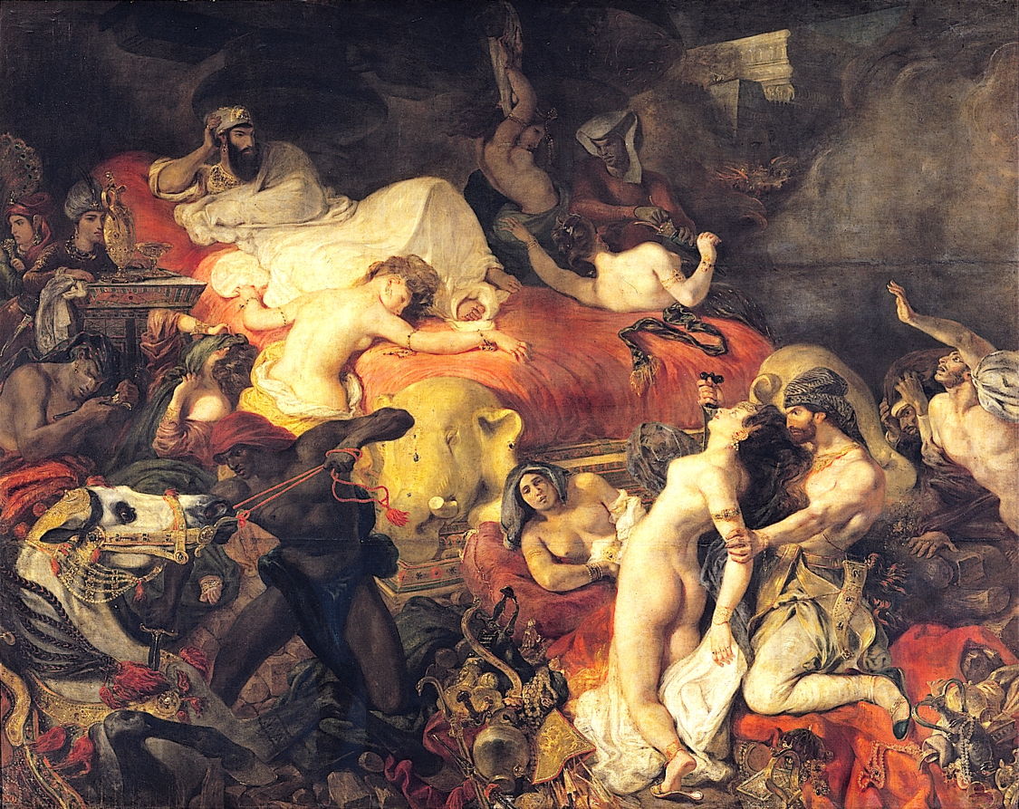

Eugène Delacroix was another leading painter who adopted modern pigments early, and kept many colours in his palette. In his The Death of Sardanapalos (1827) the reds and golds range from 65-77% saturation, but his range of hues is relatively limited and traditional.


Delacroix’s Liberty Leading the People (1830) also uses quite a traditional palette, with only the reds reaching high saturations, of around 83%.
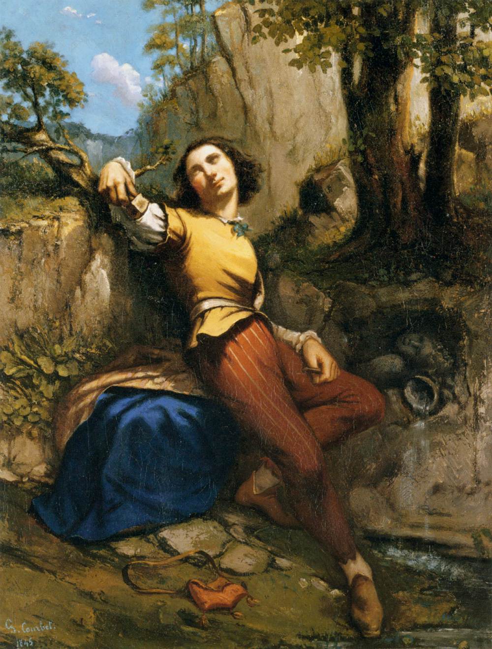

Gustave Courbet’s The Sculptor (1845) has a wider range of more saturated colours. The dark blue, presumably Prussian blue, has a saturation of 56%, the leather gold rises to 70%, and the mid brown on the figure’s trousers is highest at 80%.

Although just after this article’s cut-off date, Courbet’s The Painter’s Studio (1855) is much more traditional in its appearance and palette, with most of its colours below 40% saturation, the highest at only 60%.
Example palettes include:
- Thomas Gainsborough (c 1760): yellow ochre, red lake, natural ultramarine blue, Prussian blue, indigo, green earth, ‘Prussian green’ (Prussian blue mixed with yellow ochre), red earth, raw umber, burnt umber, Cremona (lead) white, lamp black;
- Jacques-Louis David (c 1820): Naples yellow, yellow ochre, brown-pink (dull orange), light red, vermilion, crimson lake, (? blue), green earth, Indian red, raw sienna, burnt sienna, raw umber, burnt umber, brown ochre, flake (lead) white, ivory black, vine black;
- John Constable (c 1836): chrome yellow, yellow ochre, vermilion, madder, cobalt blue, Prussian blue, emerald green, ‘Prussian green’ (Prussian blue mixed with yellow ochre), raw sienna, burnt sienna, flake (lead) white, lamp black;
- JAD Ingres (c 1850): Naples yellow, yellow ochre, vermilion, light red, (? blue), blue-black (?Prussian blue), raw umber, flake (lead) white, vine black;
- Eugène Delacroix (after 1850): cadmium yellow, Naples yellow, golden yellow lake, yellow ochre, vermilion, madder lake, red lake, synthetic ultramarine blue, cobalt blue, Prussian blue, green earth, emerald green, raw umber, burnt umber, raw sienna, burnt sienna, Cassel earth, Vandyke brown, flake (lead) white, zinc white, mummy, black.
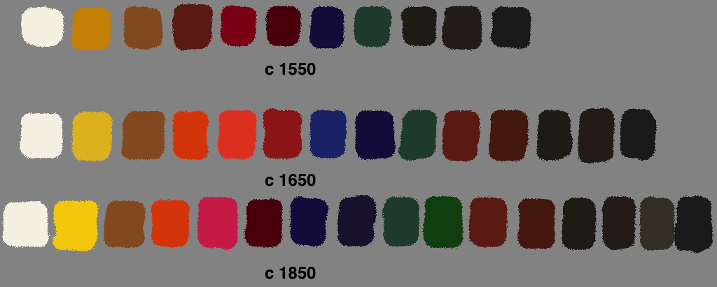 In comparison with two centuries earlier, a typical full palette of paints in 1850 would have shown an increase in the number of colours, adding emerald green and probably asphalt/bitumen/mummy, with increased saturations in yellow (chrome yellow), reds (better madder lakes), and blues (Prussian blue).
Technique
This period saw a general transition to more direct methods of painting, including what is often known now as alla prima, with less reliance on the building up of multiple layers, and glazes.
At the same time, plein air oil sketches became quite widely practised, by Constable and many others. However at this time, these oil sketches were not intended for general sale or exhibition. It was only with the advent of the Barbizon School in the early to mid nineteenth century that less finished and sketch-like works started to appear in public view.
References
Artists’ Pigments. A Handbook of Their History and Characteristics, four volumes, various editors and many contributors, National Gallery of Art and Archetype Publications. 1986-2007.
