
In my last tutorial here, I started to manipulate the attributes controlling the appearance of writing spaces, as seen in the Map view. Tinderbox expert Mark Anderson kindly emailed me to discuss other ways in which these could be used. This article presents a short account of some of those Appearance attributes, their effects, and uses.
You can edit most of these using the Appearance Inspector, which is the normal way of setting up your colour scheme and appearance. However, because they are stored as attributes, they are accessible to scripts run within Storyspace, thus mutable. You can use them to provide feedback and visual context to the reader, to emphasise certain writing spaces, or for any other purpose.
In my previous example I manipulated the values to highlight some writing spaces as if they were radio button controls, and to make others become almost invisible, by turning Shadow off and setting Opacity to 0. Be careful if you try to make them completely invisible: trying to find them will then be like pinning the tail on a donkey whilst blindfolded!
Colours can be specified in four different ways. Storyspace recognises standard named colours as strings, such as ‘warm gray’, each of which can be further specified by qualifiers such as ‘dark’. The easiest way to see these is in the popup colour selectors in the Appearance Inspector. Standard HTML format colours, such as #A482BF can also be used. If you prefer, you can specify colours using hue-saturation-value co-ordinates, given as HSV(240,80,80), or red-green-blue as rgb(68,153,68). These are converted into HTML format when stored.
Note that you can set an attribute’s value back to that inherited from its prototype by Control-clicking (etc.) its entry in the list of attributes: a popup menu will then appear offering that option.
Badge
A Badge is an iconic graphic which is displayed at the top right of a writing space in the Map view, and in the Outline, Chart and Timeline views. Storyspace comes with an extensive set of these, and you can add your own by creating a 32 x 32 pixel PNG graphics file to the ~/Library/Application Support/Storyspace/Badges folder. Badges larger than that size will be automatically scaled down, but the results are less predictable.
 Click on the ⊕ sign at the top right of the writing space in the Map view to add a badge, or select it in the Interior tab of the Appearance Inspector. You can also add any single Unicode character, such as an emoji chosen from the standard OS X character viewer.
 Its attributes are:
Badge – the name of the badge, or its Unicode character; if none, no badge is displayed. The default is for no badge.
BadgeMonochrome – if true, the badge is displayed in monochrome not colour, which can help its visibility. The default is for colour display.
BadgeSize – when 0, the default, the badge is shown at its default size. When greater than 0, this sets its size.
Border
This is the border around the writing space as shown in the Map view. Normally the border is barely visible, and its attributes are best for fine-tuning a bespoke appearance scheme.
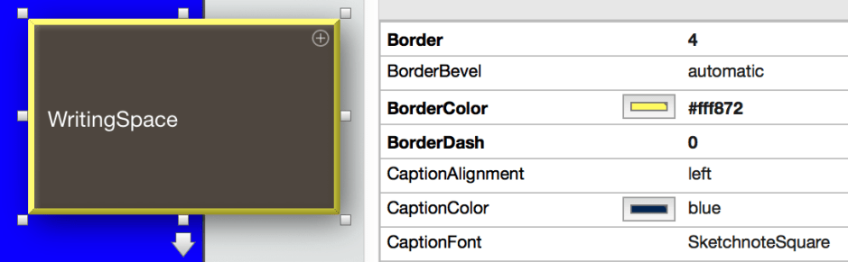
Border – the width of the border, which defaults to 2.
BorderBevel – the presence of a bevel just inside the border. Defaults to automatic, which shows a bevel when the size is sufficient. Can also be set to none, which shows no bevel.
BorderColor – defaults to red, but any colour can be set.
BorderDash – sets the line type used for the border. Default is 0, a continuous line. Larger numbers give different patterns of dashes. Very hard to see if the writing space is dark.
Caption
This is a snippet of text, displayed immediately below the writing space only in the Map view, which is set by the Caption attribute, by default none. You can edit its appearance and content in the Text Inspector’s Caption tab.
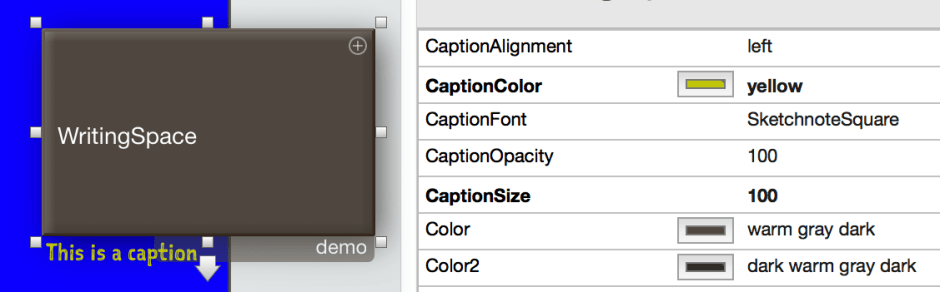
CaptionAlignment – left (default), centre, or right. Note that using right alignment will overlay the caption with any prototype name when the space is selected.
CaptionColor – the colour used for the caption text. By default it is blue.
CaptionFont – the font used for the caption, by default SketchnoteSquare, which is supplied with Storyspace. Changing font is a bit quirky: you can either type in the correct font name, as given in the standard OS X font selector, or you can double-click the text in the caption itself and select the font in the font selector. You cannot drag and drop the font name into the attribute value field, or similar.
CaptionOpacity – the opacity of the text, with 0 being so transparent it is invisible, 100 being completely opaque.
CaptionSize – the relative size of the text, with 100 being normal and default, 50 being half size, and 200 being double size.
Shape, Fill, Plot, and Shadow
These attributes control the more general appearance of writing spaces in the Map view. Consider setting up colour and appearance scheme(s) which will assist the reader in orientation, for instance, but be careful not to overdo it. As with fonts, it is better to use a small number which are distinctive and helpful, than to dazzle with meaningless muddles.

Color – this is the primary fill colour, and defaults to warm gray dark.
Color2 – this is an accent colour, used for pattern fills such as gradients.
Opacity – the opacity of the writing space as shown in the Map view, with 0 being so transparent it is invisible, 100 being completely opaque.
Pattern – a choice from options shown in the Appearance Inspector, defaults to plain. When there is a plot, this contains the plot specification.
PlotColor – the colour to be used for plots. Plots are potentially very powerful tools which I will explore another time.
Shadow – Boolean, true (default) to display a shadow, false for no shadow.
ShadowBlur – the size of the shadow blurred area, from 0 (none) to 25 (very large), with 10 as the default.
ShadowColor – the colour on which the shadow is based, defaulting to black.
ShadowDistance – from 0 (no shift) to 25 (maximum shift), the default being 5.
Shape – any of the standard shapes, with the default being a rectangle.
 The Eclectic Light Company