
Considering our list of the most important cues to depth, I now move on to the second and third:
- occlusion/overlay/interposition/superposition, resulting in depth order (previous article here)
- relative size, including foreshortening effects
- height in the picture plane
- texture and detail gradient
- shading and shadow
- aerial perspective, including reduction in contrast, reduction in chroma, colour shift towards ‘cooler’ i.e. more blue, colours, and blur
- linear perspective and outline shape.
In the development of painting, as 1 (depth order) was established by 1627 BC, so too was 3 (height in picture plane), but 2 (relative size) was not implemented until later classical Greek and Roman art. All three were well established by the time of the magnificent wall-paintings found in the ruins of Pompeii.
Height and size as major cues
You can see how these two cues combine to produce a strong effect of space by implementing them in sequence, in a very simple example using filled rectangles.
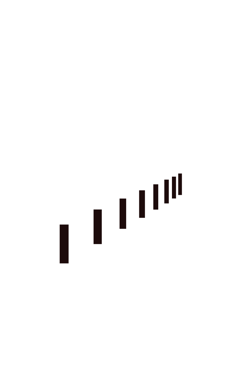
 A series of such shapes of equal size and height in the picture plane appears completely flat, without any cues of depth.
 Simply shifting them up the picture plane also does nothing to impart a sense of depth.
 However the moment that their heights are altered, a feeling of recession starts to appear. Note that their widths have not (yet) changed, so this is not a strong impression.
 A combination of rising height in the picture plane, and changing height and width is even more convincing, although as their spacing remains equal this is still a long way from any formal linear perspective projection.
 The effect of depth is completed once the rectangles are appropriately space, and now looks like a series of pillars receding into the distance.
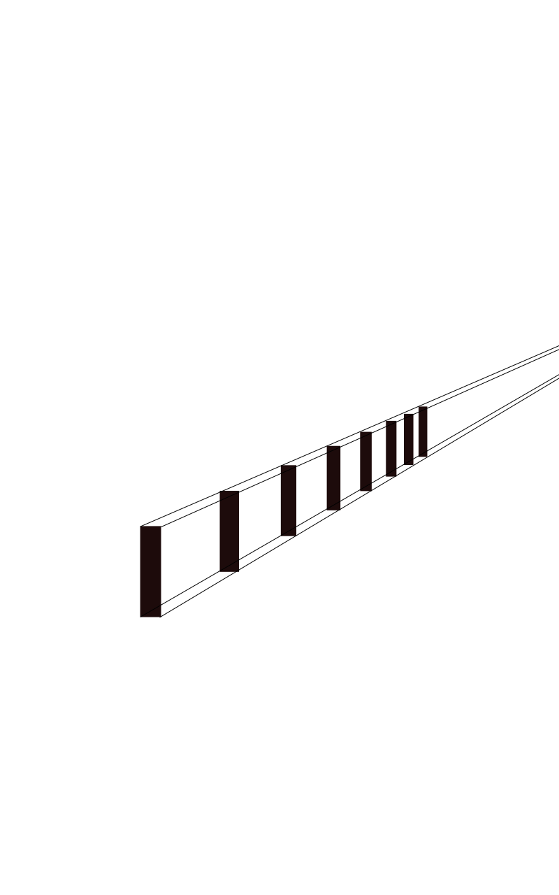 This is put into formal linear perspective by the addition of lines which make the vanishing point more apparent.
Height in the picture plane in painting
Height in the picture plane is, in the vast majority of cases, an inevitable fact of our up-down orientation, and therefore is pervasive. Being so commonplace, it is often taken for granted, and usually omitted from accounts of the depiction of space in paintings.

However it is also subject to manipulation, particularly in repoussoir, a pictorial device in which a foreground element frames the more distant elements to strengthen the effect of space and depth. The subtle use of repoussoir might extend to the trunk of a tree forming one edge, most commonly the left, of the painting, but in more extreme cases trees can frame the top and both vertical edges. For all the claims that Cézanne sought to flatten the image in many of his later works, he actually used repoussoir not infrequently; his Lac d’Annecy is another famous example.
Repoussoir and its variations strengthen the impression of depth by its contrast of the near and far higher up in the image, where we would expect to see only more distant objects, and adds another frame to the whole painting, incrementing perceived recession. It is also worth bearing in mind that prominent frames around paintings can have their own repoussoir effect, and make the painting appear as if it is the world distant beyond a window.
It is also worth mentioning in passing that our expectation of objects above the direct line of sight to be far distant (sky) is one reason why we sometimes walk into tree branches and other objects above us, but less often walk into lower obstructions.
Size contrasts and foreshortening in painting

Diminution of size of objects which are progressively deeper into the motif is apparent in many, but by no means all, situations. Where the objects are very familiar and have sufficient detail to give further indications of their depth, they can be very strong cues to depth and space. Caillebotte’s men in skiffs, although there are only three of them, make his painting appear very deep, and the simpler changes in height and size in van Eyck’s Ghent Altarpiece are good enough to maintain depth in that work.


As with the simple demonstration above using receding rectangles, a series of regular objects which recede into the distance should give very strong depth cues, as seen in Pissarro’s posts on the left side of his painting above.

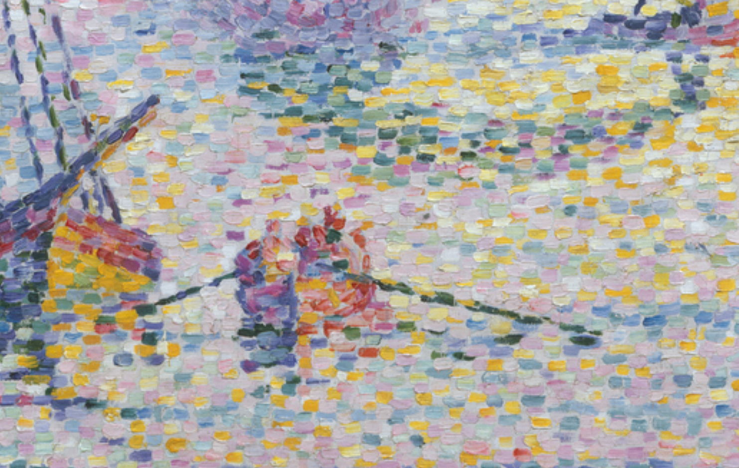
Great attention has been paid to the effect of foreshortening, in which objects whose long axis passes perpendicular to the picture plane are compressed along that axis. Although an inevitable part of all realistic perspective projections, foreshortening can be a dramatic statement about depth, particularly when it is applied to parts of animals, most notably humans. However it is most effective when the long axis of the object is not compeletely perpendicular to the picture plane. If it is, as seen in Signac’s painting of Marseille, it may actually result in flattening.
Relative importance in painting
Just as depth order is an essential basis for any painting which is to depict a 3D motif in 2D with any degree of faithfulness, so height in the picture plane and size contrasts are essential. Thankfully when painting in front of a motif, they are easy to incorporate from careful observation of the motif. Human perception of height and size varies considerably, and you may need to measure heights and positions, for example using a brush or other similar object, to ensure their accurate depiction in your painting. This practice is particularly common when painting portraits or figures, and some painters always use it even for landscapes.
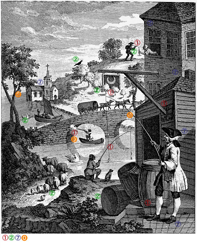
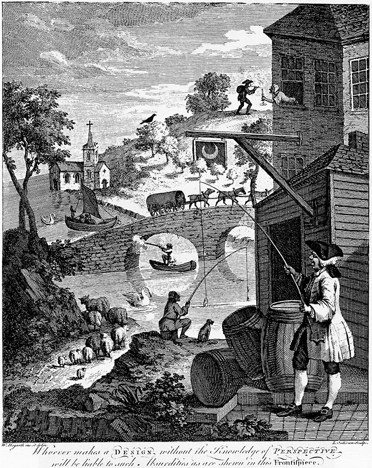
The most famous example of how not to paint perspective was produced by William Hogarth, in his engraving for JJ Kirby’s pamphlet on perspective. I have here marked up its most obvious violations of proper perspective, using the same numbers as in the list at the top of this article. Although he shows no examples of incorrect height in the picture plane (3), those of violated depth order (1) and incorrect relative size (2) are very frequent, and very obviously errors. This emphasises their importance in the perception, and creation, of depth and space in drawings and paintings.
Further reading
Wagner M (2006) The Geometries of Visual Space, Psychology Press. ISBN 978 0 8058 5253 0. (A meticulous review of predominantly experimental evidence about how humans construct visual space. Not easy reading but some important lessons.)
