

This new version of my free log analysis app benefits from similar improvements to its chart and plot windows as those I recently added to DeltaFree.
Logistician analyses log statistics generated automatically by logd when it rolls log files, saved to JSONL files with names like logdata.statistics.1.jsonl inside /var/db/diagnostics. At any time those can contain summary figures going back several weeks or even months. Although the tracev3 log files containing those entries may have been removed weeks ago, they’re often still accessible in backups, from where they can be turned into a logarchive and browsed using LogUI.
Logistician then summarises log activity in a series of three point plots, such as those below.
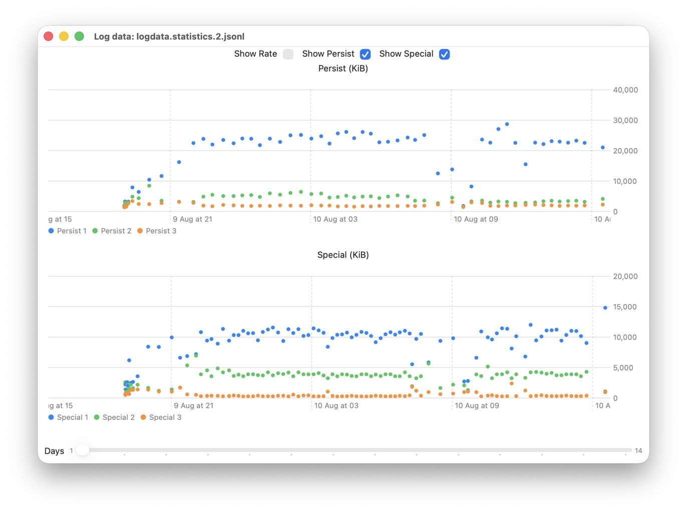
This shows off the new versions of two of those three plots, which are now scrollable with an adjustable window size of between 1 and 14 days. Here it’s displaying log data quantities written in each tracev3 log file active over a period of 24 hours back in early August. These enable you to identify log files and periods of interest, such as the peak of nearly 30,000 KiB written by the most active process at about 11:00 on 10 August.
You can then select that log file in Logistician’s listing, and explore that as a bar chart showing the most active processes in terms of their log entries.
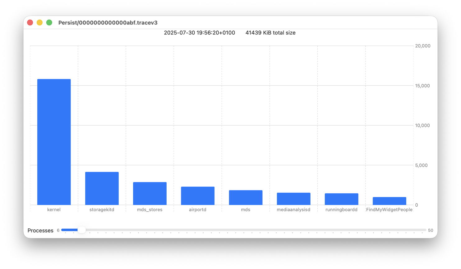
Previously, charts had two sliders to set their window size and position. Those are replaced by the more effective combination of one slider to set the number of processes to include, ranging from 6 to 50, and scrolling through the bars.
I hope you’ll find these significant improvements.
Logistician version 1.5 for macOS 14.6 and later, including Golden Gate, is now available from here: logistician15
from Downloads above, and from its Product Page.
This updated version now fixes a crashing bug in 1.4.
Once again, I’d like to acknowledge the contribution made to my code by the superb account of Swift Charts written by Natalia Panferova & Matthaus Woolard and published by Nil Coalescing Limited. If you are using, or intending to use, Swift Charts in your own apps, this is an essential guide to most things Apple doesn’t document accessibly.

