
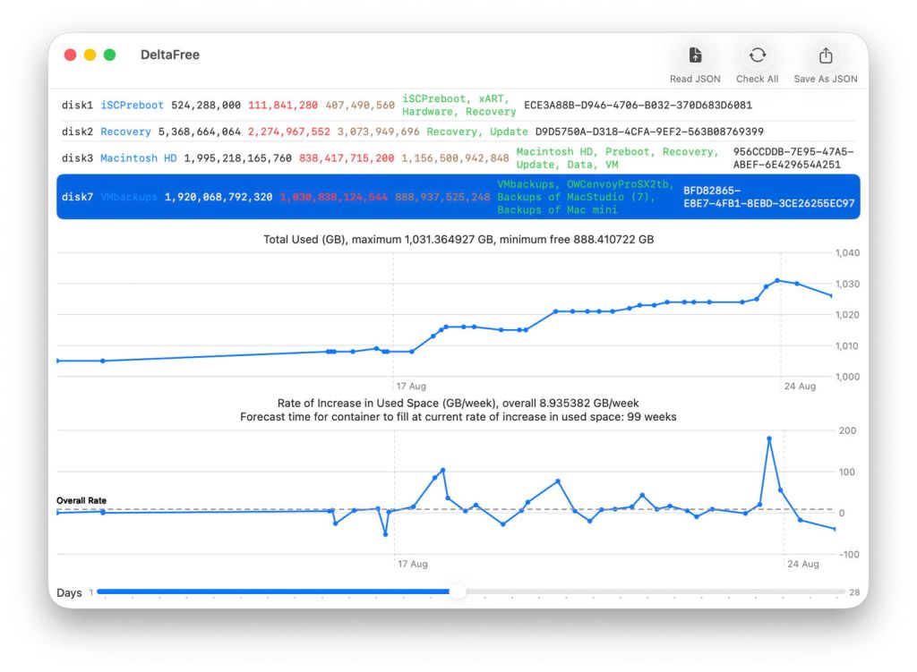
Tracking the amount of space used and its rate of change is probably the best way to forecast the storage capacity required for backups. That’s what my new utility DeltaFree sets out to do by gathering and storing periodic figures, and displaying them in point and line plots using the Swift Charts framework. I have revised those plots extensively in a new version that I hope you will find both easier to work with, and more useful as a result.
This new version doesn’t change DeltaFree’s data or file format, so should be fully compatible with files saved by its first version. For the benefit of newcomers, I’ll first step through how to get started, as that has changed.
First run
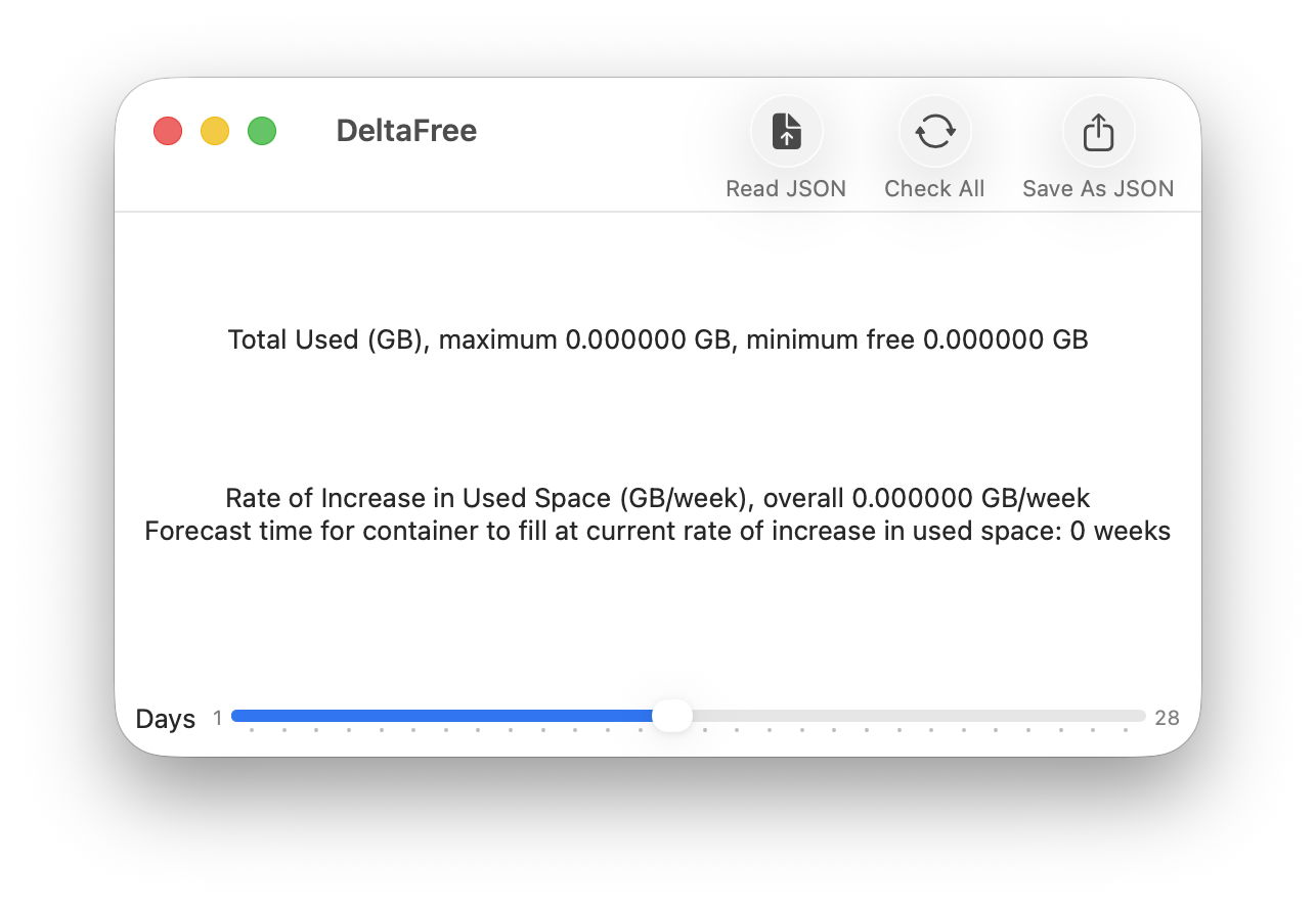
Decompress DeltaFree’s Zip archive and move the app from inside that folder to somewhere more convenient, such as your main Applications folder. Open the app and you’ll see its near-empty window ready to start collecting data. As you haven’t yet created a file containing its results, click first on the Check All tool.
This checks all the APFS containers currently mounted on your Mac, including those of its internal SSD and any external drives, and lists them at the top of its window.
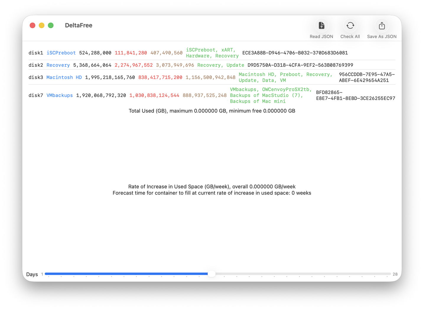
In my case there are three containers on my Mac’s internal SSD, as is normal for an Apple silicon Mac, and one on its external backup storage. Click on any of those to select it.
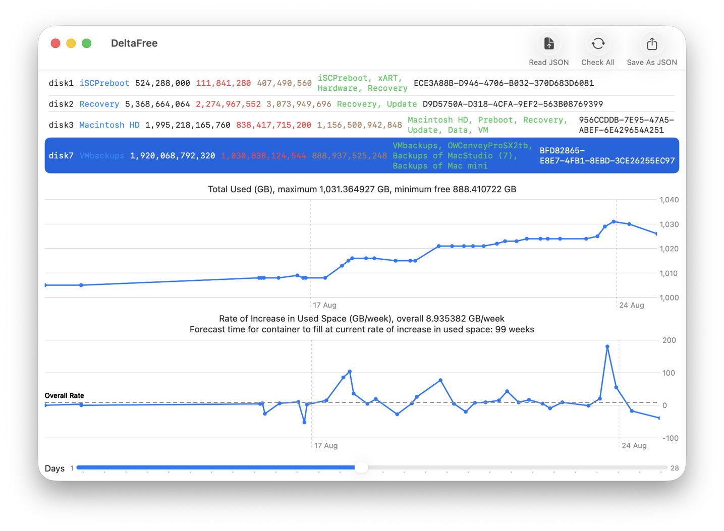
You’ll now see two plots showing total used space above the rate of increase in used space, for that container. At this stage, as there’s only one set of readings, yours will have single points. To save those measurements, click on the Save As JSON tool and those will be written to a file.
Second run
A few hours or a day or two later, open DeltaFree again and click on the Read JSON tool first. There select the file the app saved its data to when it was first run, then click on Check All again. DeltaFree will then check all the containers a second time and display their current figures. Select one of the containers in that list, and you’ll now see the its plots starting to take shape.
Before quitting DeltaFree, click on the Save As JSON tool and either overwrite the same file that you used before, or save into a new file. It doesn’t matter which you choose, as when it saves its data it writes out all the measurements it has.
Each time you repeat those steps, DeltaFree will add a further set of measurements to that file, building the plots shown below into time series of used size and its rate of increase.
New plot views
The most obvious change so far is that you don’t have to click on a tool to display plots for any listed container. All you do is select that container’s entry in the list at the top.
The upper plot now provides a figure for the minimum free space available in that container since you started monitoring it. The plot below that text is rescaled to show total used space far better, as its Y axis no longer includes zero.
The lower plot, showing the rate of increase in used space, not only gives you an overall rate of change for the whole period it has measurements for, but it plots that overall rate using a broken grey line, labelled Overall Rate.
Both plots now scroll, and a slider at the foot of the window lets you set how many days or weeks of observations are shown in the two plots. For example, to view plots for the last week, adjust the slider to display a period of just 7 days, then scroll each of the two plots to the right, to the end of their data. Unfortunately, linking plot scrolling currently appears a serious challenge to SwiftUI and Charts.
When set at the left end, the scroller shows data for a single day, and when at its furthest right it shows a full 28 days.
More than Time Machine backups
Even if your Mac doesn’t use Time Machine to make its backups, DeltaFree can still measure its rate of consuming free space, and forecast how long it would take to fill that container. It can also do that for the Data volume on the internal SSD, a more generally useful measurement.
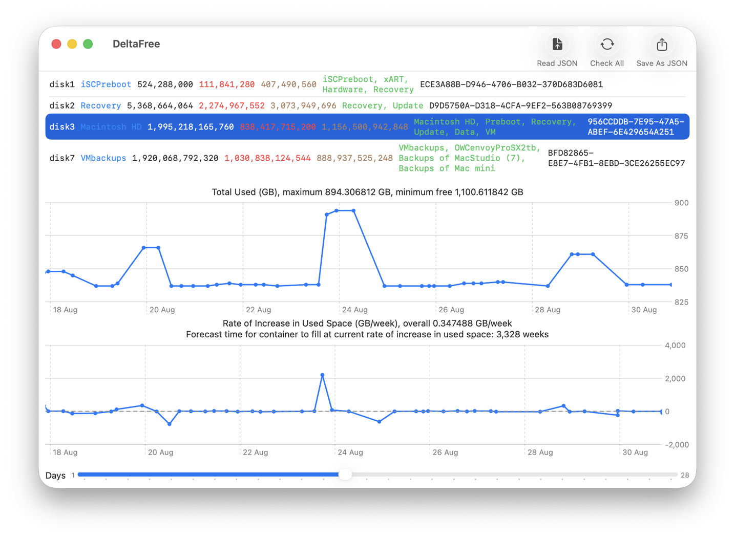
These plots show how used space can change considerably in a Data volume when it’s in use. On 23 August there was a sudden increase of about 50 GB that vanished again about 24 hours later. That was the result of the temporary use of a duplicated virtual machine, whose data was captured in a volume snapshot, which was in turn purged routinely by Time Machine after it had become 24 hours old. There are other similar if smaller events on 19 and 28 August.
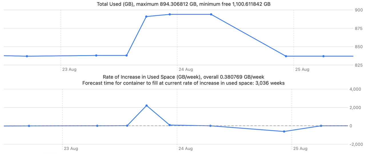
Using the slider to narrow the time window of the plots for the Macintosh HD container confirms the snapshot was made on the afternoon of 23 August, and purged by late on 24 August.
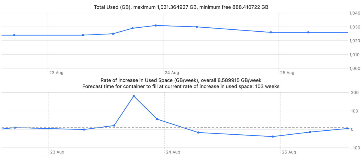
Although the folder containing VMs is excluded from backups, that change in the Macintosh HD container was accompanied by an increase of backup size of just over 5 GB, shown above, which was removed more slowly from backup storage, by the end of 25 August.
These are insights into the use of storage space that can’t be gained from utilities that analyse contents at single points in time.
The practical minimum required to provide an estimate of required backup storage capacity is two measurements 10-14 days apart. However, that gives you no insight into the variability of use, and it’s well worth getting a more detailed picture from daily measurements over that period. Measurements don’t need to be made at regular time intervals, though.
DeltaFree version 1.1 for macOS 14.6 and later, including Golden Gate, is now available from here: deltafree11
and from Downloads above.
I welcome your feedback, please, on what you’d like the next version of DeltaFree to add or change.
I’d like to acknowledge the contribution made to my code by the superb account of Swift Charts written by Natalia Panferova & Matthaus Woolard and published by Nil Coalescing Limited. If you are using, or intending to use, Swift Charts in your own apps, this is an essential guide to most things Apple doesn’t document accessibly.

