
We tend to assume that the images of paintings we see today show what the artist intended us to see, with the same colours, contrasts, and overall appearance. This new series looks at examples that demonstrate how misleading that can be.
As a result of copyright law, with very few exceptions, the paintings I can show in these articles were all completed over seventy years ago. Look around you at objects, even buildings, that are over seventy years old and compare them with photos of when they were new. Almost nothing looks identical, even when they seem to have been carefully preserved.
Just as great painters have innovated in their art, so they have tried out new techniques. Perhaps the most upsetting example was Leonardo da Vinci when he painted The Last Supper in 1498.
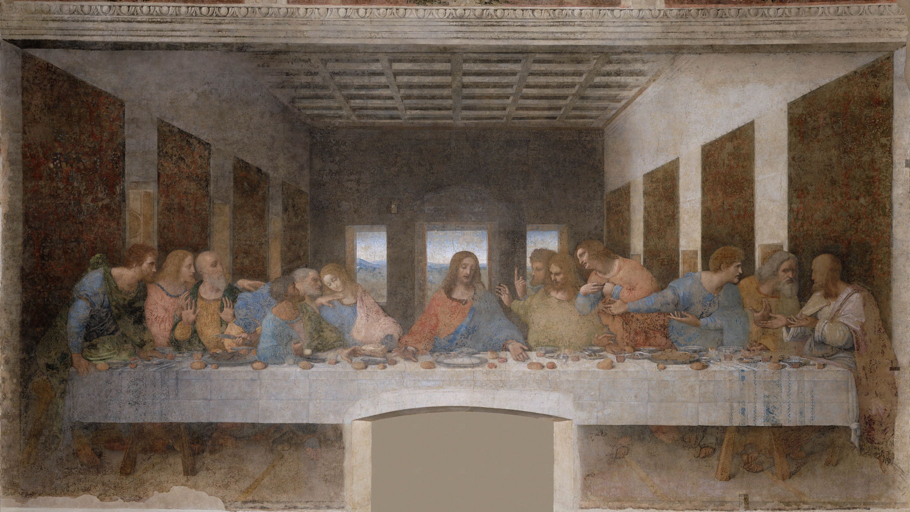
Leonardo’s innovation was tragically almost the undoing of The Last Supper. What we see on the refectory wall today is a pale and changed reflection of the magnificent work he painted, largely because of his choice of media and seemingly endless attempts to repaint sections over the centuries since. These are most apparent when you look at a detail like that below.
Instead of painting this into wet plaster using established fresco technique, Leonardo first applied a chalk ground with glue binder, on top of which he painted relatively thickly in egg tempera, possibly with oil paint too. This has been obscured by a long succession of attempts to make good its deteriorating paint layer, often by applying oil paint on top of its unstable base.
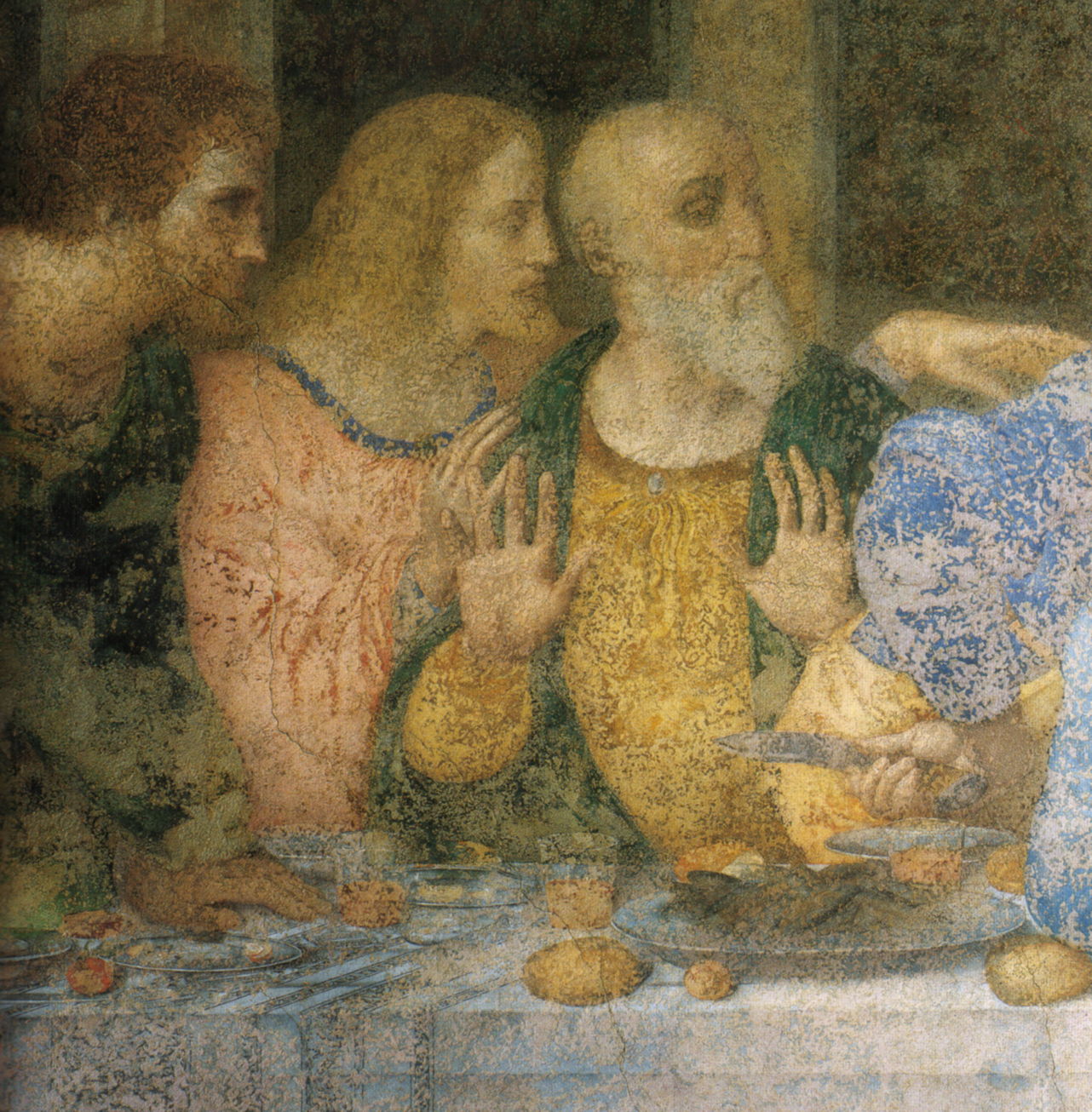
Fortunately, a full size copy was made by Giampietrino just over twenty years after Leonardo completed The Last Supper.

Giampietrino’s copy of the The Last Supper from about 1520 gives the closest impression today of what the original must have looked like. Even this copy has been butchered: the upper third was cut off, and its width reduced, but at least what remains gives a better idea of the original’s appearance.
Other paintings have been horribly mutilated in the centuries since the artist died. Until more detailed analyses were undertaken in the late twentieth century of four of the paintings of Hieronymus Bosch, it had been assumed that they were four separate works. Key to understanding their relationship was his Wayfarer (or Pedlar), which had been turned into a separate octagonal tondo by cutting down and fastening together its two halves, which had originally formed the exterior of the triptych.
Since then the interior of the wings have been reconstructed: The Ship of Fools and Gluttony and Lust form the left wing, and Death and the Miser the right wing, as reconstructed below. As the centre panel is still missing, it’s hard to establish the overall theme of Bosch’s original triptych.

Occasionally, artists do the damage themselves.
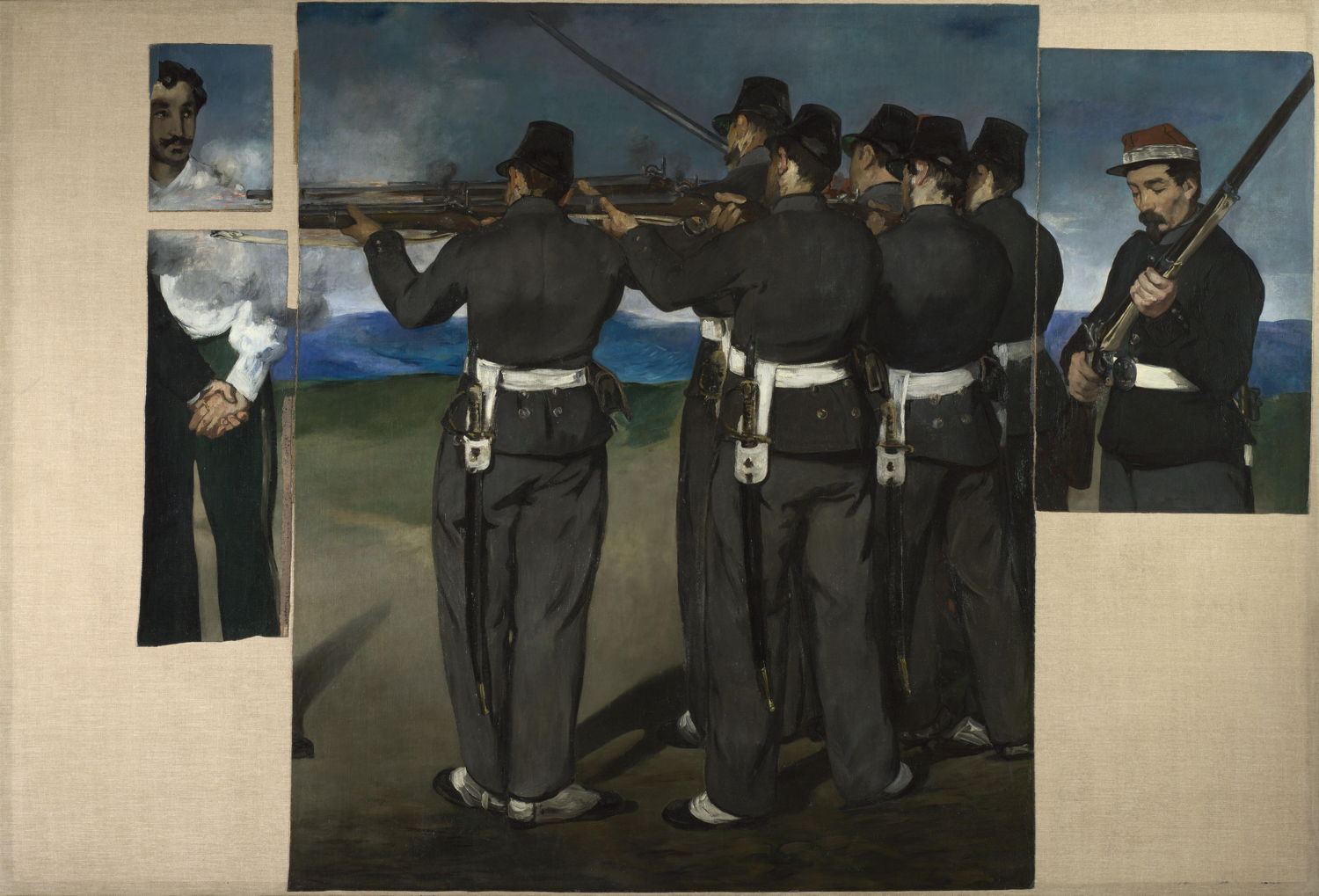
Over the years 1867-69, Édouard Manet made three large oil paintings and a smaller sketch of The Execution of Emperor Maximilian. The first and largest of those, probably completed in 1868, was cut up by the artist. After Manet’s death in 1883, the surviving pieces of canvas were reassembled by Edgar Degas, and were eventually bought by the National Gallery in London in 1918. Its conservation experts finally reunited these onto the single canvas shown above. One missing strip is even claimed to have been used to light a fire.

Another challenge for the conservation specialist is a painting like Edward Poynter’s A Visit to Aesculapius from 1880. Although this is little more than a century old, the evidence from contemporary prints made from this is that it was originally far from being so dark. Sadly it’s now almost impossible to read as a result of its near-black shadows, a victim of ageing varnish and dirt.
Another common effect of age is the fading or change in colour of pigments used in the paint.

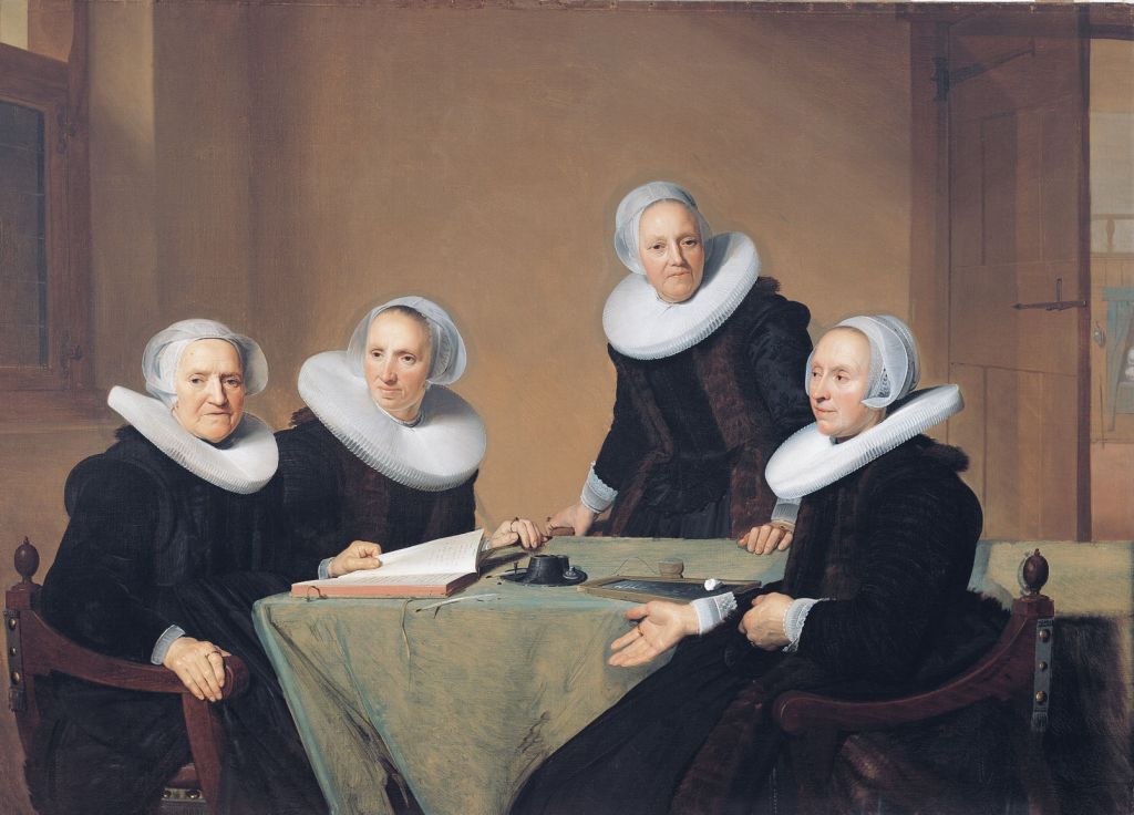
The oddly-coloured tablecloth in Verspronck’s Regentesses of the St. Elisabeth’s Hospital (1641) was originally a rich green. Unprotected indigo blue pigment has faded from much of its surface, leaving most of it an odd yellow ochre hue.
Like many artists, William Blake used materials which he thought would enhance his work, but proved less permanent than he expected. He had a particular fondness for glue tempera, whose permanence is largely determined by the quality of the glue used as its binder. Although a few of his glue tempera paintings have survived relatively unscathed, others have been lost to a grey-brown murk.
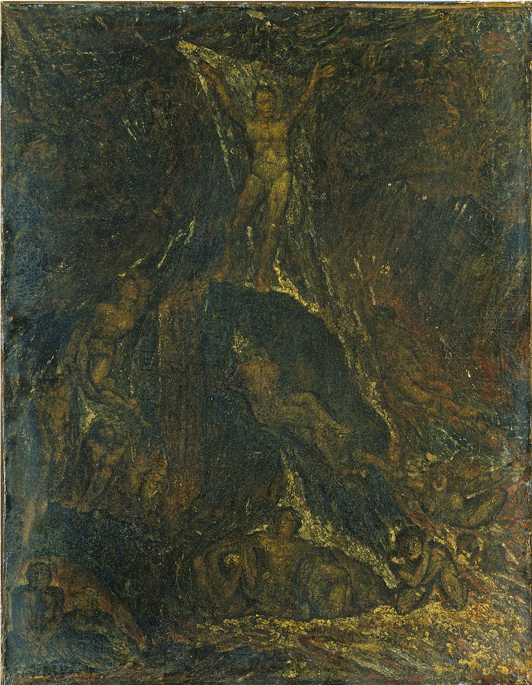
This version of Satan Calling Up His Legions from about 1809, now in the Tate in London, was dubbed by Blake “an experiment picture”, and hasn’t aged at all well.

The other version, currently at Petworth, is almost identical in its content, and remains more readable. This may be accounted for by the specific glue used, and the conditions the painting has been kept in since its completion.
Despite oil paint having a reputation for permanence, and the survival of many oil paintings against all odds, it’s also an unforgiving medium when an artist gets it wrong.

Albert Pinkham Ryder’s The Waste of Waters is Their Field, from 1883, little more than a century ago, is a small oil painting now almost completely lost. Much of its detail has merged into a dark brown mess as its superficial layers have faded, and the deeper layers darkened. The detail below shows that its entire paint layer is dissected by cracks, many gaping and oozing lighter wet paint from below.

I hope you’ll join me to explore more examples of paintings that really weren’t intended to look like that.
