
At least until the latter half of the nineteenth century, almost all finished paintings were expected to have sharp edges and clear detail, to some degree at least. Inevitable exceptions were specific, such as the optical effects of fog or smoke, but there were also circumstances in which paintings were deliberately blurred, leaving what in life were sharp edges rather muzzy. This weekend I take a look at some notable examples of such blurring.
Perhaps the most common circumstance in which a painting is partly blurred is the result of aerial perspective, a group of phenomena which occur with increasing distance, usually more than a kilometre from the observer:
- reduction in the difference in lightness between an object and its background,
- resulting in a reduction in the range of lightness values, or contrast,
- resultant loss of detail in objects,
- general reduction in chroma,
- a shift in hue, normally towards blue (‘cooler colours’).

These are shown clearly in this photograph, taken in the French Alps during fine but slightly hazy weather.
It’s commonly stated that increasing distance results in blurring, that is loss of sharpness, but (unless the observer is myopic and not wearing appropriate optical correction) that’s not normally visible: it’s loss of contrast which reduces our ability to resolve edges. However when depicted in paint, edges of objects at a distance may well need to be softened, to place them lower in the ‘edge hierarchy’, to assist perception of their weak contrast.

As shown so vividly in Vincent van Gogh’s Starry Night over the Rhône (1888), point lights such as stars, and larger luminous objects such as artificial lights, the moon, and sun, may develop halos and related optical phenomena around them when there is significant atmospheric water or dust between them and the observer.

Although Paul Cézanne has a reputation for flattening many of his paintings, he was usually assiduous in depicting aerial perspective, as seen in this painting from his Mont Sainte-Victoire series from 1886-87.
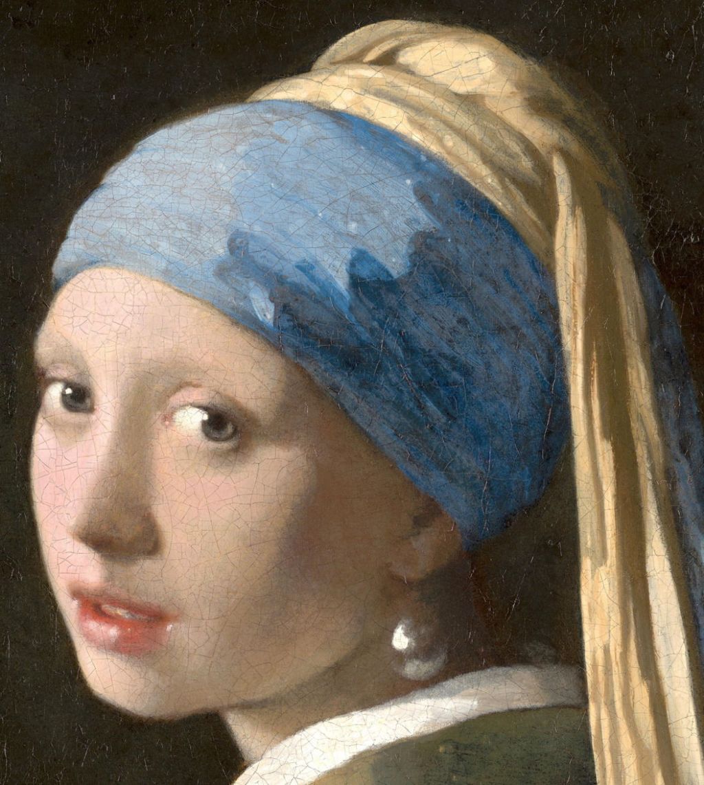
Between about 1660 and 1668, Jan Vermeer painted a series of indoor figurative works ranging from portraits such as The Girl with a Pearl Earring, through genre scenes like The Milkmaid, to what is almost certainly allegory in The Art of Painting. They are each remarkable for their use of optical effects, in that they appear to be the first and only paintings made before the late nineteenth century in which edges and objects are intentionally blurred.

This is perhaps most immediately obvious in The Girl with a Pearl Earring, from around 1665. Seen even closer up in the detail below it’s obvious that Vermeer has softened most of its edges to some degree, even on highlights such as the white reflections on the pearl itself and the girl’s eyes.

Vermeer accomplished this by applying fresh wet paint to previous paint which wasn’t yet touch dry, sufficiently wet still to allow controlled mixing at its edge. The next major painter to have used this technique as extensively is Anders Zorn, working more then two centuries later, after another visual revolution had introduced viewers to the optical effects of photographs.
One of the best examples of Vermeer’s systematic use of blurred edges is also one of the first of his surviving paintings to use this technique: The Milkmaid, from about 1660.

Look more closely now at the edges of the woman’s figure.

They’re sharpest around the woman’s left shoulder and upper arm, and soften as you look away towards her hands and the pitcher. Highlights on that pitcher and the pot below it are also decidedly blurry. These are consistent with the use of blurring to suggest movement, and for photographic depth of field, a focus effect which didn’t become widely known until after the advent of photography.

Bread and other objects on the table in front of the woman also show controlled use of blurring, most obviously in the highlights on the wicker basket.

Turning to Vermeer’s slightly later Woman Holding a Balance from around 1662-5, its focus is even softer. There’s a clear edge hierarchy, in which the edges of the tabletop in the centre of the canvas and the woman’s left hand are the crispest, and those further from that focus of the image are noticeably softer.

Similar effects are seen in Vermeer’s much better-lit A Young Woman with a Water Pitcher from the same period. Here the central focus is in the upper chest of the figure, where the edge between the split in her white mantle and the underlying deep ultramarine clothing is crispest, and the reflections on the pitcher and bowl are quite blurry. So too is the window, which might indicate movement.

In Vermeer’s late The Art of Painting from about 1666-8, the focus of sharpness is again slightly away from the geometrical centre of the canvas, in the woman holding a wind instrument, as shown in the detail below. The high tonal contrast between the marble tiles on the floor is softened in the foreground, and sharpens deeper into the picture.

Recently, several attempts have been made to explain how Vermeer came to use blurring and edge hierarchy so successfully. One story which has gained some traction is that he used optical devices such as a camera obscura to lay out the forms within each of these scenes, a theory which has been repeatedly claimed by David Hockney among others. Most recently, though, it was realised that was insufficient to explain all the optical phenomena modelled so well in these paintings, and it has been proposed by Hockney and Tim Jenison that the artist coupled a concave mirror with another mirror, a system which took Jenison five years to develop and test.
It’s perhaps unsurprising that there’s no evidence whatsoever that Vermeer possessed or used a camera obscura or other optical device, although he was a close friend of the pioneer lens maker Antonie van Leeuwenhoek.
Whether Vermeer arrived at his innovative treatment of edges and blurring by trial and error, close observation, or optical experiment appears irrelevant to his art. The fact is that, ever since people have been used to seeing blurring in photographs, his paintings have appeared those of true genius. Maybe he should also be credited as the inventor of what is now termed bokeh?
William McGregor Paxton, an American artist of the late nineteenth and early twentieth centuries, adopted the same approach.

Paxton’s Tea Leaves (1909) uses what he termed ‘binocular vision’. Two well-dressed young women are taking tea together. The woman in the blue-trimmed hat seems to be staring into the leaves at the bottom of her cup – a traditional means of fortune-telling – but neither seems to be talking to the other.

Notice the zone of relative sharpness extending from the right shoulder of the woman at the left, across the silver teapot to the hands of the woman in the hat. This contrasts markedly with the much softer blue edge of the screen above them, for instance.
Paxton not only had the advantage of being able to study Vermeer’s paintings – he and his wife travelled in Europe – and understanding of modern optics, but experienced the widespread use of cameras with lenses that had limited depth of field (sometimes erroneously referred to as depth of focus). Objects beyond the depth of field first appear slightly softer, then more blurred, until they can finally lose all form. This has been exploited to produce optical effects in the out-of-focus zone, known most recently as bokeh. And like Vermeer, Paxton was not only exploring depth of field effects, but bokeh in objects such as jewellery. Yet the term bokeh wasn’t used, in Western photography at least, until around 1997.

Finally for today, here’s an example of Anders Zorn’s hierarchical edge control, in which he uses the sharpness of edges to draw attention to different passages within the painting as a whole.
