
One of the more constant features of the Mac human interface is its common menu bar, featuring application menus at the left, and system-wide items at the right. Dating right back to Classic Mac OS, this is about to change in Big Sur, whose overhauled interface brings important changes and ends the free-for-all at the right end. This article explains what’s happening.
Currently, the right end of the menu bar is used by three main classes: two fixed items for Spotlight and Notifications, several System Preference panes with options controlled within the respective pane, and third-party software can add its own items, such as menus which provide quick access to app features. Each of those is controlled individually, particularly those of System Preference panes.
Among the most popular items for the right end of the menu bar is a digital clock. It can be set to display the time and date in a range of different formats, according to the settings in the Date & Time pane.

Before I take screenshots to illustrate an article that I have written for publication, I have to take a tour through half a dozen different panes, disabling some and changing the settings in others, until my setup meets the standard house layout. I also have to quit a couple of third-party apps which provide convenient points of access through items at the right end of the menu bar.
As Apple demonstrated at WWDC, Big Sur brings a great deal of change to the human interface. Much of this is look and feel, vitally important but mainly skin deep. Its new Control Centre is a good example of a more fundamental change: instead of having a long stretch of different additions to the right end of the menu bar, it tucks some of the most common into a single window.
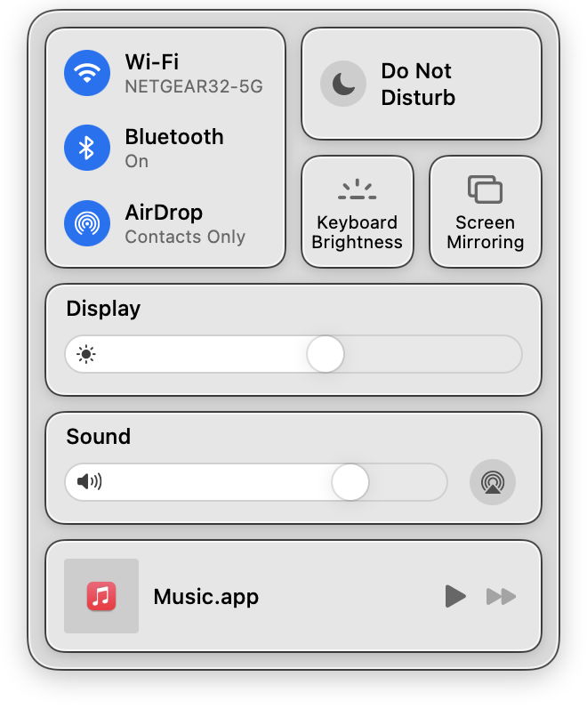
This is a huge improvement, and beneath that there’s even greater change. Look in the Date & Time pane, and you’ll see the traditional controls for the menu bar clock have gone. When I first noticed this, I was puzzled and annoyed that we had lost control over what’s shown in the menu bar, until @Schwieb kindly pointed me in the right direction – to the greatly augmented Dock & Menu Bar pane in System Preferences.

There you’ll find the controls which used to be dispersed across many different panes, gathered together. This new pane controls the Control Centre, menu bar, and all the display options for those individual items. Together, in a single place.
Like many changes to the human interface, it’s a bit disorientating to begin with, but the more I think about this seemingly small change, the more I like it. So if this empowered pane handles the first two classes of item added to the right end of the menu bar, what about the third, third-party software?
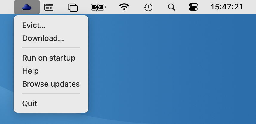
It so happens that I have my own little menu bar addition, Bailiff, which controls iCloud files. But it knows nothing about the new Dock & Menu Bar pane, which also knows nothing about it. I think that’s a shame, and just as it would be really useful for third-party tools to appear in the new Control Centre (something I’m sure that Apple is going to offer soon), it would be excellent if they could also be integrated into the Dock & Menu Bar pane.
One of the problems with small tools like Bailiff gaining a place in that pane is that they are currently so simple. They add themselves to the menu bar with a few lines of code, using NSStatusBar, which is the AppKit equivalent of the system-wide menu bar. Bailiff does this so:
let statusItem = NSStatusBar.system.statusItem(withLength: NSStatusItem.variableLength)

let theImName = NSImage.Name.init("statusIcon")

let icon = NSImage(named: theImName)

statusItem.image = icon

statusItem.menu = bailiffMenu
then all it has to do is handle the different menu commands.
The only tricky bit is adding or removing itself from Login Items, which I cheat with AppleScript, and have explained here.
If you’re already running a beta-release of Big Sur and haven’t explored the Control Centre and Dock & Menu Bar pane, now’s a good time. For those unsure whether they’re going to like Big Sur’s new interface, these are examples of what makes it worthwhile.
