
Received wisdom is that, when a brand new virus starts infecting a completely susceptible population, the number of cases grows exponentially. This is expressed in models of spread which don’t grow linearly with time, but are like grains of rice being doubled on the squares of a chess board: before you get to the sixty-fourth square, you have more rice than there is in the whole world.
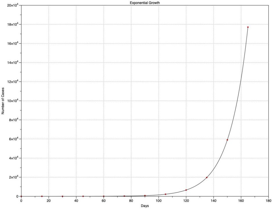
Exponential growth is a terrifying proposition. In this chart, I suppose that every fifteen days, each freshly infected case passes the disease onto three uninfected cases. A single case on day 0 grows to 177,147 on day 165. What appears to be an insignificant problem for the first two months then rapidly becomes overwhelming – and that’s what infection rates in countries like Brazil, or in the new resurgence in many US states, or any ‘second wave’ could do, at least until a large enough proportion of the population has become immune to slow the growth.
What’s even more horrifying about that chart is that the figures I use for its growth – new infections every 15 days (the serial interval or generation time), and 3 new cases for each existing one (the Reproduction Number, R₀) – are similar to those estimated for Covid-19. They also explain why governments who haven’t been too concerned when there are only a couple of hundred cases have already lost control of what will happen in the coming weeks.
Careful analysis of many real pandemics (see Yan and Chowell, for example) has shown that exponential growth occurs during the early phase of major outbreaks, but sub-exponential growth then becomes more usual. This article is an armchair epidemiological exploration using just the tools on my Mac listed at the end.
Data
As I explained previously, I’m very fussy as to the data I use. I’m here not so concerned at getting the largest numbers, but that they are attributed as closely as possible to the actual day on which test swabs were taken, rather than when the result was officially reported. This rules out the data normally reported daily through official channels up to WHO, which is more concerned with accounting for total numbers, and is often ‘corrected’ when previous errors have been discovered, sometimes even for political reasons.
I use the data for fresh cases diagnosed in England (not the whole UK) provided by Public Health England, and equivalent figures for New York City published by NYC Health. I also wanted some for Brazil, where diagnosis and data collection are more fraught. The best that I have found are those collected by Wesley Cota and colleagues on GitHub.
These three parts of the world are of course very different.
England is a component of the UK with a population of around 56 million. Although small numbers of cases of Covid-19 were reported earlier, the epidemic didn’t really get going here until around 1 March. National lockdown was put in force over the period 21-24 March, although many sources claim this didn’t take effect until 24 March, some of its most valuable restrictions were applied on 21st. Those measures appear to have been respected by the great majority of its population, and have been progressively eased during May and June, but many restrictions remain.
New York City is a much smaller and more densely populated area, with a population of around 18.8 million. First cases were reported around 1 March, and lockdown seems to have been applied from 22 March. My particular interest here is in the rate of growth in infections, which appears to have been extremely rapid during late March.
Brazil is a very large country with a population of 212.5 million, many of whom live in overcrowded conditions in its large cities. Compared to England and New York City, Covid-19 appears to have arrived later, with first significant numbers from 18 March. Currently, it’s reporting the largest numbers of fresh cases for any country, which may result from political conflict over lockdown measures and overcrowding. If any country exemplifies rapid and almost uncontrolled spread of Covid-19, it should be Brazil.
Time course of spread
For each dataset I have prepared a similar chart showing the number of Covid-19 cases confirmed each day, plotted as raw data with a trend curve fitted using LOESS, as described before.
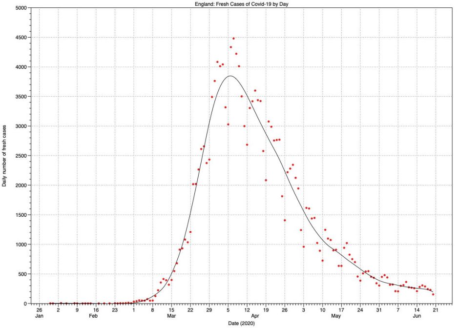
In England, case numbers rose exponentially from around 1 March until they exceeded 1,000 after 18 March. They then rose linearly until levelling off to a peak at around 1-10 April, two weeks after lockdown measures took effect. Since then they have been declining more slowly than the original rate of growth, although the effect of recent relaxation in lockdown measures has yet to be seen. Peak death figures, with a maximum of 1,173 deaths on 21 April, lagged the peak in fresh cases by a further two weeks.
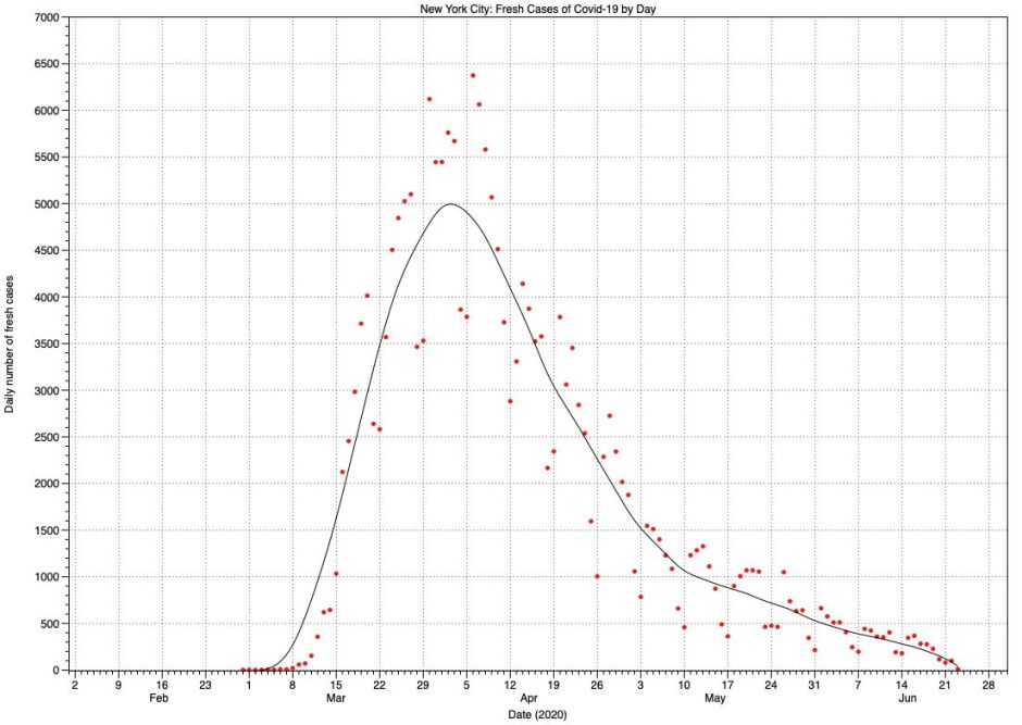
The pattern in fresh cases for New York City appears very similar to that in England. Here, the peak in case numbers is between 30 March and 5 April, but with a proportionately lower maximum number of daily deaths of 589 much earlier, on 7 April.
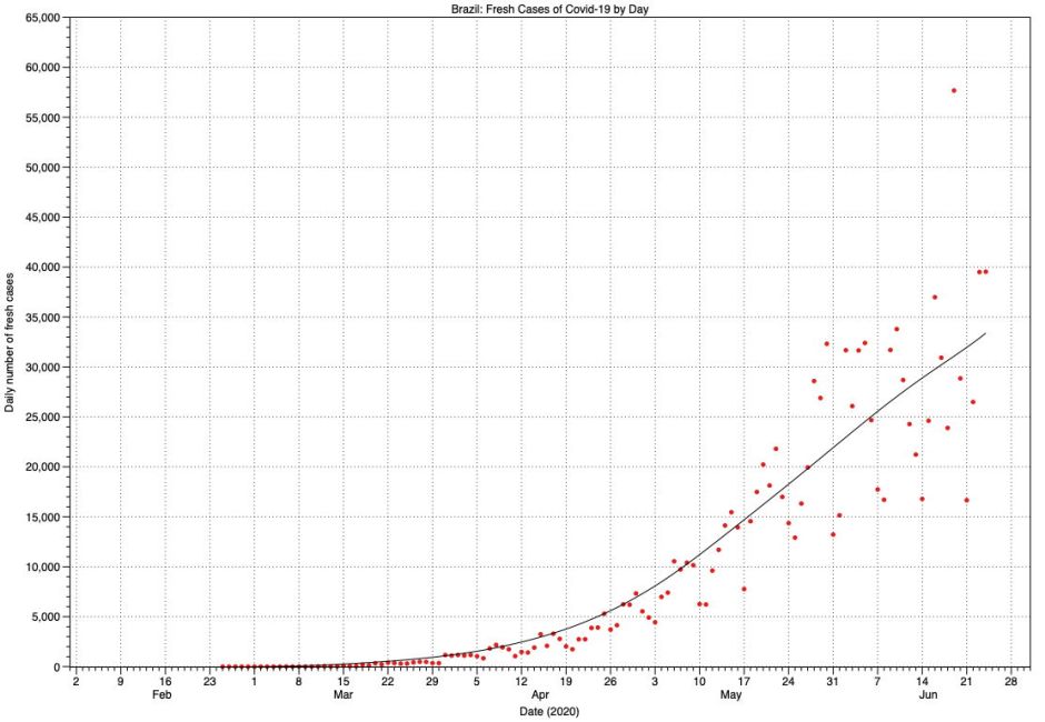
As might be expected, the scatter of raw data points for Brazil is much greater, and increases with time. At present, this shows the early phase of exponential growth, following which there may be a linear phase from the middle of May. However, confidence is low, and it’s possible that the rate of growth is still accelerating. There’s also no evidence of case numbers reaching any peak yet.
Cumulative totals
One classical way of demonstrating the underlying mathematics of epidemic growth is to examine charts of the cumulative total of cases with time. Because of the large numbers involved, this obscures much of the detail seen in the previous charts, particularly during the falling daily figures after the peak, but it reveals the nature of spread. Sometimes, these charts are shown with a logarithmic scale for the Y axis; I avoid that here, retaining a linear scale.
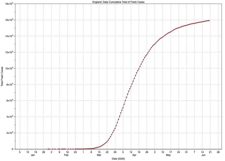
For England, this is a distinctively S-shaped (sigmoid) curve, although it isn’t symmetrical, in that growth occurred more rapidly than levelling off at the top. Indeed, the top of the curve continues to rise slowly and isn’t yet horizontal. This form of curve is also known as the logistic function, and is examined in detail on Wikipedia. It’s relatively straightforward to read its coefficients:
- L, the maximum value, I will take for convenience as being 161,000, which for the English population represents around 3 cases per thousand.
- k, the logistic growth rate, is about 3,450 cases per day per day, the maximum rate of rise.
- x₀, the midpoint, occurs 43 days after the start of significant case numbers on 1 March.
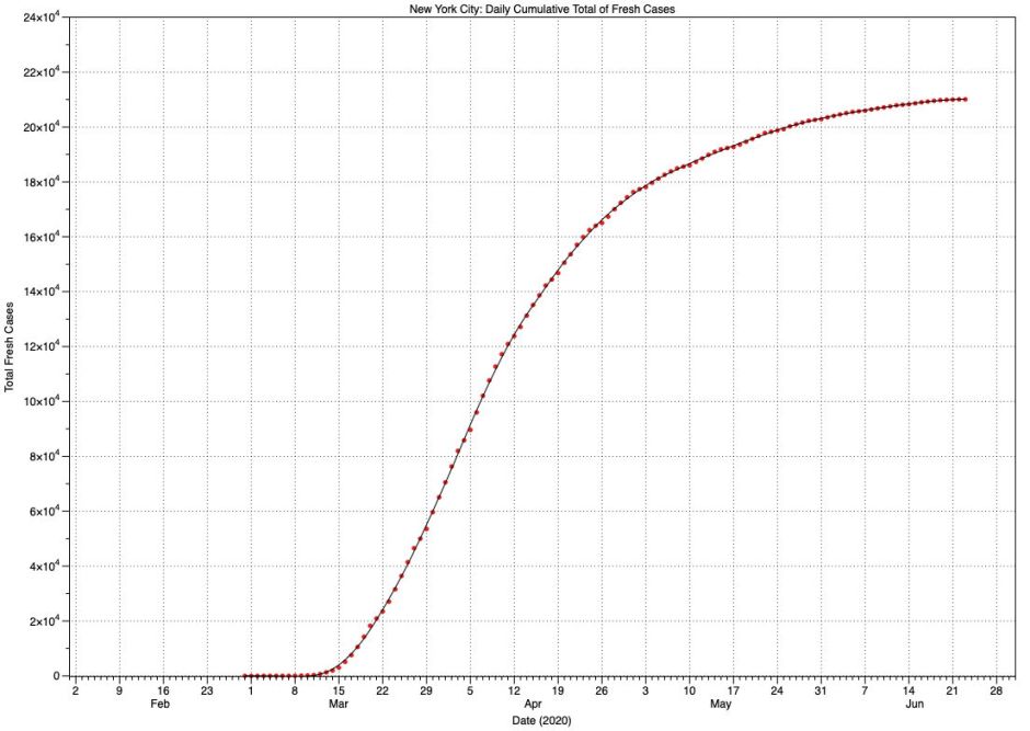
For New York City, this is another sigmoid curve similar to England’s, but with different coefficients:
- L, the maximum value, is 210,000, or 11 per thousand population.
- k, the logistic growth rate, is 5,083 cases per day per day.
- x₀, the midpoint, occurs 30 days after the start of cases on 1 March.
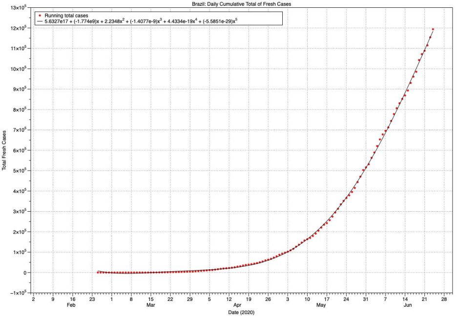
Brazil shows no sign of reaching the top of any sigmoid curve, despite attaining a total of 1.2 million cases. Although this is now sub-exponential growth, it has just doubled in the last 20 days, which is truly alarming. Mathematically, the curve shown here is reasonably well-fitted by a quadratic equation, in which x² (squared) is significant.
Tentative conclusions
There’s no doubt that Covid-19 spreads very quickly, and the explosive rise in fresh cases in each of these three areas is forceful evidence that we need to do as much as we can to control that spread. But in practice, even (probably) in Brazil, cases don’t rise exponentially as some simple models would predict. The reality is that, like most other infectious diseases, its spread is sub-exponential.
There are many good reasons for this. Although the application and effectiveness of lockdown measures in these three places differs significantly, as does the density of their populations, initial exponential growth in the number of infections should settle to a more linear rate once the infection becomes more common, although still well below the rate at which the falling number of susceptible people starts to limit further spread.
For those modelling the spread of Covid-19, or trying to predict it, these observations demonstrate some of the limitations and pitfalls in many simple models. They also show some of the differences between areas.
Figures for England include large cities like London, in which infection spread earlier and more rapidly, more similar to that in New York City. Rises in numbers of cases in less densely populated areas occurred later and more gradually. UK strategy for healthcare provision anticipated that, with dedicated temporary hospitals being opened in time for the peak. Planning for New York City seems to have been more ad hoc. In spite of that, and the fact that there is still no curative treatment for Covid-19, death rates have been very different.
I have deliberately avoided looking at deaths in any detail, for many reasons. Most significantly, as the death rate from Covid-19 is strongly related to age and differs markedly by ethnic group too, it’s meaningless to interpret death data, or even worse to attempt any comparisons, without taking those into account. Although the concept of excess deaths is attractive, unless the underlying data are clean, robust and comparable, it too can quickly become misleading.
Finally, I hope these figures and charts give an indication of how much more analysis is going to be required before any of this starts making sense. Those who rush to draw conclusions and use them to construct political criticism could so easily look foolish when better analyses are performed in the months and years to come. Don’t try counting your chickens before you know whether they’re even birds!
Reference
Ping Yan and Gerardo Chowell (2019) Quantitative Methods for Investigating Infectious Disease Outbreaks, Springer. ISBN 978 3 030 21922 2.
Software used includes DataGraph from the App Store, and Igor Pro from WaveMetrics.
