
There surely hasn’t been a time before in which online charts have been more important, and most frequently studied. During this pandemic, we have been treated to some of the best charts ever: those produced by John Burn-Murdoch and others for the Financial Times, and the extensive compilation at Worldometer stand out among many others. But from the outset they have had problems which have clouded our view of what has been happening. Two issues I discuss in this article are the data they use, and how they tackle noise to reveal trends.
I concentrate here on the reporting and charting of fresh cases of Covid-19. These are among the most important figures, as they can show trends in the spread of the disease earlier than other data such as deaths, which typically lag the date of positive testing by 2-4 weeks. Although there are many anomalies with published figures, there’s clear agreement on their definition as the number of people who test positive using a recognised method for detecting the virus on swabs.
If you want to watch for a ‘second wave’, or the impact of removal of lockdown restrictions, or the effect of holidays and festivals, fresh cases are the figures to watch.
Fresh cases of Covid-19
The most readily available figures for fresh cases in any country are those which it submits daily to the World Health Organisation, which are then collated and published. Unfortunately, they’re also more than slightly misleading. These are normally taken straight from the number of positive lab tests for that day, irrespective of when the original swabs were taken.
Delays between swabs being taken, on the actual date of the test, and the return of results vary considerably by lab, day of the week, date, and country. In some cases, test results are returned the same day, in others delays may amount to as much as a week or more. The best solution is for positive test results to be dated according to when the swabs were originally taken, effectively the moment of diagnosis. Few countries provide figures for those, and where they do, they are less accessible. In the UK, for example, Public Health England publishes these daily, but only for England and not the whole UK.
These better figures come at a disadvantage too: because they record positives on the day that swabs were taken, each day updates totals from previous days, and it takes a few days for the last test results to feed into daily totals. For example, the final total for today, 18 June, probably won’t be known until around 23 June, depending on reporting delays. But what you then end up with is well worth the wait.
Figures for England have another peculiarity: they don’t appear to include all the positive cases, as I have shown before. Quite why this is occurring seems buried in the methodology, but for the moment they still seem the best figures to use, where they’re available.
Charting, noise, and hebdomadal cycles
A glance at the raw figures for fresh cases in England by date reveals that they contain a lot of noise, and evidence of weekly or hebdomadal cycles, with figures for Saturdays and Sundays invariably being much lower than those for weekdays. One way to present these is by plotting cumulative cases over time.
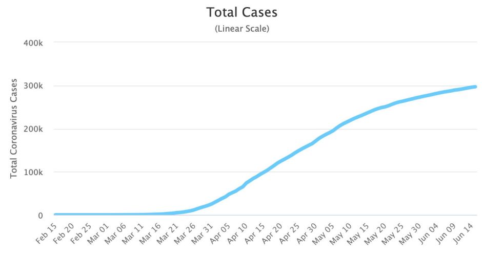
This approach, which can use either a linear or logarithmic Y axis, is popular among those modelling disease transmission for its sigmoid shape. This example is taken from Worldometer, but like others it helps little with detail, and is very hard to read in terms of change, which is what we’re generally most interested in.
The great majority of charts shown on the Web therefore use smoothed lines, sometimes superimposed over bars or points representing the original values. The example below is for one city in England, Southampton, and uses the most common method of smoothing, a seven-day moving (or rolling) average.

Worldometer offers you the choice of either a three- or seven-day moving average, which seems attractive.


In general, because of the hebdomadal cycle, sites have adopted seven-day moving averages, which do take out much of the effect of the day of the week. They also bring their own problems.
A seven-day moving average is simply calculated by adding together the figures of seven consecutive days, and dividing that by seven. What, though, does that average represent most accurately? The smoothed number of cases at the start of the seven day period, at its middle, or end? Mathematically, it should generally be most representative of the point in the middle. That would necessarily mean that no moving average could be given for the first or last three days in the time series. Look up at the charts which have been published, and you’ll notice that their smoothed lines continue right up to the most recent data point. I suspect in most cases the moving average isn’t being taken for the middle timepoint in the seven, but for its last.
This has significant effects, particularly when the number of fresh cases is changing most, as seen in two examples taken from the data for England.
When cases were rising fastest, seven consecutive raw values were 1034, 1208, 2017, 2020, 2265, 2611, 2656, which average 1973, with a median of 2020, which also happens to be the middle of the series. Using that average to represent the first point of those seven is a clear overestimate, and for the last point it’s a clear underestimate. The same happens when case numbers are falling. Consecutive raw values were 3422, 2577, 2084, 3076, 2988, 2755, 2764, with an average of 2809 and median of 2764. Again, the average misrepresents, this time being too low for the first in that series, and too high for the last.
The effect of this smoothing error is visible in all charts which use moving averages: when the figures are rising steeply, the smoothed line lags the change by 2-3 days, and when they are falling, there’s a similar lag.
Seven-day moving averages do little to address problems of noise in the data. The resulting lines wander a lot, leading the viewer into drawing false conclusions about trends which disappear as rapidly as they became apparent.
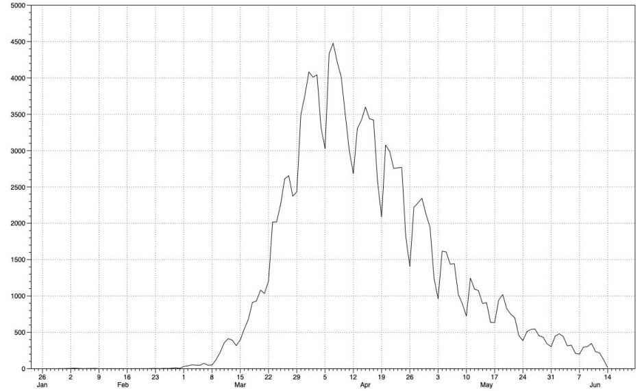
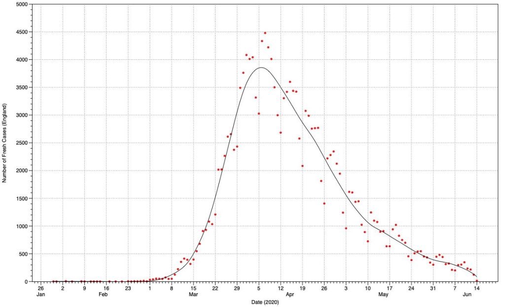
This plot of the raw data for England is faithful but hard to read. Beyond its marked hebdomadal cycles and peak, it’s not easy to see much meaningful detail, or discern more subtle trends. My favourite treatment for this type of time series combines the raw data, shown as points, with a smoothed line using LOESS or local regression. In this, subsets of the data are used for a series of weighted least squares regressions, from which a line of best fit is constructed. A smoothing parameter is used to determine how closely the fitted curve matches the raw data, and is normally adjusted by eye.

Here’s my chart of the data for fresh cases in England, showing the raw data as red points, and the LOESS curve in black. This takes out both the noise and the hebdomadal effect, and suggests a series of trends as follows:
- a sigmoid growth phase between 1 March and 6 April, with a maximum linear growth rate of about 1500 cases/week
- a peak on 6 April
- a linear fall from 9 April to 5 May at a rate of about 500 cases/week
- a less steep linear fall from 10-31 May at a rate of about 250 cases/week
- a least steep linear fall from 2-7 June
- incomplete data from 8 June appearing as a false increase in gradient up to the last data point on 14 June.
England entered full lockdown between 21-24 March, two weeks before fresh cases peaked on 6 April. Those measures have been progressively eased since the middle of May, which may correlate with the slower reduction in fresh cases into June.
One important test of how reasonable is this LOESS smoothing is charting the residuals – the differences between the raw data values and those in the smooth curve, day by day.

This shows clearly the hebdomadal cycles which smoothing has removed, and how they have varied in magnitude through the time series. Trying to use moving averages to remove those large swings isn’t going to be successful. These residuals have an average (0.66) and median (3.7) close to zero, indicating the smoothed line is unbiased, and it can be seen to track the raw data points closely without any consistent time lag. Despite some large residuals, the standard error is only 23.
If you want to try better methods of fitting time series data, macOS has no shortage of fine apps with which to do it. DataGraph is available from the App Store, Igor Pro from WaveMetrics, and the statistical programming language R is free from here. If it gets you away from those horrid seven-day moving averages, so much the better.
