
Blue is not just a primary colour, but the colour of the unclouded sky, of many bodies of water, and by convention of the Virgin Mary’s clothing. Blues occur in nature in a wide range of chromatic intensity, so having a reliable lightfast deep blue is one of the first requirements for any palette.
Blues are also among the most fascinating pigments in terms of their history and use. Ultramarine Blue is one of the oldest pigments still used in painting, and its history could fill a book. Over a similar period, artists also used Smalt, made from powdered blue-coloured glass, in which the active pigment is cobalt oxide. Thénard discovered cobalt aluminate in 1803-04, and recognised its potential as a pigment. As this preceded the introduction of artificial Ultramarine, Cobalt Blue was quickly introduced into artists’ paints, becoming available in oil paints and watercolours from around 1806-08.

So far, I believe that the earliest recorded use of Cobalt Blue is in the sky of JMW Turner’s oil sketch of Goring Mill and Church, thought to have been painted in 1806-07. This shows how similarly Turner started his oil and watercolour paintings. Once brought to this state, Turner could return to the sketch later and add foreground detail before completing it.
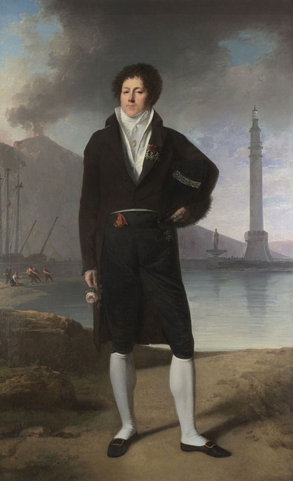
The pigment was rapidly adopted in France and Germany, with Jacques-Antoine Vallin’s portrait of Dr Forlenze (1807) being another early example. This was painted in Italy – that is the volcano Vesuvius in the background, and the subject was educated in Naples.
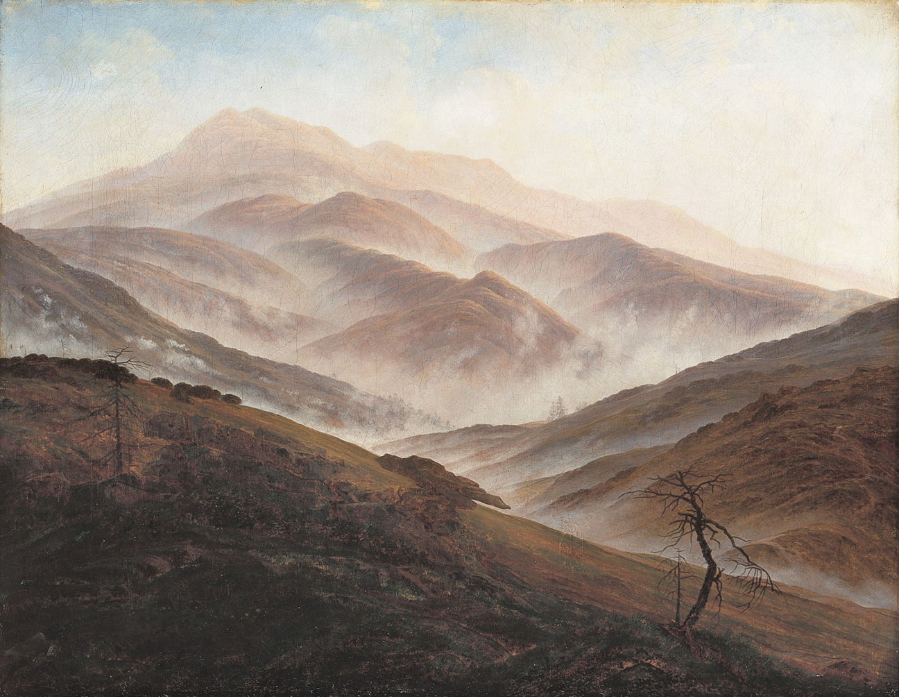
Caspar David Friedrich was another early adopter, and used Cobalt Blue in the sky of his superb Riesengebirgs Landscape with Rising Fog in 1819-20.

In this sampler of modern oil paints made by Williamsburg, each is shown straight from the tube, and below in approximately equal mixture with Titanium White. The pigments are, from the left: Cerulean Blue (genuine), Cobalt Teal, Cobalt Turquoise Bluish, Cobalt Blue, Ultramarine Blue (synthetic), Indanthrone Blue, and Phthalo Blue.
Cobalt Blue is an excellent and lightfast pigment which is not as deep blue as Ultramarine, thus has lower tinting strength, and is semi-opaque. It remains popular today, but has always been expensive. Once Ultramarine was being manufactured commercially after 1826, synthetic Ultramarine Blue quickly became considerably cheaper than Cobalt Blue.
Cerulean Blue had actually been discovered before Cobalt Blue, but was not introduced as an artists’ pigment until the middle of the nineteenth century, after both Cobalt Blue and synthetic Ultramarine. Indanthrone and Phthalo Blues are modern organic pigments which became available after 1900.

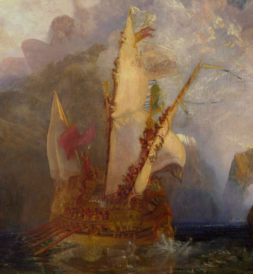
After his initial tests, JMW Turner continued to use Cobalt Blue in many of his paintings, such as Ulysses Deriding Polyphemus from 1829. Here he must have used it in the sky and cloud, although for the much darker blue of the distant sea he may well have reverted to the use of Ultramarine.

Cobalt Blue has been found in Delacroix’s famous Liberty Leading the People (1830), but he too must have used other blues, perhaps including Prussian Blue, which had become popular in the early 1700s.
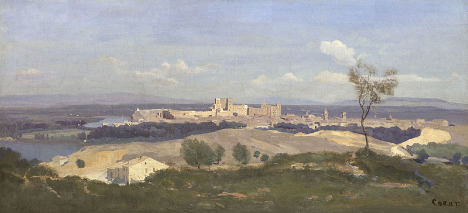
The same is probably true of Corot’s panoramic view of Avignon from the West (1836), in which the sky looks to have been painted using Cobalt Blue, but the blue pigment admixed for distant land and woods appears to have been darker.
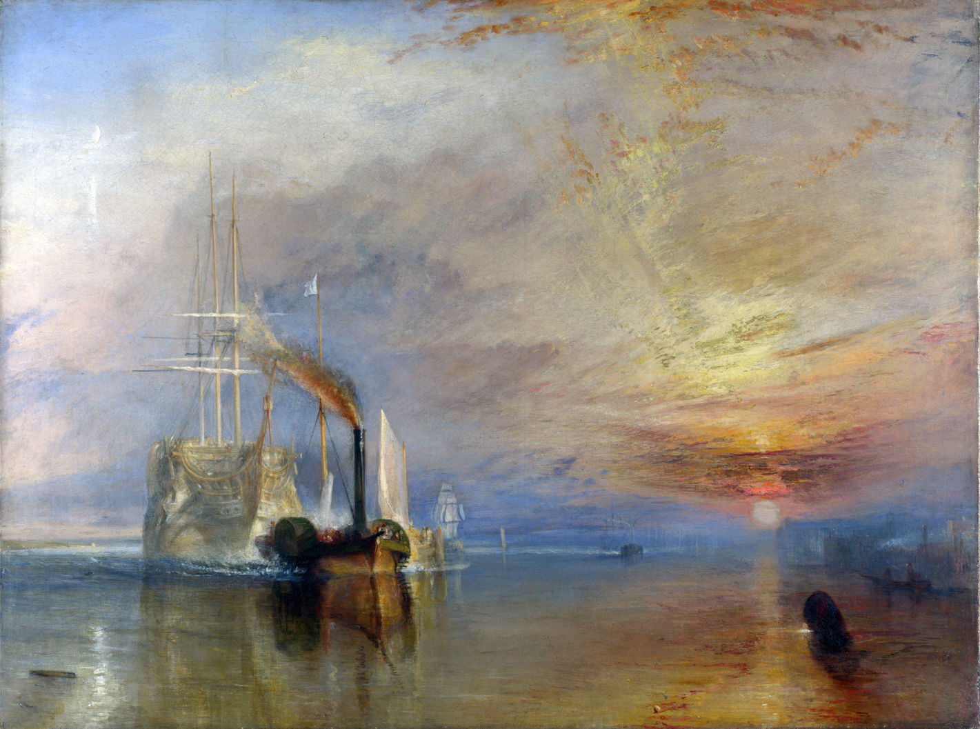
Turner’s famous painting of the Fighting Temeraire from 1839 is probably the first major painting in which Cobalt Blue was used so extensively, as the artist appears to have used it throughout both the sky and water.
The introduction of Cobalt Blue had not been without controversy. Artists of the early nineteenth century had increasing interest in the permanence of the pigments which they used, and turned to authorities such as the chemist George Field to assure them that their paints would not discolour readily. In his influential 1835 book Chromatography, Field reported that Cobalt Blue tended to turn green over time; given its known chemical stability, this is surprising and may be attributed to changes in the oil binder rather than the pigment itself.
Despite Field’s warning, analyses of paintings by the Pre-Raphaelites shows that they often relied on Cobalt Blue.

Dominated by greens and browns, Millais’ Ophelia (1851-52) has been shown to contain Cobalt Blue.

William Holman Hunt used it more extensively in the sky and sea of Our English Coasts (1852).
On the other side of the Channel, Cobalt Blue had also established itself in the palettes of major artists across France and Germany.

Several of Manet’s paintings are known to use it, here including the small patch of sky at the top, and several prominent details such as the headscarves of the two women wearing gold dresses in the left foreground.

Cobalt Blue also seems to have been a first choice of Claude Monet, appearing across the broken water surface of his Bathers at la Grenouillère (1869).
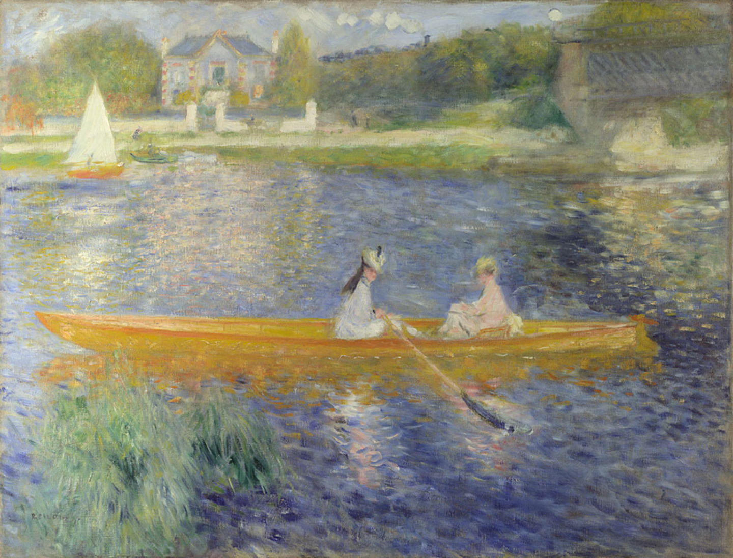
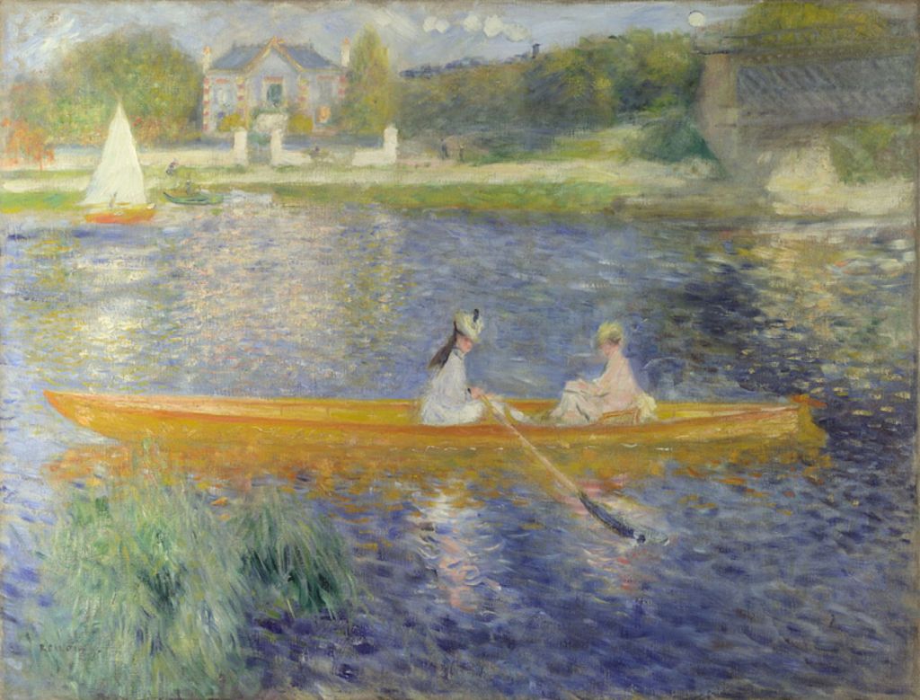
Of the core French Impressionists, it was probably Renoir who used the pigment most, and most obviously. Paint analysis of La Yole (The Skiff) from 1875 shows Cobalt Blue as the major blue pigment in use. Renoir mixed it with increasing amounts of white for the lighter strokes from which he formed the water. However, the very deep blue marks would have required admixture or substitution with another pigment.
By this time, Cobalt Blue was established as being one of the most useful blues to have on your palette, and is found in the paint layers of a great many works at the time. It was also favoured in the painstaking Neo-Impressionist or Divisionist technique during the 1880s and 1890s.

Another famous example of the use of Cobalt Blue is likely to be Georges Seurat’s large and long-laboured masterpiece Sunday Afternoon on the Island of La Grande Jatte (1884-86). It is hard to even contemplate how many of those individual marks were made with Cobalt Blue.

In the twentieth century, the rise of organic pigments such as Phthalo Blue has resulted in a decline in the use of Cobalt Blue. On the other hand, the introduction of other cobalt salts has allowed the development of different shades of Cobalt Blue, known as Cobalt Teal, etc.
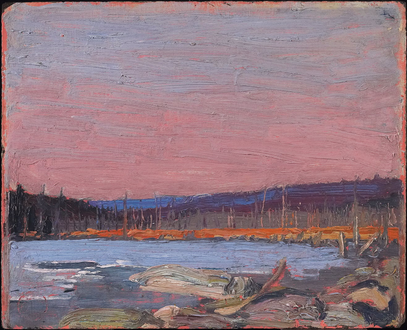
Cobalt Blue seems to have been a favourite pigment with the short-lived Canadian painter Tom Thomson. The pigment is here responsible for the blue sky and the water too.
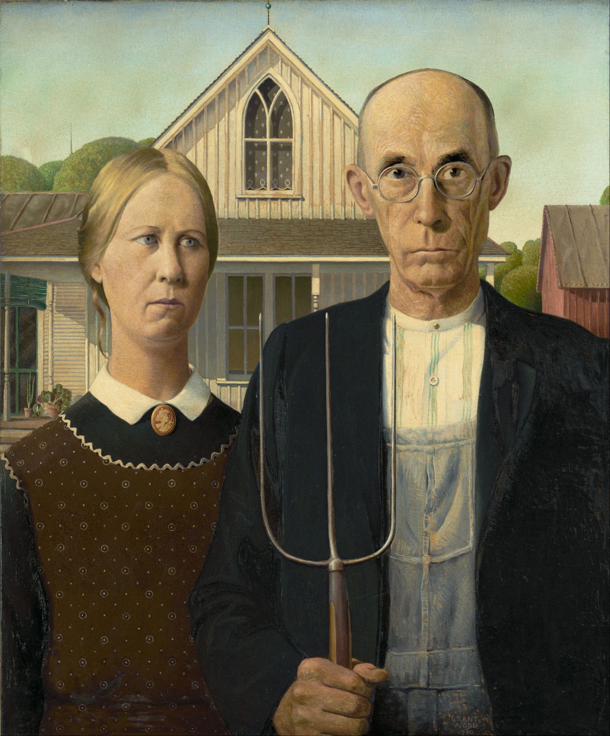
Analysis of Grant Wood’s famous American Gothic (1930) has shown the use of Cobalt Blue, although I suspect that was mainly in the sky and in the pale blue lines decorating the man’s shirt. Most recently, the pigment has been found in paintings by Mondrian, David Hockney, and Frank Stella.
With the rise in concern over the toxicity of pigments in the late twentieth century, some confusion has arisen over Cobalt Blue. As with all cobalt salts, when absorbed into the body cobalt aluminate has nasty effects. But bound in pigment particles in oil, watercolour, or acrylic paints, and being almost insoluble in water, its absorption from the gut and skin appears to be extremely low. There remains significant risk from the inhalation of dust from pastels containing Cobalt Blue, though.
Cobalt Blue and its related cobalt salts have established themselves as reliable and very permanent pigments, which will continue to feature in the palettes of many artists, and see use in sky and water.
Reference
Ashok Roy (2007) Artists’ Pigments, vol 4, ed Barbara H Berrie, Archetype. ISBN 978 1 904982 23 4.
