
One of the key technical aspects of painting which enabled the Renaissance was the widespread development and use of oil paint. Although many of the great Renaissance masterpieces were created using egg tempera or in fresco, sophisticated realism benefited greatly from the use of paint which dried over days or weeks, rather than seconds or minutes.
Accounts of the development of Impressionism during the nineteenth century often claim that the availability of new pigments was an important factor in the changing use of colour, and the look of paintings. For example, Anthea Callen – in her recent book The Work of Art (reviewed here) – wrote:
“Crucial for the nineteenth-century landscape painter were the new blue, green and yellow pigments introduced in the first 30 years of the century, since one of the central problems for the earlier Neoclassical landscapists was the lack of good greens, bright blues and yellows.” (Op. cit. p. 263.)
Although galleries and exhibitions seldom hang such different paintings side by side, most of us would agree that changes in the palette used, and their effect on painting style, are very obvious. A Rembrandt, with its dominant earth colours, looks very different from a Monet or Pissarro, with its bright reds, blues, greens, and even purples.
I have been using colour analysis of the images of paintings, together with information from more scientific studies undertaken by conservators and researchers, to examine this further. In this first article, I would like to consider whether there were changes in the colour palettes between old paintings, from the Renaissance and seventeenth century, and those of the nineteenth century. I will be referring to colours in terms of their hue, saturation (chroma) and brightness (lightness) (HSB): if you need to refresh your understanding of those, you should find this article useful.
Old paintings

 I analysed an image of van Eyck’s Rolin Madonna (c 1435) to determine its sixteen most frequent colours, which are shown in the palette strip above. These consist mainly of earth colours and pale blues, which have peak saturations of 11% to 40%. There is also the range of reds from the Madonna’s cloak, which have much higher saturations, reaching 75%.
Rembrandt’s paintings are often even more constrained in their use of colour, as in his A Woman Bathing in a Stream (1654).

 This is remarkable for being almost monochromatic, with all the colours being earths, ranging from near-black to pale straw. However these are quite saturated, particularly in the mid-range values, where they are fairly constant at around 75%.

 In The Jewish Bride (c 1667), there is a wider range of earths, and the prominent red of the bride’s dress. These have quite high saturations, reaching 84%.
I turn next to a couple of early landscapes, by Poussin. The first is my favourite Landscape with a Calm (c 1651).
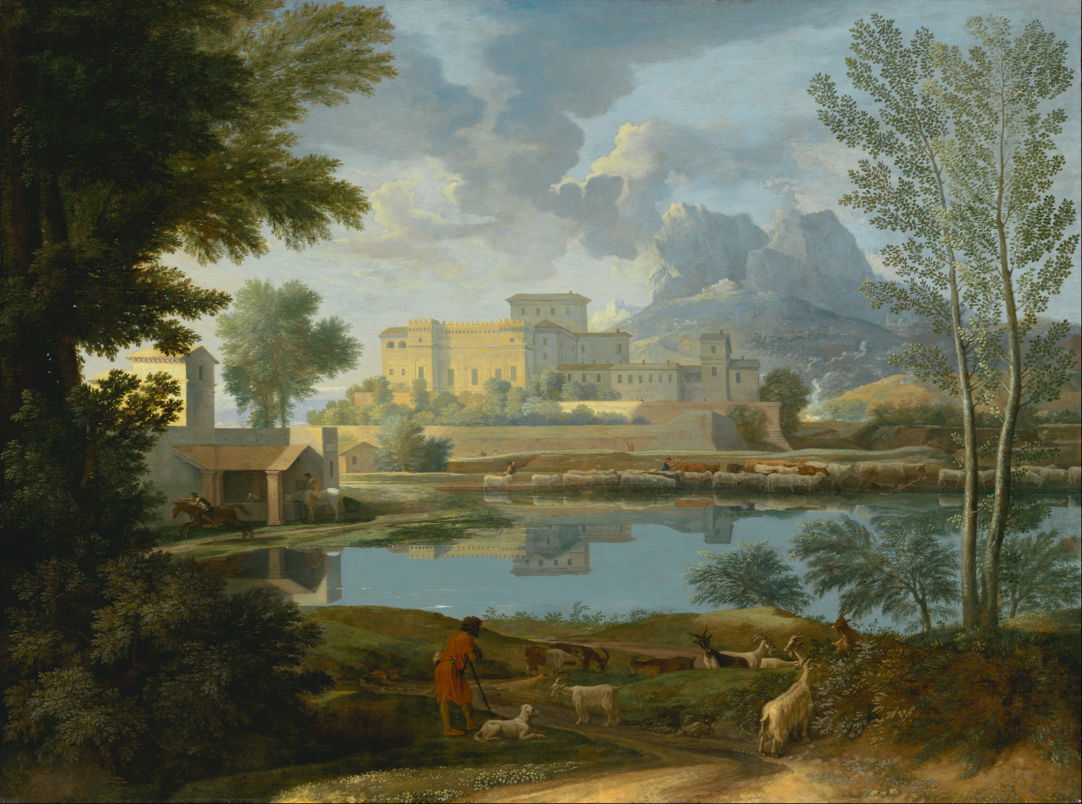
 There is inevitably a broader range of colours, but the greens in particular are low in saturation, around 40% at best. The sky and its reflection are of course blue, but are less saturated still, around 20%, and slightly green in hue, with hue values of 170˚ and 180˚. Modern ultramarine paint typically has a hue value much greater than that, of around 250˚, and even cobalt blue is usually about 230˚.
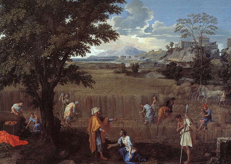
 Summer, or Ruth and Boaz (1660-4) also has a broad range of colours, with its earth red rising to 74% saturation. However the blue of the sky is again quite low in saturation, here 24%.
We do, inevitably, need to be very cautious in how we look at the use of colours and palettes.
Paintings that are several hundred years old have most probably undergone change in (at least some) colours, and even with expert conservation work to remove grime and dulled layers of varnish, the colours that we see today may be different from those during the artist’s life. Some pigments have proved to be fugitive, posing the conservator the difficult choice as to whether to try to make the painting look ‘new again’; whatever they do, it will prove controversial.
The images which I am using are unlikely to have been produced using a rigorously colour-controlled environment, and many will have had their colours and tones manipulated automatically by the firmware within a digital camera, and probably software on a computer too. Although these may shift HSB values, they will normally do so fairly uniformly throughout the image, unless the photographer has gone out of their way to adjust individual colours, for instance.
One useful comparison here is with more recent paintings which have more traditional style: Bouguereau’s Nymphs and Satyr (1873) was painted less than 150 years ago, making it over 200 years younger than the paintings of Rembrandt and Poussin. Being of the same age as the major Impressionist paintings, and made using very similar paints, it and other Salon works from the late nineteenth century are valuable comparisons.

 The most frequent colours make up another surprisingly limited palette, again mainly composed of earths, of which some have high saturations, in the range 60% to 74%, and one even reaches 83%. Bouguereau appears to have used an older palette, but with more saturated colours; the higher saturations could reflect difference in style, they may be the consequences of more modern pigments (or paint production), or possibly they result from differences in age or image quality.
Impressionist paintings

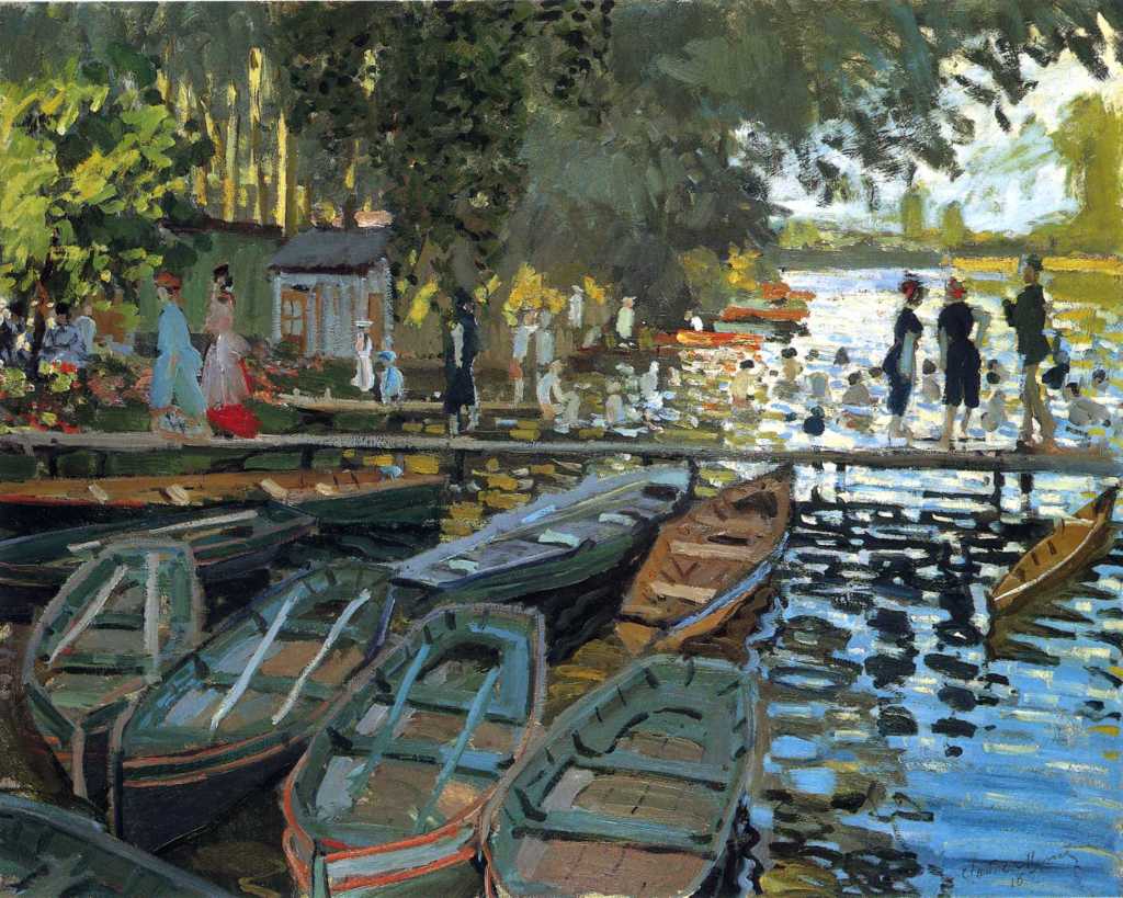
 Monet’s Bathers at la Grenouillère (1869) shows a palette with much broader range, including greens, although here they still appear low in saturation. However the blues in the sky are much more saturated, rising towards 60%.

 These two palettes were obtained from paintings in his Grainstacks series, Wildenstein numbers 1273 and 1289. They also show a wider range, and many have saturations exceeding 40%. At about this time, Monet’s palette included traditional earth colours, with additions such as Cadmium Yellow, Alizarin Crimson, Emerald Green, Viridian Green and Cobalt Blue.
Pissarro’s The Marne at Chennevières (1864-5) was one of his few paintings to survive the Franco-Prussian War, and is intermediate between Barbizon School and Impressionism in its style.

 Hardly any of the colours seen in its palette have saturations over 40%, including those of its unusually rich range of blues. He probably used both Cobalt Blue and synthetic Ultramarine Blue.

 Much later in his career, as in Setting Sun and Fog, Éragny (1891), his palette used many more saturated colours: here all the orange-brown colours have saturations over 40%, and three are over 70%. Although he was an early user of Cadmium Yellow, he was also known to have used Chrome Yellow and Orange too.
Finally, Paul Signac’s Notre-Dame-de-la-Garde (La Bonne-Mère), Marseilles (1905-6) shows a huge contrast with van Eyck, Rembrandt and Poussin, heralding the departures of the twentieth century.

 Its palette is inevitably the most radical of this series, with highly saturated ochre-yellow at one end, and saturated magenta at the other.
Technique
Coupled with these changes in palette are changes in the way in which oil paint has been applied.
Older paintings were often built up using several different layers, the upper ones often including glazes, transparent layers which tint the more opaque layers below. By the nineteenth century, paintings were usually made using more direct application of strokes of opaque paint, often appearing as if they had been completed in a single session.
Science
During conservation work, it is common for some paint samples to be taken, and modern analytical techniques now allow identification of most pigments from very small samples, usually cut in section to show the layers which were applied. We also know a great deal about the historical availability and use of different pigments, valuable information when trying to determine possible later alterations, and telling forgeries apart.
One new branch of conservation science attempts to recreate the media and techniques of the Masters. Its popular inspiration might seem to be to learn how to paint ‘like Rembrandt’ and settle old arguments about various secret recipes which have been claimed. It is more importantly central to material art history, which now underlies the more objective studies which are thriving in art history.
This series
Instead of telling the story of each pigment, its history and use, I am going to attempt to show how choice from the available pigments, coupled with the way in which the pigment was applied to the ground, relates to painting styles, and of course movements such as Impressionism. I want to discover to what degree the availability of pigments, in determining the palette, and the way in which they were applied to the ground, may have influenced or limited changes in style.
It is not hard to imagine how Impressionism and Neo-Impressionism might not have been possible (at least in the way that we see them today) without the rapid appearance of bright high-chroma and usually synthetic pigments during the nineteenth century, to give one example.
Along the way, I will visit some popular myths about pigments, such as the claim that Impressionists were dependent on cadmium yellow, orange, and red, when in fact most of them preferred pigments such as chrome yellow, which Vincent van Gogh used so successfully, for example. I hope that you will join me.
