
So what do we actually perceive of colour?
Range

We can see – and by that I mean the brain can perceive from the eyes as sensing organs – a broad range of light in the visible spectrum, between about 400 nm (violet) and 700 nm (red). That light can enter the eye directly from a light source, or more commonly after it has been scattered from a surface. Although there is no intrinsic difference between light from different sources, as our brains compose the pattern of received light into an image, so we are able to work out what each given area of light represents, thus its probable origin.
Other animals have very different ranges of wavelengths of light which they can perceive. Bees, pigeons, and some fish can see shorter wavelengths, down towards ultraviolet at about 300 nm. Others can see longer wavelengths up to about 800 nm, infra-red.
Resolution
The density of receptors – rods and cones – in the retina of each eye is so high that the overall processed image approaches infinite resolution, such that it does not appear granular, but coloured surfaces seem even and continous. This is aided by the frequent eye movements that we all make, which ensure that objects out in the peripheries of the visual fields are sometimes seen on more central areas of the retina. The brain uses this to compensate for the relatively poor resolution away from the centre of the retina.
Sensation
When sufficiently bright, light scattered from objects within the visual fields will excite cone cells in the retina, each of which is one of three sub-types according to its sensitivity to different wavelengths of light. In the brain the integrated stimulus from all three types in a given area of the retina is interpreted as the colour of that part of the visual image.
However there is a great deal of additional processing that takes place, resulting in around 20 different versions of the same basic image. Some of those are processed to detect large, dark object movement, for example, which is sent on to different areas of the brain concerned with potential threat from predators, etc.
When light levels are low, there is insufficient to activate many cone receptors, and we see mainly in monochrome using an image assembled from the more sensitive rod receptors.
Location
Although our two eyes have separate retinas, our brain sees a composite image constructed from both, as if viewed from a virtual cyclopean eye roughly midway between our actual eyes, set slightly back into the head. This composite is so well integrated that we are not aware of which areas are sensed by only one eye, and which overlap both, unless we close an eye to check.
Our best colour vision and ability to resolve detail is in the centre of the visual field of each eye, and colour vision and detail vision fall off towards the peripheries of the fields. However, as I wrote above, these effects are normally compensated by frequent changes in the direction of gaze, so we may still recall the colour of a book over to the left without having to look directly at it again.
Mixtures

What we perceive as colour is not directly related to the precise wavelengths of light which fall on the retina, but is an interpretation of it which varies between individuals, even when they have ‘normal’ colour vision. Most of us find that there are six ‘pure’ colours which we would not ordinarily consider to be mixtures of two or more colours: white and black, red and green, yellow and blue, and those pairs are usually perceived as being opposites. This is in spite of any learned knowledge of additive or subtractive colour mixing, and the creation of yellow or green as a secondary colour, respectively.
Overall, we can distinguish several million different colours. For any given constant level of lightness, most people can distinguish around 17,000 different colours.
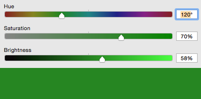
There are three fundamental properties which we can perceive about colour: its lightness, hue, and chroma – the ‘big three’ properties. These are not readily separable, and quite unlike the red, green and blue channels which are easily viewed on a computer. An image does not consist of a lightness ‘channel’ which is added to the hue and chroma ‘channels’ to make the whole coloured image up. However different mechanisms come into play in handling these three properties, as a result of which they behave differently.
Lightness

Lightness is the perceived brightness of a non-white area of colour compared with that of a perfectly white area. It thus equates to what is often called ‘tone’ or ‘value’. You can get an idea of the lightness signal of an image by desaturating it to greys, then adjusting the brightness and contrast until the whitest white in the image is shown as pure white, and the deepest dark approaches a pure black.
Unlike brightness, which is a more absolute perception of light intensity or luminance, lightness is relative because our visual systems have quite good lightness constancy. This is achieved in part by constricting and dilating the pupil to adjust the aperture of the lens, just as cameras do, although there is also central processing in the brain to adjust lightness. However when it is very dark or very bright, these mechanisms cannot fully compensate, so our whole visual image on a dark moonless night is very dark indeed.
The useful range of luminance for human visual systems is colossal: from around a thousandth of a candela per square metre, for a night sky, to more than ten thousand candela per square metre, for white illuminated cloud. However much of this depends on adaptive changes such as altering the aperture of the pupil and dark adaptation, so you cannot see the detail in a very dark object and a very bright one at the same time.
Hue
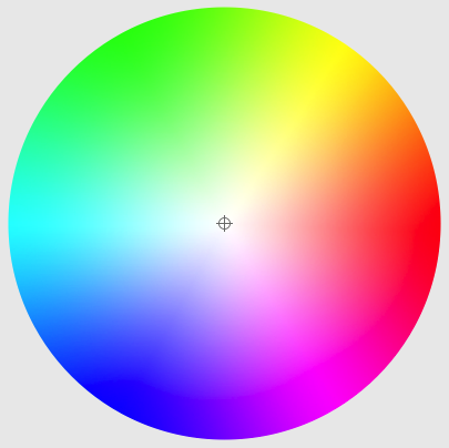
Hue is the type of colour, such as red, yellow, etc., or a mixture of colours forming an intermediate. These are commonly arranged in a circle or wheel, adjacent colours merging, and the measure of hue expressed as the angle subtended within the circle, although there is no evidence that our brains handle hue in that way. The angle is related to the wavelength of the light, although as there is no easy way to convert between angle and wavelength that is seldom attempted.

Hues are also known by popular names, different languages offering different selections. It has become not uncommon to try to draw conclusions from some languages which do not appear to have a specific name for a given hue, or which have one name which is applied to a broad range of hues, such as blue and green. It is very dangerous to suggest that such differences in the naming of hues has any relationship to those hues which can be distinguished. Other than those with specific abnormalities of colour vision, there is no evidence that any particular group of humans differs in any systematic way in its perception of colour.
Chroma

Chroma is the degree of departure of the area of colour from an area of grey of identical lightness. It thus equates to what is often called ‘saturation’, ‘intensity’, or ‘colourfulness’, and is in effect the amount of hue present in the colour. In most cases this is not easy to separate from lightness, as very pale colours necessarily have relatively low chroma. You can gauge the chroma by comparing the original colour with a matching patch which has been desaturated to grey.
The Human Colour Space

There have been very many attempts to build these properties into a geometric form (or patches, and the like) to serve as the space within which all perceived colours must be. The most commonly-encountered on computers and in modern colour science is the CIE 1931 colour space chromaticity diagram, as shown. This arrays the spectrum of colours within an area on an X-Y grid. Although the hue values are spread around the edge of the area, the X and Y axes represent parameters derived from colour measurements.
The whole chromaticity diagram represents the range of colours which are visible to the average person. Computer displays, printers, and other colour devices can only render small areas of that, usually represented as triangles, and there will therefore be many colours which we can see and distinguish, but which cannot be displayed or printed faithfully.
This is a significant problem in my producing the illustrations for this series using Adobe Photoshop and other software, as it is only too easy to use colours which cannot be directly reproduced on most computer displays, and which would therefore be rendered differently from those that I intended. This could easily cause problems with the effects that I try to demonstrate!

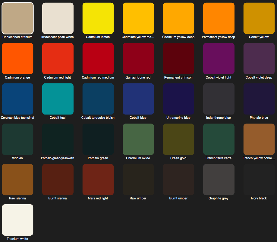
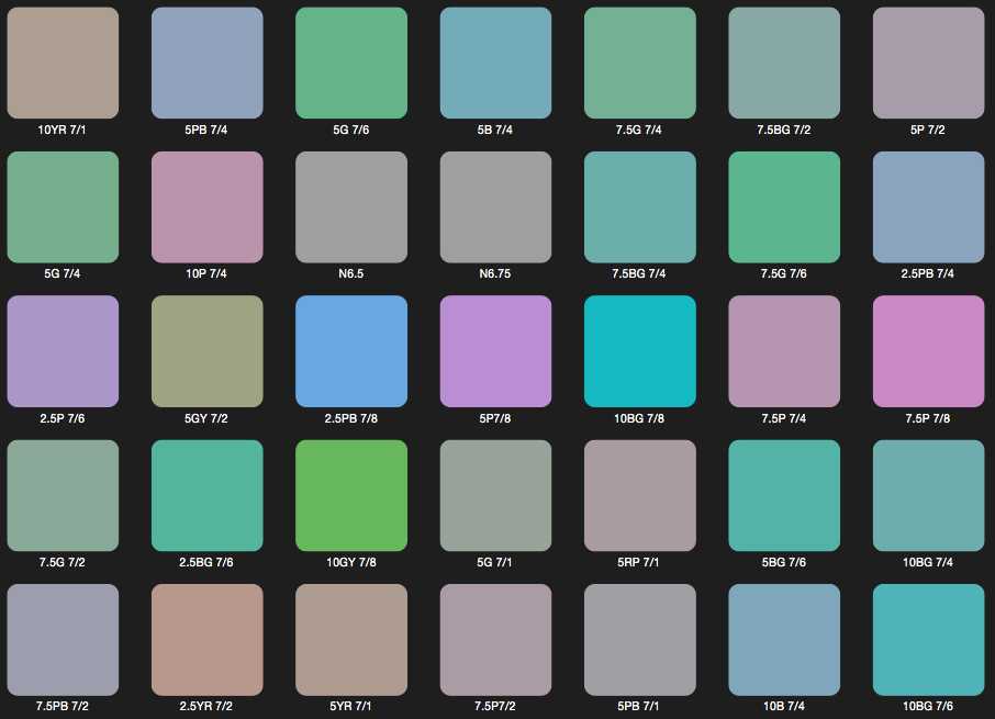
Experimental studies on human colour vision show that the best way to represent the human colour space actually requires more than the three linear dimensions of traditional (Euclidean) geometry. It is therefore not surprising that for most of us the CIE and other colour spaces fall short of being adequate descriptions. More limited and simplified systems, designed for colour matching of media and objects, such as the Munsell charts, are even more inadequate.
Additional References
Handprint on colour. Bruce MacEvoy’s superb reference and tutorial information on colour may be overwhelming, and I am not convinced that his emphasis on optics is appropriate, but it is probably the most accurate available.
Kuehni RG (2005) Color. An Introduction to Practice and Principles, 2nd edn., Wiley Interscience. ISBN 0 471 66006 X. (A superb perception-based account by the leading authority on colour.)
Kuehni RG and Schwarz A (2008) Color Ordered. A Survey of Color Order Systems from Antiquity to the Present, Oxford UP. ISBN 978 0 19 518968 1. (A thorough account of the many attempts to put colours into order, gives insight into our continuing failure to accomplish even this basic task.)
