
Considering our list of the most important cues to depth, I now move on to the sixth:
- occlusion/overlay/interposition/superposition, resulting in depth order (previous article here)
- relative size, including foreshortening effects (previous article here)
- height in the picture plane (as 2)
- texture and detail gradient (previous article here)
- shading and shadow (as 4)
- aerial perspective, including reduction in contrast, reduction in chroma, colour shift towards ‘cooler’ i.e. more blue, colours, and blur
- linear perspective and outline shape.
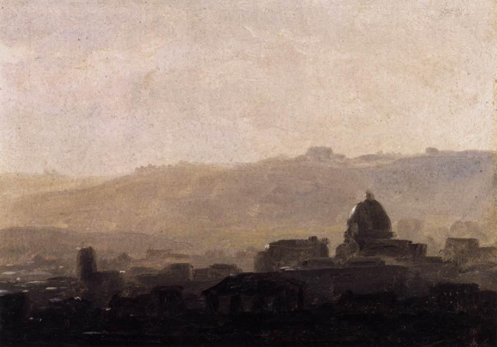
Aerial or atmospheric perspective is a group of optical phenomena which have been known about since before the Renaissance. However it is extremely difficult to know to what extent, if any, they were used by classical Roman painters, and it is only during the Renaissance that they were first clearly implemented in landscape painting.
Effects
As usual, there is some controversy over precise terminology. However the phenomena which are well-described include the following features with increasing distance, usually more than a kilometre from the observer:
- a reduction in the difference in lightness between an object and its background,
- resulting in a reduction in the range of lightness values, or contrast,
- resultant loss of detail in objects (which is part of the fourth cue in the list above),
- reduction in chroma generally,
- a shift in hue, normally towards blue (‘cooler colours’).

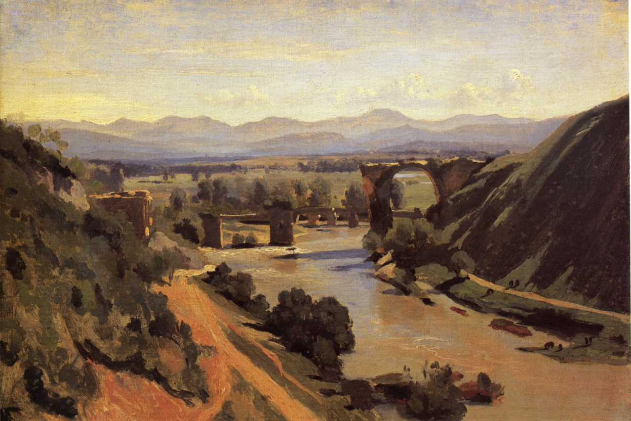
These are shown clearly in the coloured and monochrome versions of the photograph, taken in the French Alps during fine but slightly hazy weather.

Achromatic effects
Lightness, contrast, and detail effects are fairly universal, but do vary in their intensity according to the clarity of the atmosphere between the observer and distant objects. Atmospheric water, becoming as dense as mist, fog, and cloud, dust particles, and pollutants all increase these effects. Although they are usually dependent on distance – the further away the object is, the greater the effect – atmospheric particles are unevenly distributed, and the effects can be as patchy.
It is commonly stated that increasing distance results in blurring, that is loss of sharpness, but (unless the observer is myopic and not wearing appropriate optical correction) this is not normally visible: it is loss of contrast which reduces our ability to resolve edges. However when depicted in paint, edges of objects at a distance may well need to be softened, to place them lower in the ‘edge hierarchy’, to assist perception of their weak contrast.

Pinpoint lights such as stars, and larger luminous objects such as artificial lights, the moon, and sun, may develop halos and similar optical phenomena around them when there is significant atmospheric water or dust between them and the observer.
Colour effects
Reduction in chroma, leading to a less ‘saturated’ colour at a distance, and shift in hue are more complex.

In the first instance, these assume that areas of identical local chroma and hue are present throughout the view, which is seldom the case. Often the most distant objects in a landscape are hills or mountains (or the sea), which have no (or different) vegetation, and may have bare rock or ice. However the foreground is often relatively lush vegetation, which will naturally be higher chroma and a ‘warmer’ green.
They also assume even lighting, which is often not the case in the periods around dusk and dawn, when distant hills may become quite pink, thus warmer in hue, from the redder light resulting from low solar elevation. Painting landscapes during the periods of dusk or dawn is fraught with difficulty, as colours may change dramatically over just a few minutes, and often include a reversal of the usual shift in hue seen with aerial perspective.

The other common complication is that in populated areas atmospheric haze has its own colour, which is usually a pale ochre, but can be quite red, yellow, or brown, and may result in a reversal of the normal blue shift in hue. This is not readily predictable, but is usually slower to change than the light around dawn or dusk.
Implications for painting
The only way to depict aerial perspective correctly is from direct and careful observation.
A ‘value viewer’ can be very helpful for establishing the range of lightness at increasing distance, and it is sometimes surprising how narrow that becomes. As I remark above, although deliberately blurring the edges of distant objects is not true to life, such edges should be softer than those in the foreground, which will also aid the impression of low contrast, as sharp edges appear to increase lightness (and chromatic) contrast.
Enforcing an artificial blue shift or cooling in paints used is often better than not applying any shift in hue at all, but it is much better to match colours against what you actually see.
Nocturnes (painted during the hours of darkness), and all painting when the sun is at a low angle in the sky, require great care to establish consistent lightness, chroma, and hue throughout the image, ideally ‘frozen’ at a single moment in time.
However as the light illuminating the painting will also be changing, your ability to see and match colours will also change very markedly. It is often a great help to take a photo using a tablet to provide a guide, and local daylight-balance artificial lights (e.g. from low-power LEDs) may also assist.
Further reading
PleinAir Magazine regularly features experts accounts of nocturne and other ‘tricky light’ work.
Wagner M (2006) The Geometries of Visual Space, Psychology Press. ISBN 978 0 8058 5253 0. (A meticulous review of predominantly experimental evidence about how humans construct visual space. Not easy reading but some important lessons.)
