
Considering our list of the most important cues to depth, I now move on to the fourth and fifth:
- occlusion/overlay/interposition/superposition, resulting in depth order (previous article here)
- relative size, including foreshortening effects (previous article here)
- height in the picture plane (as 2)
- texture and detail gradient
- shading and shadow
- aerial perspective, including reduction in contrast, reduction in chroma, colour shift towards ‘cooler’ i.e. more blue, colours, and blur
- linear perspective and outline shape.
In the development of painting, these two did not start to appear until the Renaissance.
Texture and detail gradient
The processing of visual data to form texture maps is very complex, and relies on high resolution information in the image. If there are optical defects of vision – such as myopia (‘short sight’) – which result in image blur, this information may be lost, degrading or losing texture maps. This explains why, unless properly corrected, most people with short sight find it more difficult to judge distance.
Textures are resolved as part of the process of object recognition, and is highly contextual. Fine strokes of light and dark green in the foreground might be recognised as blades of grass, which in the middle distance are seen as lighter and darker green clumps, and in the far distance as more evenly green areas, for example. If we were to see fines strokes of light and dark green in the distance, they might be recognised as high stands of palms instead.
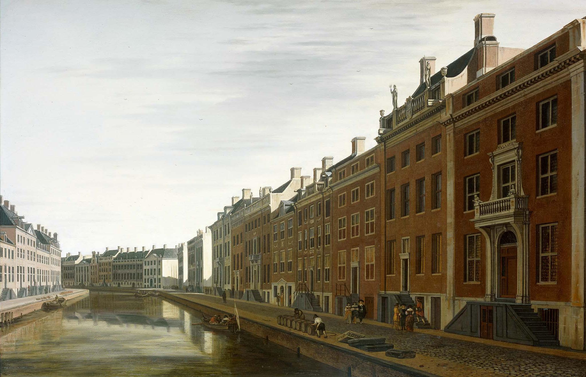

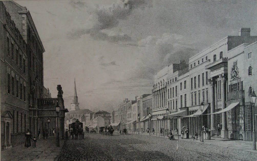
Buildings, with their regular surface structures such as windows and doors, and textured materials such as brick and stone, give particularly rich clues as to depth and space.
Even when you strip out other visual cues to depth, differences in texture can start to give an illusion of depth. However this is not a strong effect, and texture and detail changes are normally an adjunct to the more important cues, such as overlay, relative size, and height in the picture plane (1, 2, and 3 in the list above).
Paintings in which additional textures are produced by brushes and painting tools pose additional complications, because the textures and details perceived include those made in the paint. As I pointed out in the first article in this series, Cézanne’s ‘constructive stroke’ is a good example of conflicting information resulting in apparent loss of depth in paintings.
If the marks in a painting are to be visible at the intended viewing distance, then care should be taken to match the size and resulting texture of marks with the natural textures in the depicted image, if depth is to be preserved. This was understood by those using Divisionist or ‘pointillist’ techniques in the late nineteenth century.
Another situation in which an artistic image may result in conflicting cues is in printmaking, where lines and other marks of ink in a print are used to depict shading and colour. Many older engravings, including Hogarth’s parody on perspective shown in the second article, do not vary the density of marks to assist with cueing depth, thus appear flat.
Some media can be quite tricky to produce variable textures in, unless a great deal of time is spent making marks. Watercolour washes, for example, can contain texture when they granulate, but imparting a gradient in granulation whilst retaining even lightness and chroma is fiendishly difficult.
Painters with a printmaking background, like Eric Ravilious, devised ways of making rich textures, although most appear to require more time than would be available plein air, for example. Sadly the result is that most plein air painting cannot take advantage of the cues from texture gradients, although there are some wonderful exceptions.

Shading and shadow
There are various and varied conventions over terminology: here I will simply refer to those shadows resulting from an object’s three-dimensional form which fall on itself, and cast shadows, which are the shadows caused by other objects but fall elsewhere.
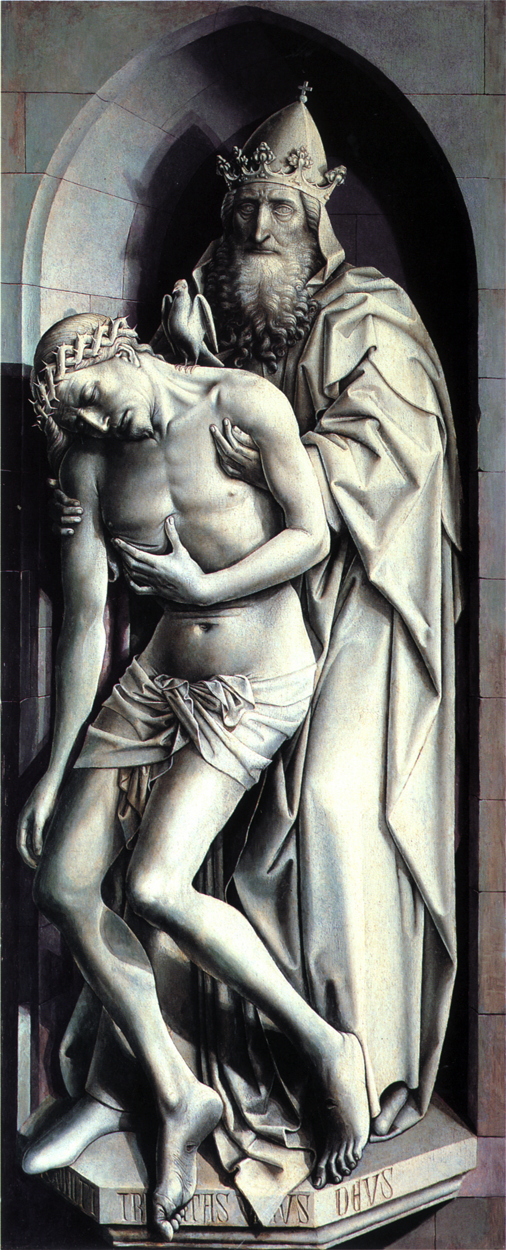
Shadows falling on the same object are classical examples of very strong cues to the shape and depth of the object, and are detailed in all good books on drawing. They are often the only features which enable the brain to transform an area of colour into a proper 3D object. Paint the stem of a tree with uniform lightness and chroma and it will inevitably appear to be a flat surface; put even the simplest highlights and shadows in and it will immediately be perceived as being cylindrical in form.

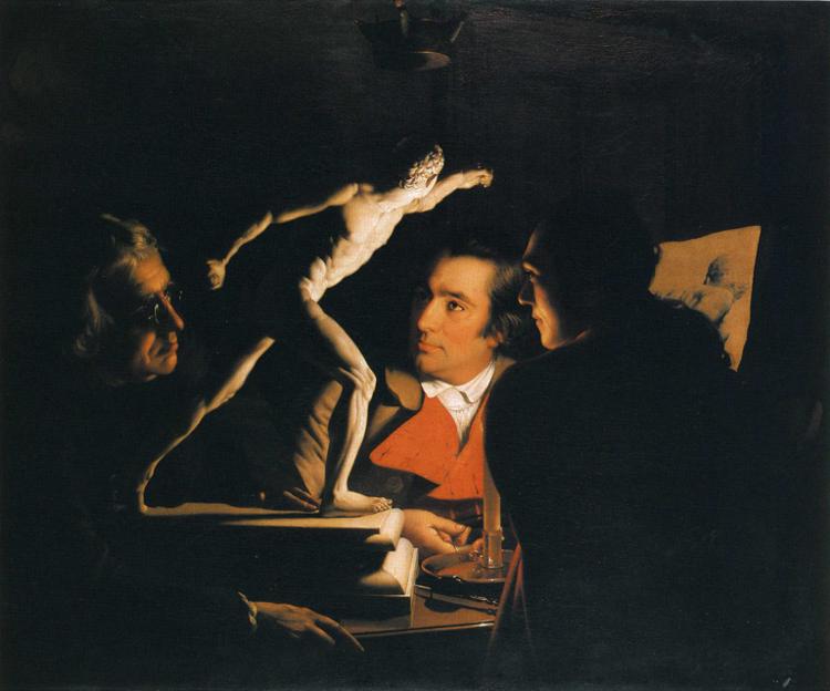
Shadows cast on other objects can strengthen depth cues considerably. One obvious way in which they are used in the brain for this is when zones of shadow and full-lit areas divide the image into multiple planes, as shown here, where they play an important part in working out depth order. Although more complex and open to misinterpretation, the complex forms of cast shadows also enhance the perception of depth, and sometimes may be the only cues to the form of certain objects.

Cast shadows are often the last elements to be added to a painting, and are readily forgotten when a plein air painting has overrun. Although that is seldom a disaster in itself, it can result in shadows being hurriedly painted in at the very end of the outdoor session, when they may be quite different from others which were painted in earlier. It is worth including them in a mental checklist of things to do before signing a painting.
Fortunately omission of shadows is less often noticed than most painters fear. However marked inconsistencies in shadows can be very easy to notice, and should be avoided at all costs.

Further reading
Gombrich EH (2014/1995) Shadows. The Depiction of Cast Shadows in Western Art, Yale UP. ISBN 978 0 300 21004 0. (A delightful, brief but well-illustrated account of shadows and their depiction. Essential.)
Wagner M (2006) The Geometries of Visual Space, Psychology Press. ISBN 978 0 8058 5253 0. (A meticulous review of predominantly experimental evidence about how humans construct visual space. Not easy reading but some important lessons.)
