
For many centuries much of the population of Europe was illiterate, and their only sources of stories were those told orally, or depicted in paintings. With the exception of the Dutch Golden Age, those paintings seen by ordinary people, even those who had been educated, were either portraits following in the tradition of religious icons, or narrative in purpose.
Telling a story in a painting is one of its greatest challenges. A landscape painting shows a view at a moment in time, but doesn’t normally tell a story, as that requires a minimum of two states, with the story linking them. This series of articles shows how visual artists have risen to that challenge, and told stories.
Over the millennia that humans have been painting, several techniques have developed for telling a story with more than one timepoint shown in paintings. Although the terms used vary, those fall into the following categories:
- instantaneous, where the image is intended to show what was happening at a single moment in time, even though it contains references to other moments in time;
- multi-image, where a series of separate images (paintings) is used to tell the story;
- multiplex, where a single image contains representations of two or more moments in time from a story, merged together;
- multi-frame, where two or more picture frames are used to tell a story, as in comics or manga;
- polymythic, where a single image contains two or more distinct stories.

As soon as you look at this Roman painting of Perseus and Andromeda, you can see the duplicated images of Perseus: one flying in from the left, the other being congratulated at the right. If intended to be a literal telling of the story, Cetus the sea monster wouldn’t appear until after Perseus had freed Andromeda from her chains. It therefore contains pictorial elements from at least two different moments in time, but isn’t divided into frames, making it multiplex narrative.
Among the secular precedents of more modern religious paintings are those of the Wheel of Fortune, which was popular during the Middle Ages.
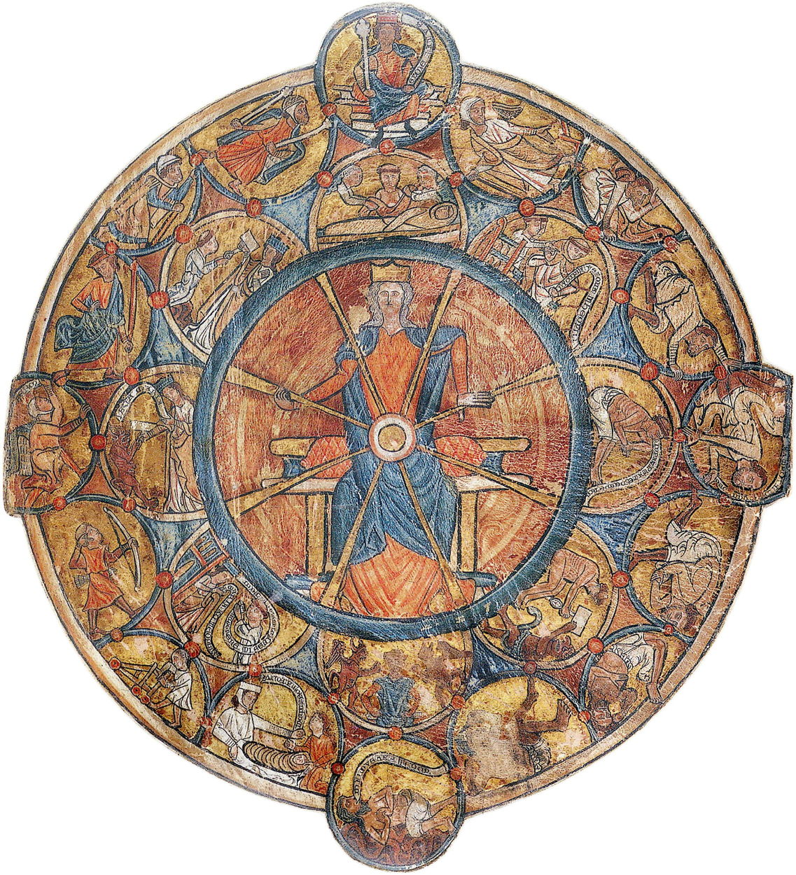
William de Brailes’ Wheel of Fortune from about 1240 is based on this folk theme, but becomes more elaborate than most other depictions. At its centre is Fortuna, Roman goddess of fortune. The outermost ring of images, each a circular frame, show four different scenarios at the three, six, nine and twelve o’clock positions.
These are connected by half roundels showing twelve stages of life from the swaddled baby at seven o’clock to death at five o’clock. Inside those are inner half roundels showing scenes from the life of Saint Theophilus the Penitent, starting at one o’clock and ending at twelve o’clock. Each frame within each cycle has been carefully aligned to ensure the concentric cycles are in approximate synchrony, and the individual contents have been aligned so the page can be read in a single orientation. These form a curious combination of religious and folk-secular themes typical of the Middle Ages, set in multi-frame narrative.

Although this series concentrates on European examples, as visual arts developed in other cultures they too employed similar techniques. In the Heiji Monogatari Emaki (Sanjo Scroll) from the late 1200s in Japan, time advances from right to left in multiplex narrative, without any visible duplication of actors.
As modern visual art emerged from the Middle Ages, European masters like Duccio became fluent storytellers.

Duccio’s The Healing of the Man born Blind, from his Maestà Predella Panels of about 1310, is an excellent example of these emerging narrative paintings. Much of the panel is taken up by the first scene, in which Christ is healing a man we know, from the Gospel story, is blind. Back to back with him being healed as a blind man, he is shown healed and sighted to the right, in simple multiplex narrative.
Those attending worship in Siena Cathedral in the early fourteenth century who saw this would have been only too familiar with the oral story shown here, but precious few would have been able to read it. Duccio’s visual cues are plain and uncomplicated, and link directly to the words that ordinary people would have heard on many occasions.
Although multiplex narrative might now appear hard to read, odd, and starkly unreal, it was most popular in the centuries before about 1600, over two hundred years before the first photographs attempted to capture images of ‘reality’, and humans became conditioned to seeing instants in time. For much of that period, paintings were seldom intended to be faithful representations of any given instant, and attitudes to temporal representation were far more relaxed. This is illustrated well by some of the more ingenious visual accounts of the Passion.
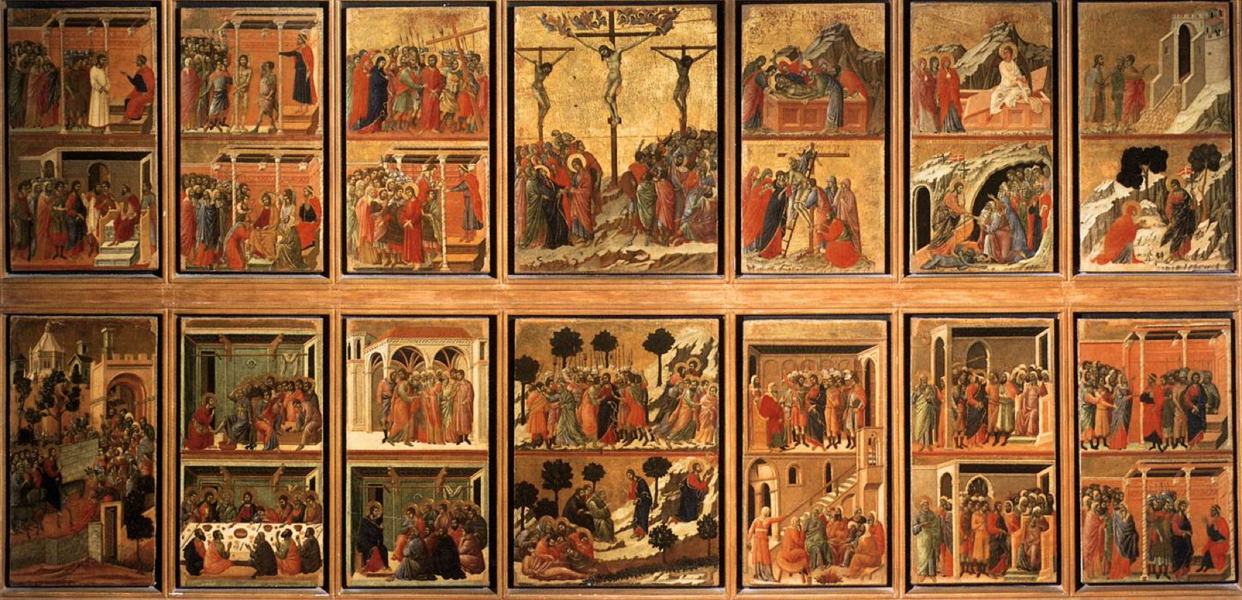
One of the earliest attempts to tell the full story of the Passion of Christ in a single integrated view is Duccio’s Stories of the Passion, painted on the verso of the Maestà for Siena Cathedral between 1308-11. Most of these panels are readily recognisable, but the sequence in their reading may not be immediately apparent.
This starts with Jesus’ triumphant entry into Jerusalem at the lower left, moves on to the Last Supper to the right of that, and so on across to the middle. The two central scenes in the Garden of Gethsemane then link to the right edge, work back towards the centre, and jump from there to the upper left. The Passion itself completes with the central crucifixion, scenes at the tomb on the right side, and ends with the story of the Resurrection, all told in multi-frame narrative.
Looked at from the point of view of someone who has read many comics, graphic novels, etc., this may appear confusing. But viewers of the day would be only too familiar with each scene and story in the cycle, and probably wouldn’t have thought twice about their complicated layout.
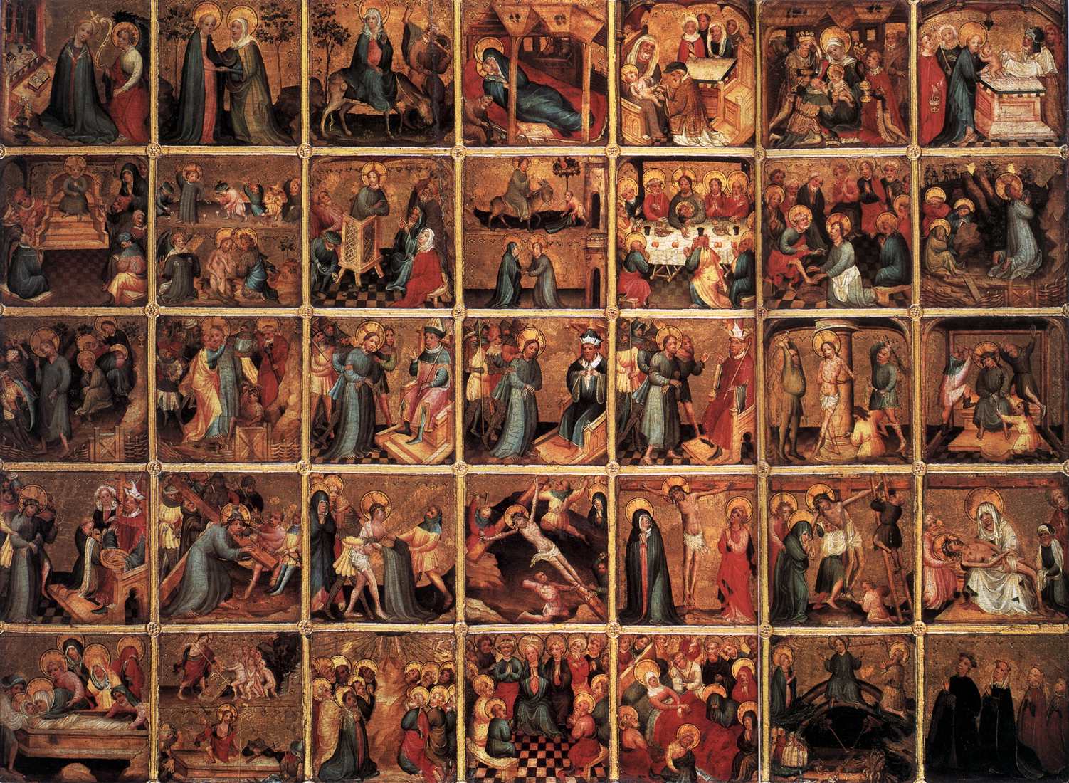
This anonymous account of The Life of Christ and Mary painted in Bruges in about 1410-20 follows a more regular sequence, and is read row-by-row starting from the top, and the left end of each row. Unlike Duccio and Wheels of Fortune, the area allocated to each scene is identical, although there’s heavy emphasis on the Passion, which starts in the middle of the second row, and completes at the end of the fourth.

Masaccio’s fresco in the Brancacci Chapel of The Tribute Money (1425-8) contains three images of Saint Peter, and two of the tax gatherer, carefully set and projected into the same single view. Although each is spaced apart from the next, no pictorial device is used to separate them into frames.
His literary reference is to the Gospel of Matthew, in a story in which Christ directs Peter to find a coin in the mouth of a fish so that he can pay the temple tax. In the centre, the tax collector asks Christ for the temple tax. At the far left, as indicated by Christ and Peter’s arms, Peter (shown a second time) takes the coin out of the mouth of a fish. At the right, Peter (a third time) pays the tax collector (shown a second time) his due.
Masaccio demonstrates how important space and layout are in successful multiplex narrative.
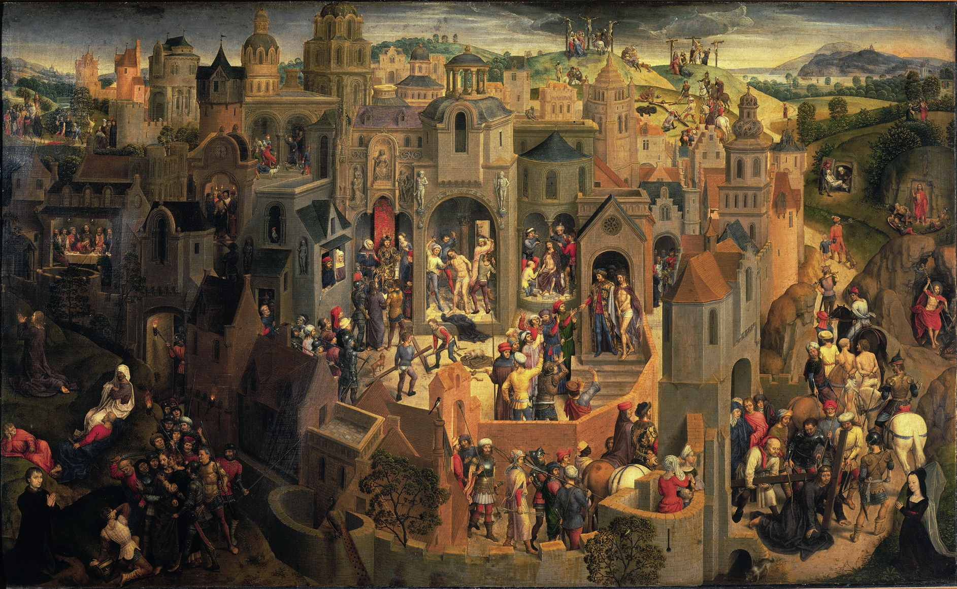
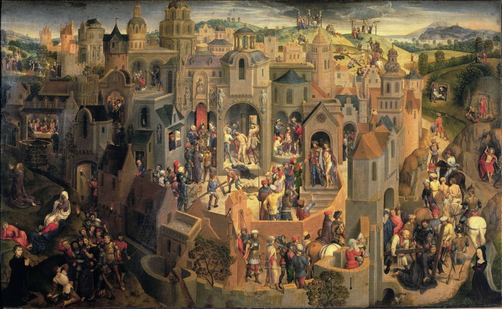
Hans Memling’s outstanding Scenes from the Passion of Christ, painted in 1470-71, is perhaps the first successful attempt to cast a detailed account of the Passion into a single multiplex image.
Here each of the individual scenes making up the Passion as a whole is located in a different part of a fictionalised aerial view of Jerusalem. This does lead to some strange effects, though. For example, he shows no less than three separate crucifixions: at the upper right of the city is the first, with Christ laid on the cross but still on the ground. The second is above and to the left of that, where all three victims are seen on their crosses. The third and final scene is to the right of that, where Christ’s body is being brought down in a Deposition.
The buildings provide demarcated spaces for many of the scenes, almost framing them. This is a technique now used in illustrations for children’s books which we use to teach them how to read multiplex narrative, without really being aware of what we’re doing.
It was Hieronymus Bosch who painted a more direct descendant of the Wheel of Fortune, on the reverse of his Saint John on Patmos.
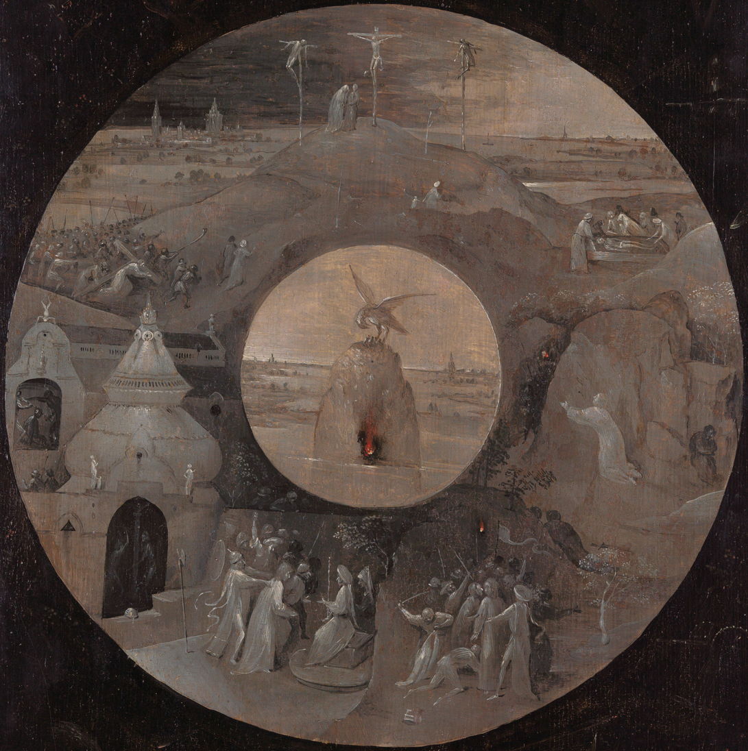
This series of scenes from the Passion is arranged in a circle, around a central image of a pelican feeding its young with its own blood, a well-known symbol of self-sacrifice. They’re painted in a brown grisaille, with small patches of orange and red to represent flames.
The scenes shown start at the 5 o’clock position, with the betrayal and arrest in the Garden of Gethsemane, and move clockwise from there. The next shows Christ brought before his judges, then his scourging and beating. The upper section shows a sequence from his carrying the cross to Golgotha, his crucifixion there, and his body laid in the tomb. The final scene, at the 3 o’clock position, shows his resurrection from the tomb.
The lower two-thirds of the scenes are carefully divided into frames, five in total, but the upper third merges its three scenes into a single multiplex image, in which Christ appears three times: at the left carrying his cross up to Golgotha, at the top on the cross, and at the right his body being laid in a coffin for burial. This uses a common location for those three scenes in an ingenious composition.
The central image of a pelican feeding its young from its own blood not only sets the moral theme of self-sacrifice, but also solves the problem of how to bring the peripheral scenes together in the centre.
The peculiarity resulting from this otherwise ingenious composition is that the narrative sequence begins at the five o’clock position, in order to accommodate the resurrection scene at the tomb, at the right. Bosch leaves the viewer to work that out, which should have been an easy task in this case, given the familiarity of contemporary viewers with the stories shown.

Multiplex narrative has also been widely used in accounts of classical myth since the Romans. In Piero di Cosimo’s Andromeda freed by Perseus (c 1510-15), Perseus appears three times: flying down from the top, stood on Cetus about to kill the monster, and in the subsequent party at the bottom right. Andromeda also appears at least twice.

Gaudenzio Ferrari’s Stories of The Life and Passion of Christ (1513) arranges twenty frames covering the life of Christ around a central frame with four times the area of the others, showing the Crucifixion. The frames are naturally (for the European) read from left to right, along the rows from top to bottom, although the Crucifixion is part of the bottom row. This is a layout commonly used throughout graphic novels, of course, and is a superb example of multi-frame narrative more than three centuries before Rodolphe Töpffer started experimenting with comic form.

The five different sets of Adam and Eve shown in Lucas Cranach the Elder’s The Garden of Eden (1530) are set within the representation of the garden as a whole, making this multiplex narrative.

The four separate episodes forming Hans Sebald Beham’s Scenes from the Life of David (1534) are arranged in a square, so that each occupies a triangular frame, clearly separated from the others, and quite different from a normal linear layout. The snag with this is that the panel is really only suitable for viewing when laid flat on a table, otherwise only one of the frames is correctly orientated. Beham clearly liked the symmetry afforded by this layout, and enhanced it in his composition of the two frames shown here at the top and bottom.
I hope these have whetted your appetite for a closer examination of how great painters have told stories visually.

