

Until the advent of photography in the middle of the nineteenth century, our ancestors only had two everyday ways of seeing: looking at the world around them, or looking at artistic representations of that world. Either way, the images they saw were as sharp as their vision was. For many, that meant that images, and the edges within them, were invariably clean and crisp. Visual artists copied nature, and with few exceptions their representations were sharp and not blurred. For most, the first time they saw motion blurring or depth of field effects was when looking at photographs.
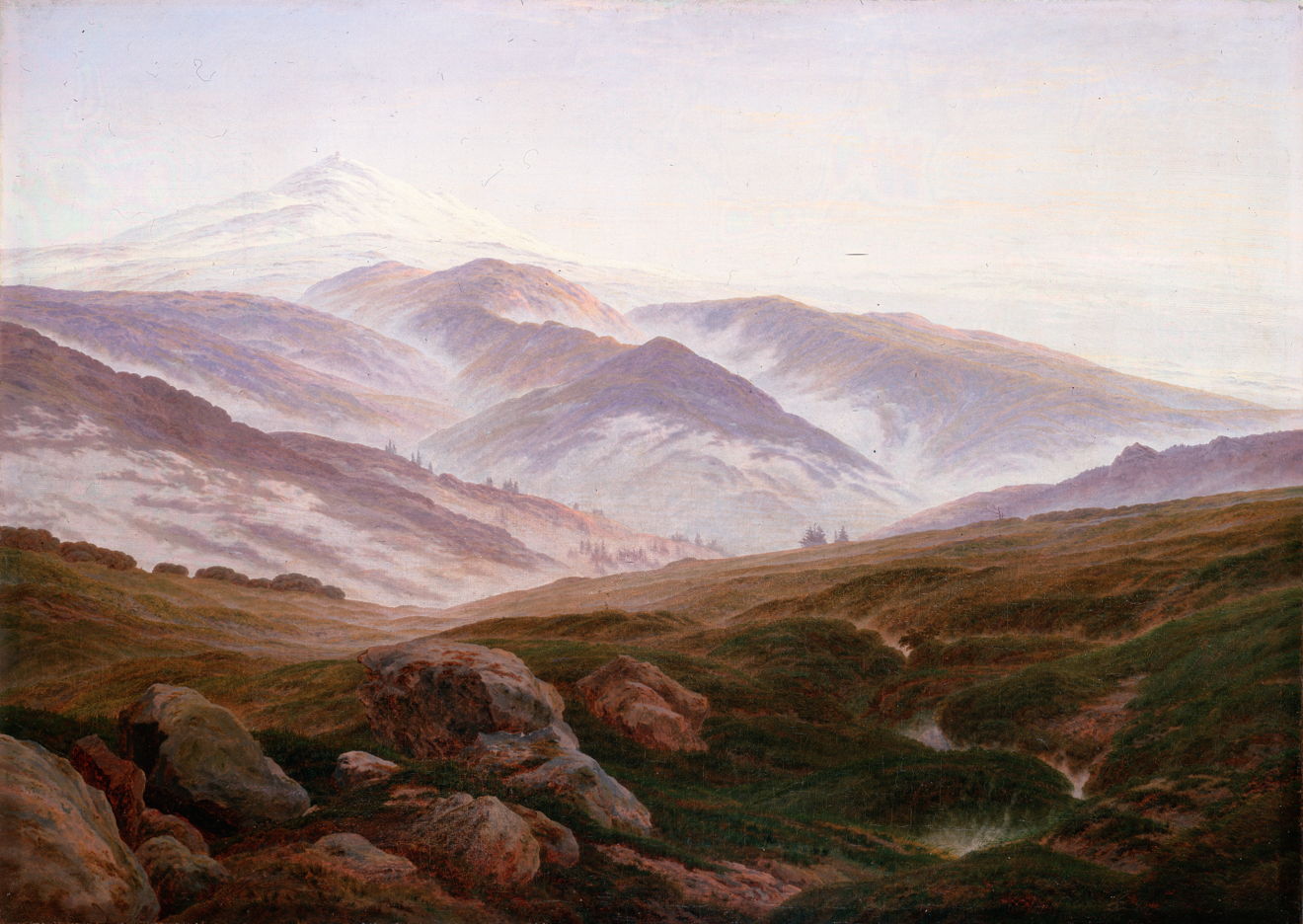
Even when viewing objects over a wide range of distances and in misty conditions, the human visual system doesn’t perceive blurred edges, as shown so well in Caspar David Friedrich’s Giant Mountains from 1830–35, just as the earliest photographic images were being made. This is because the optics of the eye are automatically adjusted to ensure that whatever we look at directly remains in focus. The image assembled within the visual cortex of the brain thus isn’t prone to exhibit the same focus effects seen in optical instruments and camera lenses. The brain’s images don’t require long periods of exposure either, during which movement would result in blurring in a photograph.
The first paintings using motion blur started to appear at the end of the nineteenth century, as viewers became increasingly accustomed to seeing and reading photographs. As a painting technique, it appears to have been used initially to enhance the feeling of motion in representations of dance.
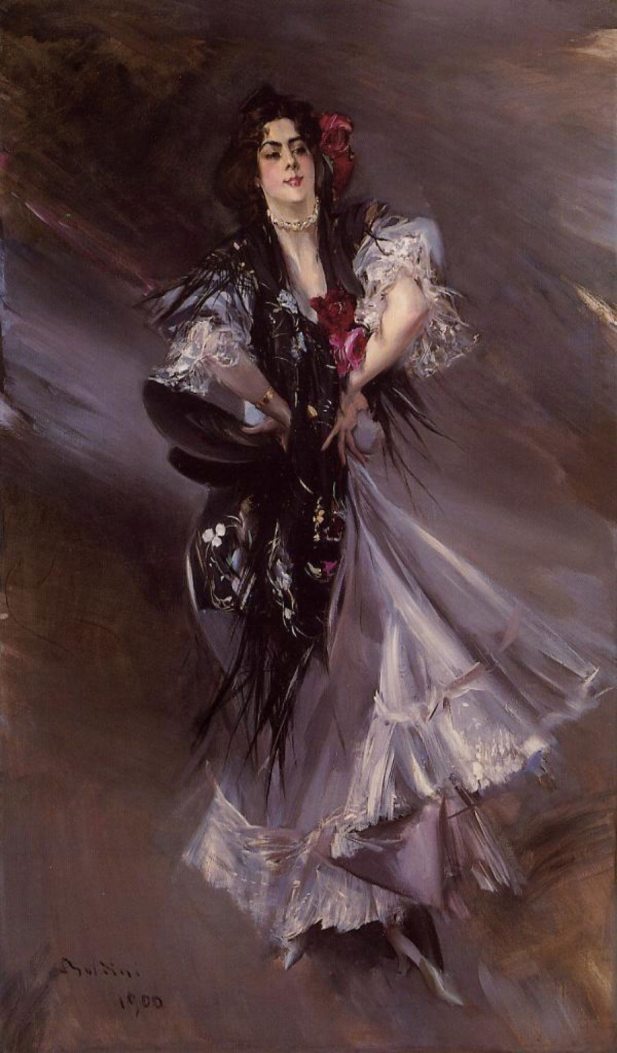
Giovanni Boldini seems to have used it here for the background, and to a lesser degree at the edges of the dancer’s clothing.

Franz von Stuck appears to have used ‘flowlines’ here rather than simple motion blur.
There are notable exceptions to this that merit careful consideration. Probably the earliest are the series of indoor figurative paintings made by Jan Vermeer between about 1660 and 1668. These range from portraits such as The Girl with a Pearl Earring, through genre scenes like The Milkmaid, to what is almost certainly allegory in The Art of Painting. They are each remarkable for their use of optical effects, in that they appear to be the first and only paintings made before the late nineteenth century in which edges and objects are intentionally blurred.

This is perhaps most immediately obvious in The Girl with a Pearl Earring, from around 1665. Seen even more closely in the detail below it’s obvious that Vermeer has softened most of its edges to some degree, even on highlights such as the white reflections on the pearl itself and the girl’s eyes.

Vermeer accomplished this by applying fresh wet paint to existing paint which wasn’t yet touch dry, but sufficiently wet still to allow controlled mixing at its edge.
As viewers became more familiar with photographic blurring, some artists introduced depth of field effects into their paintings.

Painted in 1886, Paul Louis Martin des Amoignes’ In the Classroom looks as if it may have been made from photographs. One boy, staring intently at the teacher in front of the class, is caught crisply, pencil poised in his hand. Beyond him the crowd of heads becomes more blurred.

In 1907, Ukrainian-born artist Max Silbert painted a Singing Lesson in a School in Holland. Its realism isn’t as detailed or photographic in quality as French Naturalist paintings from the 1880s, but it shows a marked photographic depth of field effect. The pupils closest to the artist are shown in sharp focus, and those in the further distance are markedly blurred. It’s impossible to tell whether this results from Silbert painting this work from photographs with the same blurring, or that it was a deliberate effect introduced by the artist to give the painting a photographic appearance.

At about the same time, William McGregor Paxton claimed to have rediscovered Vermeer’s optical techniques in what he termed binocular vision. His Tea Leaves from 1909 uses that to show two well-dressed young women taking tea together.

Notice the zone of relative sharpness extending from the right shoulder of the woman at the left, across the silver teapot to the hands of the woman in the hat. This contrasts markedly with the much softer blue edge of the screen above them, for instance.
Paxton not only had the advantage of being able to study Vermeer’s paintings and an understanding of modern optics, but experienced the widespread use of cameras with lenses that had limited depth of field. Objects beyond the depth of field first appear slightly softer, then more blurred, until they can finally lose all form. This has been exploited to produce optical effects in the out-of-focus zone, known most recently as bokeh. And like Vermeer, Paxton wasn’t only exploring depth of field effects, but bokeh in objects such as jewellery. Yet the term bokeh wasn’t used, in Western photography at least, until around 1997.
The most sophisticated use of blurring in paintings occurs in what’s known as an edge hierarchy, demonstrated well in Anders Zorn’s Self-portrait from about 1889.

Edge hierarchies started to appear in the late nineteenth century, and don’t mimic optical phenomena like depth of field effects or motion blur. Instead the painter uses varying sharpness of edges to draw the viewer’s attention to different passages within the painting as a whole.
I hope that you’ll join me in exploring this little-studied subject in painting.
