

I was giving my PowerPoint presentation in a full dress rehearsal for a VIP visit, in front of The Big Boss. Predictably, when it came to display a JPEG image, PowerPoint did the dirty and failed to decode it properly, showing a boxful of coloured snow. When I apologised to the Boss, he revealed that he was unaware of any problem, as he couldn’t see colour at all.
Next time you’re with a group of people, and able to ask, find out how many of them are aware that they don’t see colours the same as most others. The chances are, if there are more than a dozen men who give honest answers, at least one of them will admit to having deuteranomaly, in which they find it difficult to discriminate between colours on the red-green axis.
The most common types of deficiency in colour vision are:
- deuteranomaly, affecting 5% or more of European males, in which red-green discrimination is mildly reduced;
- deuteranopia, affecting 1% or more of males, where red-green discrimination is more severely impaired;
- protanomaly, affecting 1% of males, similar to deuteranomaly in its effects;
- protanopia, affecting 1% of males, where both blue-green and red-green discrimination are more severely impaired, resulting in extensive differences in the perception of many colours.
Other types, including completely monochromatic vision, are rarer. These almost exclusively affect men, because most are genetic and carried as recessive traits on the X chromosome. As women have two X chromosomes, they’re much less likely to have the gene on both of them; men, who only have one X chromosome, don’t enjoy the protection of the other.
There’s extensive information about these on Wikipedia and Colour Blind Awareness, among many other sites.
Considering as many as one in ten males in some populations have significant colour vision deficiency, our use of colours such as red and green for safety-critical purposes is remarkably dangerous. Ships have sunk because a bridge watchkeeper mistook a red light for a green one (and the opposite), people have been electrocuted when they touched the wrong colour wire, and pretty well every set of traffic lights across the world is coloured to confuse.
For those designing in colour, Michel Fortin’s Sim Daltonism is a superb tool for inspecting the effects of different colour vision deficiencies, and Apple has recently built a feature into the Accessibility pane to provide simpler help.

Until relatively recently, any deficiency in colour vision was almost certain to block someone from a career in painting. When painters started as apprentices in the workshops of masters, even slight impairment of red-green discrimination would have become manifest early in an apprenticeship, and would have ended their career before it had even started.
You may come across misleading claims about famous painters who have been proposed as being ‘colour blind’. Among them are Vincent van Gogh and Claude Monet, who may well have suffered from disturbance of colour vision, but don’t appear to have had what is often referred to as colour-blindness. In Monet’s case, this is thought to have been the result of cataracts, which can act as colour filters, rather than any hereditary disorder affecting the function of his retina.
Surprisingly little attention has been paid to those with deficiency in colour vision who view paintings, which I’ll consider in the rest of this article, with examples generated using Sim Daltonism.
Pigments and styles have changed greatly over the last five hundred years. The more limited and less colourful paintings during most of that time appear more intelligible to those with the more common deficiencies.

As seen by someone with full deuteranopia, Giorgione’s The Three Ages of Man (c 1500) looks a little washed-out, but its qualities still shine through.

Viewed from the more common and milder deuteranomaly, Raphael’s Madonna della Sedia (1513-14) lacks the red-green contrast of the original, but again loses little else.

Tintoretto’s Saint George and the Dragon (c 1555) suffers even less, although the rich greens of the landscape are far paler. The brilliant mandorla in the sky isn’t affected at all, and its narrative remains clear.

More traditional paintings from the nineteenth century, such as Adolph Menzel’s Concert for Flute with Frederick the Great in Sanssouci (1850-52), are also little affected. Indeed, it could be argued that this reduction in chroma is more accurate given the reliance on candlelight.
Deuteranomaly starts to pose more problems with the rise in chroma brought with Impressionism and the newer pigments of the nineteenth century.

Monet’s Grainstacks, End of Summer (W1266) (1891) becomes vague and misty by comparison with its full colour original, literally a pale shadow of its former self.

However, Pissarro’s Boulevard Montmartre, Spring Morning (1897) survives far better, retaining much of its appeal.

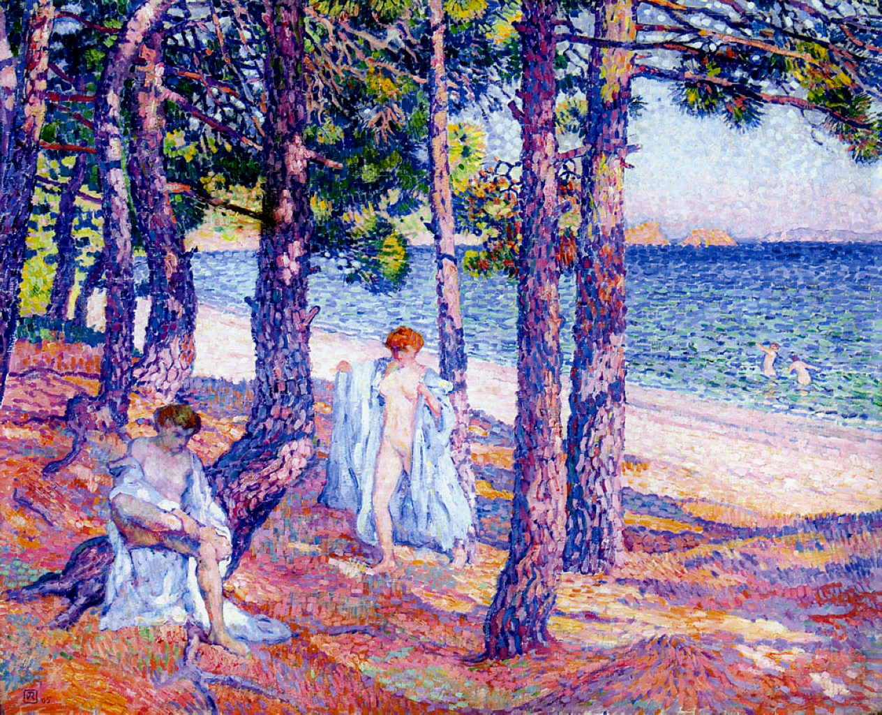
Loss of the many warm reds and purples from Théo van Rysselberghe’s Bathers under the Pines at Cavalière (1905) gives this view a colder look, dominated by the more uniform blues of the tree trunks, and the pale greens of its vegetation, compared with the original below.

Although it loses most of its original vibrance, Pierre Bonnard’s The French Windows with Dog (1927) isn’t as severely affected.
I’m not trying to make the case for some kind of constrained art deliberately made accessible to the one in ten men with deficient colour vision, just wondering rather sadly why they appear to have been so ignored, over a period in which such great advances have been made in improving accessibility to others. Perhaps painters have been too deeply in love with their new rich pigments and the thrill of high chroma?
I’ll be particularly interested to hear whether those with deficient colour vision find that it affects their preference for art, artists or styles.
