
Welcome to the first in a new series of articles examining a rich variety of topics centred on colour in visual arts. This introduction lays out my palette, starting with the most fundamental issue of all: what do we see?
At this point, most texts on colour launch into detailed anatomical descriptions of the eye, the histology of the retina, and a summary of the neuroanatomy of parts of the brain like the visual cortex. Fascinating and important though those are, they only detail the apparatus which enables colour vision. They don’t explain what we see, or answer fundamental questions such as whether you and I see the same colours.
Some of the better accounts look at reduced colour vision, or colour-blindness (a misnomer in almost every case), but usually downplay the proportion of the healthy population who don’t see colours the same as the majority. While that figure is normally given as around 10% of all males, that doesn’t give the full picture. For example, specific branches of armed forces (such as seamen) require higher standards of colour perception than are normally tested for. Even more men fail to achieve those, indicating that among those generally deemed to have ‘normal colour perception’, not all are equal.
Women are of course much less likely to have reduced colour vision, and there are even suggestions that some women may have four different types of cones in their retinas, providing colour perception beyond what’s considered the norm.
You’ll also see many misleading claims about famous painters who have been proposed as being ‘colour blind’. Among them are Vincent van Gogh and Claude Monet, who appear to have suffered from disturbance of colour vision, but don’t appear to have had what is normally referred to as colour-blindness. In Monet’s case, this is thought to have been the result of cataracts, which can act as colour filters, rather than any hereditary disorder affecting the function of his retina.

Above is Giorgione’s original Three Ages of Man (c 1500), below is the same image as would be perceived by someone with deuteranopia, or ‘red-green colour-blindness’

Throughout these accounts, a Cartesian approach is the rule, using comparisons with the optics of cameras. Less emphasis is laid on the fact that human vision works very differently from image formation in a camera. Our central or ‘foveal’ vision is normally excellent, and in good lighting conditions spans a wide spectrum of colour.
Move out to our peripheral vision, though, and colour perception and detail fall off markedly, with our peripheries only well-equipped to detect motion. Because of this, we don’t form an image of what is captured by the lens in the eye in the same way that a camera does. Instead, our eyes move frequently in what are known as saccades, and our brains assemble those fragments into a mental image of the whole view. Painters have long recognised this, and usually provide visual cues to ‘draw the eye’ across their work, something quite unnecessary for a camera.

Perhaps the most extreme example of ‘drawing the eye’ is the story told by Hans Memling in his Scenes from the Passion of Christ (1470-1).
Looking at paintings also has particular problems. Any work older than a few decades which has been varnished or had any form of surface treatment is unlikely to appear today with the colours the artist intended. Multiple layers of old varnish and trapped dirt give a very misleading impression of what we would have seen soon after the work was completed. Painstaking work by conservation specialists can restore old paintings to what we presume is their former glory, in full colour again.

Hieronymus Bosch’s Christ Carrying the Cross (1490-1510) is seen above before its recent conservation work, and below is the result of thousands of hours of cleaning and treatment.

Even when a painting has been returned to the state experts believe that it should be in, we may not view it in the light that was intended, let alone when it was created by the artist. Here we enter the controversial world of colour constancy: whether or not human colour vision can ‘correct’ for differences in lighting. Among the many books I have on colour is one which is solely about our colour constancy, yet others dismiss it as not being present in humans at all.

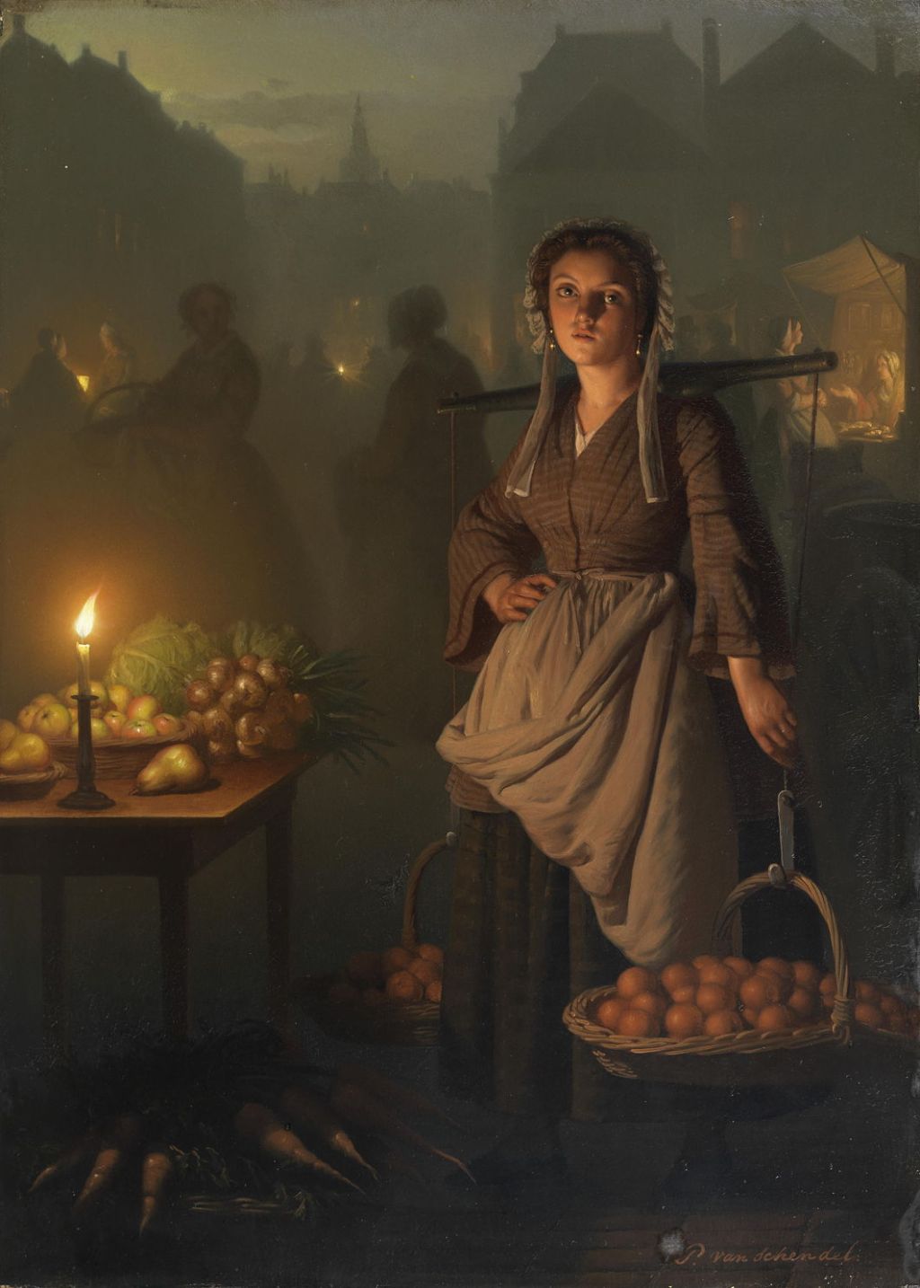
Petrus van Schendel’s Market by Candlelight (1865) is an essay on colour constancy. What colours are those apples, and are those oranges truly orange?
One method which has been used for trying to understand how we perceive colour is the study of the words we use to classify and describe basic hues. For example, if you know a little Russian, you may be aware that the language has two different words for what others like English accomplish in the single word blue.
What you may not know is that Ukrainian has three different words for the basic colour blue, and these illustrate well how difficult this field becomes when you examine it carefully. This is because Ukrainian has two major contributors to its lexicon, words of Russian origin, and those from Polish, because much of that lexicon was developed at a time when most of modern Ukraine was part of the kingdom of Poland.
The Ukrainian блакитний (blakytnyy) has common origin with modern Polish blękitny, and generally indicates a light or azure blue like the sky; синій (syniy) relates to modern Russian синий (siniy), and is a darker or aqua blue. The third term голубий (holubyy) has Russian origins from голубой (goluboy), and is also a light or azure blue. But it isn’t as simple as that: a popular name for the Ukrainian flag is жовто-блакитний (žovto-blakytnyy), ‘yellow-and-blue’, but the official designation in the Constitution is for the upper strip to be синій (syniy), and in reality variations seen range from light to navy blue.
Even the ancient Greeks seem to have suffered from confusing colour terms: their word for light blue, γλαuκοσ (glaukos), could also mean light green, grey or even yellow at a push, and is inherited in English glaucous which refers to the colour grey-blue or grey-green.
Next week, my first article in this series opens its can of worms by looking at what have been termed complementary colours, red and green. According to the Impressionists, they were perfect harmony, but my grandmother, who sold ladies’ fashions, told me that they should never be seen together. Who was right, and why?
