

Having made my way from yellow through red to blue in the first of these two articles, I conclude this tour of the colours of the painter’s palette with three of the most important: green, black and white.
Viridian
The element chromium is so named because of the rich colours seen in many of its salts and compounds. One of them, chromium oxide, was discovered in about 1798 by Louis-Nicolas Vauquelin, who immediately recognised its future use as a pigment, because of its “fine emerald colour”, although it’s actually a rather dull yellow-green. Its introduction into paintings probably didn’t start until around 1840, when landscape painting outdoors was becoming all the rage. An improved version, hydrated chromium oxide, became known as viridian during the 1860s.

The best example showing the colour of viridian is perhaps Édouard Manet’s The Balcony (1868-69), where he appears to have used the pigment throughout the blinds and railings, most probably mixed with lead white, and unmixed for the woman’s parasol.
Verdigris and copper resinate
Verdigris was easy and cheap to produce from copper. In Europe, its manufacture centred around Montpellier, in the south of France, where there was a plentiful supply of waste products from winemaking to provide vinegar. By the seventeenth century, consumption of copper there had to be satisfied by imports from as far away as Sweden. Typically, verdigris is more blue when first applied, and develops its full green hue over the first month or so following application.
From the fifteenth century onwards, verdigris pigment was mixed with natural resins for use in glazes. This produces a different pigment from normal verdigris, as the copper combines with the resin acids to form what is known as copper resinate. A popular technique among many Masters to produce an intense green was to paint an underlayer using verdigris, over which several glazing layers of copper resinate were then applied.

Studies at the National Gallery, London, have found copper resinate in three of the four paintings in Paolo Veronese’s series The Allegory of Love. In the third of these, Respect (c 1575), it was found in the man’s intense green cloak, and the duller gold-brown brocade patterning on the wall behind his hand (detail, below).

Emerald green
Wilhelm Sattler, a paint manufacturer in Schweinfurt, Germany, worked with Friedrich Russ to discover a better arsenic compound for use as a colourant, and from 1814 Sattler’s company manufactured Schweinfurt or emerald green, toxic copper acetoarsenite. Its alluringly brilliant green colour appears very stable, with only slight darkening resulting from reaction with hydrogen sulphide, a common atmospheric pollutant.

Paul Gauguin’s Arlésiennes (Mistral) (Old Women at Arles) (1888) uses emerald green for the band of bright green grass which sweeps up across the painting from the right. It is also mixed for the skin and hair of some of the figures, and in the foliage more generally.
Green earths
As with other ‘earth’ colours, green earths are taken from the earth as a clay mineral – celadonite and glauconite to be specific. This occurs in abundance near Verona in Italy, and on the Mediterranean island of Cyprus, so was used extensively by Roman artists in classical times. Although a useful colour, green earths lack the intensity of most other greens, but were in general use during the Middle Ages and Renaissance.
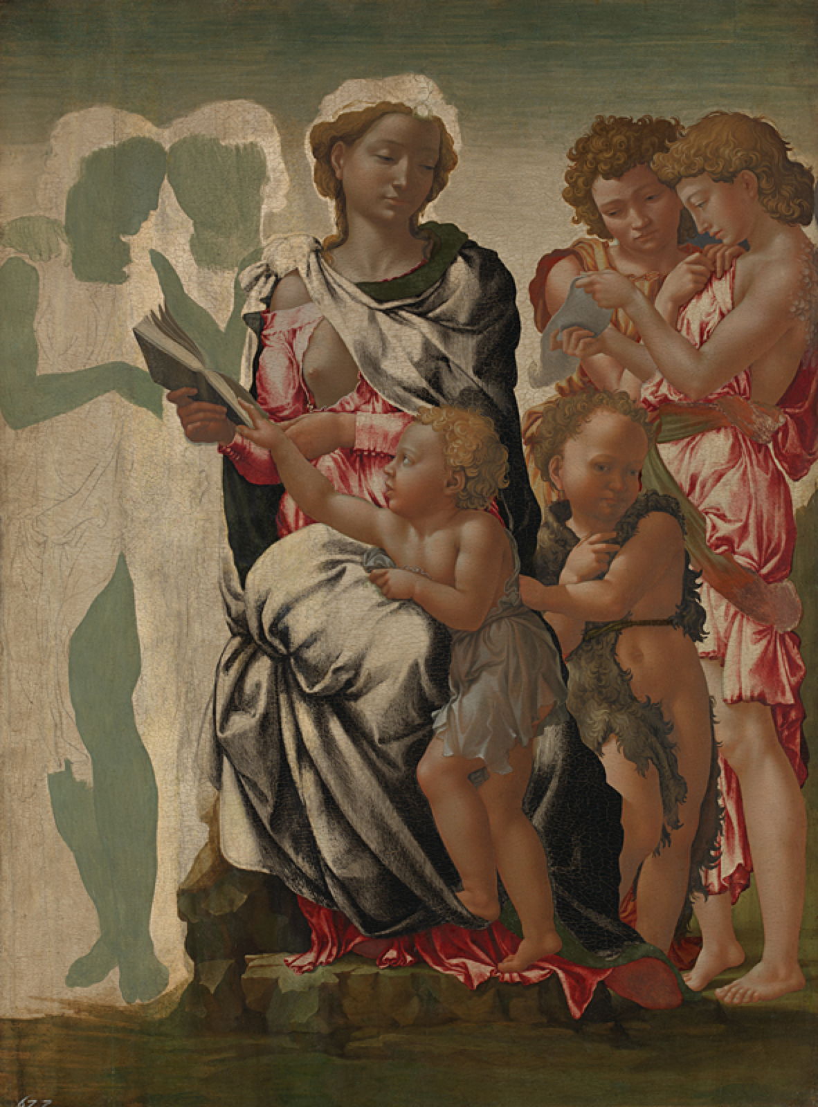
Michelangelo’s unfinished Virgin and Child with Saint John and Angels, popularly known as The Manchester Madonna, from about 1497, shows how an underpainting of green earths, visible at the left, was used to achieve realistic flesh tones. Later, painters came to prefer verdigris for this, but green earths appear to have worked particularly well in egg tempera, as in this case.
Charcoal, bone and ivory black
Traditionally, single-pigment blacks have relied on elemental carbon – the carbon blacks. The first and, until relatively recently, most popular source has been charcoal made by the controlled charring of plant matter, particularly thinner branches and twigs of trees and shrubs. There have been many alternative sources, including the mineral graphite (a layered carbon crystal), and carbon from the combustion of almost anything else, including ivory, animal bone, seeds, and organic fuels such as oils.
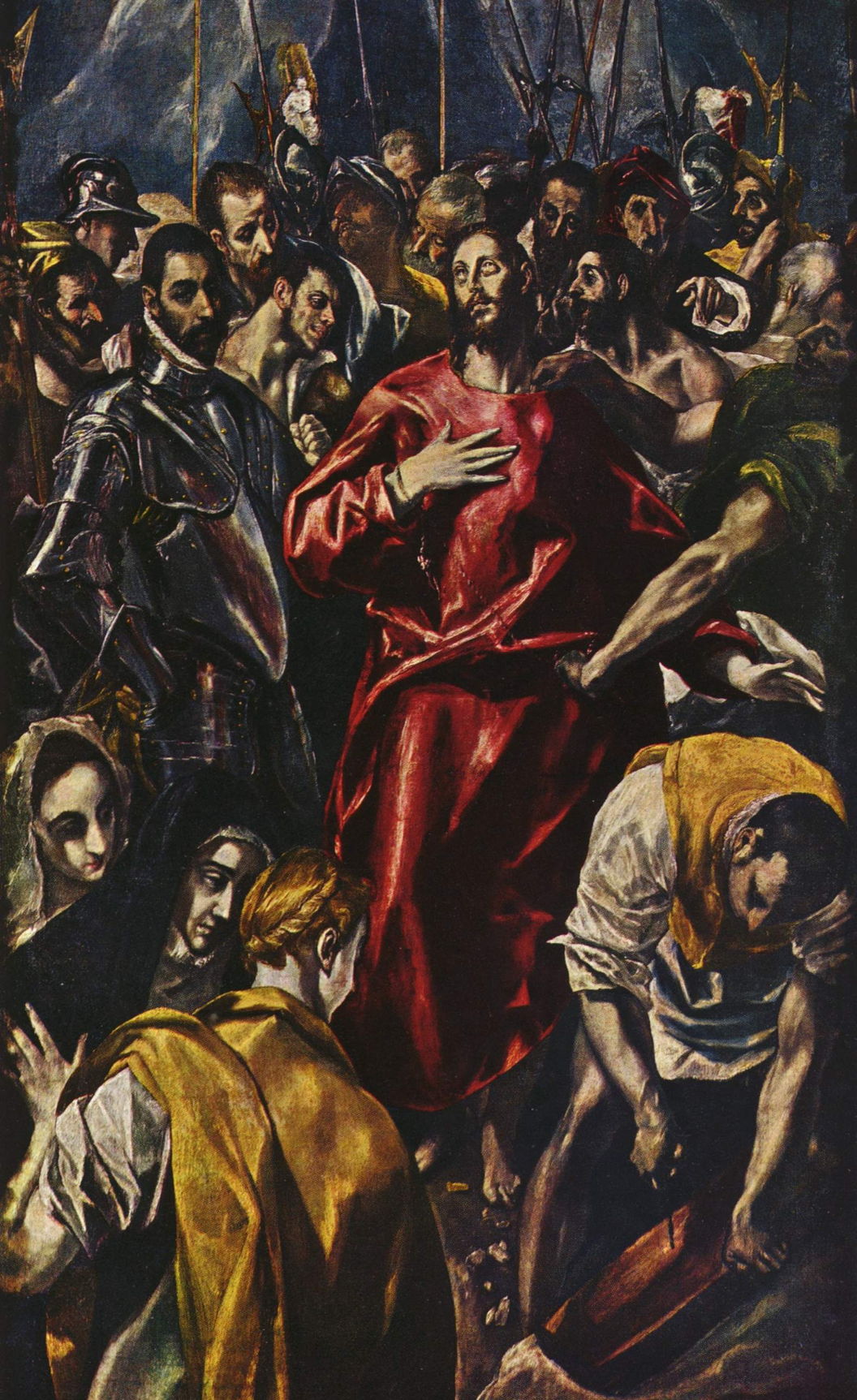
El Greco’s Disrobing of Christ (1583-84) is a good example of the extensive use of charcoal black pigment.

Édouard Manet preferred to use bone or ivory black in his Corner of a Café-Concert from 1878-80.
Lead white
White may not appear a particularly adventurous colour, but is fundamental to most paint media, particularly oils, where it’s used, normally mixed, to form brilliant white grounds, in combination with almost every colour, and in its own right. Lead white was and remained the white pigment of choice for oils until the end of the twentieth century. Both dangerous and difficult to prepare, large quantities of lead white pigment had to be produced for grounds, as well as for white paint.
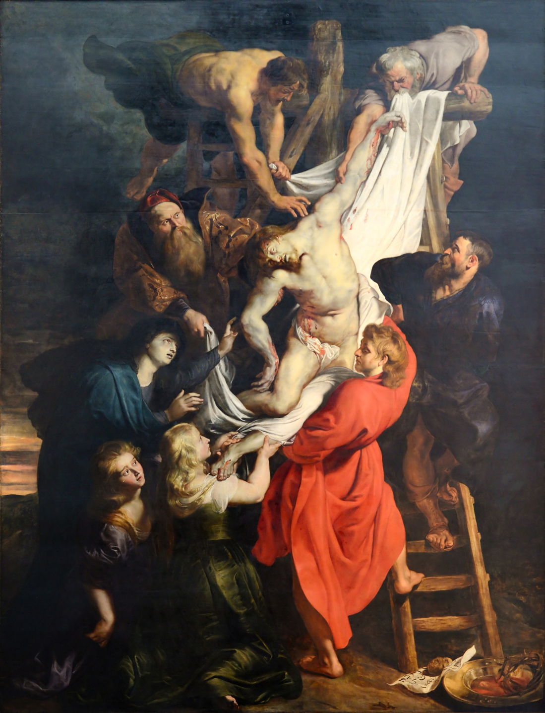
Rubens commonly mixed lead and chalk whites to form his grounds, as found in his magnificent triptych in Antwerp’s Onze-Lieve-Vrouwekathedraal, of which this Descent from the Cross (1612-14) is the centre panel. The white used in its paint layer is also lead white.
Chinese white
Most of the time that lead white was in use, there was a non-toxic alternative in the form of zinc oxide, the same white that (more recently) makes zinc oxide plaster white. It took until 1780 for artists to look seriously for alternatives to lead, and even then zinc oxide was only very slowly adopted in oil painting. It did, though, become popular in watercolour, where it was known as Chinese white when first marketed by Winsor & Newton in 1834. It is, of course, neither Chinese nor of Chinese origin.
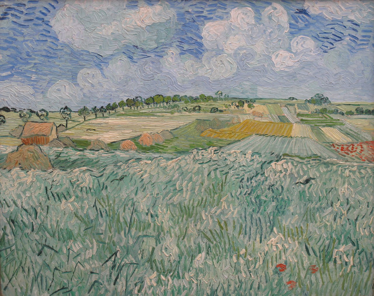
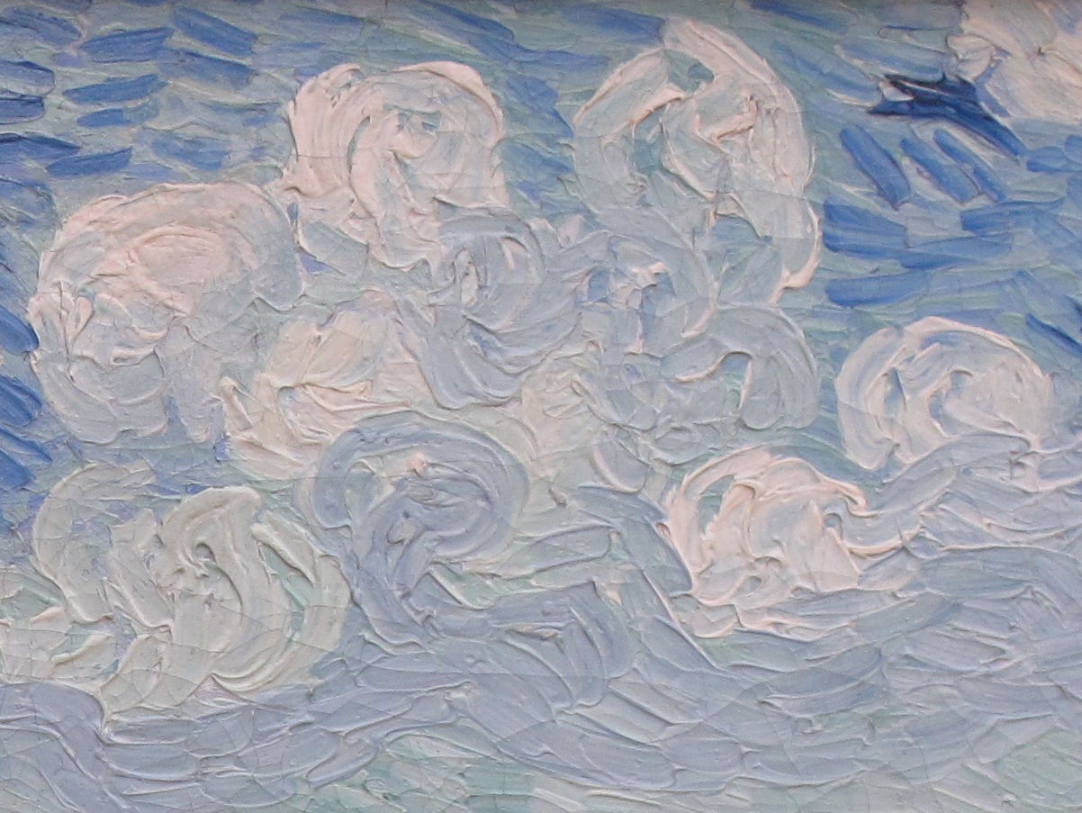
Vincent van Gogh used Chinese white in several of his paintings. Perhaps the best example is his wonderful Plain near Auvers from 1890, also shown in the detail below.
Modern pigments
During the twentieth century, many of the traditional pigments have been replaced by synthetic compounds, including titanium white, quinacridone red and phthalo blue. Painting has steadily progressed from alchemy to industrial chemistry, but at least many are now far less toxic and environmentally damaging than they used to be.
