
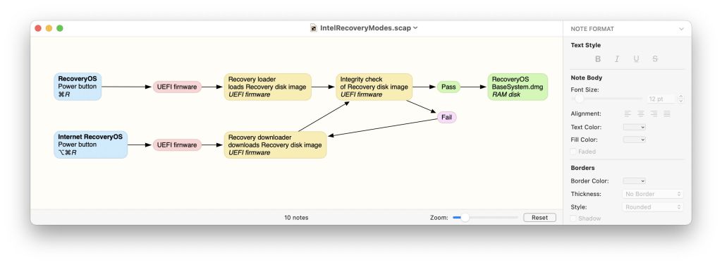
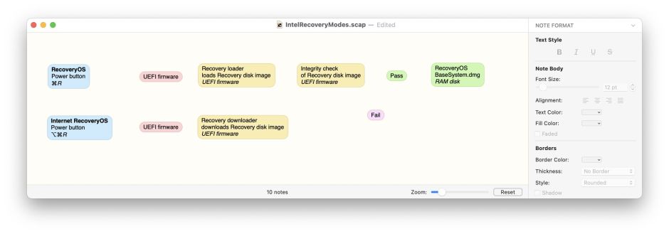
There’s one question I get asked repeatedly: which app do I use to produce the diagrams which I post of various parts of macOS? My answer is Scapple, by Literature & Latte, from the App Store. This article shows how and why I use it, even for complex diagrams such as those of the folders on Big Sur’s boot volume group.
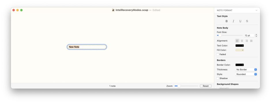
When opened, Scapple invites you to double-click anywhere in its window to add your first note, and that’s what I do once I’ve shown its Inspector, at the top of its View menu. I then enter the text to appear in that note.
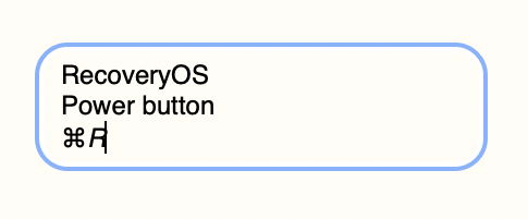
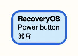
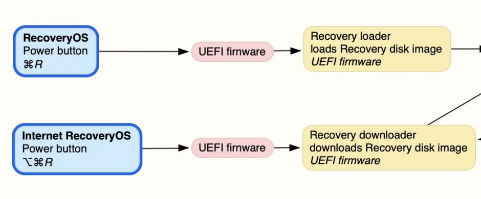
In this case, I’m structuring my notes into lines: the first is the title, the second the main control, and the third the special keys to be held. As usual, I enter the Command sign from the Emoji & Symbols window.

I tend to use Scapple’s standard styles, but they’re simple to customise and extend. With the note selected, I click on the desired style in the Inspector. I then select the title line and style that in bold.
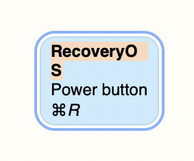
This grows the first line so that it wraps, so I drag the right edge of the note until it fits snugly.
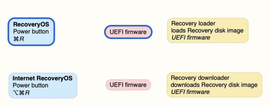
I continue adding notes, using the same processes, until I’ve roughly laid out that section of the diagram. Placement of individual notes at this stage is flexible: I drag them around until I think they look roughly right. There’s no need to be any more precise.
The next stage is to wire them up using connections, in this case arrows. I select the ‘from’ note, hold the Shift key, then select the ‘to’ note, and use the Connect with Arrow command in the Notes menu. When you’re connecting a lot, use the shortcut ⌥⌘.
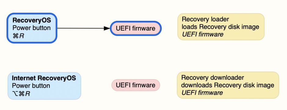
I repeat that with each pair of notes I want to connect, until that section is ready to neaten up.
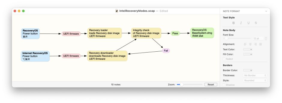
Aligning and distributing notes neatly is done using the commands in the mid-section of the Notes menu. I drag-select those notes which form the first column and Align their Left Edges to make them look neater. I repeat that with other columns, sometimes aligning by the left edge, sometimes by centers.
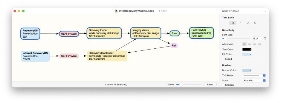
Then I align rows. One of the few potentially confusing issues in Scapple is whether to align a row by Horizontal or Vertical Centers: the way that I remember this is that it appear counterintuitive. When aligning a row, you want to align their Vertical Centers; when aligning a column, you want to align their Horizontal Centers!
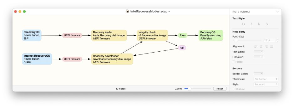
Once happy with the content and the layout, I export as PDF and/or PNG as appropriate, and my diagram is ready to publish here.
In other diagrams, rather than using arrow connections, I use ordinary connections. These are added similarly, by selecting the two notes to be connected and using the Connect command in the Notes menu. Because they’re non-directional, you don’t need to select them in any particular order.
Scapple can do a great deal more than that, of course. But it’s so easy to get obsessed with tinkering and tweaking with format, and to forget that clear presentation of content is most important. When I want to produce more complex diagrams, with extensive text and image content, I go for Tinderbox instead.
