

Most of the comments that I’ve had about my new app Ulbow have been about its controls, some of which appear relatively unfamiliar to many users. As they’re all standard controls selected from the repertoire available in Apple’s AppKit, and detailed in the macOS Human Interface Guidelines, they should be very familiar. This article takes a brief tour through them, and explains how to get the most out of them.
For much of Classic Mac OS, controls and the human interface were quite standard, although some apps started to break away with their own very different interfaces. Among the leaders in this was the Bryce fractal landscape design app in 1994. This diversity has only increased with Mac OS X, to the point where different apps use visually similar controls in contrasting ways. If you spend much of your day using Adobe CC apps, for example, you’ll be intimately familiar with Adobe’s approach to the human interface, which isn’t the same as Apple’s.
Apple provides a huge class library named AppKit, which includes an extensive and reasonably consistent human interface. Many independent developers, and some large corporations, either use AppKit exclusively or as the basis for their interfaces. This should, in theory at least, make it easier to switch between different apps without having to switch interface behaviours as well.
I’ll start with some basic controls with which I’m sure you’re very familiar, using screenshots from Ulbow.
Pop-up Button
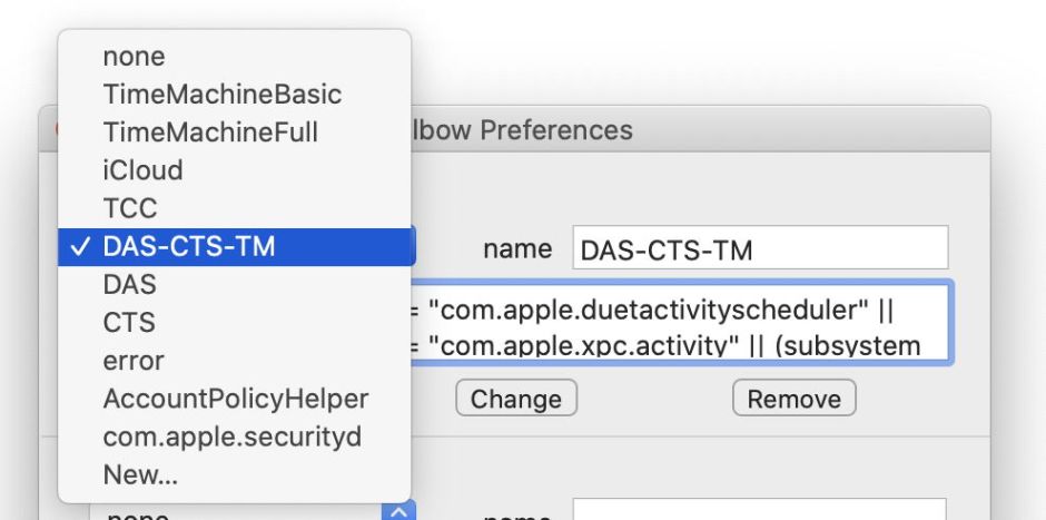
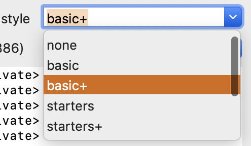
This is what’s often referred to as a popup menu, which displays the currently selected item chosen from a list, any of which can be selected by popping the menu up. The choices should be mutually exclusive: this isn’t a good way to let the user make multiple selections.
These tend to be relatively slow-changing; in this example, taken from Ulbow’s Preferences window, the last item in the menu lets you add a new item to the end. Some also allow you to change the order of existing items, but implementing that in a way which remains accessible hasn’t proved simple, so many fix the order. The currently selected item should be ticked, so the user can see which it is as they scroll through the list.
In AppKit, these are of the NSPopupButton class.
Text field
(Shown here below a Checkbox, of course.)
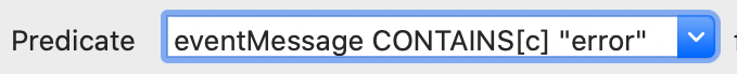
These are also known as text boxes, or text views (although they’re normally larger and for more substantial amounts of text). They’re the most common place to enter text, including numbers, from the keyboard, and in AppKit are of the NSTextField class. Where specific types of text are required, validation should be performed if possible, but the thorny issue with text fields is how the app should determine when the user has completed an entry. Standard AppKit behaviour is to ‘fix’ the text entry when the user presses the Tab or Return/Enter key, but that is by no means universal. This inconsistency causes confusion, and in some of my apps users are often upset when they think that they’ve changed an entry, but as they haven’t pressed a key to tell the app that they’ve finished editing the text, the app doesn’t recognise what they think they have entered.
This happens a lot in Consolation’s Period text field, so in Ulbow the Period isn’t directly editable, but uses a Stepper (NSStepper) which doesn’t have such ambiguities.
If you want to cultivate one good habit when using interfaces, make it the Tab key to ‘fix’ what you’ve just been editing and move onto the next control.
Combo box

If you combine a popup menu (strictly speaking, a ‘pull-down button’ rather than a pop-up button) with a text field, you get this more unusual control. It works in three modes:
- a pull-down or drop-down list of commands or properties,
- a text field into which you can type an item which isn’t in that list,
- a text field into which you can type an item from that list, which then works as if it was selected from the drop-down list.
Click on the arrow control to drop the list down, and you can then scroll through the existing list of choices, although only a limited number of them will be visible at any one time. Click in the text field and type in text if you prefer to do that instead, either to select one of the existing items, or to enter something different instead of the items in the list. Used as a text field, it is always wise to press the Tab or Return/Enter key to ‘fix’ your text entry.
In Ulbow, these very flexible controls let you choose between predicates, filters, and styles already stored in the app’s settings (and editable in Preferences), or custom entries which you enter on the fly.
As you’ll see in Preferences, items in the pull-down are shown there using labels, rather than their effective contents. But when you use text field mode to enter a new item, you have to type the effective contents, as such ad hoc items don’t have a label.
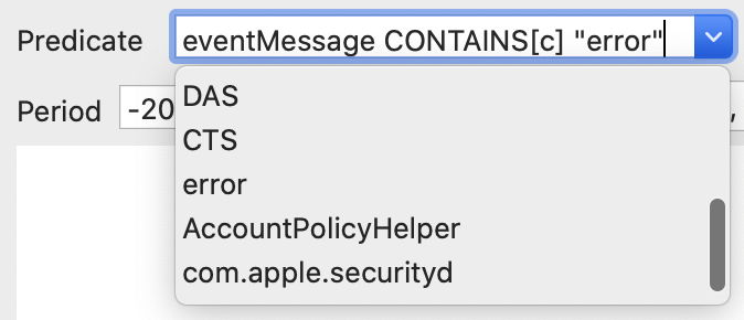
Unlike adding a new item to a pop-up button, any typed-in entry in a Combo box is ephemeral: switch back to using it as a pull-down, and what you’ve typed in vanishes.
The third use of the text field, to select between items listed in the pull-down, isn’t so well known, but can be a timesaver when you’re already familiar with the contents of the pull-down. In Ulbow, you can give items short mnemonic labels to aid this.
In AppKit, this control is of the NSComboBox class.
Non-editable text field and stepper
This combination of controls is used to specify the period: the stepper increases or decreases the number set. By holding the click/tap down on the up or down arrow, the number shown will change continuously, saving you from clicking or tapping your way slowly through all the intervening numbers.

Date picker
This is another sophisticated control used to specify dates and times with precision and convenience. Each element – date, month, year, hours, minutes, seconds – is individually selectable. When selected, you can type in a number directly, or use the stepper control to increase or decrease one step at a time. In AppKit, this is an NSDatePicker, of course.
I hope that helps you get the best out of those controls, in Ulbow and other apps which use AppKit.
 The Eclectic Light Company