

If painting is about light, so it must also be about its opposite, darkness. Their combination in the single term chiaroscuro is both appropriate and confusing, as it has been used to describe so many different uses of contrast between light and dark, including the general build-up of three-dimensional form using shade.
In this and the next article, I’m going to take a whirlwind trip through the history of the most distinctive form of chiaroscuro painting, what has been termed compositional chiaroscuro. In this, a painting is dominated by very dark tones, with dramatically-lit highlights. This is most readily seen by looking at a painting’s monochrome luminosity profile, now easily performed using imaging software.
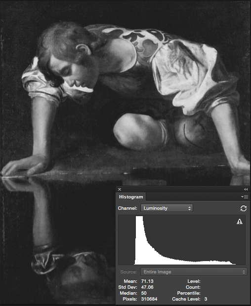
My favourite painting by Caravaggio, his Narcissus of the end of the sixteenth century, shows the typical pattern of an abundance of pixels of near-black luminosity, and a long tail rising to its far less frequent highlights.
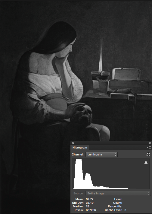
An almost identical pattern is seen in another great work by a master of darkness, Georges de la Tour, his Mary Magdalene with a Night Light from 1630.
Although most strongly associated with Caravaggism and ‘Tenebrism’ in the first half of the seventeenth century, this form of chiaroscuro is to be seen in some paintings from much earlier, in the Renaissance.
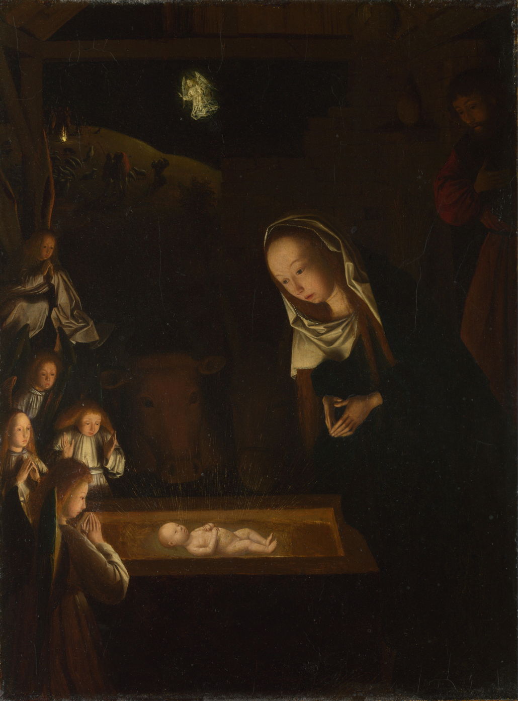
The earliest good example that I have seen is this wonderful nocturne by the early Netherlandish painter Geertgen tot Sint Jans, Nativity at Night, which is thought to be from about 1490. Chiaroscuro makes narrative sense here, and results in a scene of great tenderness and reverence, thanks to its soft transitions of tones.
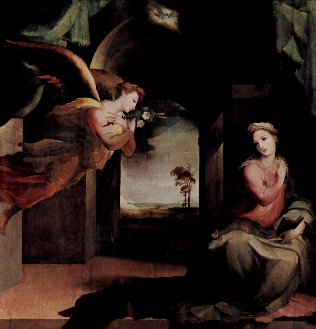
Beccafumi’s The Annunciation from 1545-46 is rather different, though, as its motif is not normally associated with the dark or darkness. This implies that he used the extreme contrast to heighten the effect of his painting, something which was quite unusual at the time.
Fifty years later, chiaroscuro rose to become popular, and in the case of some artists, a signature style.
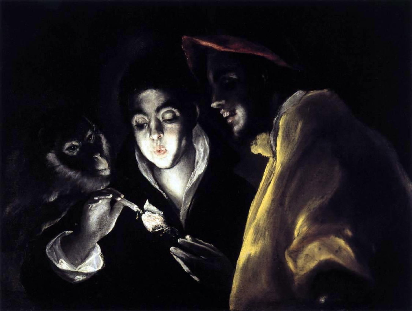
El Greco’s An Allegory with a Boy Lighting a Candle in the Company of an Ape and a Fool (Fábula) from 1589-92 deliberately exaggerates the light of a glowing coal being used to light a candle to heighten effect in telling this fable.

Then, for the couple of decades of his tragically brief career, Caravaggio became the master of chiaroscuro. Here is his brilliant Narcissus of 1594-96, which uniquely combines the effect with reflection, to tell the story of Narcissus so powerfully.
Caravaggio’s paintings attracted a strong following, and brought a phase of Caravaggism.
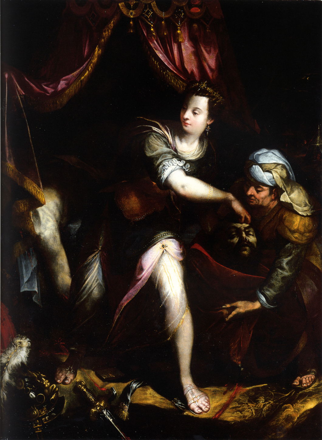
Lavinia Fontana’s Judith with the Head of Holofernes from 1600 has several good reasons for its use of chiaroscuro. Here is Judith with the decapitated body of Holofernes, passing the head she has just hacked off to her maidservant. The darkness hides some of the more ghoulish parts of the scene, heightens the sense of drama, and is entirely appropriate for the location and time of day.
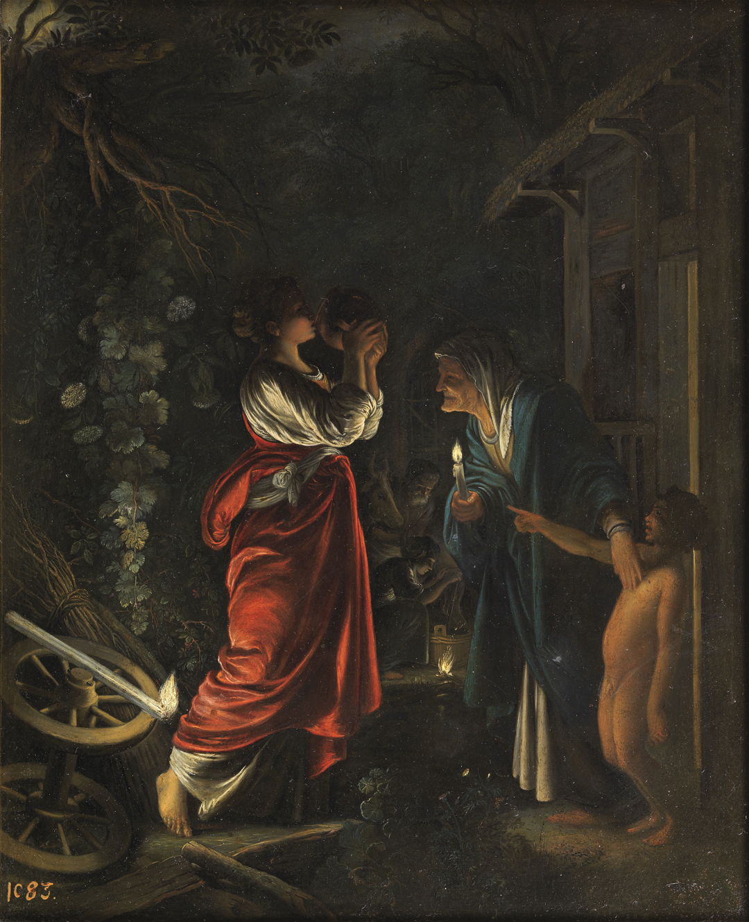
Many of Adam Elsheimer’s exquisite oil paintings on copper use very strong chiaroscuro too, showing stories which are set during the night, such as that of Ceres at Hecuba’s Home from about 1605.
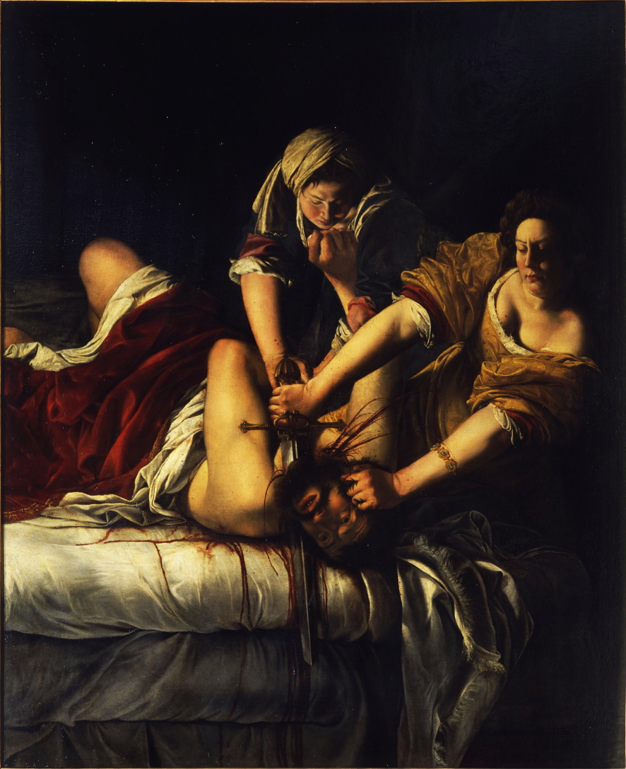
Artemisia Gentileschi’s father was a well-known Caravaggist, and she followed suit for the early years of her career. Her painting of Judith Slaying Holofernes from 1620-21 shares all the same reasons as that of Lavinia Fontana above.

For Gerard van Honthorst, sometimes referred to as a Utrecht Caravaggist, dimly lit indoor scenes were associated with pleasures, often fairly sinful ones, as in his Merry Company from 1623. He also shows us how directional lighting can transform appearance, turning quite ordinary or ugly faces into caricatures.
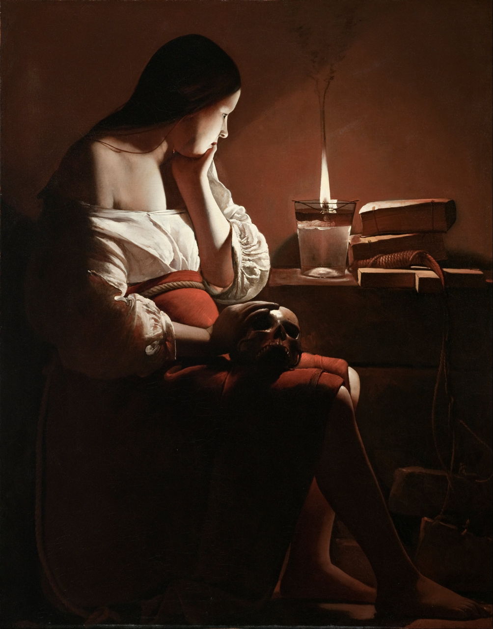
One of the great exponents of chiaroscuro in religious painting was Georges de La Tour, whose series of paintings of Mary Magdalen are among the finest examples of the style. The Magdalen with the Smoking Flame is one example which probably dates from around 1630.

Francisco de Zurbarán’s powerful painting of The Death of Hercules from 1634 uses chiaroscuro as stark as any of that of Caravaggio to change the death of a mythical Greek hero into a moving Christian martyrdom, its victim staring up to heaven, commending his soul to God.
Realtively few landscape painters have attempted to use chiaroscuro in their work, because of its direct conflict with their primary aim of showing their view.
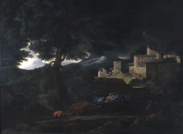
One exception to this is Nicolas Poussin’s Landscape with a Storm from about 1651, which must be one of the earliest ‘Gothic’ landscape paintings. It uses darkness to heighten the sense of terror, and to encourage the viewer to share the fears of those pictured. The same landscape picture in more everyday light would have looked very bland.
One of Roger Fry’s withering (and quite unwarranted) criticisms of the painting of Rembrandt was of the master’s use of chiaroscuro, most generally known in the paintings of his late career.
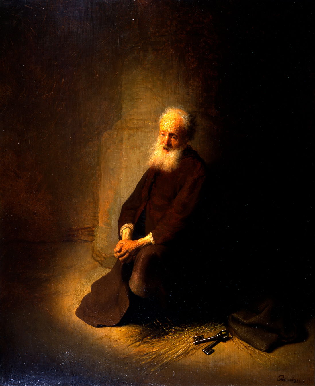
Although several of his best-known chiaroscuro paintings were made in his old age, Rembrandt had long used it when appropriate, here in Saint Peter in Prison (The Apostle Peter Kneeling) from 1631.
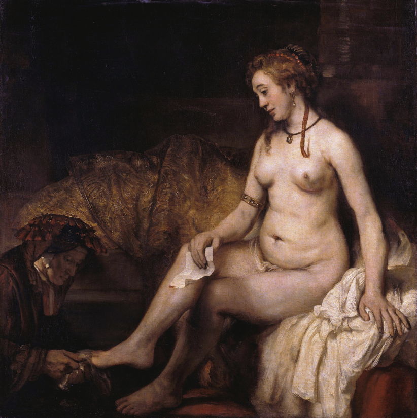
But together with his increasingly radical and painterly style, it really came to the forefront in the paintings he made after 1650, such as Bathsheba with King David’s Letter (1654). This is not the brash even harsh chiaroscuro of Caravaggio, though: in fifty years, it had evolved considerably.

Among the last of the Caravaggists was Elisabetta Sirani, whose enigmatic painting of Cleopatra, or possibly The Flea, from the middle of the seventeenth century, is a fine example.
Then, after little more than fifty years, chiaroscuro fell into disfavour, and almost vanished.
