
Even young people are desperately conservative. I can’t remember when I last chose to print a document onto paper, and my expensive colour laser printer spends month after month powered down. Yet I, like pretty well everyone else, continue to write documents on computers and iOS devices in black text on a white background, as if I had monochrome vision and wanted to print every page on paper.
It has always been difficult and expensive to do anything else in print, but in macOS and iOS, it is simple and free to colour text. In some specific applications, such as coding in programming and markup languages, coloured text has already become widespread if not universal, but it is seldom even an option elsewhere. This is despite our penchant for wide colour high-resolution displays, which show colour far better than those of the past.
There is little point, though, in colouring text for the sheer hell of it. Setting different words, phrases or whole paragraphs in different colours should only be used where it adds meaning which can’t be conveyed as easily in those words. Here are a few examples which I already find valuable:
- Discriminating mark-up from content in any text-based editor, most commonly HTML, but also XML and SGML (almost universal).
- Showing syntax in programming code (almost universal).
- Distinguishing changes and comments in any text document (widespread in apps with this feature).
- Showing changes when comparing different versions of a document (widespread).
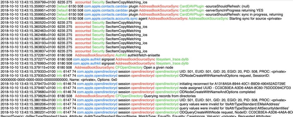
- Distinguishing different fields of content, as in the macOS unified log (Consolation 3).
- Distinguishing entries from different subsystems in a log (Cirrus).
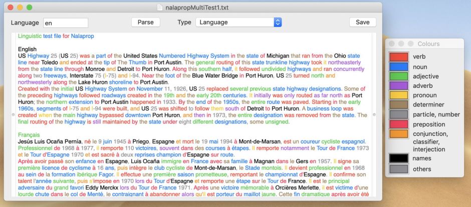
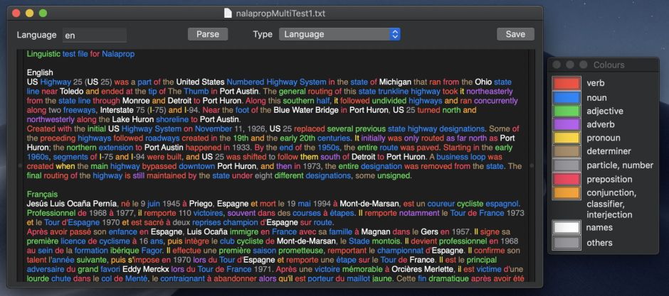
- Classifying words into different lexical classes (Nalaprop).
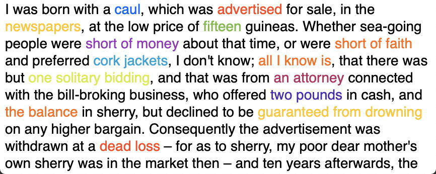
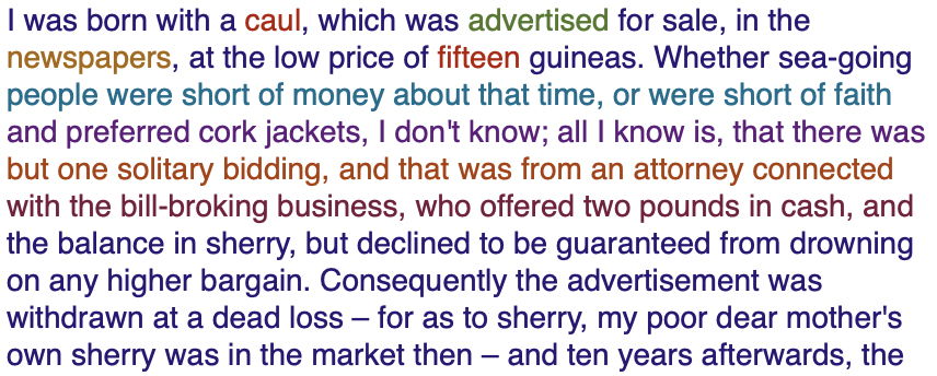
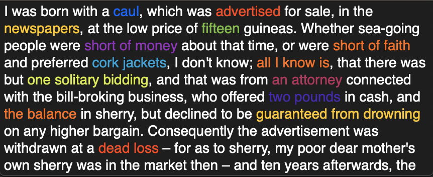
- Distinguishing quotations from different sources or speakers in a transcript, or any other document (not a standard feature of any app, but accomplished using styles).
One reason for coloured text still being relatively little-used is that it often doesn’t work as well against a white background. The glyphs which make up text are relatively thin, making contrast in lightness important. When you reduce lightness of fine glyphs against a white background, it generally becomes increasingly hard to discriminate their colour accurately. This limits the number of distinct colours which can be used and/or makes the text harder to read.
Provided that its colour doesn’t become too dark, coloured text in Dark Mode appears more effective than in Light Mode. When I was selecting how many and which colours to offer in Consolation 3 for Sierra and High Sierra’s permanent Light Mode, in addition to black, I chose just three – red, green and blue – as being readily distinguished against a white background.

When used by Nalaprop to show the lexical class of words, I felt that Dark Mode can comfortably accommodate a total of eight distinct colours plus black. My experience so far – without going to the lengths of creating optimised sets of colours – is that coloured text is far more usable in Dark Mode. It might be possible to arrive at a greater range of usable colours by carefully optimising separate sets for Light and Dark Modes.
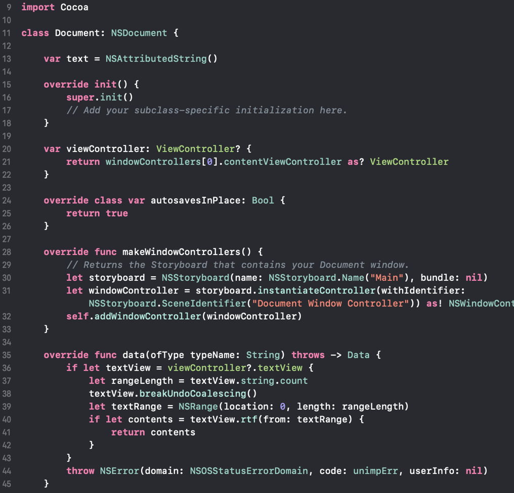
Apple’s current practice, in apps such as TextEdit, Pages and Numbers, is to display documents traditionally viewed in black on white in a view which remains fixed in Light Mode, irrespective of the appearance mode set. Its major exception to this is in Xcode 10, where it colours text according to syntax, and accepts that does look far better in full Dark Mode.

Another reason for avoiding the semantic colouring of text is limited support for different appearance modes in standard file formats, but that is already changing.
Apple now has a working solution for HTML in a stylesheet media query, and in Rich Text with a named entry in an expanded colour table. These allow uncoloured text to be rendered in black when in Light Mode, and in white when in Dark Mode.
To the best of my knowledge, there is no support for any equivalent feature in PDF. When you print (sic) a document to PDF in Dark Mode, the closest that you can get is for Dark Mode content to be rendered against a dark window on a white page, which is just about the worst of all solutions. But most applications fix all printed output, including that to PDF, in Light Mode without any user option to retain its appearance.


The combination of coloured sections of text displayed in Dark Mode can be highly effective when used wisely. macOS Attributed Text supports the display of coloured text in both Light and Dark Modes, and HTML and RTF can mark uncoloured text up so that it can be rendered according to the prevailing appearance.
The next step is for us to explore the semantics of coloured text, how we can use it now that text has been set free from nearly six hundred years of being rendered in black on white. With the greatest of respect to Apple, we aren’t going anywhere when apps like Pages and Numbers don’t do Dark Mode properly.
