
Mojave’s new Dark Mode seems like a good and simple idea. But as I wrote a few days ago, it is not as simple as appears, and forces some uncomfortable choices which leave the user wondering whether it was worth the effort. Here’s one example.
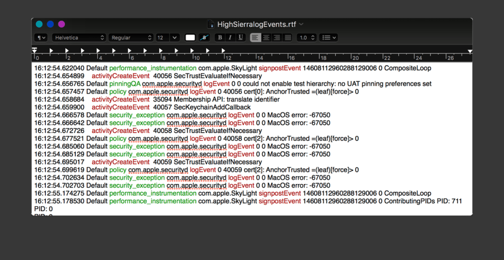
We’re well used to the idea of styled text, in which we italicise, colour, and otherwise style letters and words in a document. Under WYSIWYG rules, if I set a word in bold red, wherever that word is displayed it is shown in the same bold red style. Here’s an example log excerpt acquired in High Sierra and styled using RTF.
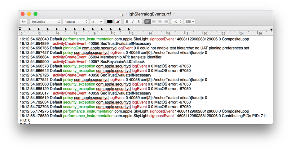
In High Sierra, that log excerpt looks the same when viewed in the authoring app (Consolation), or in any app which supports the faithful display of RTF, in this case Apple’s TextEdit, although it could equally be Microsoft Word, Nisus Writer Pro, or almost any other word processor.
Now consider creating that same document in Dark Mode. As I cannot show a screenshot from Mojave here, I will simulate that using the colour inversion feature of the Accessibility pane. This also changes the red and green text, something which doesn’t happen in Dark Mode, according to presentations at WWDC 2018.
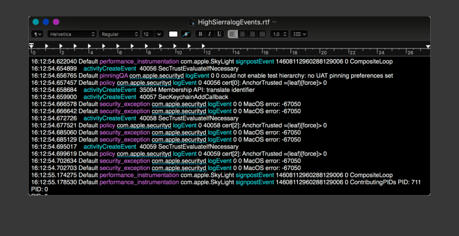
With a black background, the text which was displayed in black in Light Mode is now displayed in white, or it would be illegible. However, the RTF saved is exactly the same as when this is captured in Light Mode.
Apps which display RTF text therefore have a dilemma. If they do what Consolation does in Dark Mode, and show black text as white against a dark grey background, they are not being faithful to documents which know no Dark Mode, and are breaking WYSIWYG rules. Their alternative is to always display RTF as black text on a white background, as if in Light Mode.
Those who know RTF well will also know that it can contain colour tables; it is feasible for apps to set the colour scheme of documents to match those at creation, but changing the colour of standard black text and the default white background is little-used, and would only increase anomalies, not address them.

I suspect the standard solution for most text-based apps will be to display the styled text against a white background, in a sort of local Light Mode. You don’t have to have many windows like this on your display before it resembles a chequerboard, transforming cool Dark Mode into messy Chequer Mode.
For a photographer or designer preferring to work in Dark Mode, one solution would be to have a second display which remained in Light Mode. Windows for RTF readers, mail clients, web browsers, and so on, which worked better when they remained in Light Mode could then be moved to that display.
However, at WWDC Apple implied that Mojave’s Dark Mode is global, and not configured separately for each display. Even if it were to work per-display, it would make windows which bridged two displays look extremely bizarre.
A far more practical solution would be for apps to have a setting, controlled perhaps in their Finder information rather than than in their Preferences dialog, which allowed the user to force them to run in Light Mode, Dark Mode, or to comply with whichever mode macOS was running in. This may of course already be possible in Mojave; if it isn’t, I think it would be a very valuable addition. It couldn’t of itself solve this type of problem, but would at least let the user decide on their own compromise.
