
Displaying dense content as text is a tough problem. When the content is structured into fields of fairly consistent length, the traditional model has been the table, the ancestor (via account ledgers) of the computer spreadsheet.
Tables and spreadsheets are ungainly if not unusable with many types of content. Traditional computer logs stretch them to the limit. To remain consistent with the model, fields in each log entry are truncated or padded with space to force them to align into columns. Truncation is frustrating as it conceals potentially crucial information, and padding wastes space, driving the user to scroll in two dimensions.
Sierra’s new unified log presents even greater problems. Each log entry can contain up to sixteen different fields, several of which are very long, and one of which can occupy many lines even on a wide display. The traditional table model here proves woefully inadequate.
One novel approach is to abandon the idea of aligning fields into columns. This in turn poses the problem of how to distinguish between content from different fields along each log entry: a matter of style.
Underlining became popular in the heyday of the typewriter, as it was one of the few techniques which was available to operators of mechanical typewriters. It unfortunately seems to have embedded itself into computer styling of text; it clutters text and reduces legibility, so is of no value here.
Emboldening and italicising are also fine for short and occasional segments of text, but pose several similar problems when their use is more extensive. Highlighting, taken from the use of marker pens to emphasise printed text, again reduces legibility and when used extensively readily becomes eye-wateringly unpleasant.
Using different colours to render the text itself was not common before the advent of computers, although it was possible when using two-colour typewriter ribbons, and has been used successfully in handwritten and printed text. It has been used in some log browsers (and similar utilities), but I have not seen it being used systematically to distinguish fields along the length of each line.
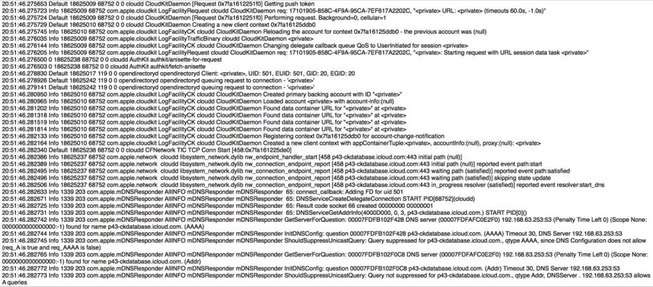
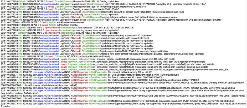
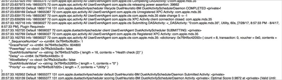
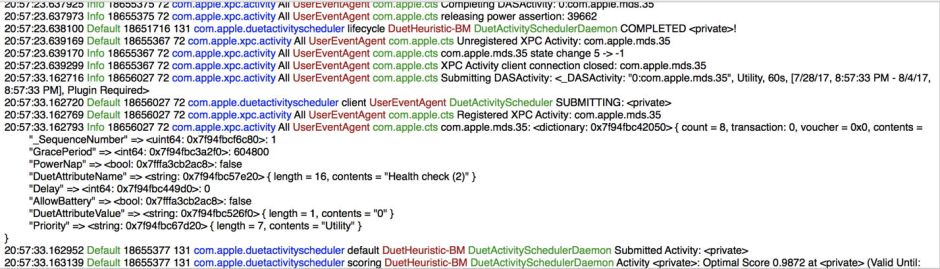
The next beta-release of Consolation 3, which should be available here early next week, now makes it very simple for the user to customise the layout of log entries, including the use of different colours to distinguish fields in the log. I think that you will find it a transformative experience, which is a major advance. The more that I use it, the better it works for me. Here are two example log excerpts, each shown in conventional black and white, then with a colour style.
Such styles are specified using unfashionable alphanumeric codes, rather than exciting WYSIWYG tools. To start each log entry with the timestamp without the date, and to place the message type next to that in green, you start the style specification with
0h 2g
as the timestamp is field 0, h indicates that the time should be displayed without the date; field 2 is the MessageType, with g to indicate that should be set in green colour. The screenshot below shows the full style specification used in the examples above.

It might seem attractive to give the user direct controls to select, order, and style the different fields, but when you start trying to implement them, it quickly becomes apparent how complex and clumsy those controls would be.
Another valuable aspect of colour styles is that you can switch between them almost instantly: this allows you, for example, to view the same extract using different styles to help you read the log in different ways. Going back and using one of the standard styles, such as syslog or the new default without the support of colour, quickly shows how hard it is to see what is happening in the log.
Log browsers are not normally something to get excited about. Try out the next beta of Consolation for yourself to see why I think that this is an exception.
