If you’re a professional photographer, designer, or someone else whose career depends on colour fidelity, you’ll doubtless keep your Mac’s monitor carefully calibrated, and have incorporated colour management at the heart of your workflow. This series of articles is not aimed at you, although if you’re still not exactly sure why you do those things, you might find it illuminating.
This series is aimed at everyone else who has the slightest interest in getting better colour results from their Mac, cameras, printers, and more. You probably don’t have a device to calibrate your display, and would find it hard to justify the cost and trouble of using one. Although your living doesn’t depend on getting faithful colour, you want to ensure that photos taken of your paintings/family/holiday look right, and look good.
Colour cock-ups
A friend, a distinguished composer, once emailed me because a photo of him which had been published on a website made him look like he had severe sunburn – his flesh was so red. But this only appeared when using certain browsers. He, and the webmaster, were baffled, as when they looked at the JPEG image it looked fine.
I take photos of my own paintings, and those of far better artists in museums. I also use many available from Wikimedia Commons, and often see colour management problems manifest in images. One quick example is seen in the two different versions available in Wikimedia Commons of the painting of Charlotte Corday by Arturo Michelena.
These look to be very different paintings. Which is closer to reality? How can you ensure that the images you bring back from a museum you have visited depict those paintings and other objects faithfully?
Colour perception
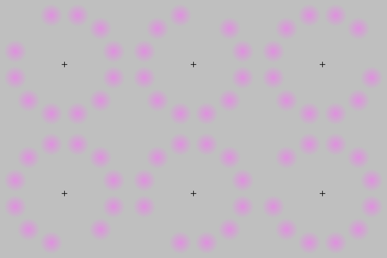
As with my series on colour for painting, I am not going to lose your interest by spouting a lot of physics at you. Physical approaches to colour and its management are widely available online, and in several excellent books. Instead, I am going to concentrate on our perception of colour, which is actually far more important in this context. It is also remarkably easy to trick. Watch the Lilac Chaser illusion below.

We can readily see colours where there aren’t any. We also perform our own mental colour correction, a phenomenon known as colour constancy. The best way to see that is to get an orange (the fruit) and view it in different lighting conditions, including those in which there is marked colour. We tend to see very familiar objects such as fruit as being the same colour, even though objective measurements say very different.
Colour constancy is also very variable, according to the consistency in colour of the object which we are viewing. Cars – which we know come in a very wide range of colours – exhibit much weaker colour constancy than do oranges.
Colours also appear to change according to adjacent colour, the phenomenon of simultaneous contrast shown below.

Representation and rendering
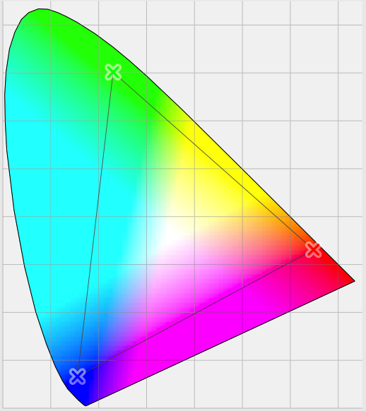
But the biggest problem when using computers to handle colour is that their peripherals – displays and printers in particular – can only handle a very limited range of colours. Although it uses colour coordinates which are rather more complex than the RGB which you are used to, this is well illustrated in the diagram below.

Most of us are capable of perceiving all the colours shown in the coloured area. However the small triangle within that shows the extent of the colours which can be displayed on a specific device – its colour gamut.
So let’s assume that we have a ‘perfect’ camera which captures colours from nature completely faithfully, and whose gamut is the same as you and me, right out to the edges of the outer rounded triangle. When you take a photo with that camera and import it to your Mac, that vast range of different colours will be converted, pixel by pixel, into the Mac’s internal representation for colour.
Long ago, in the early days of computer colour systems, each pixel was represented by a single byte for the red value, one for the green, and one for the blue: 24 bits in all. When you looked at what should have been a smooth colour gradient, it was easy to see the step changes in colour, which arose because of the constrained representation.
Now, OS X normally uses four channels for each pixel (the fourth being the alpha value for opacity), each represented as a floating point number between 0.0 and 1.0. So the Mac’s internal colour format ensures remarkably faithful representation for all the colours captured by this ‘perfect’ camera. But when we view the image on our Mac’s display, that can only show those colours within the smaller triangle, its gamut.
The problem which colour management is trying to solve is how best to achieve that – getting an image to look right even when displayed (or output) to a device with a relatively limited gamut, the process of colour rendering. That is what I will explain in the next article.
References
Handprint on colour.
Kuehni RG (2005) Color. An Introduction to Practice and Principles, 2nd edn., Wiley Interscience. ISBN 0 471 66006 X.
Kuehni RG and Schwarz A (2008) Color Ordered. A Survey of Color Order Systems from Antiquity to the Present, Oxford UP. ISBN 978 0 19 518968 1.


