

It is easy to show that we do not see colours as they actually are. Several well-known visual illusions can trick your brain into seeing colour in a completely black and white image, seeing colours that are different from those physically present in an image, and all manner of other chromatic fantasies.

The ‘lilac chaser’ shown here and detailed on Wikipedia is a simple example, and there are collections such as that at Archimedes’ Laboratory here.
I am not a great believer in such illusions, as it is easy to overinterpret them and imagine that all paintings consist of tricks of light and colour. However they demonstrate that, if you want to understand colour in paintings, you need most of all to understand how our brains handle colour, not what a glass prism will do to incident white light.
This series of articles sets out to get to grips with colour in painting, and colour for painters. Rather than drowning you in the optics of colour and anatomy of the eye, I am going to approach the subject differently, considering how we perceive colour – colour cognition – in the world around us, and in paintings of that world.
Our ancestors have long held colour and vision to be subjects of great interest. Optics goes back to the earliest days that good quality lenses could be produced, and sufficient trigonometry was available to analyse results. The nineteenth century saw a blossoming of interest in the ‘science of colour’ and ‘colour theory’, with books and papers written by scientists such as Hermann von Helmholtz, his frequent opponent Ewald Hering, Michel Eugène Chevreul, and Ogdon Rood.
Although these describe tantalising explorations of the effects of putting different colours side by side, and knowledge of the structure of the human eye was also advancing fast, disciplines such as psychophysics and neurosciences did not really flourish until the twentieth century. Almost everything that you read, and have read, about colour is therefore stuck in that past, delivering physics not physiology. But almost all the work since has shown how wide the gap between optics and what we really experience.
The inconstancy of colour
Take a simple phenomenon such as colour constancy, which is a term that has been broadly applied to the observation that paper still looks white, and an orange is still orange, under a range of different natural lighting conditions. Many recent texts assert how colour constancy is so prominent and important in human vision that it is a key feature – even Wikipedia’s article on the subject follows this line.
Yet all you have to do is view a handful of balls of different colour (billiard or pool balls are ideal) under red or green light, and you will see that any constancy in your colour perception readily breaks down. Try painting from a photograph under artificial light (which is not corrected to resemble daylight) and observe the results in noon sunlight. Or match the colour of some fabrics under similar indoor conditions to see how poor this constancy when you observe your ‘match’ outdoors.
Although we have a degree of ‘colour constancy’, it is limited, and the further conditions depart from those of common natural lighting, the more it will break down.
For centuries, painters’ studios in the northern hemisphere have been sited and constructed so that they take in natural light from the north, which never receives direct light from the sun. Colours have been selected, mixed, and matched under that natural light to create paintings which are seldom if ever viewed under the same light, although with modern lighting technology this is now an option open to art galleries and more affluent collectors. Few painters, when accepting a commission, check how their work will be lit when it has been completed and delivered. But it is easy to see how different lighting conditions can transform our perception of paintings.
Have objects changed colour?

Look carefully in the paintings of the old Masters, such as Poussin, and you will see that their shadows rarely show any significant chroma, and reflected or cast lighting effects are very seldom shown.
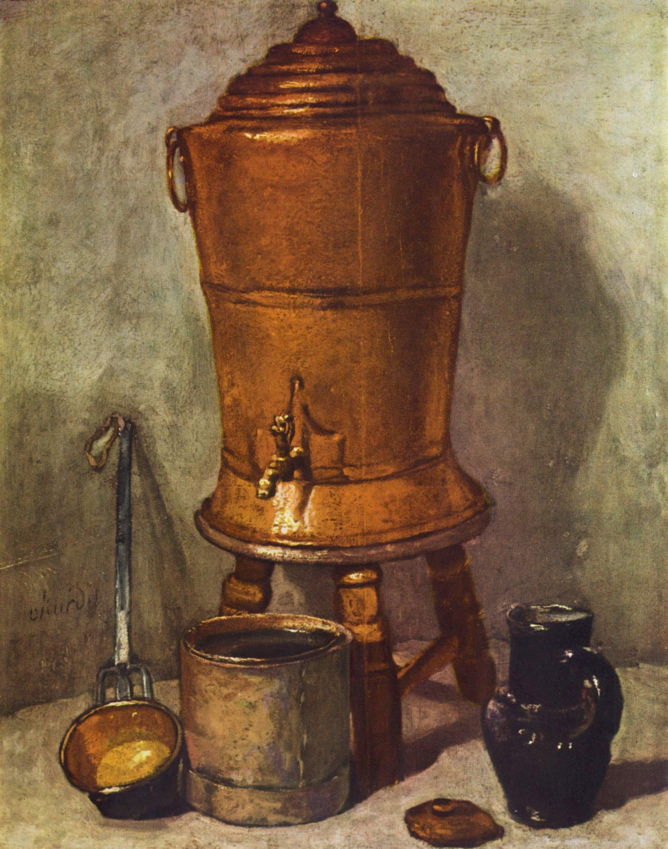
Although most of the still life paintings by specialist Chardin follow that tradition, some, such as his Copper Water Tank, have traces of colouration in their shadows.

Compare those with more modern paintings by Impressionists such as Pissarro and Post-Impressionists such as Cézanne and Signac, where shadows and shading have significant, sometimes prominent, chroma, and objects can be tinged with colour from reflected or cast light. In Pissarro’s Sunset, areas of grass which lie in the shadow of the trees are intensely green, whilst those in full light are gold.
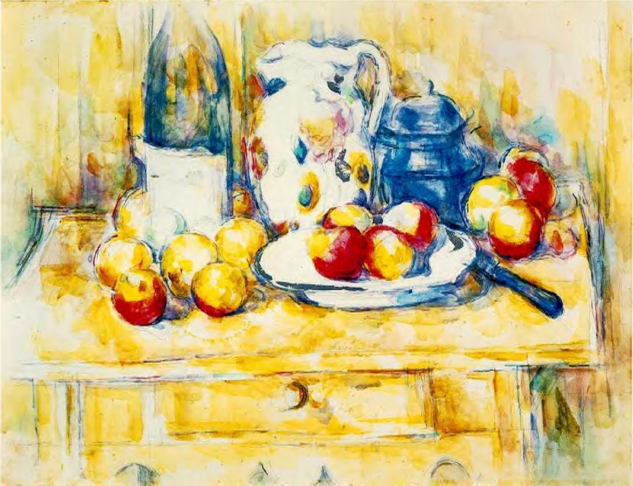
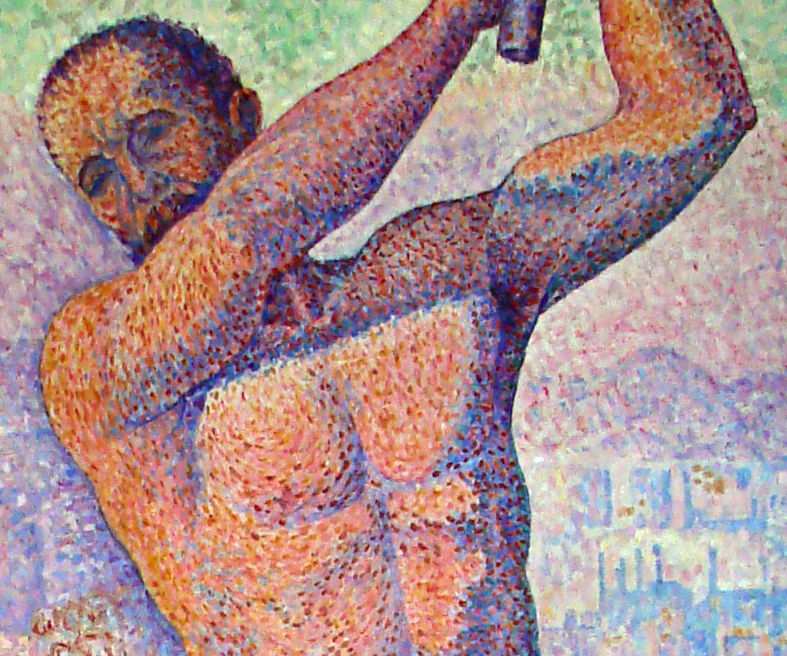
In Cézanne’s Still Life, shadowed areas of the tabletop, white bowl, and other parts have quite different colours. This is even more obvious in the detail shown of Signac’s Demolisher.
It would be absurd to suggest that these differences result from changes that have occurred in the physical world, or that these artists had quite different visual systems, or powers of observation. If we are to understand colour in painting, to comprehend how to apply pigment to depict what we see, we first need to understand our perception of colour.
Additional References
Handprint on colour. Bruce MacEvoy’s superb reference and tutorial information on colour may be overwhelming, and I am not convinced that his emphasis on optics is appropriate, but it is probably the most accurate available.
Kuehni RG (2005) Color. An Introduction to Practice and Principles, 2nd edn., Wiley Interscience. ISBN 0 471 66006 X. (A superb perception-based account by the leading authority on colour.)
Kuehni RG and Schwarz A (2008) Color Ordered. A Survey of Color Order Systems from Antiquity to the Present, Oxford UP. ISBN 978 0 19 518968 1. (A thorough account of the many attempts to put colours into order, gives insight into our continuing failure to accomplish even this basic task.)
