
Of all the disciplines in Design, the one that has fascinated me most is the design and production of fonts.
My interest was fired when Apple introduced TrueType fonts, in 1991. At the time, I had a handful of applications which supported a range of large format industrial flat-bed cutting systems, powered by lasers, water-jets, and even plasma-jets. The hardware manufacturer wanted to expand into the sign-making trade, and asked me to develop an application which would cut letters (and other glyphs) from standard computer fonts.
At the time, PostScript 1 fonts were encrypted and, unless you were a large developer, a no-go area. But Apple had produced some initial documentation for its new TrueType format which suggested that I should be able to use those fonts. I had personal assistance from members of the TrueType development team, got my head around its internals, and shipped my app Glyptic a few months later. Sadly, attempts to sell the cutters into that market were unsuccessful, but for weeks I was thinking TrueType, and it was wonderful.
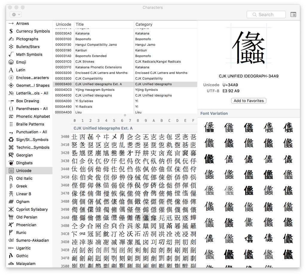
Of course I was only working with Latin fonts, as the Mac didn’t do Unicode at that time: indeed, Unicode was only just getting started. But Latin, Arabic, Persian, Georgian, Kanji, and Chinese fonts have fascinated me ever since. Each has its complexities, but the experts are unanimous in agreeing that Chinese fonts are the most complex of them all.
Now Nikhil Sonnad has provided a fascinating glimpse into the problems which have to be addressed by those who design Chinese fonts here.
I think that my dabbling will remain thoroughly Latin in nature.
