

Art history has tended to operate under the assumption that it is artistic choice and influence which determines changing style, and to neglect the technical limitations within which styles are constrained.
There are notable exceptions to this, for example the recognition of the importance of oil paints in the Renaissance (particularly in the north). But I have yet to see any account of nineteenth century painting in Europe which considers the fact that during that century more new (and more effective) pigments came into use in oil paint than in the whole of the previous two millenia.
Considerable emphasis is made in most accounts of the history and effects of the Salon system, and of the development of various colour theories, and their influence. However very few studies – Anthea Callen’s being the most notable exception – have taken into account the technical history of paints, materials, and equipment.
In my quest to understand how painting materials and techniques relate to changes in style, the previous articles have looked at the history of pigment availability and use, and shown visual examples of the associated changes in palettes used, and resulting paintings. I hope that they have provided quite convincing support to the idea that pigments and the means of applying oil paint account – at least in part – for changes in style between early oil painting and that of the latter half of the nineteenth century.
Although I believe that to be the first such analysis, it remained incomplete and subjective. In these final two articles in the series, I will attempt to provide a more robust and objective analysis, which I believe to be unique and innovative in its methods.
Several published studies hint at the relationship between the availability of pigments and changes in artistic style, but I have been unable to find any previous work which has examined any real evidence on this. The clearest statement which I have been able to find is Anthea Callen’s, in her recent book The Work of Art (reviewed here):
“Crucial for the nineteenth-century landscape painter were the new blue, green and yellow pigments introduced in the first 30 years of the century, since one of the central problems for the earlier Neoclassical landscapists was the lack of good greens, bright blues and yellows.” (Op. cit. p. 263.)
Sadly she provides no objective evidence, and occasional studies which have looked at changing palettes and pigments, such as Januszczak’s Techniques of the World’s Greatest Painters, lack discussion on how those changes might have related to styles.
Method
What I have done is to analyse the 16 most widely found colours in 32 paintings believed to have been created between 1395 and 1938, a period of 543 years. All except for the first were made using oil paint, and all were created by European or American painters working in Europe or America.
Paintings were selected as being broadly representative of the best work at the time, by the most established Masters. Although landscape painting is over-represented, no attempt was made to use a ‘random’ sample, nor to select those with the greatest use or range of colour.
For each painting, I located a freely available, and rights free, image at the highest resolution available, typically through Wikipedia and Wikimedia Commons. Images of greater than 1 Mpixel size were used, so as to provide sufficient data for palette analysis.
Each image was then opened using the OS X app Colour Palette from Image (Mac App Store), set to 16 colours. The resulting 16 colour palette was saved in PNG format, and those palettes have been included in the previous four articles in this series. Each colour in each palette was then measured on the HSB scale, using the app Classic Colour Meter (Mac App Store), those measurements being stored in Apple’s Numbers spreadsheet before being plotted in polar form.
Variation in image quality
Because I am relying on free-to-use images from a wide variety of sources, the first factor which I needed to examine was the effect of image quality and processing on my results. Because of its strange monochromatic palette, I wanted to check analysis of Rembrandt’s A Woman bathing in a Stream (1654), and compared a third-party image with an official image released by the National Gallery, London.
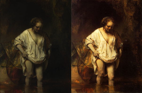
As such images go, the two could hardly have been more different. The official image (left) was of fairly low contrast and almost lacking in colour; the third-party image (right) appears to have undergone processing to increase both contrast and chroma. Having examined this painting myself when it was exhibited at the National Gallery a year ago, I felt that the image on the right was more true to its appearance, but that on the left was probably taken under much better-controlled conditions.
Results throughout this article are shown on polar charts; I will explain.
Although the RGB colour co-ordinate system is widely used on computers, a more useful and meaningful system in painting is that of Hue, Saturation, and Brightness (HSB), which relates directly to the properties of colour as perceived in hue, chroma/saturation, and lightness/brightness. The conventional measure of hue is the angle (in degrees) on a colour circle. Because this is an angle, you cannot use regular XY co-ordinates on a graph, but need to use a polar chart to represent, in this case, the combination of hue and chroma/saturation.
To plot a point representing a moderately saturated turquoise blue, with a hue value of 180˚ and 60% brightness, locate the hue angle at the left of the outermost circle, then follow in along the radius towards the centre until you reach the 60% circle. Alternatively (and more methodically), you could start at the radius going out to the right, at 0˚, and first sweep round anti-clockwise to reach 180˚, then move out along the radius until you reach the 60% value.
Thus in these polar charts, the distance from the centre of the circle is the measure of saturation. The further from the centre, the more saturated the colour is. The angle (measured anticlockwise from 3 o’clock) represents the hue, as shown in the colour wheel around the periphery.
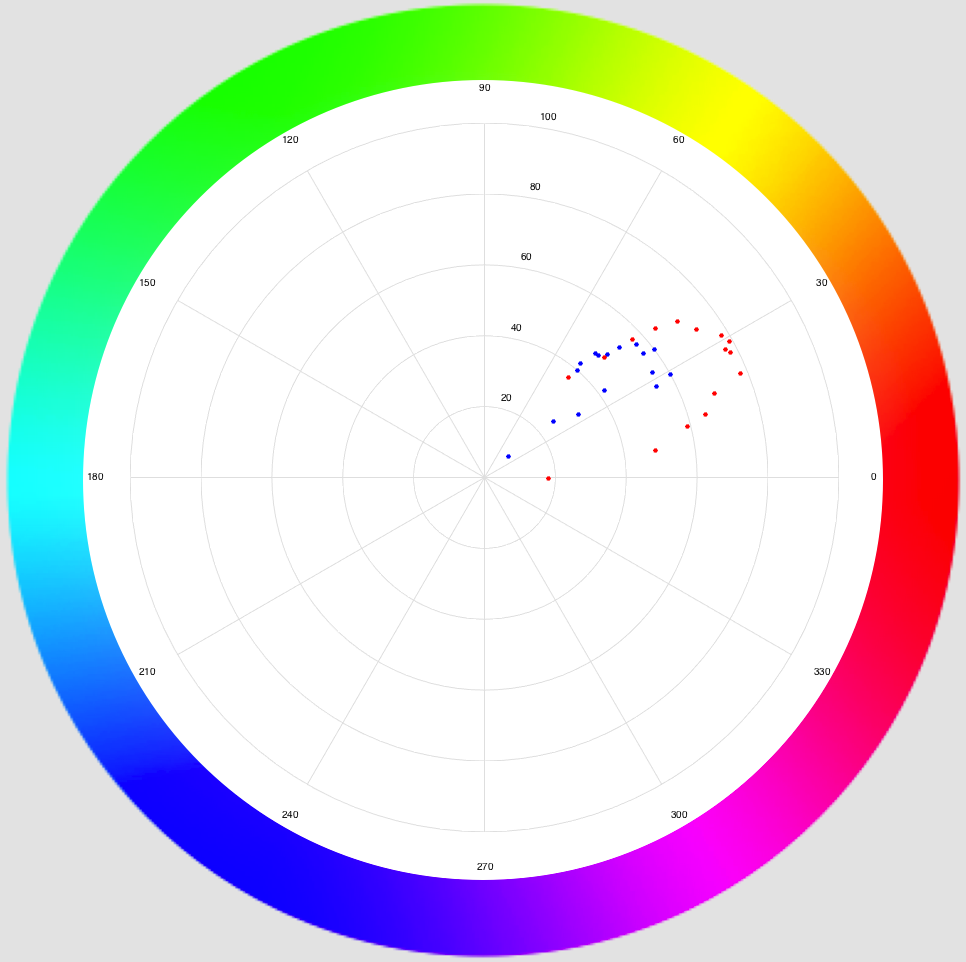 Plotting the 16 colours found in the palette of the two different images, there were of course quite substantial differences: in the polar chart above, the official National Gallery image resulted in the blue points, the third-party image in the red ones.
However both palettes are very similar, being confined to a narrow segment of the hue-chroma circle, and reaching maximum saturations of 60% (official) or 80% (third-party). So although image quality, processing, etc., will influence these polar charts, the underlying data should be unaffected despite such distortions.
I remain impressed at how similar the two clusters of points are on the polar chart, despite the images appearing very different indeed.
Are 16 colours sufficient?

To assess the adequacy of my somewhat arbitrary choice of 16 colours for analysis, I analysed the same image of Robert Delaunay’s Rythme no 1 (1938), which has a much wider range of colours of high saturation. In addition to the standard 16 colours extracted using Colour Palette from Image, I used Classic Colour Meter directly on the image to obtain 37 spot measurements which I judged as providing a more complete catalogue of its colours.
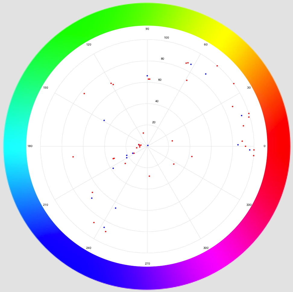 In the polar chart above the set of 16 colours is shown in blue, that of my 37 spot measurements in red. Inevitably there are disparities, and the larger set of measurements contains significant detail which is missed in the set of 16. However the general spread and range is similar between the red and blue methods.
But how have the paintings changed over time?
Another potential complication is that I am comparing paintings of greatly differing ages. Rembrandt’s paints have been resting on the canvas for 400 years, accumulating layers of varnish which have been periodically replaced. In contrast the paintings of the height of Impressionism are a mere 150 years old, and some have never been varnished.

One helpful comparison here is between paintings of similar age but contrasting style. I have chosen Bouguereau’s Nymphs and Satyr (1873), against Monet’s Bathers at la Grenouillère (1869) and Bordighera (1884).
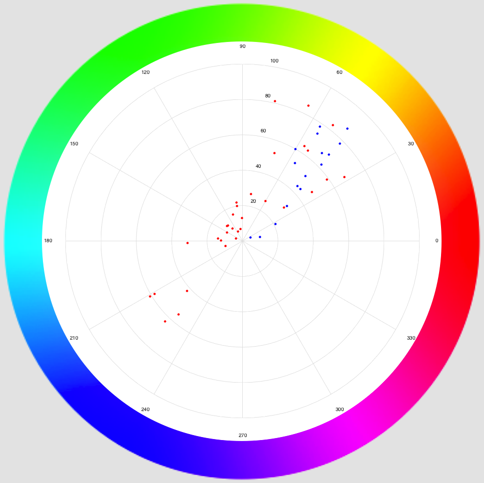 This polar chart shows how Bouguereau (blue points) constrained his palette to more traditional earth colours between 25˚ and 60˚, similar to Rembrandt, while Monet (red points) used colours that went far beyond, with high-saturation blues at around 220˚, a cluster of unsaturated greens between 90˚ and 180˚, and saturated yellow-greens between 60˚ and 80˚, which probably contained cadmium yellow.
It is clear that, whilst the presence of layers of dirt and varnish, and changes in the colour of certain pigments with age will affect this type of analysis, the similarity between Rembrandt’s and Bouguereau’s palettes and their difference from Monet’s suggests that ageing as such should not obscure the results significantly.
Reference
Artists’ Pigments. A Handbook of Their History and Characteristics, four volumes, various editors and many contributors, National Gallery of Art and Archetype Publications. 1986-2007.
Callen, A (2015) The Work of Art. Plein Air Painting and Artistic Identity in Nineteenth-Century France, Reaktion Books. (Esp. chapter 4.)
Januszczak W (ed.) (1980) Techniques of the World’s Great Painters, Phaidon Press.
