

Until the late nineteenth century there had been no question as to the colour of shadows, and they had been almost universally depicted as grey, indicating a reduction in light across the full spectrum.
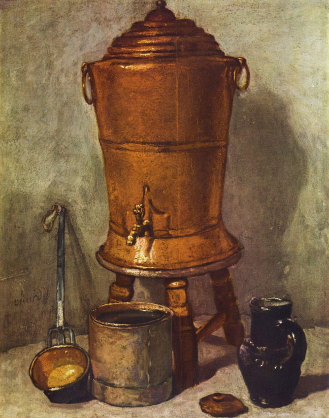
There had been occasional exceptions, including at least one of the still life paintings by specialist Jean-Baptiste-Siméon Chardin, in his Copper Water Tank from about 1734, with visible colouration in its cast shadows. In this case, it could be argued that the reflective surface of the copper tank was responsible, and the principle remained unchallenged.
This became a controversial topic for the new Impressionist movement, and since around 1870 there have been many painters who have asserted that cast shadows have distinct colours of their own.

One of the earliest paintings adopting this novel approach is Camille Pissarro’s Route de Versailles, Louveciennes, Winter Sun and Snow, from about 1870, where the shadows of these barren trees are distinctly blue as they cross the road and patches of snow on its verges.

Three years later, in Pissarro’s justly famous Hoar frost at Ennery, the rhythmic cast shadows of trees are here dark brown where they fall on the ploughed area, and blue-green further back where they fall on frost-covered grass. Nowhere do they appear merely grey.

In Pissarro’s later Saint-Charles, Éragny of 1891, areas of grass in the cast shadows of the trees are intensely green, while those in full light are a rich gold.
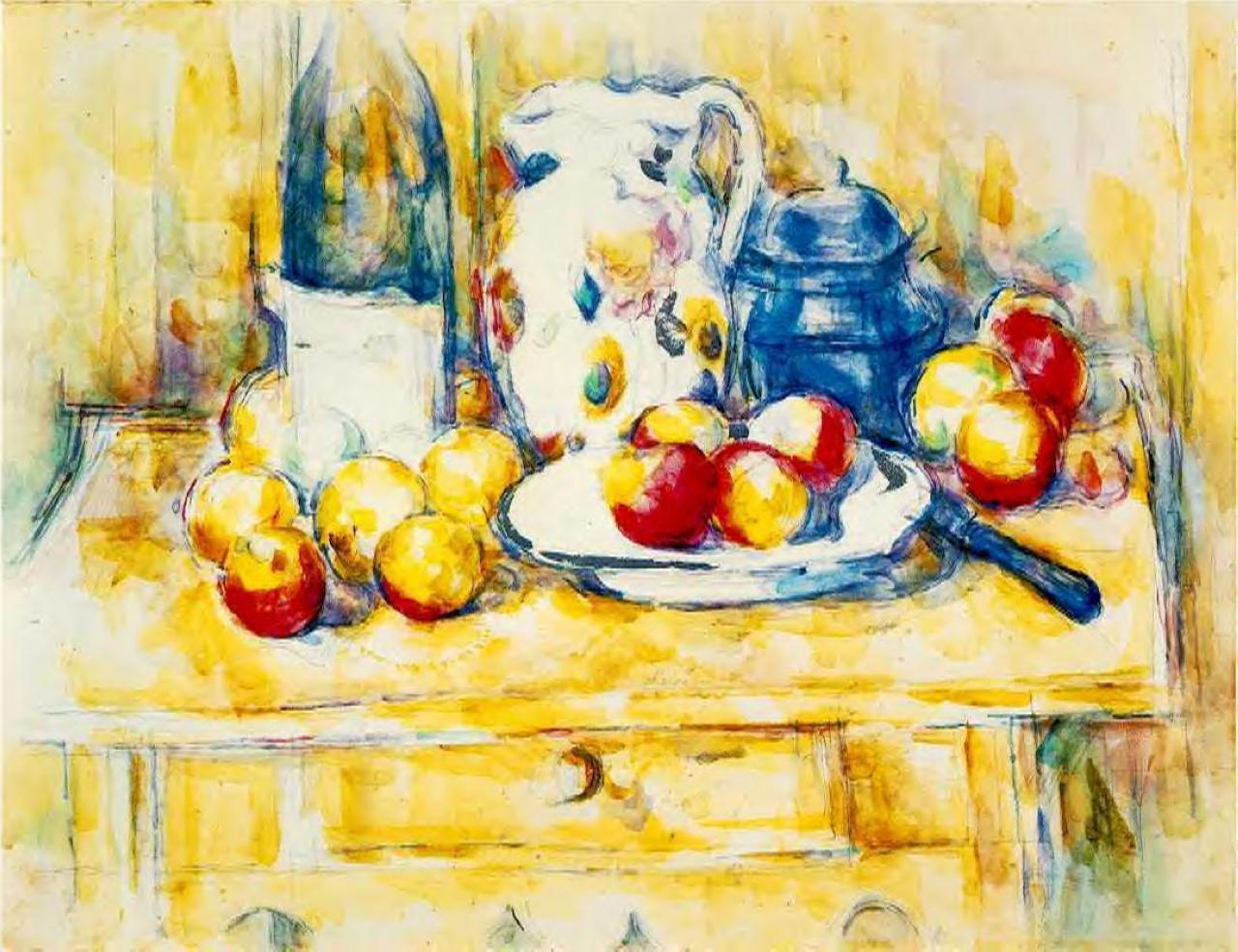
Paul Cézanne added colours to cast shadows in some of his paintings as well. In Still Life, from after 1900, shadowed areas of the tabletop, white bowl, and other parts have quite different colours.
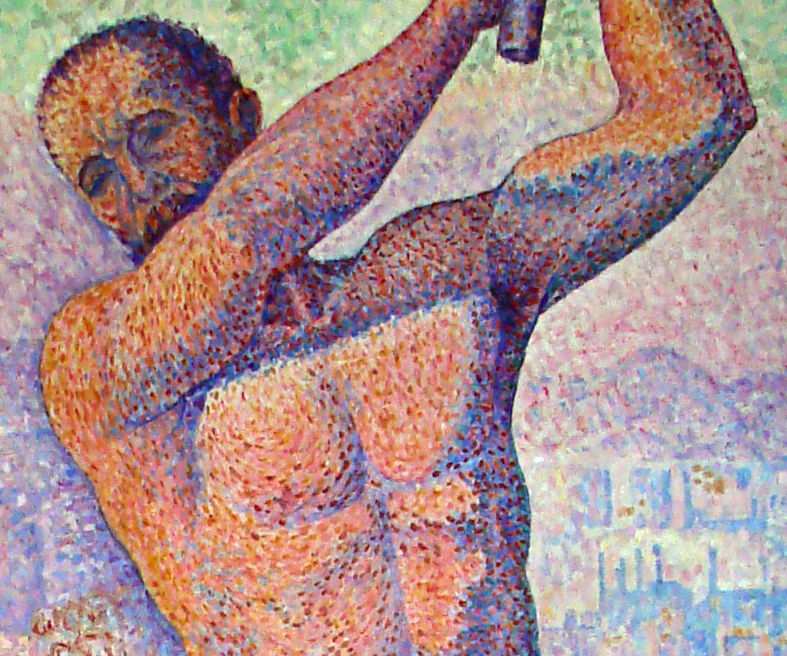
Colour is even more obvious in this detail of Paul Signac’s Demolisher, from 1897-99, ranging through purple, blue and deep red.
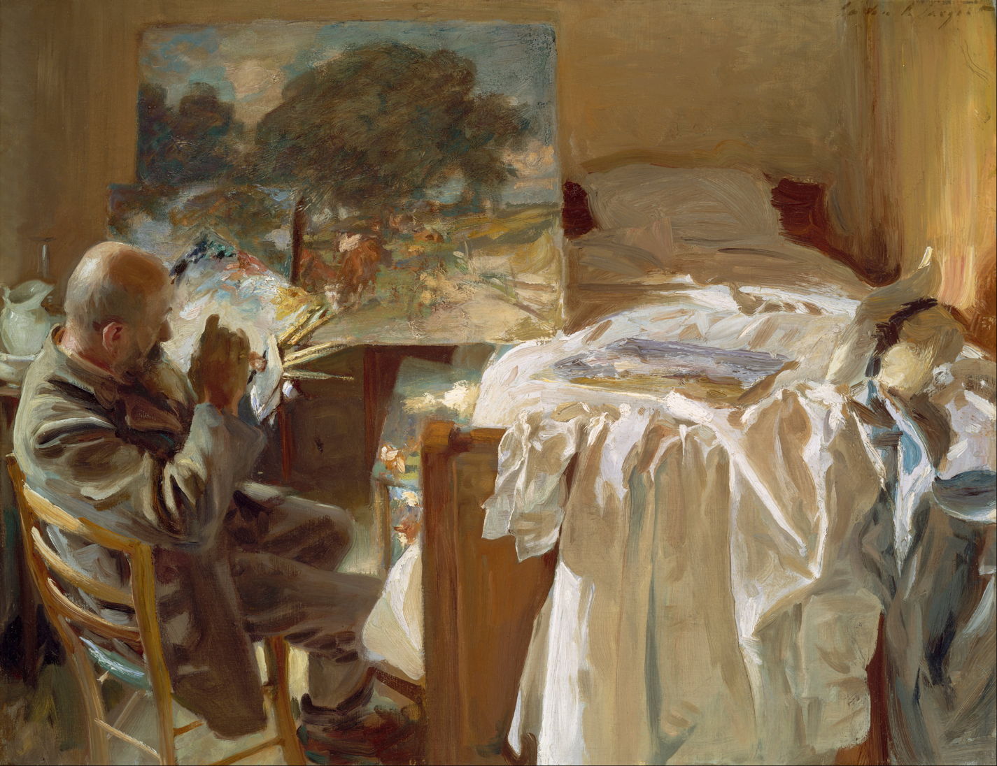
This change in approach isn’t confined to those who might have been Impressionists or Post-Impressionists: John Singer Sargent’s oil sketch of An Artist in His Studio from 1904 depicts the shadows in its crumpled sheets as being pale brown and blue, at the right.

There are no grey shadows at all in Sargent outstanding watercolour Simplon Pass: The Tease from 1911.
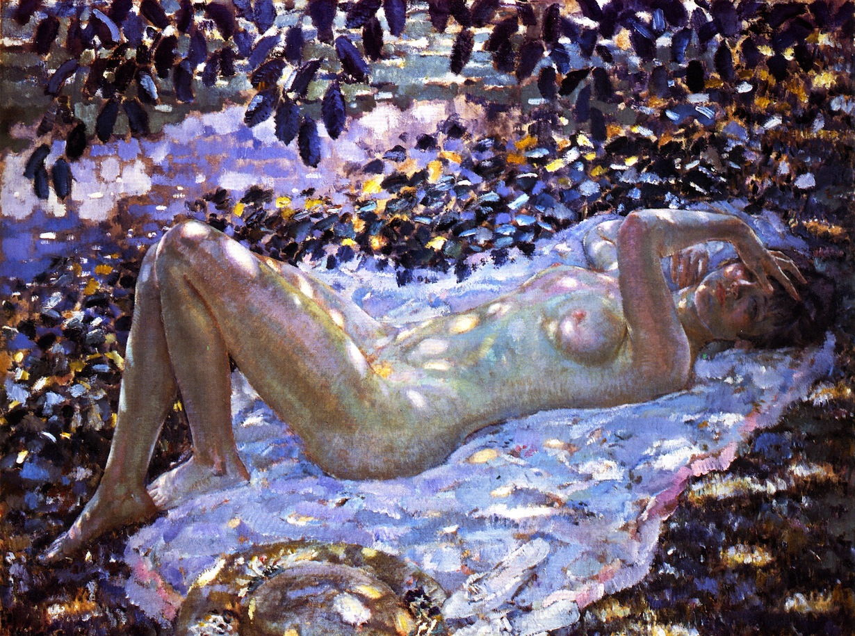
Frederick Carl Frieseke’s Nude in Dappled Sunlight from 1915 includes a gamut of different colours in the shadows cast on this nude, including browns, pink, golden yellow, blue-green, and purple.

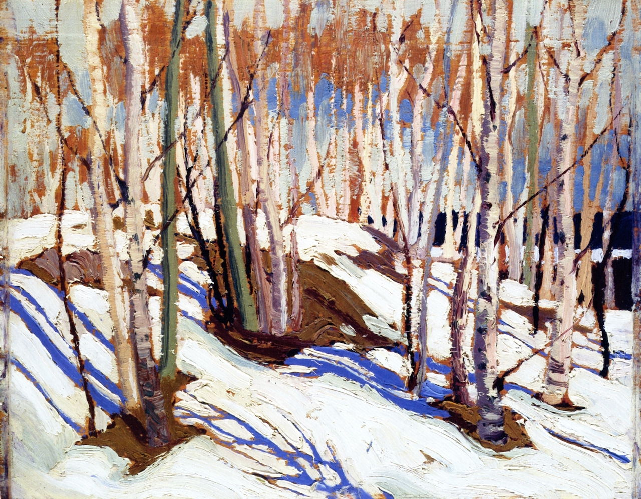
It was the Canadian landscape painter Tom Thomson who perhaps showed the most richly-coloured shadows, cast here on snow, seen in his Snow in October (1916-17), above, and Early Spring, Canoe Lake (1917), below.
It would be absurd to suggest that these differences result from changes that have occurred in the physical world, or that these artists had different visual systems, or powers of observation.
But there is one well-known psychophysical effect that must be borne in mind, that of colour constancy. If you view an object with a distinctive known colour, such as an apple or orange, under a wide range of different light, with different hues and intensities, the object tends to be perceived in most conditions as having the same colour as is perceived in white light. However, this perceptual constancy is lost in more extreme lighting conditions.
Perhaps shadows aren’t truly coloured at all, but their perception can be.

