
In just over a week the razzle of this year’s WWDC will have started, and we’ll see what macOS 27 has to offer those with Apple silicon Macs. This is unusually important, as it also marks the end of further improvements to the last version of macOS that can run on Intel Macs. For the many who still use Intel Macs with T2 chips it’s time to decide whether to see their remaining years out with Sequoia or Tahoe, and that in turn is limited by Tahoe’s flawed and dazzling interface. For those with Apple silicon Macs who have delayed upgrading to Tahoe, what we are shown in WWDC may also be decisive.
Has Tahoe recovered? Will macOS 27 be any more usable?
When macOS 26.0 was released it came with three sets of controls over its appearance, increasing to four in 26.1:
- Appearance mode, Light or Dark, in Appearance settings;
- Display variations to Reduce transparency or Increase contrast, in Accessibility settings;
- Icon & widget style, in Appearance settings;
- A Liquid Glass setting, Clear or Tinted, in Appearance settings, added in 26.1.
Although these offer many different combinations, I have examined some of their flaws in graphic detail. Here I compare the more obvious functional shortcomings in 26.0 with the new, improved 26.5.
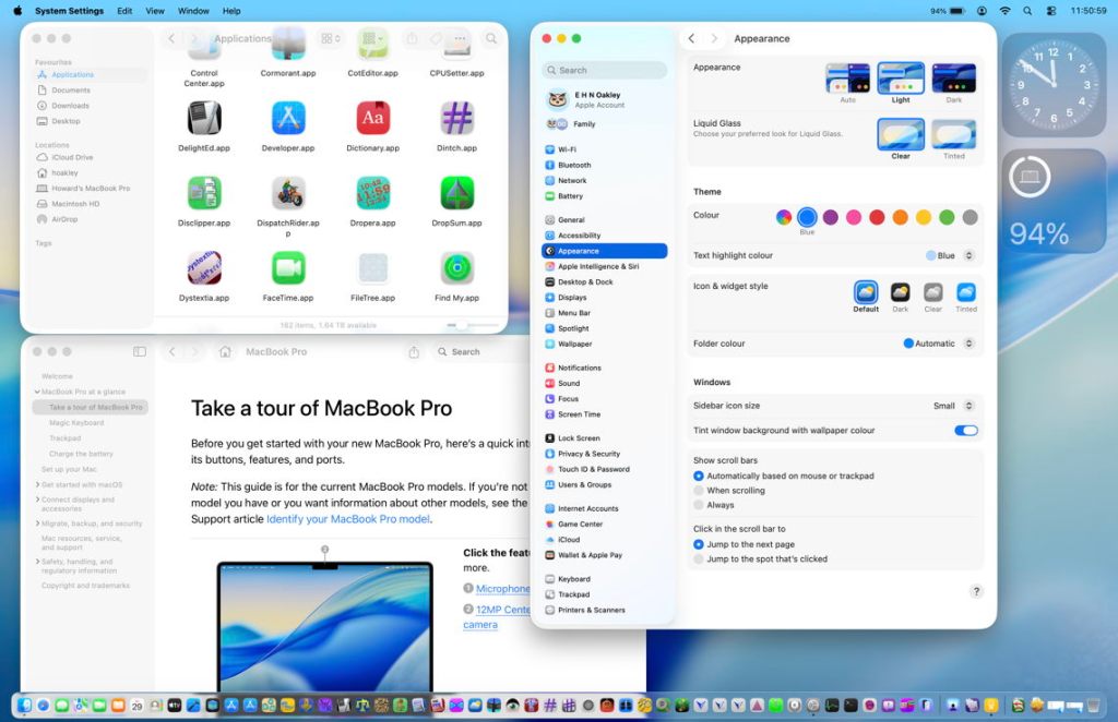
Light mode, default transparency, Liquid Glass clear

The overall appearance of macOS 26.0 above appears little changed in 26.5 below. In the Finder window at the upper left, app icons still deface the window title bar as much. Dock transparency is more obvious not because it has changed, but it demonstrates how that affects readability of app icons when they overlie dark objects in the window behind. Tinting from the wallpaper is more apparent in the upper part of System Settings’ navigation sidebar, and the new Liquid Glass setting added to Appearance settings is perhaps the most noticeable change.
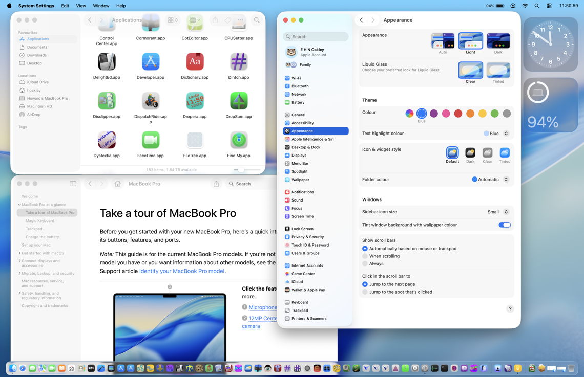
Light mode, default transparency, Liquid Glass tinted

With the new Liquid Glass control set to Tinted, no change is apparent in 26.1 above, or 26.5 below. I still can’t tell the difference this new control makes in general use.
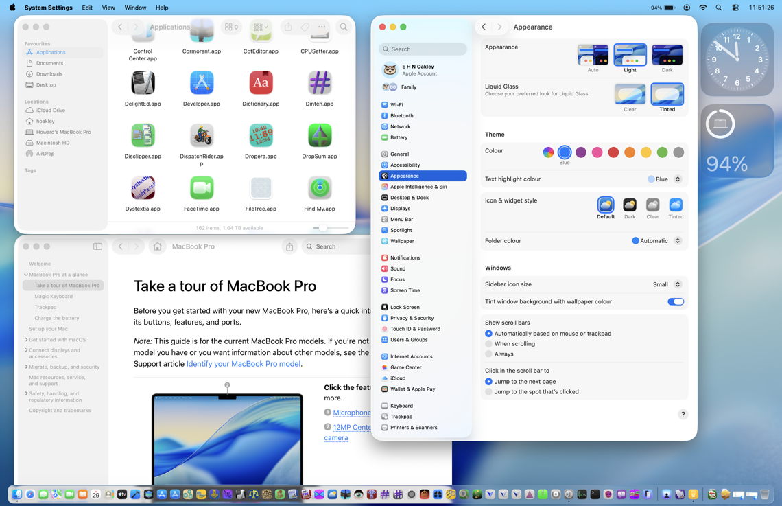
Light mode, reduced transparency, Liquid Glass clear

Above and below are light mode with Reduce transparency enabled in Accessibility settings. This disables all Liquid Glass effects, restoring the traditional opaque menu bar and Dock, and making the Finder’s toolbar more readable.
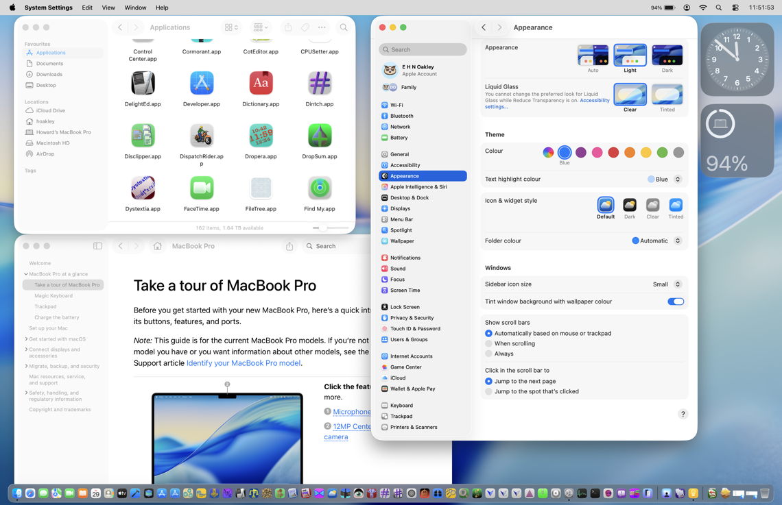
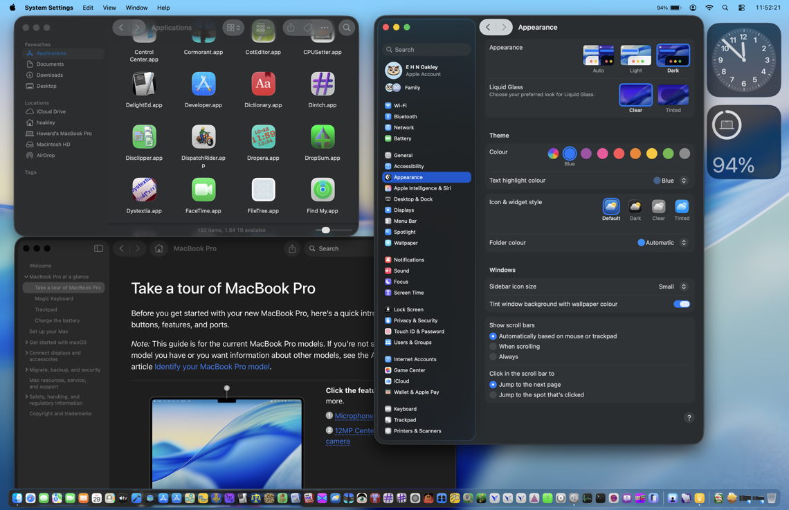
Dark mode, default transparency, Liquid Glass clear

Dark mode differs in its use of what appears a more opaque Dock when it overlies window content, but not over wallpaper.
Defaced controls in Light mode, default transparency, Liquid Glass clear

The most glaring visual faults in 26.0 were in the use of Liquid Glass transparency in the top of navigation sidebars and in toolbars and other controls in window title bars.
At the top left of System Settings in 26.0, underlying text defaces the search box to the point where both are unreadable and unusable without scrolling the list below. Apple has improved this in 26.5 (below) by softening the underlying text to a faint blur. The similar problem with window title bars remains, though, and is unaffected by the Liquid Glass tinting option.

Whiteout

Lack of contrast in controls results in a ‘whiteout’, where text entry boxes can’t be distinguished from the bleached background. This remains exactly the same in both 26.0 above, and 26.5 below.

Has Tahoe’s interface improved?
It’s now almost a year since we got our first glimpse of Tahoe at WWDC 2025, and eight months since it was released to the public. Despite widespread outcry and detailed criticism, it has changed remarkably little. If you were unconvinced of its merits last September, I see little here that’s likely to persuade you otherwise. The only remaining question is whether, in the razzle of WWDC, Apple will do anything substantial to relieve the dazzle on our displays. I fear I already know the answer.

