
Understanding so often proceeds from careful observation. Place your phone next to your Mac’s display and what do you notice first? How different they are in size and aspect ratio.
My iPhone’s display has a resolution of 1179 x 2556 pixels, giving it an aspect ratio of just under half (1179/2556 = 0.461). Although I do sometimes hold it in landscape orientation, I almost always use it in portrait mode. In contrast, my Macs have displays with resolutions of 5120 x 2880 for aspect ratios of almost 1.8, close to the inverse of my iPhone’s. Although I could mount them with their displays in portrait mode, I invariably use Mac displays in landscape.
The consequences on text display are just as obvious. At readable size, my iPhone is hard-pressed to display more than 8 words across its width, while my Mac displays can accommodate over 50 words in comfort, should I wish to expand a window that wide.
Yet, since its redesign in 2020, alerts on my Mac have been laid out as if they were being displayed on my iPhone. Is that not extraordinary?
When these bizarre vertical alerts first appeared in Big Sur, I thought they were a temporary aberration, a simple mistake that would soon be rectified. As we now enter yet another redesign rumoured for macOS 16, I wonder whether its aim of ‘increasing consistency’ is instead going to bring further thoughtless replication.
As I showed yesterday, for 36 years Mac OS had evolved through a series of designs for alerts based on windows with high aspect ratios matching display dimensions, and enabling coherent layout of text with left alignment (for languages written left to right) to improve their readability.

This is a stop alert from Mac OS 9.1 in 2001, with an aspect ratio of 2.3. Its 27 words are presented in four and a half lines, an average of 6 words/line, and entirely left-justified.

This more recent alert that Apple seems to have slipped past Big Sur’s redesign has an aspect ratio of 2.1, and contains 63 words in its 7 lines, for an average of 9 words/line, all of it left-justified.
In that redesign of 2020, all those 36 years of experience were ignored and alerts appeared in portrait mode with centred text.
This is a typical alert from macOS 13 Ventura a couple of years ago, with the new aspect ratio of 0.83, containing 31 words in 6 lines for an average of 5 words/line, all of it centred to leave the left margin jagged.
The traditional, tried and tested, thoroughly proven, alert was designed to accommodate the often substantial amounts of text required to fulfil its mission, presented in the most readable way. That means breaking it into lines of suitable length, with left justification. Length is important to avoid having to scan short fragments of 4-5 words in each line, and aligning their start to avoid requiring the reader to discover the beginning of each line before reading its words.
Since iOS alerts have been almost replicated in macOS, Apple has also changed its expectations of the text they should contain. Previous guidance states that informative text in an alert “provides a fuller description of the situation, its consequences, and ways to get out of it.” “Do not leave informative text out. What you think of as an intuitive alert message might be far from intuitive to your users. Use informative text to reword and expand on the alert message text.”
Current guidelines are discouraging: “include informative text only if it adds value. If you need to add an informative message, keep it as short as possible”. Maybe that was deemed necessary to cope with the flaws of the new vertical alert.
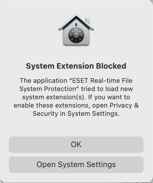
Apple has always discouraged the use of alerts unless they’re “absolutely necessary’, but over the last few years since macOS Mojave their most frequent source hasn’t been third-party apps, but macOS itself, primarily its privacy and security protection. These have reached the stage where first launch of some third-party apps results in a bewildering torrent of different alerts, to authorise system extensions and negotiate access to protected services. Apple’s own apps are seldom marred by such salvos, though, as somehow they appear to have been exempted from those rules.
As privacy protection has become more invasive, so these alerts have multiplied, with at least one now requiring periodic renewal, and yet more to come in macOS 16. This deteriorating user experience has surely demonstrated that alerts aren’t the best way to present privacy settings, and confirmed that alerts should only be used when “absolutely necessary”, and almost never for those purposes.

This example, taken from beta-testing in 2023, illustrates how little Apple respects its own Human Interface Guidelines. This was an attempt to drive users to warn third-party developers that their apps used features in macOS (Apple Type Services, ATS and ATSUI) that were due to be removed in the near future. Fortunately, it was so ill-conceived that in this case it even failed to identify the app responsible.
I’m all for better consistency and integration, but they should enhance not corrode. To see why, just hold your phone next to your Mac’s display and look carefully at their differences.
