
Five years after its introduction, Dark Mode is still puzzling in places. In this article I look at how changing appearance mode can change the rendering of colour, and consider whether the current version of TextEdit (1.19) and Sonoma’s QuickLook thumbnails follow Apple’s rules.
This arises because relative colours are important to human vision. When the background colour of the interface is black, rather than white, adjustments are often needed to give the impression of similar colours in the interface and its controls. But those same adjustments mustn’t extend to content such as images. As Apple makes clear in its developer article: “For the user’s content, always preserve colors that the user explicitly chooses. For example, a painting app should not try to change colors that the user applies to their canvas. Use adaptable colors primarily in the views and controls for your app’s chrome.”
I first complained here about TextEdit’s problems with rendering colour in Dark Mode in version 1.14, nearly five years ago.
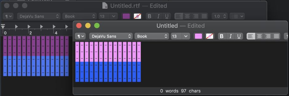
This shows two overlapping windows, the underneath being TextEdit, and the overlying one from my rich text editor DelightEd. The darker blocks of symbols on the left (in TextEdit) are as shown when coloured in that app. They were then copied from TextEdit and pasted into DelightEd, where they have magically become much lighter. Those lighter colours are the same as the colours displayed when TextEdit’s Dark Background is turned off.
Test methods
To distinguish between adaptable colours and those in user content, I created two different RTF files, one containing only defined system colours with their light and dark mode variants, and the other containing only user-defined colours. These are easy to distinguish in the RTF source code, according to their expandedcolortbl. Once created, I locked those files to ensure that no app would try to rewrite their rich text.
To create the RTF containing only system colours, I obtained a log extract from Ulbow of a message written in the log using blowhole. When Ulbow colours its log extracts, it uses only defined system colours, including the bi-modal textColor which can be rendered in black or white depending on appearance mode, and three primary system colours such as systemRedColor. Those are written out to the expandedcolortbl in the RTF files written by Ulbow thus:
{\colortbl;\red255\green255\blue255;\red0\green0\blue0;\red41\green199\blue50;\red10\green96\blue255;\red252\green33\blue37;}

{\*\expandedcolortbl;;

\cssrgb\c0\c0\c0\cname textColor;

\cssrgb\c15686\c80392\c25490\cname systemGreenColor;

\cssrgb\c0\c47843\c100000\cname systemBlueColor;

\cssrgb\c100000\c23137\c18824\cname systemRedColor;}
I used TextEdit 1.19 (403) to create the other RTF, using its standard controls to set two filled circle characters to a colour close to that of systemRedColor. That was set simply in the generated expandedcolortbl, where there’s no reference to named bi-modal or system colours at all:
{\colortbl;\red255\green255\blue255;\red230\green0\blue10;}

{\*\expandedcolortbl;;

\cssrgb\c93267\c7169\c1953;}
Results
My expectation was that all apps, including TextEdit, and QuickLook thumbnails, would adjust the colour rendering of system colours in the first RTF, but leave the user-defined colour in the second RTF unchanged regardless of appearance mode, in accordance with Apple’s instructions to developers.
The rendering of system colours changed slightly in all apps according to the appearance mode. Measured on PNG screenshots (which match what I observed on the display), and given as (R, G, B) values of 0-255, this typically amounted to (233, 85, 70) in light mode, and (224, 82, 67) in dark mode, for systemRedColor. There were similar small differences seen in the other two primary system colours used.

Seen in my app DelightEd, differences between light and dark mode are barely perceptible, and support Apple’s contention that such small adjustments look right to the observer.
Rendering of the user-defined colour remained unchanged across all apps except TextEdit, and QuickLook thumbnails, where the difference between light and dark modes was much greater than those seen in systemRedColor. All other apps, and TextEdit/QuickLook in light mode, rendered the custom red as (216, 51, 34), but TextEdit/QuickLook changed that to (222, 82, 67) in dark mode.

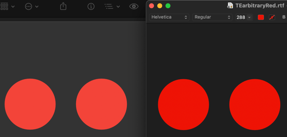
As rendered in DelightEd, this arbitrary red is identical in both modes, as confirmed by measurement on this screenshot.

In dark mode, TextEdit (left) renders the red differently from DelightEd (right).
The same difference is apparent in dark mode in the QuickLook thumbnail (left), compared with DelightEd (right).
Conclusion
In their current releases, TextEdit and QuickLook thumbnails change user-selected colours when used in dark mode. This is not only visually misleading, but breaks Apple’s own instructions. There appears to be no reason for rendering user-selected colours differently in the two appearance modes.
