

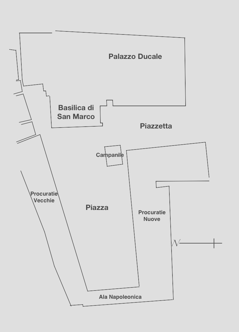
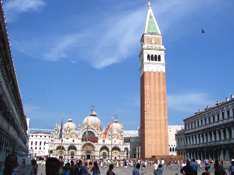
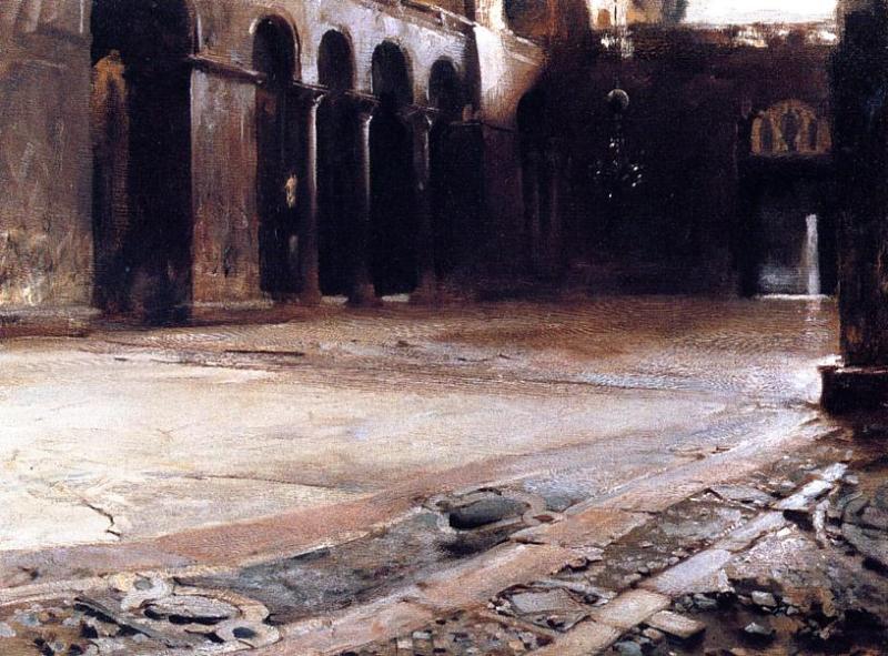
Today we’re back in Piazza San Marco in Venice, to see it in paintings from high Impressionism in 1881 to those of the years before the First World War. To remind you of its geography, here’s the plan and a more recent photograph.
Paintings 1881-1908

The first of several Impressionists to visit Venice, Pierre-Auguste Renoir chose a view of the Piazzetta from over the water, further back than Turner’s, in his Doge’s Palace, Venice from 1881. The tops of the roofs follow the horizontal centreline, with the Campanile reaching well above that, and various boats below the band of buildings.
Renoir’s canvas has an aspect ratio of 1.24:1, considerably more square than the golden ratio, and far from the panoramic proportions that might be expected for such a shallow view. This left him with substantial bands of largely blue sky and vacant water, above and below the buildings and boats.
Although this painting makes visible abundant brushstrokes and appears very loose in its facture, Renoir has included a lot of fine detail, such as the individual arches and columns for the whole of the front of the Doge’s Palace, even some of the tracery in the windows above. This would have required multiple sessions in front of the motif, or more probably several days spent in a studio.
Colours are bright, and broad areas such as the sky and water made up from strokes of unmixed colours, to give them a coarse chromatic texture which is typical of Renoir’s style at the time. All these effects contribute to the overall impression of spontaneity and speed of execution.

The American Impressionist John Henry Twachtman was one of several great American landscape painters who visited Venice, but the only one for whom I have been able to locate a suitable view. His watercolour Venice (1881) was clearly painted quickly en plein air, and shows a view not dissimilar in nature to Turner’s Venice from the Giudecca.
The lower half of his paper (in the ‘portrait’ orientation) contains only reflections; the upper half is a view from the water placing the Campanile slightly to the right of centre, little higher than neighbouring church domes. Superimposed on that waterfront are passing boats, their sails and rigging complicating the buildings behind. His palette is also limited to earth colours, with grey-blue on the water below.

The Russian Impressionist Valentin Serov painted a study of Saint Mark’s Square in Venice in 1887, probably en plein air. His composition is the tightest so far, showing the Basilica, the foot of the Campanile, and that south-eastern corner of the Piazza, a closer crop than even Bonington’s.
His brushwork is loose and sketchy in places, as would be expected of a study, and Serov mainly uses earth colours apart from a little blue in the sky. It’s not clear whether he made an underdrawing, but the five arches forming the front of the Basilica are carefully formed and regular, and the flagpoles in front of them well marked out. Staffage is light, just a few figures depicted by simple marks. He achieves a lightness with his oils which could be mistaken for watercolour.

Franz Richard Unterberger was a landscape painter from the Austrian Tirol who produced many fine views of Venice in a more traditional Romantic style. Although I’ve been unable to locate any of the Piazza, his Rio San Barnaba, Venice (date not known, but probably around 1895) gives a reasonable account of his approach. The motif is not far from the Piazza, but the tower shown isn’t the Campanile.
Although not as highly finished as the classical works of Canaletto, Unterberger puts great detail into buildings, figures, and other staffage, even down to painting the ties and walking sticks of figures. However, fine brushstrokes are distinct over the faces of buildings and in the water, and the clouds display marks more clearly. His facture is thus comparable to that in Guardi’s later and looser rendering of the Piazza.
His palette is also more conservative than most of the other nineteenth century painters included here, consisting largely of earth colours, with a few small patches of brighter red. Blues and greens are generally low in chroma and not used for contrast. This is also one of the few paintings shown here looking directly into the sun, contre jour, which would have been difficult to achieve in front of the motif, given that the sun is also high in the sky and intense. All the indications are that this work was painted in the studio.
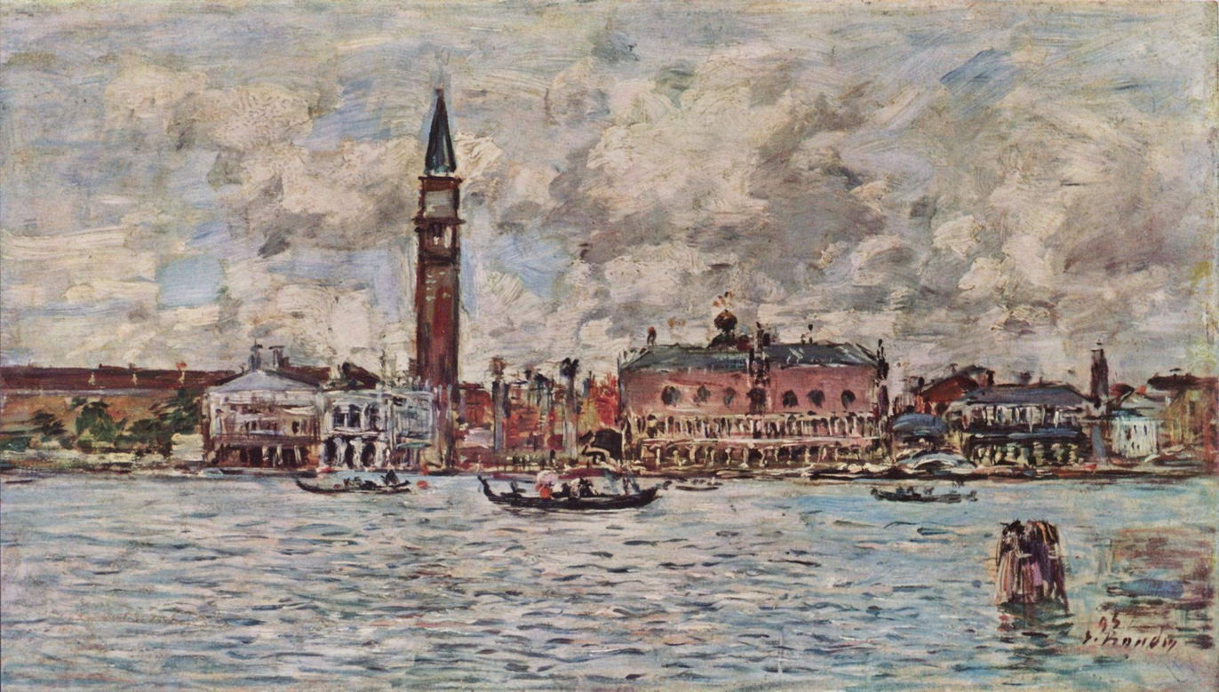
Together with Jongkind, Eugène Boudin had a special influence over the early development of Impressionism, and took part in the first Impressionist exhibition in 1873, while continuing to exhibit in the Salons. In the 1890s, when his style had become much looser than it was when he was guiding Monet and others in the 1850s, he visited Venice regularly.
His San Marco Square in Venice from 1895 adopts the same view and composition as Renoir’s earlier Doge’s Palace, Venice (1881), although he uses a panoramic canvas with an aspect ratio of 1.76:1, higher than the golden ratio. This ensures that less of the vertical extent of the painting is occupied by uninterrupted sky or water, although the Campanile doesn’t reach to the top of the canvas, and the horizontal centreline is made up of the tops of the roofs, just as in the Renoir.
Boudin’s version of this view is more roughly-hewn in its marks, but surprisingly low in chroma. The day is more cloudy, and those clouds crowd the sky with coarse patches of white and grey. Although considerable detail is shown in the buildings along the waterfront, arches and columns are irregular and appear hurried in execution. A few boats are shown in front of the buildings, and a piled structure is at the lower right. The overall impression is of rapid application of paint, and the work may well have been completed in a single session en plein air.
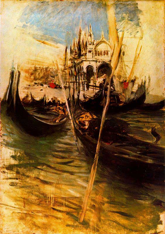
The Italian Impressionist Giovanni Boldini was a former member of the Macchiaioli, but by the end of the nineteenth century had become a popular portraitist. His San Marco in Venice from 1895 shows an unusual view looking down the Piazzetta from the water to the south, with the ornate frontage of the Basilica. Its close cropping omits any reference to the dominating Campanile that would have been off-picture to the left, or the Doge’s Palace, off-picture to the right.
His tight composition places the centre of view just below the front of the Basilica, drawn in by the forms of the gondolas in the foreground. The water’s edge makes a horizontal line just above the centre of the painting, also drawing the eye in to the centre of view.
Only the central Basilica and gondolas are fully formed, and towards the edges of the work the paint is applied sparsely and bare ground is visible. Apart from two small patches of red, and a blue window of sky, this painting uses earth colours, mainly at the tonal extremes. Brush marks are left highly visible, and in some parts dilute paint has been allowed to form runs. The whole painting appears to have been executed as a brief sketch, with bravura brushwork and painterly panache.
John Singer Sargent was fascinated by Venice, where he mostly painted brilliant watercolour sketches. Although these and finished oil paintings are numerous, I’ve been unable to locate an accessible image in which he painted the entirety of the Piazza. His Pavement of Saint Mark’s (1898) may appear at first to be a puzzling view to paint, but reflects the artist’s eye for unusual details. The cracked and worn pavement is rendered in almost hyperrealistic detail.

The American Post-Impressionist Maurice Prendergast also painted many watercolours of Venice in the final years of the nineteenth century. The Piazza of Saint Mark’s, Venice (c 1898-9) shows a small scene in the north-east corner of the Piazza, with the facade of the north side in the background, and the Basilica on the right.
Another original view and composition, this shows almost no sky at all, and the short shadows suggest that it’s set in the early afternoon. The Piazza is packed with people, most shown taking shelter under brightly coloured parasols. His rendering of the buildings is moderately detailed, but lacks Sargent’s bravura. The flags, parasols and clothing add patches of high chroma to the earth-coloured walls and pavement.
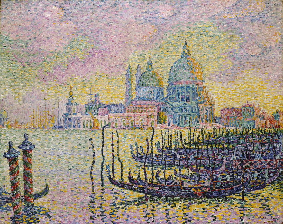
In the early years of the twentieth century, Venice became even more popular as a location for artists. Among its visitors was the Neo-Impressionist Paul Signac, who painted Le Grand Canal, Venice in 1905. Its composition is fairly conventional, with the band of buildings straddling the horizontal centreline, and a few small boats in front along the waterline. A larger cluster of gondolas is arranged along a diagonal which fills most of the lower right of the canvas, and there are a couple of decorated piles at the bottom left, to provide some balance.
As was usual in Neo-Impressionism, the paint surface is composed of small rectangular tiles of colour, arranged to encourage optical mixing. Set at dusk or dawn, the right side of the buildings are coloured gold in the rich light. Within the limitations imposed by the facture, considerable detail is shown in the buildings and boats.

Sargent’s bravura watercolour sketch Grand Canal, Venice (1907) is far from the Piazza, but gives an idea as to his approach and style. It’s composed of a sparse collection of brushstrokes of watercolour which assemble into a detailed view. He sees Venice from the level of a gondola, the bows of which are also shown. His palette for these sketches is generally centred on earth colours for the buildings, with blue for the sky, water, and usually the shadows too.
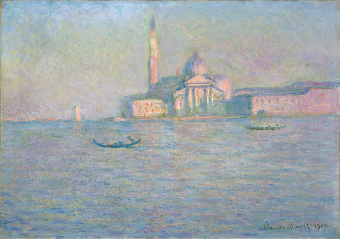
Claude Monet visited Venice with his wife Alice for two months of painting from 1 October 1908, before he started to have problems with cataracts. Among the 37 paintings he started there The Church of San Giorgio Maggiore, Venice (1908) shows the famous facade of that church with its tower (not the Campanile in the Piazza San Marco) from the Grand Hotel Britannia. He painted six versions of this view, each illuminated by warm afternoon sunlight, and with different patterns of passing gondolas.
Each is composed with the line of the waterfront at the horizontal centre of the canvas, so the church and its tower occupy much of the upper half, and the water the whole of the lower. Sky and water are built from multiple orientated brushstrokes of different colours, resulting in oddly indeterminate hues. There’s no detail, and the buildings are seen as if in soft focus.
Although these paintings were started en plein air, and have the appearance of brisk sketches, Monet spent many months adjusting and refining them when back in Giverny. They eventually went on public exhibition in 1912, the year after Alice had died.

The closest that Monet came to painting the Piazza San Marco was in six similar views of the Palazzo Ducale (Doge’s Palace) with a glimpse into the Piazzetta, and of the Campanile, none of which is currently accessible. However he did paint a different version of a view of the Church of San Giorgio Maggiore, San Giorgio Maggiore at Dusk (1908). This time, the church is backlit by the sunset, and seen together with its tower in silhouette.
Late in Odilon Redon’s long career, he painted Venetian Landscape, or Fishing District in Venice (c 1908). Far removed from the Piazza, this shows an interesting intermediate between late Impressionism and more modernist movements in the twentieth century, with their trend towards the abstract.
I hope you enjoyed those four centuries of paintings of the same place.
