
Painters have long been concerned over their materials, including changes occurring in the colour of some pigments over time. Among the first to write about these was Cennino Cennini, in about 1400, who gave lengthy advice on problems well known at that time. Because painting was centred on workshops and was administered by exclusive guilds, the empirical secrets of good craftsmanship were passed on orally, from master to apprentice, and few attempts were made to compile and promulgate good practice.
Madder lake
One of the early challenges in the history of art materials was the transformation of vegetable dyes into pigments, often by a process known as laking. The need was simple: take a vegetable dye such as the crimson derived from madder plants, and fix it into pigment particles which can be dispersed in gum solution (watercolour) or a drying oil medium.
Before the Renaissance, someone discovered that aluminium salts would combine with the colourants in madder extract and make a pigment suitable for fine art painting: madder lake. This became widely used, and generally sought-after, although it isn’t lightfast, even when protected in an oil paint film, and can fade rapidly, sometimes in months or just a few years.

Niklaus Manuel’s Demons Tormenting St. Anthony, on the left wing outside from the Antonius Altar of 1520, features several different reds, at least one of which contains madder lake as its main pigment. It also appears that some of those reds have faded: Saint Anthony’s cloak looks pale and anaemic, for example.
Smalt
It’s not known when it was discovered that blue-coloured glass could be ground into a powder and used as a pigment named smalt. From the late middle ages onwards, smalt has been one of the mainstay blues, alongside more costly ultramarine. With many of its particles being transparent glass, it has low covering power, and its one vice is that it can discolour, becoming paler and losing chroma over time.
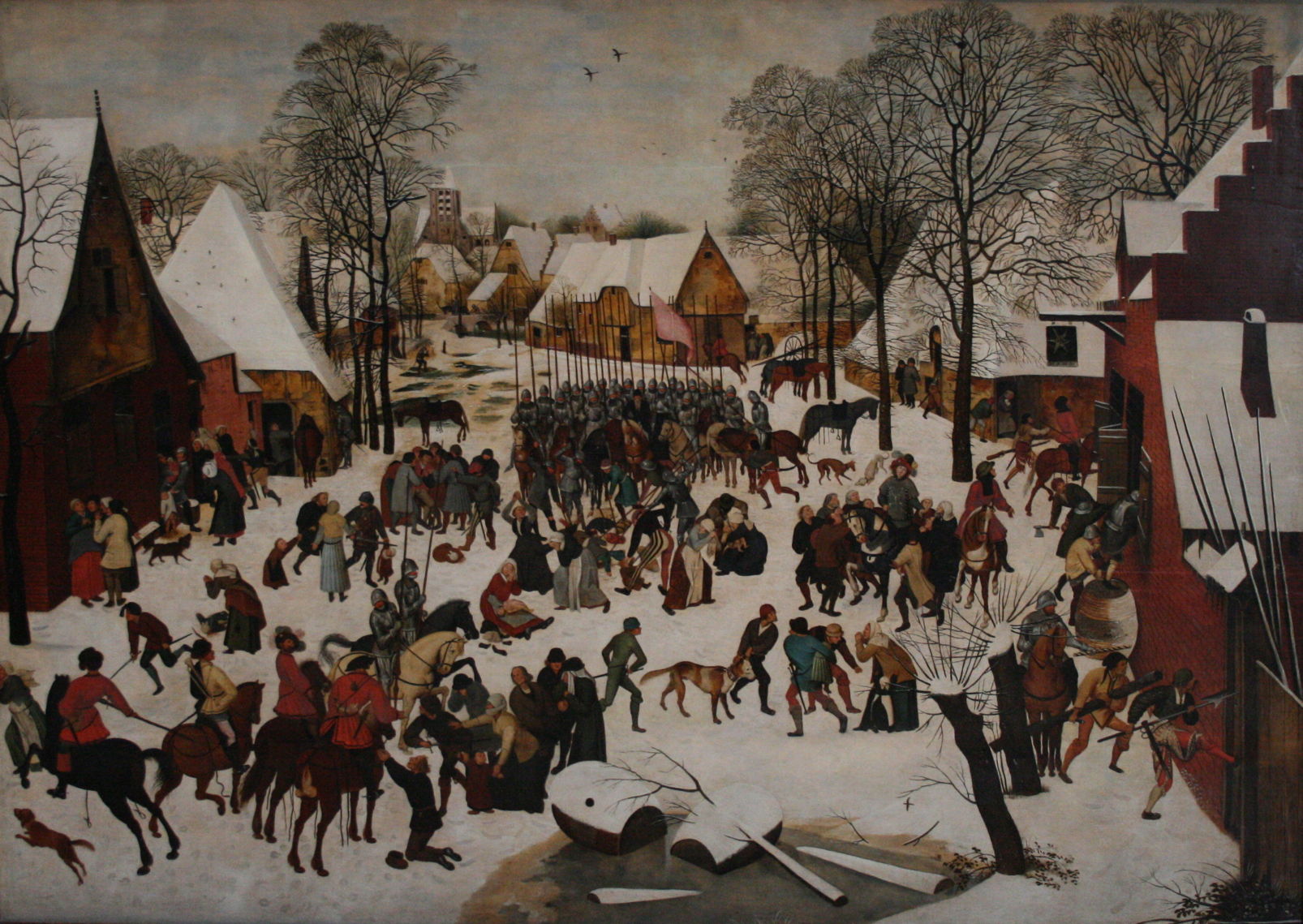
Pieter Brueghel the Younger’s Massacre of the Innocents from about 1615 is a victim of this discolouration, where the smalt has faded in its sky, leaving only vague blue patches.
Indigo
Prior to about 1625, the use of indigo in oil painting was relatively limited, and principally in underlayers to model the folds of fabrics. Then in about 1627, Frans Hals and other Netherlandish artists started using it more generally, and in the upper parts of the paint layer, where it was more exposed to light and atmospheric pollutants. As demand for indigo rose, it’s probable that pigment manufacture became less diligent, and supplies may have been adulterated with woad, which is notoriously fugitive.

In Abraham Bloemaert’s The Adoration of the Magi from 1624, the cloak of the Virgin Mary appears to use two different blues, with its lower passages painted in the duller hue of indigo, which has faded. The dullest areas are those which had the thinnest ultramarine glazes applied, much of which have now abraded away during subsequent cleaning of the painting. The unprotected indigo has therefore suffered sufficient exposure to fade, as well as losing its rich glazes.

Hendrik Gerritsz Pot used the novel technique of putting indigo layers over underpainting, without the protection of glazes, in his Portrait of the St Adrian Civic Guard, Haarlem from 1630. As a result of fading of the indigo, what were originally bright blue sashes have become almost white, as shown in the detail below.


Frans Hals’ Officers and Sergeants of the St Adrian Civic Guard (1633) not only shows the same group of men, but has suffered exactly the same fate with their once blue sashes.

In Jan Miense Molenaer’s humorous depiction of the sense of Smell (1637), indigo with lead white were used for the skirt of the mother cleaning her baby. This has suffered severe fading, the extent of which can be judged by the much darker blue seen at the edge of the panel, where the frame has shielded the pigment from light.

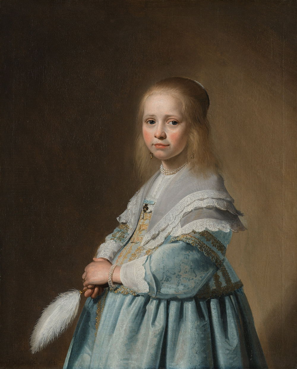
Johannes Cornelisz Verspronck’s Portrait of a Girl Dressed in Blue (1641) now shows the dress as a pale and anaemic blue; judging by the thin rim of unfaded paint at the lower edge (unfortunately cropped from this image), its blue was originally intense. The artist didn’t apply any protective glazes over the indigo blue of the dress.

The oddly-coloured tablecloth in Verspronck’s Regentesses of the St. Elisabeth’s Hospital (1641) was originally a rich green. Unprotected indigo blue has faded from its surface, leaving much of it an odd yellow ochre hue.
Investigation
When artists’ colourmen started supplying paint to painters in their studios during the eighteenth and nineteenth centuries, they took the permanence of pigments more seriously, but still didn’t attempt any more systematic studies. What prompted those was the rise of national collections of art, in particular the bequest by JMW Turner of a great many of his works to the British nation. This coincided with the involvement of chemists and other scientists in what has now become the conservation of art.
In Britain, this reached a peak in the 1880s, when there were great concerns over the permanence of Turner’s watercolours. As a result, Walter Russell and William de W Abney were commissioned to investigate, and in 1888 their report was brought before the Houses of Parliament, as it was considered of such great importance to the nation.
Russell and Abney exposed samples of watercolour paints using specific pigments to prolonged periods of full sunlight and daylight which was estimated to be equivalent to nearly five hundred years of exposure in one of the public galleries. Among the least stable of the pigments were carmine, crimson lake, purple madder, scarlet lake, and indigo. Some pigments showed no discernible change, including Prussian blue and ultramarine.
This sparked intense debate, and the new manufacturers of artists’ paints such as Winsor & Newton started to evaluate lightfastness more systematically. The first standard for lightfastness of artists’ paints was set in Germany in 1907, but unfortunately used alizarin crimson as its baseline, a pigment derived from some of those already shown by Russell and Abney to be fugitive. It wasn’t until 1984 that the American Society for Testing and Materials (ASTM) finally published a set of standards which have since become used internationally.
Yet some painters continue to choose to use pigments and paints known to fade or discolour over time.
