

Painters match colours by eye, but computers and printers need a mechanism to ensure that the colours they display are as faithful as possible. To give you an idea of how badly this can go wrong, here are two different images of the same painting by Arturo Michelena of Charlotte Corday (1889), both available from Wikimedia Commons.

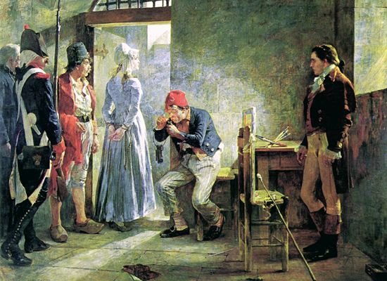
Those are clearly the same original painting, but their tone and colours are quite different.
Even when digital images have been taken carefully and appear true to the original, the biggest problem when using computers to handle colour is that their peripherals, displays and printers in particular, can only handle a limited range of colours. Although it uses colour coordinates which are rather more complex than the RGB which you’re used to, this is well illustrated in the diagram below.

Most of us are capable of perceiving all the colours shown in the coloured area. However, the small triangle within that shows the extent of the colours which can be displayed on a specific device, its colour gamut.
Let’s assume we have a perfect camera which captures colours from nature completely faithfully, and whose gamut is human, right out to the edges of the outer rounded triangle. When you take a photo with that camera and import it to your Mac, that vast range of different colours will be converted, pixel by pixel, into the Mac’s internal representation for colour.
Long ago, in the early days of computer colour systems, each pixel was represented by a single byte for the red value, one for the green, and one for the blue: 24 bits in all. When you looked at what should have been a smooth colour gradient, it was easy to see the step changes in colour, which arose because of the constrained representation.
macOS now normally uses three channels for the colour of each pixel, each represented as a floating-point number between 0.0 and 1.0. So the Mac’s internal colour format ensures remarkably faithful representation for all the colours captured by this perfect camera. But when we view the image on our Mac’s display, that can only show those colours within the smaller triangle, its gamut.
The problem colour management is trying to solve is how best to achieve that: getting an image to look right even when it’s displayed on or output to a device with a relatively limited gamut, by the process of colour rendering.

This screenshot from the specialist colour tool CT&A from BabelColor shows how one colour might be rendered. At the top centre is the standard CIE colour chart with two colourspaces marked out. The inner is ColorMatch, and the outer Wide Gamut, which doesn’t quite fill the colourspace, but comes close.
The superimposed circles in the middle are the whitepoints for those gamuts, which here coincide. Suppose our perfect camera recorded some pixels in an image which are very strong pink, at a point represented by the small green square, and that our display, perhaps, can only cope with the ColorMatch gamut, in the inner triangle.
For macOS to convert that pink to one which the display can show, the green square is going to be mapped to the orange square (on the lower side of the smaller triangle). That’s rendering the original colour to one which can be output by the display.
The large rectangles of colour at the bottom of the window show (on the left) the original colour before rendering, and (on the right) the rendered colour. These are also shown in the samples on the right of the window, where you can see that the pinks are very close, but not quite the same.
So the first task of colour rendering is to convert colours which are outside the output gamut to colours which are within that gamut.
There are several different ways of doing that, known as rendering intents, which I’ll mention below. However, rendering doesn’t just affect colours which are outside the output gamut. If it just squished all those onto the edge of the output gamut and didn’t change other colours, then many colours which look different in reality would end up appearing the same, in what’s called clipping.
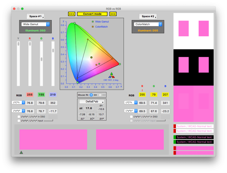
So rendering the small green square here results in the colour represented by the small orange square, even though the original colour is inside the smaller triangle.
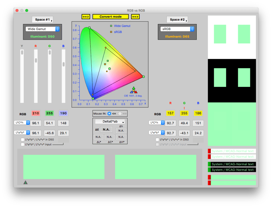
Another problem arises when the white points of the original and output gamuts are different. In the first two windows, they were identical, but here is an example of rendering where the white point changes, from the green circle to the orange one. This also shifts all the colours around, as seen with the green and orange squares.
Normally we don’t see colour rendering in action, because it’s handled internally. When it works correctly, you’re very unlikely to notice any difference, although colour measuring instruments can show the changes that have taken place. Note that rendering doesn’t change the colour values in the original image, it just adjusts what is output to a device like a display or printer.
The best way to see rendering in action is with a photo image editor such as Affinity Photo, or Adobe Photoshop. They have a soft proofing feature, to give you a preview of how an image will be rendered. In Affinity Photo, you can select a colour profile or gamut to use, the rendering method (rendering intent), and whether there should be compensation applied to the black point to obtain consistent black rendering.
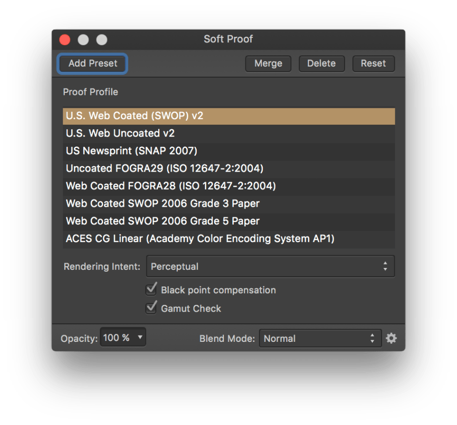

The optional Gamut Check shows your original image with all the pixels outside the output gamut marked in grey – here many of the greens. This gives you a good idea as to how much adjustment there’s going to have to be when rendering the colour. In this photo, a lot!

Rendering intent is the term describing the principles used for rendering. The four standard options available are:
- Perceptual – this shrinks the entire colour space into the output one, shifting all the colours so as to preserve their relationships. This is the method described above.
- Saturation – this maintains the relative saturation of the colours, and isn’t normally suitable for photographic images.
- Relative Colorimetric – this only alters colours outside the output colour space, mapping them to colours inside it, but not altering those already inside the output colour space. Sometimes known as ‘clipping’, this isn’t normally used with photographic images as it tends to produce areas of identical flat colour where clipping occurs.
- Absolute Colorimetric – this ensures that colours are matched exactly, and is intended for use in design work where precise colour is more important than relative colour.
Working with most photographic images, you want the whole image to look right, thus should choose perceptual rendering intent. Absolute colorimetric rendering intent is most useful when you want precise matching, for example with corporate colours in design.
This should now explain how your coloured images are rendered to the display, or for print. Whether they look right on that output depends on making sure that the display or printer is properly colour calibrated, so that the colours generated are correct. If you’re making giclée prints of your original paintings, that’s what your customers will expect.
