
My grandmother, who would have been well over a hundred years old by now, always told us when she saw another woman wearing red and green together: ‘red and green should never be seen’. It was part of the folklore of women’s fashion during the first half of the twentieth century, yet in the previous century, this colour combination was supposedly a radical new formula of the French Impressionists. This article looks at the history and psychophysics of what are often referred to as complementary or harmonious colours.
In fact, combinations of red and green have long been popular and successful in visual art.
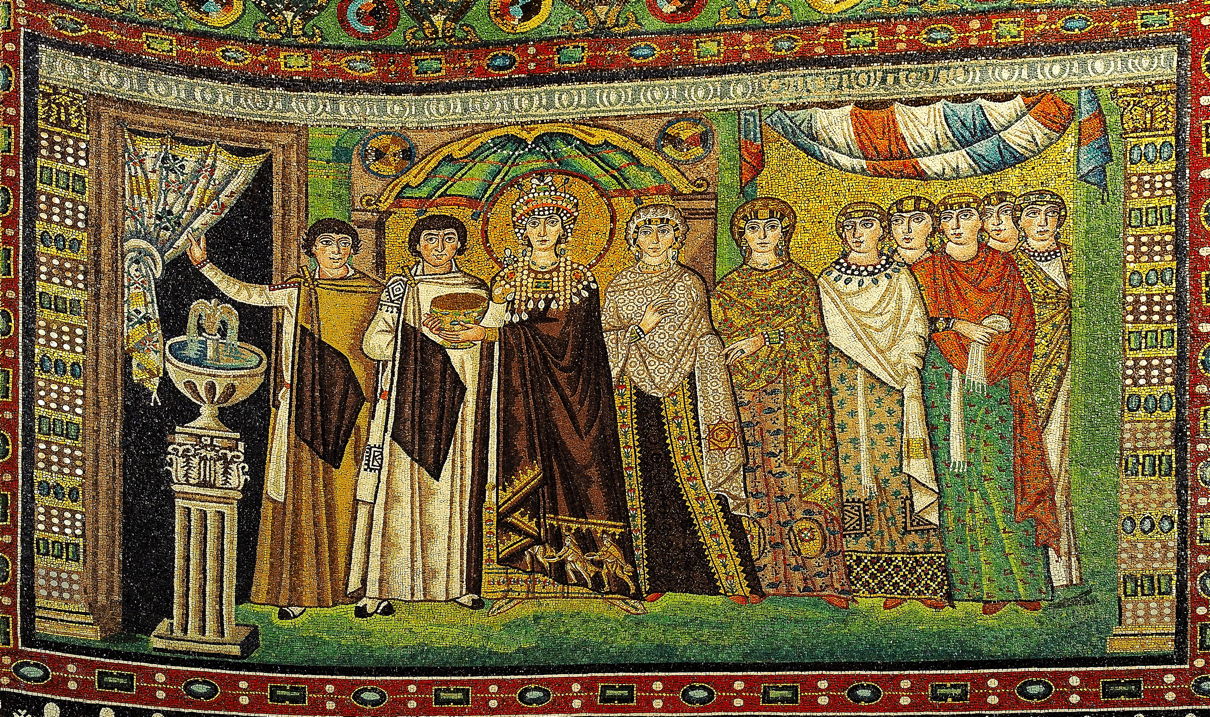
My oldest example comes in this exquisite Mosaic of Theodora in the Basilica of San Vitale, which was built in 547 CE, thirteen hundred years before French Impressionism.

The earliest known and dated painting using drying oils as the binder is that of the altar frontal at Tingelstad in Norway, which was created in about 1275-1300. This reconstruction reveals its extensive use of red and green in combination, including in the clothing of the Virgin Mary.

Red and green regular appear in paintings of the Holy Family, in this case for the clothing of both Joseph and the Virgin Mary, in Fra Bartolomeo’s Nativity from 1504-07.

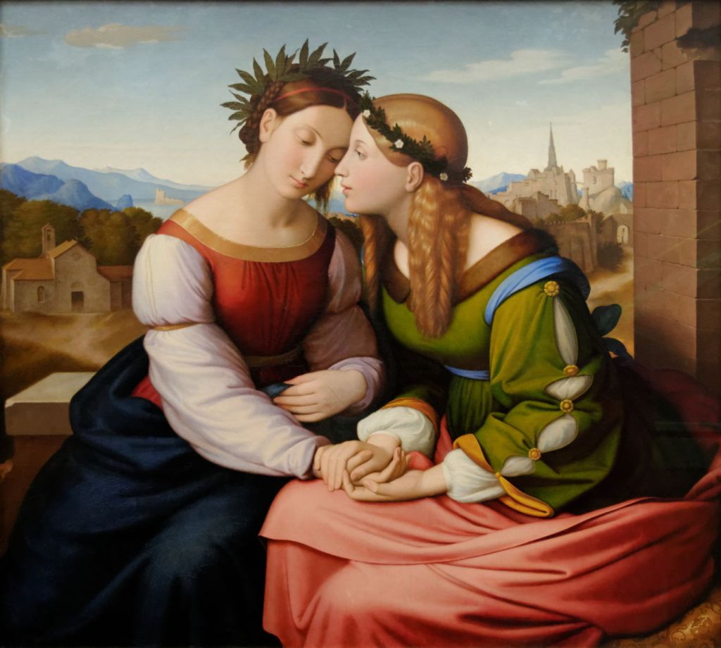
Raphael’s Madonna della Sedia (Madonna of the Chair), from 1513-14, again dresses the Virgin Mary in red and green.

Closer still to the dawn of Impressionism, Johann Overbeck’s painting of Italia and Germania from 1828 successfully combines the two colours. By that time, Goethe had expressed his view of ‘colour harmony’, in which harmonious colours were those on opposite sides of his colour circle. According to that, red and green were indeed harmonious; I don’t know whether Goethe’s theory influenced Overbeck’s choice of colours.

Colour wheels, circles and polygons had become increasingly popular among those trying to explain the phenomena of colour vision. The example above was used by the artist Charles Blanc (1813-1882) in about 1867 in his educational books for artists. The main problem with these is that the positions of colours are entirely arbitrary, and lack any physical or physiological basis. The fact that red and green were often positioned opposite one another, hence were deemed harmonious, had no independent evidence, so was self-fulfilling.
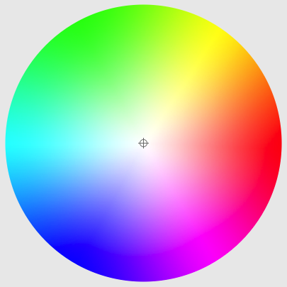
Indeed, if you look at its modern equivalent, the macOS Colour Picker, red isn’t opposite green, but cyan. Being principally for the additive colours of illuminants – rather than that for the subtractive colours of colourants – red and green shouldn’t be diametrically opposite.
Viewed on the more conceptually tricky CIE 1931 x-y colour space, complementary colours appear opposite one another on the inner triangle used to define standard colourspaces such as sRGB.

Nevertheless, artists of the late nineteenth century pressed on with theories of colour harmony.

In the summer of 1887, Pissarro worked on this strongly Divisionist painting of Haymaking, Éragny. Throughout his many fine brushstrokes are shades of red intermingled with shades of green.
By this time, neurophysiological understanding of colour vision was developing, thanks to the research and writing of Hermann von Helmholtz (1821-1894). Sensors in the retina of the eyes responded to different frequencies of light, originally considered to be the additive primary colours of red, green and blue, in the Trichromatic Theory of vision. So why should red and green appear in any way harmonious?
It was one of von Helmholtz’s scientific adversaries, Ewald Hering (1834-1918), who proposed the solution in his Opponent Colours Theory. This simple system might account for the sensors, although they’re now referred to as short, medium and long (S, M and L) wavelength rather than by colour, but it doesn’t consider how those signals are processed thereafter.
Subsequent and even more painstaking research has shown that our colour processing has specific interactions responsible for the harmony of red and green. The cones which are most sensitive to red tend to suppress nearby cones which are most sensitive to green light, and the other way around, in what’s known as centre-surround antagonistic receptive fields. Nervous signals from those cones interact in the first part of the brain that they come to, known as the lateral geniculate nucleus (LGN). There, the signals from the three different types of cones are summed to produce an achromatic signal, and two differenced signals are also produced. One of these is a red-green signal, the result of L – M + S, the other a yellow-blue signal from L + M – S.
So we actually see two colour harmonies, red-green and yellow-blue, which are programmed into our visual processing system. Not that that is any indication of whether those harmonies should be seen together in women’s fashion.
