

Colour is one of the fundamentals in painting. It’s all very well having rich and brilliant pigments, but if you don’t understand how to mix them to create the colours you want to appear in your painting, you won’t get very far. We also learn that different colours and their combinations are associated with aesthetics. The road to understanding colour has been long, and involved physics, physiology, psychology and artists.
The ancient Greeks speculated how many colours were primary, and how many formed fundamental categories. Although it was much later that Newton demonstrated how white light can be separated into components of different colour, Pythagoras and Aristotle both proposed systems of colour categories by which they thought all perceived colours could be classified.
Ordering colours in this way is not a mere theoretical exercise, although it has many aesthetic uses. Once ordered, colours can be identified systematically, artists and designers can better understand how to mix colours, and more. Ordering is also an important preliminary to gaining insight into colour spaces, now central to colour reproduction and colour science more generally.
During the Renaissance, the more theoretical approaches of classical times were eclipsed by the practical experience of painters mixing pigments. In their writings on the art and craft of painting, Leon Battista Alberti and Leonardo da Vinci proposed basic chromatic colours, typically of red, blue, green, and dull yellow, from which they held that all others could be mixed. Their conclusions, though, were limited by the pigments then available and lack of sound physical knowledge.

In 1615, the Flemish physicist Franciscus Aguilonius, also known as François d’Aguilon, (1567-1617) was the first to propose a colour line extending from white (albus) to black (niger), passing through the primaries of yellow (flavus), red (rubeus), and blue (caeruleus). Below that are secondary combinations of orange (aureus) and purple (purpureus), with green (viridis). This was published in his six volume treatise on optics, whose title page and illustrations were designed by Peter Paul Rubens.
This ordering, with slight variations, remains the basis for the layout of colours on palettes and in most paint ranges.
During the Age of Enlightenment, ideas about colour ordering advanced again, as investigators brought in the second and third dimensions in an effort to include all the colours observed in nature, or mixed by the painter.
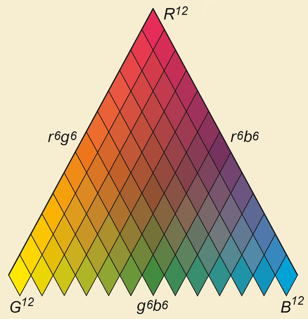
In 1758, Tobias Mayer (1723-1762) proposed this colour triangle, recreated here by Jacques Lacombe in 1792, which is impressively modern. With the three primaries forming its corners, it was the first expression of the painter’s acquired knowledge that all colours could be mixed from the three primaries plus black and white. Mayer envisaged assembling a series of triangles of diminishing size into a six-sided solid, with white and black as the polar vertices, and the three primaries forming its triangular equator, but never expressed this concept in a full model.

It was Johann Heinrich Lambert (1728-1777) who first showed this explicitly in his diagram of a colour pyramid of 1772, in which the vertical axis represents lightness. It was also Lambert who first appreciated the practical value of colour order systems, pointing out their use for dyers to formulate colourants with reproducible effects.

It was an artist friend of the painter Caspar David Friedrich, Phillip Otto Runge (1777–1810), who advanced Lambert’s pyramid into a solid colour sphere, in 1810. The upper views here show the outer surface of this sphere from the white and black poles. The lower views show cross-sections through the sphere: on the left, cut through the equator, and on the right a vertical section through the poles.
Unfortunately this aesthetically pleasing model has its problems, as it includes some impossible colours, and denies that each colour can be uniquely identified by a single set of values for hue, lightness and chroma.

The nineteenth century brought renewed interest in colour ordering, driven particularly by the introduction of science and technology into traditional crafts such as dyeing and tapestry manufacture.

In about 1867, the artist Charles Blanc (1813-1882) used this colour star in his educational books for artists. It differs little from the colour line of Aguilonius above, and the chemist Michel-Eugène Chevreul (1786-1889) advanced a more sophisticated colour hemisphere. Chevreul was the director of the dyeing department of the royal tapestry manufacturer of Gobelins, who daily wrestled with problems trying to achieve consistent dyeing of textiles for use in tapestry-making.
The late nineteenth century saw major influence of the German physicist and physiologist Hermann Ludwig Ferdinand von Helmholtz (1821-1894). Von Helmholtz awakened interest in the psycho- and neuro-physiology of colour, and the importance of perception as well as physics. It was actually one of von Helmholtz’s scientific adversaries, Ewald Hering (1834-1918), who brought the most important and immediate improvements in colour ordering, by applying principles of colour perception. Chevreul and von Helmholtz were highly influential on the Impressionists.
By the early twentieth century, many other colour orderings had been proposed, on the basis of a wide variety of theories.
Among them was the Colour Harmony Manual of the German Nobel Prize-winning chemist Wilhelm Ostwald (1853-1932). Having won his Nobel Prize, he decided to devote his remaining career to projects which interested him, including colour order. In 1905, he lectured in the USA on colour, and met Albert Henry Munsell. But the two were on different courses, and of little influence over one another. When Ostwald started to publish his proposals in a series of volumes from 1918, they formed yet another system for ordering colour.
Munsell had graduated from the Massachusetts Normal School of Art. During his studies, he was inspired by Ogden Nicholas Rood’s book Modern Chromatics, and this drove his lasting interest in colour and systems for measuring and ordering it. His first experiment with colour took place in 1879, when he painted ordered colours on a pyramid and spun it on a string, to observe the colours mixing optically.
He travelled to Paris to study in the early 1880s, and on his return was appointed a lecturer at his alma mater, where he developed his interest in colour education. In 1898, he constructed a colour sphere, on which he painted what he termed ‘balanced colours’: when optically mixed by spinning the sphere, those different colours became the same neutral grey. This was the starting point for his colour ordering system.
Munsell looked at other ordering systems, concluding that Hering’s couldn’t be correct; he augmented it with a fifth basic colour for the hue scale, and realised that a painted sphere would be too constrained by the properties of the pigments then available. He extended the range of ordering models which he had examined to include those of Lambert, Runge, and others.
The lightness scale was a particular problem for Munsell, with its choice between logarithmic or square root scaling from the available evidence. He opted for painter’s terminology for this, calling it value. The third attribute, the intensity of colour, he named chroma in 1901, a usage which has since become general.

Munsell originally wanted to map his colour ordering in terms of slices of constant value (lightness) through a colour solid, but in 1902 he came up with the idea of a colour ‘tree’ formed using slices of constant hue, which became the basis for his first colour atlas.

The final decision which he had to make was the order in which to present his colours. His initial plan had been to arrange them into complementary colours, but he changed that to perceptual uniformity in 1904, and the following year published the first edition of A Color Notation. That was followed in 1907 by the first Color Atlas of the Color-Solid, which was enlarged and renamed the Munsell Book of Color in 1929, just over a decade after his death.


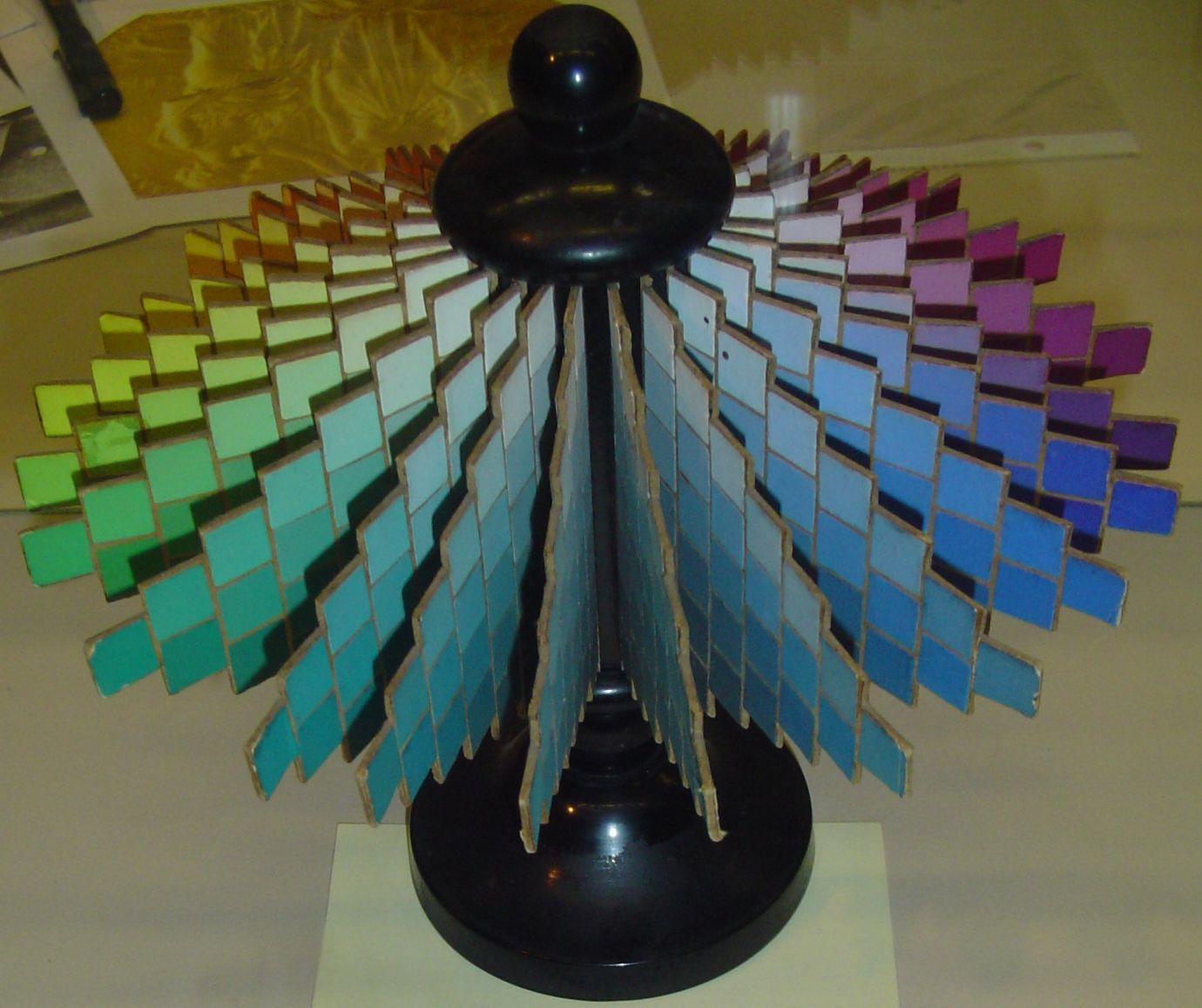
The Munsell Colour Wheel is at the heart of the system, with basic hues red (R), yellow (Y), green (G), blue (B), and purple (P). Intermediates are inserted between those as shown.

Here is an example set of Munsell hues, all shown at the same values of 6, and chromas of 6.

Munsell colour tables are here assembled for the two hues 5PB (purple-blue) and 5Y (yellow), which are diametrically opposed on the colour wheel, thus deemed complementary. The vertical scale shows values from 0 (black) to 10 (white), and chromas vary horizontally from 0 (grey) in the centre, to 12 (pure colour) at left and right. Not all colours can be represented here, of course.

Assembling the three coordinates together results in this diagram. This shows the circle of ten hues, which are displayed with values of 5 and chromas of 6. The vertical value scale ranging from 0 to 10 is shown in neutral colours, from black to white. A wedge of constant 5PB hue is then shown at a fixed value of 5, the chromas ranging from 0 (grey) to 12 (pure colour).
Munsell made several important advances in his first colour ordering. He broke from most earlier orderings in not putting colours of the highest chroma on the same horizontal plane, and making the vertical axis that of value (lightness). In defining chroma, he established that colours of constant hue and value can vary. These remain fundamental to all modern colour ordering systems.
His system was extensively revised in the light of the then-novel CIE colour system, in 1943. As a result of this, the Munsell Color Company, which Munsell had founded shortly before his death, issued revisions known as the Munsell Renotations. Although not perfect, the Munsell Colour System remains one of the most widely used colour ordering schemes.
Reference
Rolf G Kuehni and Andreas Schwarz (2008) Color Ordered, A Survey of Color Order Systems from Antiquity to the Present, Oxford UP. ISBN 978 0 19 518968 1.
