There was a time when using colour in web pages was known to be a dangerous proposition. Colours were crude, their rendering unreliable, and most computers didn’t handle them at all well. Since then we’ve come on leaps and bounds, or have we?
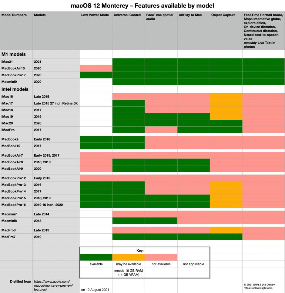
Last Friday, I published a table in which I used semantically coded colours to represent the availability of various features in Monterey. One viewer complained that the colours which I had taken great care to select appeared too similar, in that two of them were visually almost identical.
It turns out that each step in the process of rendering those colours had been tampered with in a way that regressed them – a pale red and a saturated golden yellow – to the point where only a well-calibrated display in good lighting conditions showed their difference. This is the story of how, in an act of reverse alchemy, software transformed gold into pale red.
In the original JPEG which I posted, the two colours are distinct, as shown by their RGB values:
Yellow 241 175 62

Red 239 155 145
Although their red content was similar, the differences in green and blue made them appear quite different. In HSB, the hue of the yellow is 38˚, and that of the red 6˚, sufficient for most with colour-blindness to distinguish. The yellow was 74% saturated, while the red was only 39%.
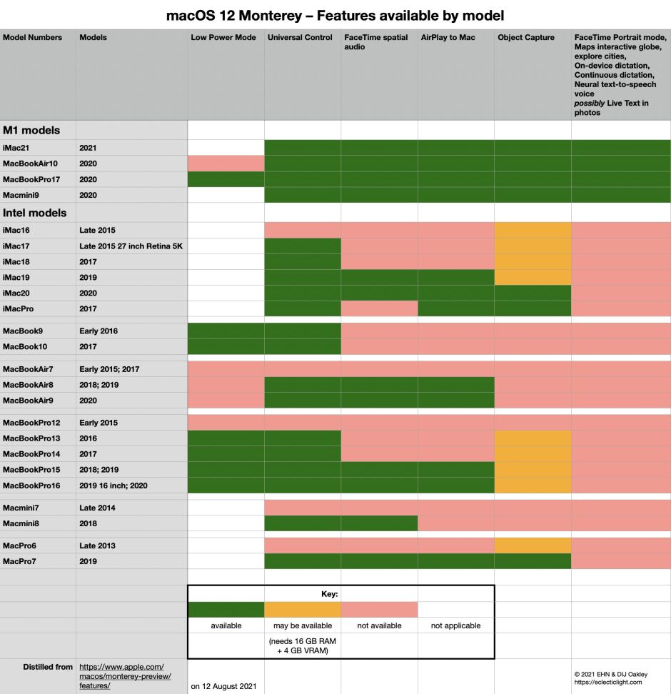
Viewed in Safari in standard light mode, something had already nobbled the colours, changing their RGB values to:
Yellow 230 176 85

Red 225 159 148
The hue of the yellow hasn’t changed, but the red has increased to 9˚, and the yellow has been desaturated to 63%. Visually, although the two colours aren’t as distinct, on most displays their difference should still be obvious.
Unfortunately, the viewer who had complained of the problem wasn’t using Safari in its standard mode, but with an extension which attempts to render pages in Dark Mode. This could be dangerous to colours, but standard practice is not to make any changes in the colour of images such as JPEGs. Once an extension breaks that, it’s entering tiger country where it’s likely to render photographs and images of paintings incorrectly. That’s seriously disruptive.
Viewed with Dark Mode enabled, those RGB values changed even greater, to:
Yellow 222 168 120

Red 225 149 147
which are so close in colour that they’re now hard to distinguish, despite their hue difference, with the yellow at 28˚ and the red at 9˚, because the yellow is even more desaturated to just 46%.
It’s perhaps worth comparing RGB values for the original yellow with that in Dark Mode:
Original 241 175 62

Dark mode 222 168 120
Those values for Dark Mode are very similar to the original red:
Original red 239 155 145.
Ironically, most of those with limited colour vision would see greater contrast than those with normal sight. If you’re not aware of it, Michel Fortin provides a superb tool to view parts of the display in different simulations of colour-blindness: Sim Daltonism is free from the Mac App Store, and there’s now an iOS version too.
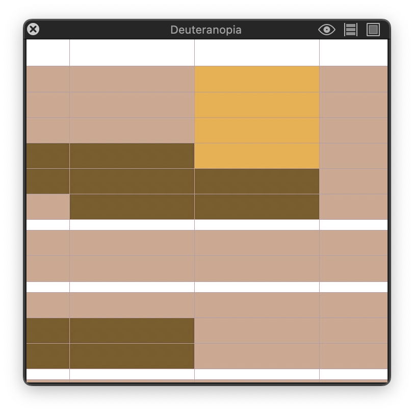
When viewed by someone with deuteranomaly, mild red-green colour-blindness, which affects around 4-6% of the male population, red and yellow are clearly distinguished, and in the more severe form of deuteranopia, differences are actually exaggerated.
Designing for colour-blindness is clearly very important, given how common it is. Designing for what appear to be successive failed attempts at perceptual rendering of colour from webpage to display remains unpredictable, and makes it very hard to retain any meaning in the use of colour. How it affects the paintings I display here can only be disastrous.
Isn’t it time, now that we have such capable displays and systems such as ColorSync, to render colour better?
Postscript
Here is the same JPEG complete with colour profile, for comparison.