

You’ll no doubt be well aware of the recent errors discovered in the Public Health England (PHE) reporting of new cases of Covid-19. While these have drawn attention to bad practices in the recording of vital health information (a subject I’ll return to on Sunday), few seem to have noticed that the revised numbers of cases demonstrate that, at the moment, fresh cases of Covid-19 are soaring almost out of control. If they continue at their current growth rate, by the end of October, England alone could be reporting 80,000 cases every day.
Back on 22 September, I explained here that case numbers in England were clearly rising faster than they had been since the first peak back in March-April, a change which was obvious in figures which had been reported since the beginning of September, whose early signs became apparent in late July.

Despite that evidence, the UK government had done remarkably little to tackle the growing problem, indeed had continued relaxing measures to prevent the spread of infection. My conclusion was the ominous:
“It would be good, though, if we could learn a little more, even lessons from what we got wrong back in March: give the coronavirus a few days to take hold, and it will take months of pain to recover. Here we go again…”
Until 2 October, figures weren’t looking too bad. They did continue to rise at a fairly steady rate until 22 September, when they appeared to level off.
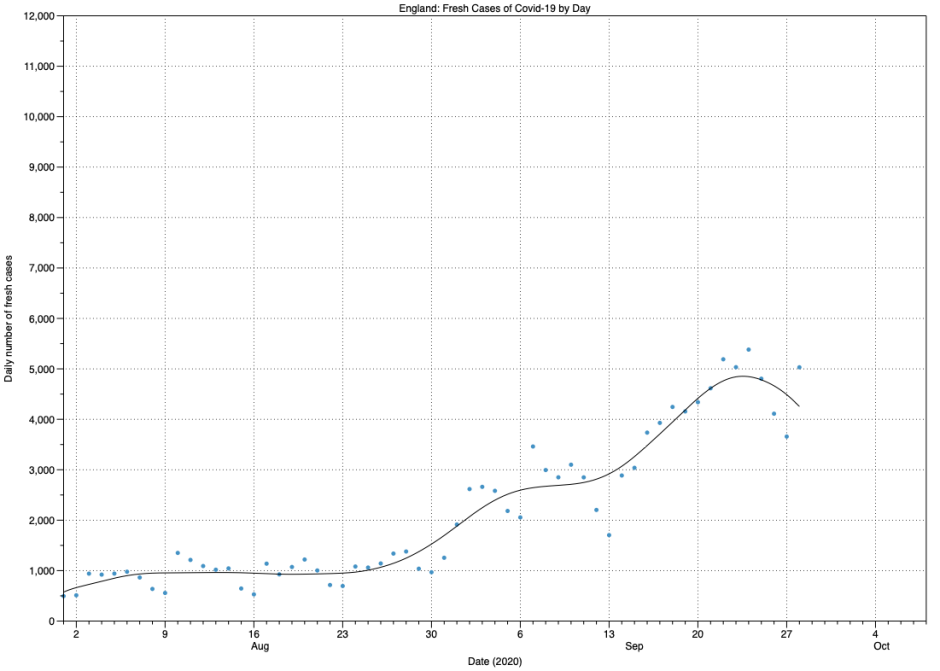
I should point out that, as is my wont, I am here showing not the fresh case figures given by date of test report, which are still misleadingly used by so many, including the BBC. The UK has long also provided figures according to the dates that samples were taken, which are invariably closer to the date of the infection, thus a considerably more accurate reflection of what is happening.
On the night of 2 October, PHE discovered that its figures had omitted nearly 16,000 fresh cases which had been reported by labs during late September, but because of a bug in their data handling had simply been ‘lost’ and not recorded in their daily totals. For those following the numbers as reported, the effect was initially shocking: cases suddenly leaped from 4,797 on 2 October to 10,806 the following day, and 21,309 on 4 October. But most of those were the backlog, so it was easy to assume that little else had changed.

Looking at case numbers by the date that samples were taken, when the first of the backlog were added on 3 October, it did indeed look as if changes were modest and by no means any cause for alarm. But the picture changes completely when the rest of the backlog has been processed, and more recent results added in the figures on 6 October.

These show that, not only are new cases continuing to rise, but that the rate of rise is increasing. Could this perhaps be an exponential rise? To investigate that, we need to look at just the most recent section of this curve, free from earlier complexities prior to the middle of September, when rates had both accelerated and slowed.
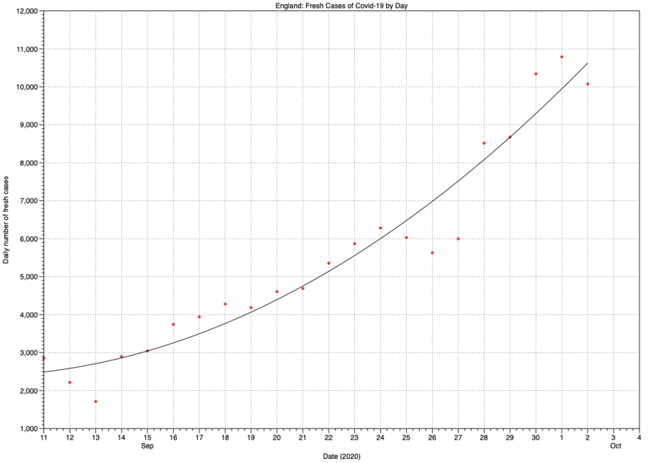
Here I’ve fitted a local quadratic curve rather than LOESS as in the previous charts. It shows that daily figures doubled from 3,000 cases on 15 September to 6,000 on 24, that’s a period of 9 days, and from 5,000 by 22 September to 10,000 on 1 October, also 9 days later.
It’s even possible to estimate a range for the R number during this period. This has to be related to the duration of the infection cycle, how long it takes for an index case between the day they become infected until they infect the next case. That is typically around 6 days for Covid-19, but could be as long as 9 or 10 days. Taking the smallest of those, in 6 days this curve shows the number of cases increasing from 4,000 to 6,500, giving an R number of 1.6. For a cycle of length 9 days, the R number would be 2.0.
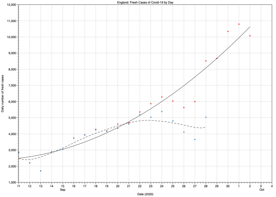
For me, this is the most disturbing chart of this set: it shows in blue dots and dashed line the curve we could have assumed using the figures on 2 October, and in the red dots and solid line that apparent just 4 days later. You can see the gap between the daily dots widens on 23 September, 9 days before PHE discovered the error in their figures.
Where are all these fresh cases occurring? Reports have focussed on areas already struggling with very high rates, such as Manchester, Liverpool, and the North-East. But a glance at the government’s own map shows that this is a general problem. Large areas of that map were white just a couple of weeks ago, indicating that they had fewer than 3 cases. In the last two weeks, again since about 22 September, more and more white areas have turned blue, indicating 3 or more cases. This appears to reflect a general failure of the PHE Test and Trace system to ensure that those who do have Covid-19 don’t come into contact with others, although there may be other factors at work too.
Using the fitted curve, daily fresh cases numbers reached 10,000 on 1 October, doubling every 9 days. Unless effective measures are applied to reduce the R number in England, they would reach:
- 20,000 on 10 October
- 40,000 on 19 October
- 80,000 on 28 October
- 160,000 on 6 November
and so on until the growth slows because so many people in England have already suffered Covid-19. Isn’t that message loud and clear?
Of course, the rate of change could miraculously slow and this second wave might be over. As measures to prevent its spread have so far been based on the data from before 2 October, and not those since, that appears unlikely.
Data used are taken from official UK figures at this Government site. Figures are cases classified by specimen date (not the date reported), and represent the date on which each person’s first positive specimen was taken. The last three figures in each series are omitted, as data for specimens collected on those days are invariably still incomplete, resulting in low numbers which will be revised upwards in the coming days. Unless otherwise stated, data are processed and charts prepared using DataGraph, with curves fitted using LOESS by eye and residuals.
