

During Mojave’s beta-testing, I largely ran it in Light Mode. Having spent nearly thirty years in front of Macs with their ‘paper white’ displays, I was a Dark Mode sceptic. But over that time, as those screens have grown larger and finer in resolution, I’ve been aware that they have also become more of a challenge to my eyes. So for the last week or so, I have been trying out Dark Mode, to see if it helps.
For the last several years, my main display has been an iMac 27 inch, currently a Retina 5K which had been set at its default ‘looks like’ 2560 x 1440 resolution. I’m myopic, and wear spectacles to walk outdoors and drive, but not when in front of my Mac. Quite often, particularly when I’ve been working on my Mac for longer periods, I’ve found its brights a bit fatiguing, despite turning its brightness down.
This is made worse when I have to peer at the brighter display on my iPhone 6 or an iPad for significant periods too. I’ve tried backing off their brightness controls, but then I can’t see them clearly when outdoors.
I do work for long, but interrupted, sessions at my iMac: this article started life at 0630, and I normally don’t put the display to sleep until nearly midnight.
My first impression of switching the iMac to Dark Mode was visual ease, and I felt comfortable in changing its effective resolution up to 2880 x 1620, which is more accommodating for screen-hungry apps like Xcode. But whatever resolution I use, the biggest problem that I have encountered with working in Dark Mode has been windows which don’t play the same tune: what I call the Flashlight Effect. The worst offender is Safari.
When you’re used to working in Light Mode, the appearance of a (local) Dark Mode window is no particular shock. You may need to refocus and adjust a tad, but no more than that. When you’re in Dark Mode, every substantial white area is like looking at a flashlight shining at your face in the dark – hence my term Flashlight Effect.
My first day or two of Dark Mode saw me pecking away at changing the Preferences of various apps to eliminate as much Flashlight Effect as I could. Because Apple currently has a policy that most rendered text is still shown black on white, this hasn’t always been easy. It’s a bit like trying to black a room out completely: the more gaps that you close, the brighter become those remaining.
My solution to Safari is to park it on a black Home page, which is simplest using a local file, although this seems to result in an error every time that I open the Safari app. Anything else which renders HTML – like HelpViewer and some web views which are built into apps – is likely to be a similar problem.
There are some notable exceptions, such as the Dictionary app, which change appearance to be much easier on the eyes. I have found myself exploring more Preferences in the last week than I have done in several months before, in my quest to see what I can customise to fit better with Dark Mode.
Apple still seems a bit ambivalent about Dark Mode, and this shows through in its editors. Although developers can set up text editing views to switch appearance properly, the default is to continue to display text in black on a white background regardless of the chosen appearance, and that’s exactly what TextEdit does.
Most amusingly, Apple seems to think that Dark Mode for Pages and Numbers means that the view showing document content also remains in black-on-white, and only the window tools, bar, and frame should change in appearance. When you’ve been working for several hours in Dark Mode, opening a document in Pages or Numbers is a startling experience, and an excellent example of the Flashlight Effect.
There are some remaining glitches which I presume will get fixed. QuickLook thumbnails of text are in Dark Mode, but Rich Text is previewed in Light Mode even when it contains additional colour information to support Dark Mode display. There are still some anomalies in web controls, such as the Dark Mode username and password popups shown above.

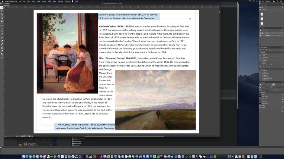
It is very gratifying that many developers are putting a lot of work into making the appearance of their apps altogether more customisable. QuarkXPress 2018 Pro (just released in the App Store) is an excellent example, with all of its controls and windows offered in a pre-pack for Dark Mode, and completely customisable too. I just wish that there was an easy solution to the black-on-white document view which remains.
But my special prize for the best Dark Mode implementation goes to one of my most-used apps, MarsEdit. It follows the standard in delivering its previews in black-on-white, which I hope will evolve in time to eliminate the Flashlight Effect. But I spend a lot of my day working in its HTML editor, which is so much better in Dark Mode than in Light.

There are lots of other excellent apps which become even more of a joy when your Mac is doing it Dark: BBEdit and most text editors other than TextEdit (CotEdit, free from the App Store, is well worth a try), and Apple’s Xcode itself.
Dark Mode isn’t going to be everyone’s choice. If you’re content with Light Mode, then I’m very happy for you. But for some of us, it looks like being a real delight.
Postscript
At the time that I was writing this, another major app was released which now provides advanced document editing in true Dark Mode: Liquid | Author 3.0, from the App Store, is one of the first to avoid the Flashlight Effect. If you’ve switched to Dark Mode and want to create properly styled and formatted documents, take a look, as I think it shows where we should be heading.
