
Like Madder, Indigo is a vegetable dye which has been used to colour fabrics since ancient times. According to classical authorities, its European variant Woad was used by ancient Britons to colour their skin blue and make them look ferocious in battle. The term Indigo was then restricted to an almost identical dye produced in India and imported into Europe, but is now used for all blue dyes and pigments derived from Indigofera species of plant, shrubby members of the pea family.
When used as a dye, Indigo is highly colour-fast on wool, but fades noticeably on cotton. As a result, manufacturers, colour merchants and artists were very secretive about the processes they used to make Indigo pigment, some of which involved adulteration with wool fibres, starch, and other substances. The effect of those adulterants and manufacturing processes on the lightfastness of Indigo in oil media is not known, but in practice there is wide variation seen in paintings.

Friedrich Herlin’s altarpiece in the church of St. Jakob in Rothenburg is a relatively early example of the use of Indigo in conjunction with other blues for its most popular application, modelling drapery. The panel showing The Presentation of Christ in the Temple has some strange discolouration in the robes of the Virgin Mary in the foreground, which could be accounted for by fading of Indigo overpainting.
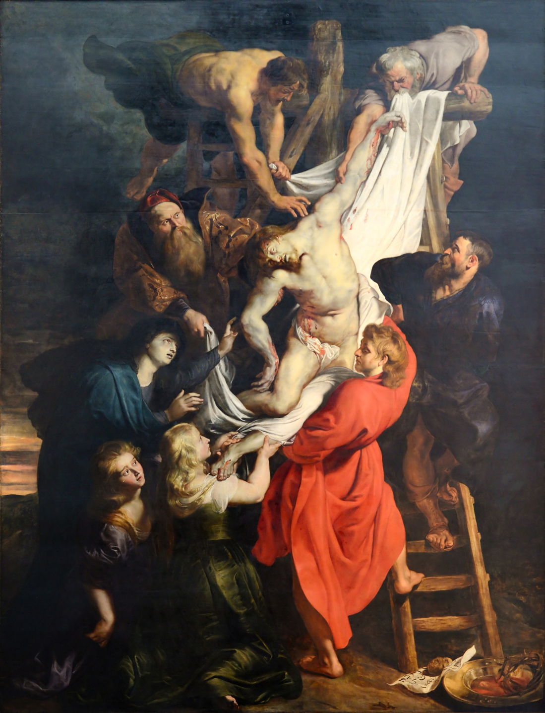
Rubens relied on Indigo for the dark blues in his triptych of the Descent from the Cross from 1612-14. He appears to have used it mainly in underlayers, where it is better protected against fading from light or atmospheric exposure.
Prior to about 1625, the use of Indigo in oil painting was relatively limited, and principally in underlayers to model the folds of fabrics. Then, in about 1627, Frans Hals and other Netherlandish artists started to use it more generally, and in the upper parts of the paint layer, where it was more exposed to light and atmospheric pollutants. Demand for Indigo from India rose, and it is probable that pigment manufacture became less diligent, and supplies may have been mixed with local Woad.

In Abraham Bloemaert’s The Adoration of the Magi from 1624, the cloak of the Virgin Mary appears to use two different blues, with its lower passages painted in the duller hue that is Indigo, which has faded slightly. Examination of the paint layer has shown that the artist used a beige ground, onto which he painted a thin layer of Indigo Blue mixed with Lead White.
Bloemaert then modelled the folds using a red pigment for shadows, and Lead White for brights. Over that, he painted a finer-modelled layer of Ultramarine, with Lead White for highlights. There were then several thin glazing layers of Ultramarine applied to generate the rich blue, following traditional technique.
The dullest areas are those which had the thinnest Ultramarine glazes applied, much of which have now abraded away during subsequent cleaning of the painting. The unprotected Indigo has therefore suffered sufficient exposure to fade slightly, as well as losing its rich glazes.

In Judith Leyster’s A Game of Tric-Trac (1630), the blue of the nearest player’s jacket consists of a thin medium-rich layer of Indigo over a dark brown underpainting, which is now starting to show through in the darker patches.

Hendrik Gerritsz Pot used the novel technique of putting Indigo layers over underpainting, without the protection of glazes, in his Portrait of the St Adrian Civic Guard, Haarlem from 1630. As a result of fading of the Indigo, what were originally bright blue sashes have become almost white (shown in the detail below).


Frans Hals’ Officers and Sergeants of the St Adrian Civic Guard (1633) not only shows the same group of men, but has suffered exactly the same fate with their formerly blue sashes.

In Jan Miense Molenaer’s humorous depiction of the sense of Smell (1637), Indigo with Lead White were used for the skirt of the mother cleaning her baby. This has suffered quite severe fading, the extent of which can be judged by the much darker blue seen at the edge of the panel, where the frame has shielded the pigment from light.

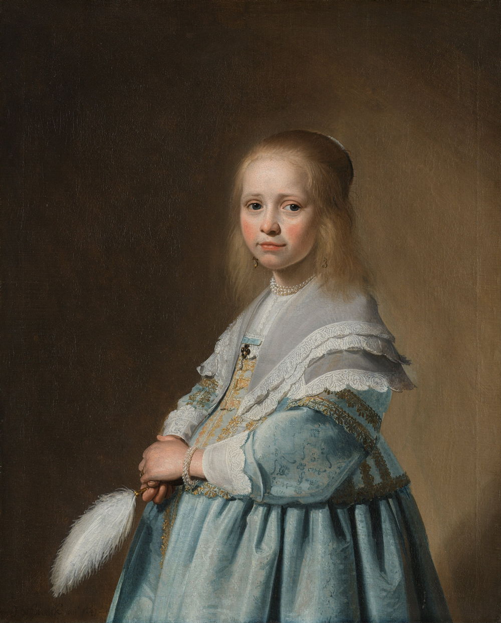
Johannes Cornelisz Verspronck’s Portrait of a Girl Dressed in Blue (1641) now shows the dress as a very pale and anaemic blue; judging by the thin rim of unfaded paint at the lower edge (unfortunately cropped from this image), its blue was originally quite intense. The artist did not apply any protective glazes over the Indigo Blue of the dress.

The oddly-coloured tablecloth in Verspronck’s Regentesses of the St. Elisabeth’s Hospital (1641) was originally a rich green. Unprotected Indigo Blue has faded from much of its surface, leaving most of it an odd yellow ochre hue.

Some of Vermeer’s paintings have also been affected, although thankfully much less visibly. In Christ in the House of Martha and Mary (c 1654-56), the blues, which include Indigo, appear to be well-preserved.
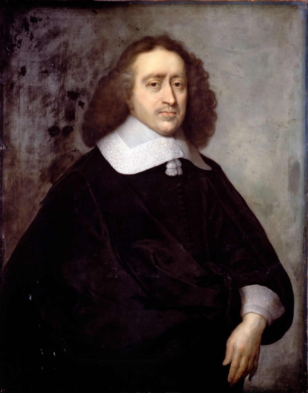
The background of Cornelius Jonson the Younger’s portrait of A Dutch Gentleman (1657) was once quite a dark blue, according to the evidence of the blue rim around the canvas where the frame shielded the Indigo.

Vermeer did use Indigo in his masterpiece Girl with a Pearl Earring (c 1665), in the upper of three layers which he used in the near-black background. Not that any of us would notice if it were to have faded there.
Indigo has remained in use in water-based media such as watercolours, its potential for fading being accepted by those who use it. By the late seventeenth century, it was falling out of favour for oil paints, and when Prussian Blue – an almost exact colour match – became available in the early eighteenth century, Indigo was quickly displaced by the new synthetic and more reliable pigment.
Reference
Helmut Schweppe (1997) Artists’ Pigments, vol 3, ed Elisabeth West Fitzhugh, Archetype. ISBN 978 1 904982 76 0.
Margriet van Eikeina Hommes (2004) Changing Pictures, Discoloration in 15th-17th Century Oil Paintings, Archetype. ISBN 978 1 873 13239 5.
