
In the last article, I looked at colour profiles attached to images, and when you should avoid them. That puts most of the pieces in place for you to work with images for general purposes, such as posting them online. But there are times when you need complete control over the colour in an image: when preparing a photograph for display, for submission to a jury (e.g. in a painting competition), or for accurate colour printing, such as when making ‘giclée’ prints of a painting or photo.
For these colour-critical situations, you must not only ensure that the whole image looks right, in terms of relative colour, but you need to make its salient colours as faithful as possible to the original (photo, image, painting, or object). Given that your image contains many millions of pixels, you need to choose a few key colours on which to concentrate; in most cases, these will be obvious.
Image editors, like Affinity Photo, contain several tools for analysing colour. Here I will use the Colour Picker tool, which is sometimes a separate ‘dropper’ tool in the toolbar, but in Affinity Photo is dragged out from its icon at the top of the Colour pane in the Studio. Simply click, hold, and drag that out, and it will change into a magnifying glass which you can move over your image.

This shows the RGB colour values of the central pixel underneath, and when you release the mouse button, that central colour will be pasted to the small colour well next to the dropper icon, its values being displayed on the RGB sliders below.
Obtain measurements for the key colours in your image. If you have a colorimeter which is capable of measuring the values from the original object, such as an X-Rite ColorMunki Design, then you can compare those values with readings made from your original. If not, you will have to do the best that you can by eye.
You then need to adjust the colour in the image to bring those few key colours as close as possible to their originals, without harming the overall colour balance. Affinity Photo offers several different methods for doing this:

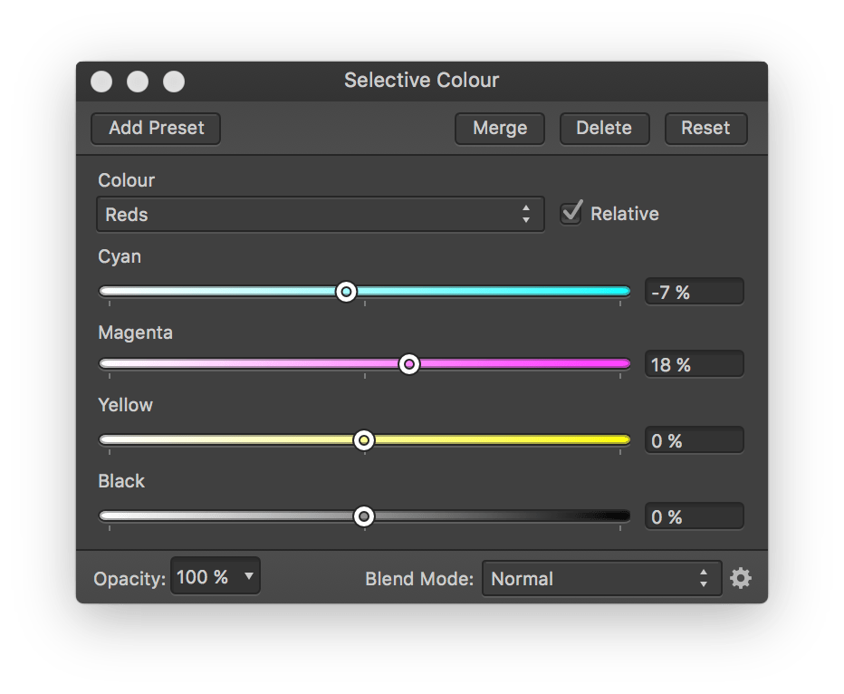
Selective Colour controls are probably the most useful here.
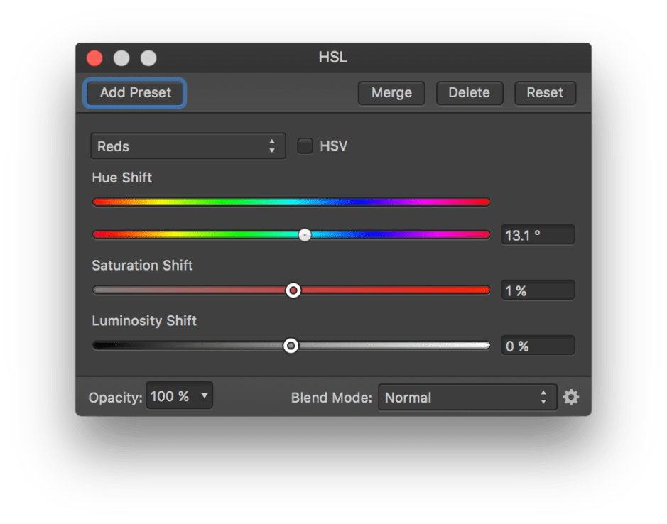
The HSL controls are also fairly straightforward to operate.

If you are used to working with curves from other apps, you may find them valuable, although I confess that I usually end up resetting them and starting afresh.
If your image is going to be submitted in electronic form, once you are happy that its general colour balance is good, and that its key colours are as faithful as you can get them, save the image with its colour profile (never omit the profile), and you are done.

If you are going to print, for giclée prints, for example, now is the time to perform soft proofing with the right colour profile for your printer and the output support (paper, canvas, etc.). Affinity Photo’s Colour Picker also works very nicely on the soft proofing image, so you can check the key colours there too. You might find that you could get a better result using a different profile, but beware: colour profiles take into account the support on which you are going to print. Generally speaking, you should first try the appropriate colour profile.
Make a proof print, and compare that with the corrected image, and if possible with the original object itself, viewed in appropriate lighting conditions, e.g. with a ‘daylight’ source.

There are other tools which you might find helpful. For instance, Chroma (App Store) performs colour analysis on images, and you can use it to help identify key colours for you. It only handles five colours at a time, but you can change these as you wish to extend the range.
Finally, you must now use an appropriate file format and settings to ensure that your finished colour-corrected image is preserved. Lossy methods of compression, as used in JPEG images, alter the colours and content of images irreversibly. This is explained in more detail here. Save your image for printing or submission using non-lossy options for the preferred format, and when you (or someone else) open it your hard work will have been preserved.
References
Handprint on colour.
Kuehni RG (2005) Color. An Introduction to Practice and Principles, 2nd edn., Wiley Interscience. ISBN 0 471 66006 X.
Kuehni RG and Schwarz A (2008) Color Ordered. A Survey of Color Order Systems from Antiquity to the Present, Oxford UP. ISBN 978 0 19 518968 1.
