

In the last article, I explained the importance of some form of colour calibration, and how to do that. So you now understand the process of rendering, know what rendering intents are, and have a display which is reasonably faithful if not calibrated by instrument. How should you handle colour in, say, your photographic images?
Cameras, even quite basic ones built into mobile phones, almost all now capture images with a colour profile. This means that each image consists of the data for the pixels making up that image, and details of the colour space (ICC profile) for that image. This is the best way to work with images: if they lose their colour profile, then OS X and apps do not know how the pixels should be rendered, and you could easily end up with colour problems, such as skin looking too red, as if sunburnt.

Open an image in Affinity Photo, or another image editing app, and it will show you the profile which is attached to that image. You can change the profile if you wish, using the Convert ICC Profile… command in the Document menu. If for any reason the image that you are working with does not have an associated profile, the Attach ICC Profile… command can put that right.

Traditionally most images are captured with Adobe RGB or sRGB profiles. However, these are now generally more restrictive that some cameras are capable of, and OS X can work readily with Wide Gamut, which is considerably broader. One of the features coming this autumn in macOS Sierra is improvement in capability with Wide Gamut image processing, so if you are a keen photographer you should now be looking to working more with such wide profiles.

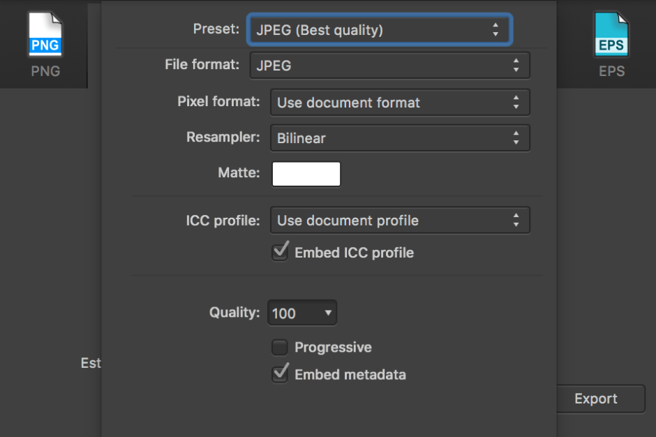
When you come to export that image as a finished JPEG file, you can opt to embed the profile. This is tucked away in the More options in the Export as JPEG workflow. The default is to embed the profile, and I hope that you can understand why that is what you should normally do.
Even the free and bundled Preview app allows you to assign and alter colour profiles of images, and its info window details the profile of an image. However it does not give you the option of saving an image without a profile.

So when should you save an image without a colour profile?
To know when that is preferable, you have to understand how a computer or other device will handle an image which it receives. All modern computers, phones, tablets, etc., should now look for the embedded colour profile and then render the image according to a colour management system, so as to create a faithful and colour-correct image on the display. So flesh should look like flesh, and not boiled lobster.
When there is no colour profile, the computer takes the image literally, and simply renders it appropriately for the display. This is the more primitive, but it is also the more reliable assumption when posting images on the internet: some browsers on some computer systems ignore embedded profiles, and will thus not render an image properly.

So when I prepare images for articles in this blog, I pass them through GraphicConverter 10, ensuring that their profile is set to sRGB first. Then, the Don’t embed sRGB profile option removes any embedded profile and ensures that the JPEG file is ready for the jungle that is the web. You could equally do that using Affinity Photo’s option to not embed the ICC profile on an image which you have already converted to the sRGB profile.
As I am not going to perform any further processing on images which I have prepared for posting, the profile ceases to serve any useful purpose anyway. Removing it ensures that the basic image is already as corrected for colour as I can make it, and ready for any browser anywhere.
Changing the colour profile of an image can be useful in other cases too. Most colour profiles are based on a D50 or D65 white point. Traditional profiles used in images, like Adobe RGB and sRGB, are based on the D65 point, but modern wider profiles such as Wide Gamut opt for D50. If I am going to work more in Wide Gamut in the future, using a display which already has a larger gamut that the sRGB profile, then I may well need to bring images down to a more practical sRGB – with its shift from D50 to D65 – before using them in documents, for instance. This too could spare red faces.
In the next article in this series, I will consider how you can enforce strict colour control, for example when preparing work for exhibition purposes – whether the image is being exhibited, or you want it to show a painting or other work of art very faithfully.
References
Handprint on colour.
Kuehni RG (2005) Color. An Introduction to Practice and Principles, 2nd edn., Wiley Interscience. ISBN 0 471 66006 X.
Kuehni RG and Schwarz A (2008) Color Ordered. A Survey of Color Order Systems from Antiquity to the Present, Oxford UP. ISBN 978 0 19 518968 1.
