
In the second article in this series, I explained how colour is rendered to output devices such as displays and printers, and what rendering intents are. Those determine what OS X sends to the output device, but not necessarily how a coloured image appears. To ensure that an output device such as a display or printer shows faithful colour, it needs to be calibrated.
Formal colour calibration
Full colour calibration of displays normally involves putting a sensor (colorimeter) onto the display. Then an app controls the display to generate a range of different colours, while the sensor measures the colours actually being displayed. Devices to do this, such as X-Rite’s ColorMunki series and DataColor’s Spyder series, tyically cost upwards of £/€/$ 80, and good systems are usually around £/€/$ 150-250.
Calibrating a colour printer is more involved again. An app prepares a set of pages for printing, each of which features chips of known colour. The printed pages are then scanned by a sensor (another type of colorimeter) which measures the actual colour produced. Complete calibration kits which include display and printer calibration are normally expensive, and the best will cost you more than £/€/$ 1000.
As most displays and printers do not have direct controls which allow you to adjust how they output colour, the calibrating app instead produces a colour profile describing the way in which the device renders colour. This enables your apps and OS X to adjust rendering, so that the output is as faithful as possible to the original colour.
Adjustments
Although display calibration is the cheapest and simplest, it is also the most prone to error. This is because most displays are used under a wide range of ambient light conditions. The corrections required for your display at noon on a bright, sunny summer day will be quite different from those for mid-afternoon or later on a dull day just before Christmas, and any artifical lighting changes everything completely.
Although the ambient light spectrum will change significantly, the two most fundamental settings which can be altered are the display brightness, and the white point.
Brightness should be fairly obvious, but white point merits a little more explanation. Although our perceptive colour constancy usually ensures that areas which should appear white are perceived as being white, subtle shifts can occur, making pure whites appear slightly yellow, pink, or blue. The white point in any colour space is the middle of the whitest area, and that which should appear a completely neutral white without the slightest colour cast.
Better displays can now be hooked up with built-in optical sensors so as to measure ambient lighting conditions and adjust the brightness and white point of the display in a dynamic way. When the sun goes behind the clouds, the display automatically dims to compensate. When the sun is setting, and the natural light becomes more yellow, the white point is also adjusted to keep whites on the display still appearing white. When you turn an artifical light on, the sensor adjusts both brightness and white point to keep the display looking perfect.

The 5K display built into Apple’s current iMac 27″ model, and many other Apple displays, will automatically adjust brightness when you enable this in its Displays pane. This does not, though, include adjustment of the white point, something which some better displays offer.

Basic display profiling
To adjust white point and the whole colour calibration, you need to make your own display profile, a feature available in the Color tab of the Displays pane. If you have a display colour calibration system, this is where you would select the profile which you created when calibrating the display. To sample how a listed profile affects your display, just select it in the list.
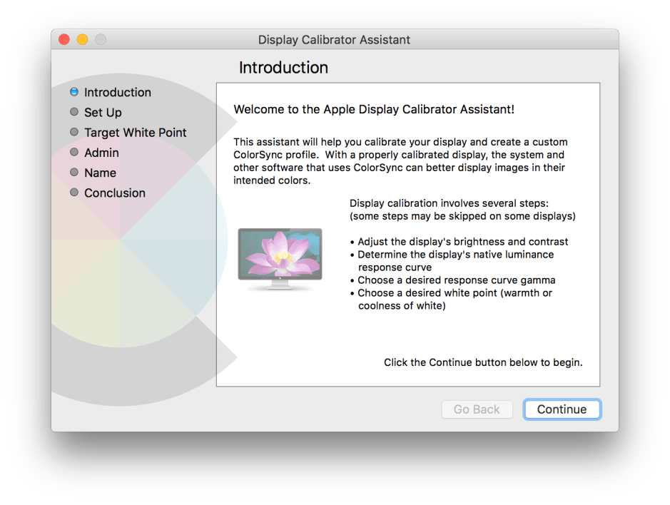
Click on the Calibrate… button to perform a basic calibration without the benefit of a proper calibration system. It will help you to have shown on your screen, in separate windows, the pure white of a new document (in any app), and full black (from an image). Against those you can compare matte sheets of ‘bright’ white paper or card, and full black.
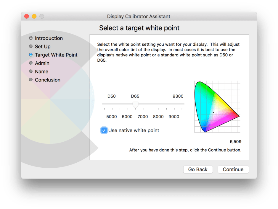
The first panel in the sequence lets you select the white point for the display, using the notional colour temperature (marked in degrees), or standard D50 or D65 settings, or just leave it set at the native white point for the display. Comparing the white window on your display and your white paper should help you work out the most appropriate setting here. If the display white appears slightly (neutral) grey, you can increase its brightness later, but it is important to eliminate any colour cast here.
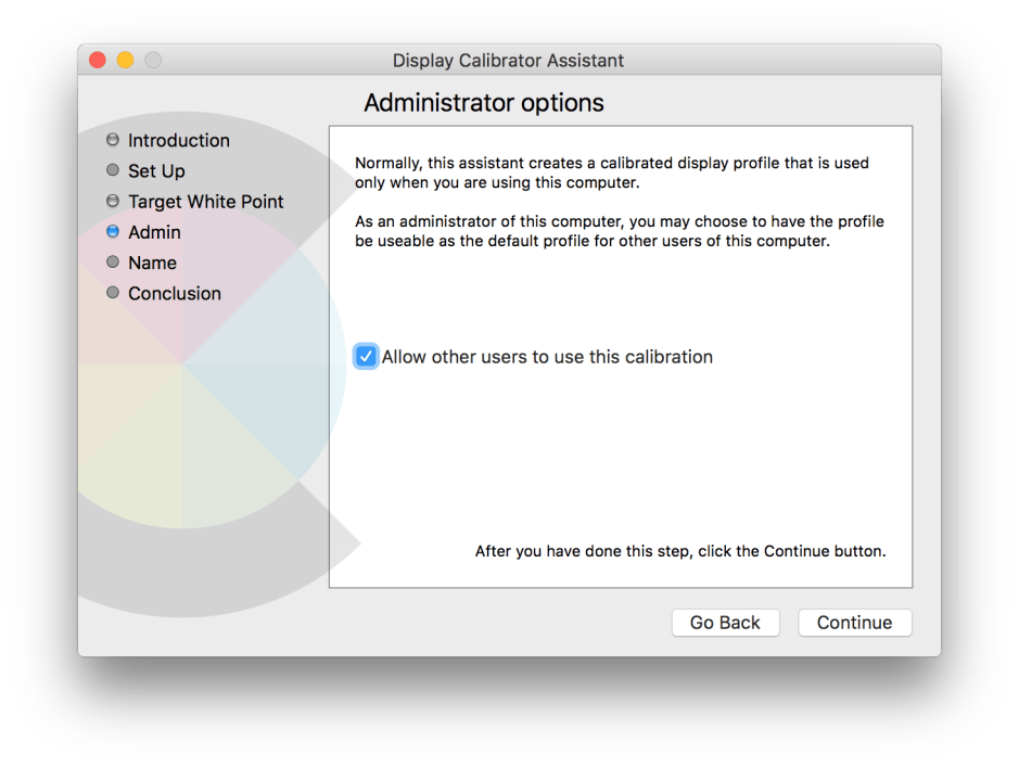
If you want other users to be able to use this profile, ensure this is checked. You will then be prompted for your admin password, so that the profile can be stored in the /Library folder, rather than in your Home folder’s Library.

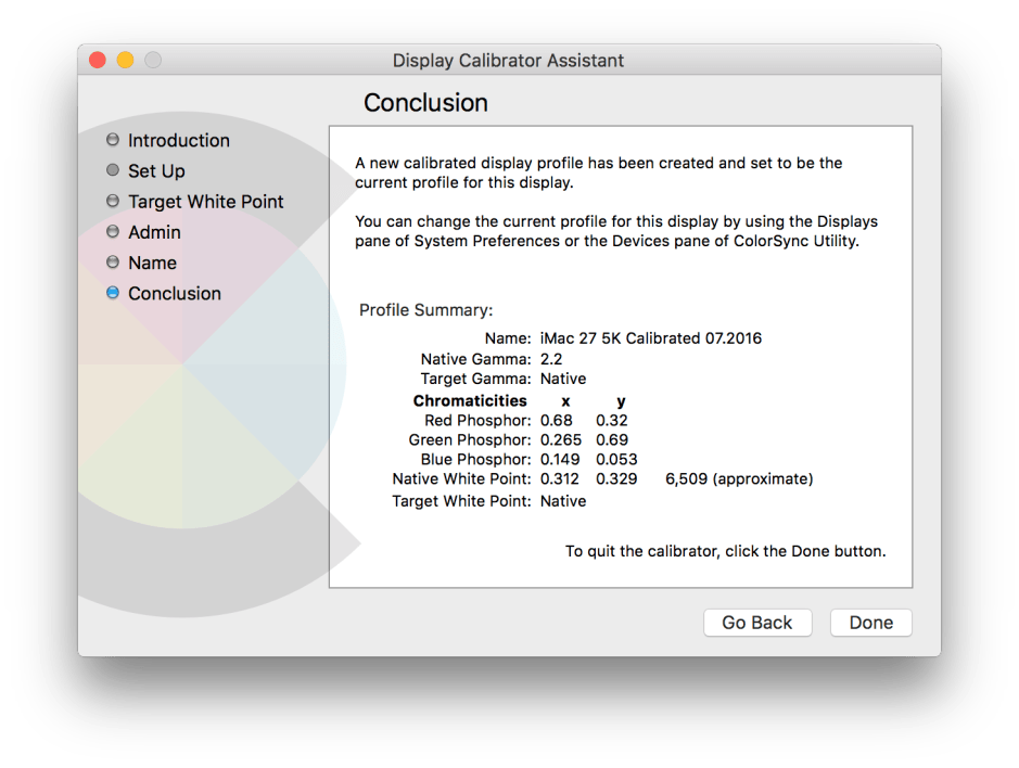
You can then adjust the display’s brightness so that its white and black match the physical samples that you have.
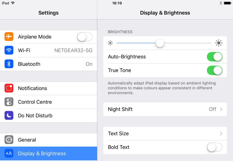
Apple’s latest iPad Pro 9.7″ goes further than that: it not only offers automatic brightness adjustment, but attempts to adjust the white point setting too, with ‘True Tone’ – something which is not yet offered in the larger iPad Pro. You can also perform formal colour calibration of many iOS devices: details are given here.

Comparing standards
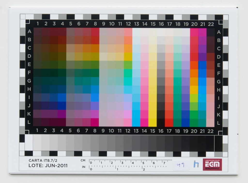
The final step in this basic uninstrumented colour calibration is to compare a colour standard against what you see on the display. To do that, you will need a precision-scanned and colour-correct image of an IT8.7/2 colour chart from here, and a matching hard copy version, which can be purchased online for as little as £/€/$ 10, from Wolf Faust and good photographic retailers.
You can then verify that your display and the hard copy colour patches are in reasonably close perceptual agreement. If not, you will need to tweak the brightness, white point, or display profile so that you are happy. This is not as accurate as performing a formal calibration using a colorimeter instrument, but should give you reasonable confidence in making decisions about what you see on the display.
In the next article, I will look at some simple techniques for improving the faithfulness of your colour images.
References
Handprint on colour.
Kuehni RG (2005) Color. An Introduction to Practice and Principles, 2nd edn., Wiley Interscience. ISBN 0 471 66006 X.
Kuehni RG and Schwarz A (2008) Color Ordered. A Survey of Color Order Systems from Antiquity to the Present, Oxford UP. ISBN 978 0 19 518968 1.
IT8.7 colour chart by Hugo Rodriguez, via Wikimedia Commons.
