
In the first article in this series, I showed why colour management is important, how colour perception is complicated, and explained how OS X deals with colour. I ended by stating the problem which colour management is trying to solve: how best to get an image to look right even when displayed (or output) to a device with a relatively limited gamut. That is the process of colour rendering, which is the focus of this article.
The following screenshot shows one of my favourite colour tools, BabelColor‘s CT&A, which is expensive but does so much more than simpler tools such as ColorSync Utility (bundled in OS X). Although it is busy, let me explain the relevant features and information.

At the top centre is a standard CIE colour chart, based not on RGB but derived values x and y. At this stage, don’t worry about those, look at the way that it spreads different colours out in two dimensions, and how red, green, and blue colours concentrate towards the corners. Within that colourspace there are two triangles: the inner one represents a colourspace named ColorMatch, the outer one known as Wide Gamut, which still doesn’t quite fill the CIE colourspace, but comes close.
The superimposed circles in the middle are the whitepoints for those colourspaces, which here coincide. Let’s suppose our ‘perfect’ camera recorded some pixels in an image which are very strong pink, at a point represented by the small green square, and that our display, perhaps, can only cope with the ColorMatch gamut, in the inner triangle.
For OS X to convert that pink to one which the display can show, the green square is going to be mapped to the orange square (on the lower side of the smaller triangle). That is rendering the original colour to one which can be output by the display.
The large rectangles of colour at the bottom of the window show (on the left) the original colour before rendering, and (on the right) the rendered colour. These are also shown in the samples on the right of the window, where you can see that the pinks are very close, but not quite the same.
So the first task of colour rendering is to convert colours which are outside the output gamut to colours which are within that gamut.
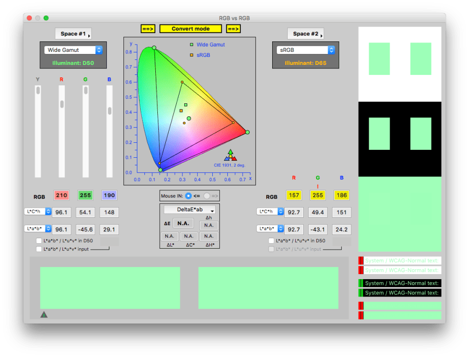
There are several different ways of doing that – known as rendering intents – which I will mention below. However, rendering doesn’t just affect colours which are outside the output gamut. If it just squished all those onto the edge of the output gamut and did not change other colours, then very many colours which look different in reality would end up being the same.
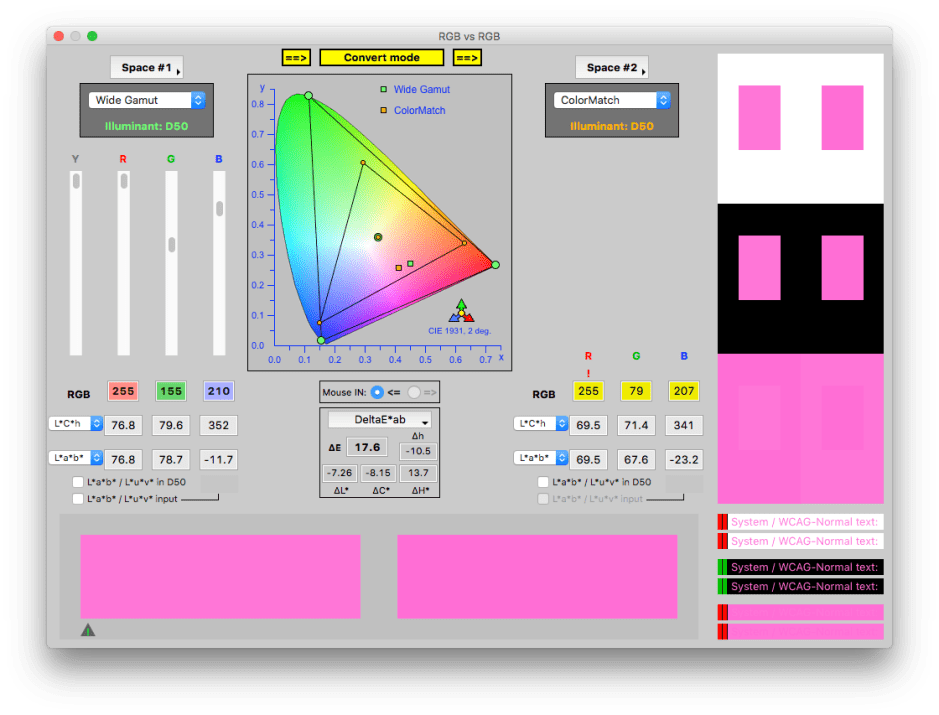
So rendering the small green square here results in the colour represented by the small orange square, even though the original colour is inside the smaller triangle.
Another problem is when the white points of the original and output gamuts are different. In the first two windows, they were identical, but here is an example of rendering where the white point changes, from the green circle to the orange one. This also shifts all the colours around, as seen with the green and orange squares.
Normally we don’t see colour rendering in action, because it is handled internally. When it works correctly, you are very unlikely to see any difference, although colour measuring instruments can show the changes which have taken place. Note that rendering doesn’t change the colour values in the original image, it just adjusts them when they are being output to a device like a display or printer.
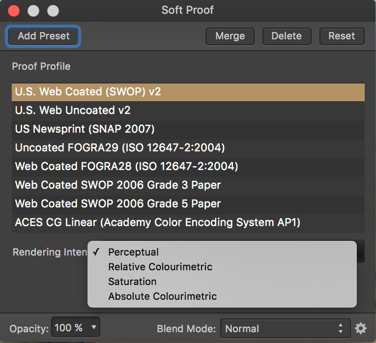
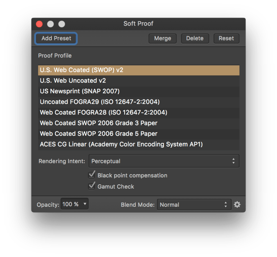
The best way to see rendering in action is with a photo image editor such as Affinity Photo, or Adobe Photoshop. They have a feature known as soft proofing, which gives you a preview of how an image will be rendered. In Affinity Photo, you can select a colour profile or gamut to use, the rendering method (rendering intent), and whether there should be compensation applied to the black point to obtain consistent black rendering.

The optional Gamut Check shows your original image with all the pixels which are outside the output gamut marked in grey – here many of the greens. This gives you a good idea as to how much adjustment there is going to have to be when rendering the colour. In this photo, a lot!

Rendering intent is the term used to describe the principles used for rendering. The four standard options available are:
- Perceptual – this shrinks the entire colour space into the output one, shifting all the colours so as to preserve their relationships. This is the method which I have described above.
- Saturation – this maintains the relative saturation of the colours, and is not normally suitable for photographic images.
- Relative Colorimetric – this only alters colours which are outside the output colour space, mapping them to colours which are inside, but not altering those which are already inside the output colour space. Sometimes known as ‘clipping’, this is not normally used with photographic images as it tends to produce areas of identical flat colour where it has been clipped.
- Absolute Colorimetric – this ensures that colours are matched exactly, and is intended for use in design work where precise colour is more important than relative colour.
Working with most photographic images, you want the whole image to look right, and thus should choose perceptual rendering intent. Absolute colorimetric rendering intent is most useful when precise matching is used, for example with corporate colours in design.
This should now explain how your coloured images are rendered to the display, or for print. Whether they look right on that output depends on making sure that the display or printer is properly colour calibrated, so that the colours generated are correct. That is what I will look at in the next article.
References
Handprint on colour.
Kuehni RG (2005) Color. An Introduction to Practice and Principles, 2nd edn., Wiley Interscience. ISBN 0 471 66006 X.
Kuehni RG and Schwarz A (2008) Color Ordered. A Survey of Color Order Systems from Antiquity to the Present, Oxford UP. ISBN 978 0 19 518968 1.
