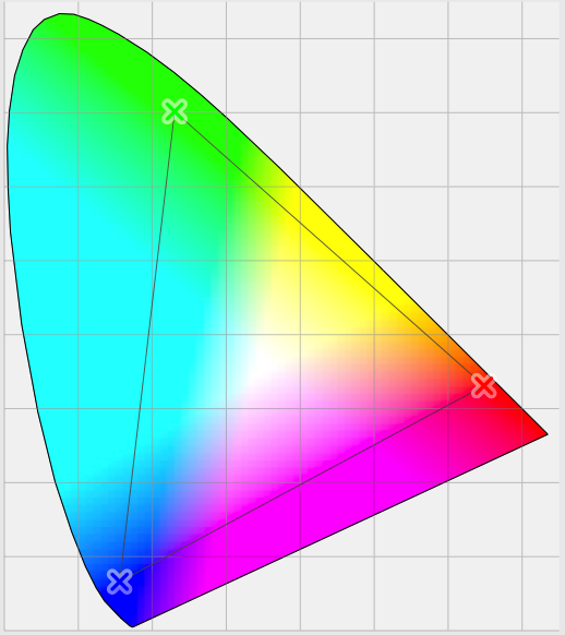
For most Mac and iOS device users, colour is very important. Even the most casual amateur photographer may now process their images through apps intended to ‘enhance’ their colour, and turn a quick snap into a well-liked post on social media. For those who make a living from images and designs, getting colour ‘right’ is critical to their professional survival.
Apple has long recognised this, and since it introduced ColorSync to what was then System 7 way back in 1993, its products have done their best to help us get colour to work properly. It is worth pausing for a moment to acknowledge the achievement of ColorSync’s original leader at Apple, Robin D Myers, and to remember that Apple co-founded the International Color Consortium which has set the standards ever since.

The idea at the heart of ColorSync and other colour management systems is simple. Each pixel of an image is represented by an ‘absolute’ colour value – now three floating point numbers – which is derived by correcting the input from devices such as cameras and scanners, and rendered appropriately to output devices such as displays and printers. The corrections and other transformations made to input and output versions of the image are determined by their colour profile and the user’s choice of technique.
These are most obvious, and most critical, in rendering the image to a display, now that few of us print many of our images, but want others to see them in faithful colours. Those who take most care about this will typically calibrate their display, and locate it so that ambient light will remain quite constant, both in brightness and colour balance.
This is all very well for desktop Macs, but falls apart when you are using mobile devices, such as an iPad. You might want to use that out in the bright sunshine of the middle of the day, or in a darkened bedroom at night. With the large-format iPad Pro becoming so popular among artists and designers, this is a significant problem. Arnaud Frich offers an account of how you can colour calibrate an iPad or iPhone display with a Spyder3 or Spyder4 Pro or Elite colorimeter, but any significant change in ambient lighting requires recalibration.
Now the new iPad Pro 9.7″ – but not yet the larger 12.9″ popular with creatives – has a True Tone display to perform automatic white balance adjustment to try to work around this problem. Apple has, as usual, applied a bit of common sense: the iPad Pro is equipped with light sensors to detect ambient conditions, and iOS performs automatic adjustments to keep the display looking right. Why shouldn’t all displays now do the same?

The answer is bedevilled by the big problem with colour management: it may work perfectly in physical terms, but human colour perception is far more complicated, and psychophysical in nature.
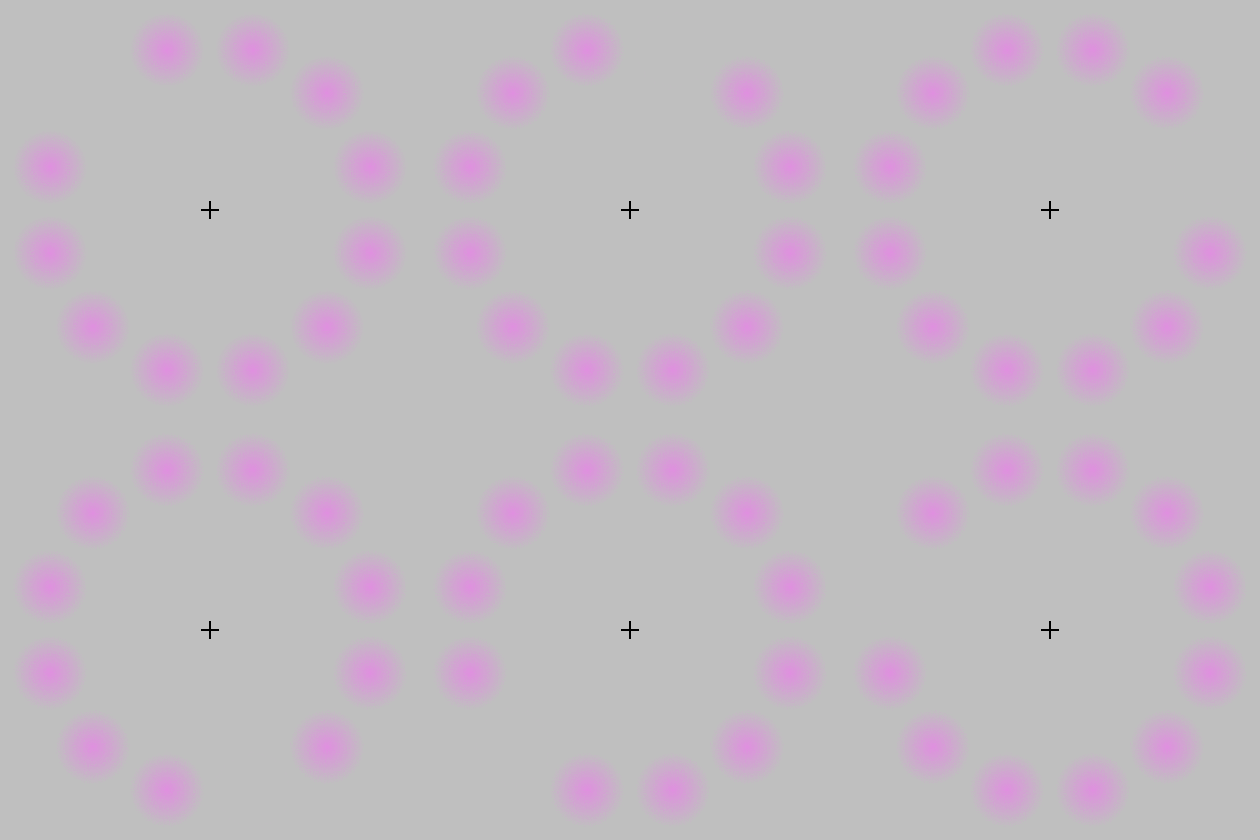
It is not hard to come up with simple demonstrations of how our visual system – by which I am mainly referring to the areas of the brain which process images, not the eyes themselves – does all sorts of processing on images. We regularly perceive colour where there is none, as shown in the Lilac Chaser illusion below.

Even relatively simple chroma-free perception can be readily confuddled, as shown in the Checker Shadow illusion below. It is very hard to convince yourself that the squares marked A and B have the same lightness, but you can verify that using a software spot colour tool.

We have mechanisms which make an orange fruit appear orange even when it is seen cast in tinted light – ‘colour constancy’ – and ‘simultaneous contrast’ illusions such as that below show how colour perception is altered according to adjacent colours. Strangely colour constancy varies according to the object seen: it works more strongly with objects of fixed colour, such as fruit, but is weaker when applied to objects whose colour can vary more widely, such as cars.

One of the fallacies with showing the adjacent displays of two iPads, one without and the other with True Tone enabled, is that when we are working with any display, our perception will adjust towards colour constancy.
Some have also suggested that all those using iOS 9.3 on their devices can achieve almost as effective compensation for ambient lighting changes by using the manual control in the new Night Shift feature. The snag with that suggestion is, of course, the fact that any adjustment made by manual control relies on the same psychophysics which makes any such adjustments misleading at best.
What we really need is to bring human perception into the control system somehow, to display a standard image and ‘read’ from the visual areas of the brain to check that its colours match our ‘standard’ perception. Until someone comes up with a practical way of doing this, the choice is simple: correct the display to output what is physically most accurate, or leave the display uncorrected, and hope that the brain will get it right.
For my money (and it will come down to that too), I think I’d prefer the display to do the best according to the physical models, in the hope that will help the accuracy of my perception. In which case, it is about time that all displays adopted Apple’s True Tone system. The iPad Pro 9.7″ looks to be blazing that trail.
References
From Pigment to Painting, part 1 series on this blog.
Kuehni RG (2005) Color. An Introduction to Practice and Principles, 2nd edn., Wiley Interscience. ISBN 0 471 66006 X.
Kuehni RG & Schwarz A (2008) Color Ordered. A Survey of Color Order Systems from Antiquity to the Present, Oxford UP. ISBN 978 0 19 518968 1.
