

Time is the warp through which we weave narrative. Though we can directly visualise most other elements within a narrative, we cannot see time, and can only represent it indirectly in the form of a timeline, against which we can place the events which together compose the narrative.
A timeline, sibling of the time series chart, is a display of events against an axis representing the passage of time. The term is also widely used to describe a textual and chronological listing of events, as were the antecedents of modern timelines, such as Eusebian Tables. It is more appropriate to distinguish such tabulations as sequences of events or timetables, as they lack any conventional representation of time along a line.
Early timelines did not always give the time axis a uniform scale, Gerardus Mercator’s ancient examples being highly non-linear, but by the late 1700s several major figures of the Enlightenment had arrived at what we recognise today as a mature timeline. Among them was the pioneer scientist, Joseph Priestley (1733-1804). The history of timelines has been beautifully documented by Rosenberg & Grafton (2010).
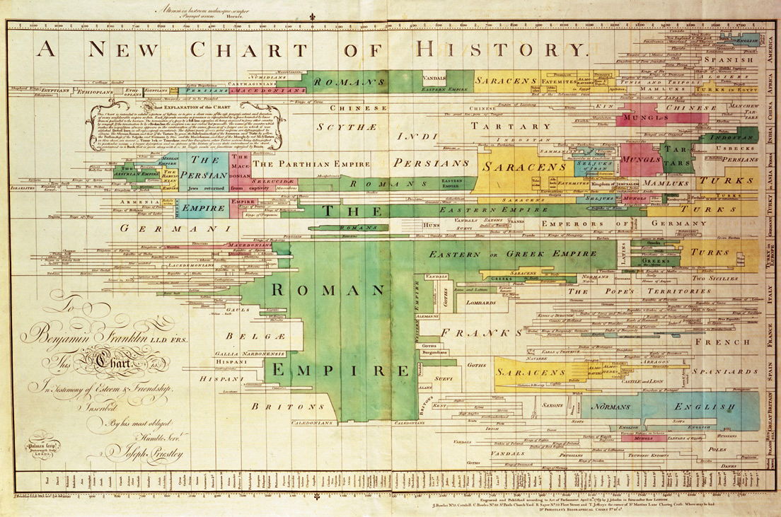
From then on, historical timelines became longer, larger, and increasingly elaborate, culminating in the monster drawn up by Sebastian C Adams in 1878.


There have been many variants used over the last couple of centuries, some of which are illustrated by Rosenberg & Grafton. Although primarily for the depiction of sequences of discrete events, many have produced timelines which graph more continuous variables over time, as in a time series chart.

Trees, particularly those of taxonomy, natural evolution or artificial constructions modelled after nature, have also been incorporated, as shown in Bashford Dean’s timeline of the ‘evolution’ of armoured helmets.

The time axis can run horizontally or vertically, although printing and computers have tended to make the horizontal format more popular and almost a standard. In countries whose languages primarily read left to write, it is conventional for the earliest moment in time to appear to the left, and for the latest to be at the right; I do not know whether this convention extends to countries whose script runs from right to left. The direction of the time axis is more variable when it is vertical: historically these have tended to place earliest time at the top, but there is little rationale for doing so.

Because time as a concept passes at a uniform rate – despite its much more uneven perception – the great majority of timelines use a simple linear scale. Where the application makes it more appropriate, perhaps when dealing with extremely long periods, logarithmic scaling may be used instead, but that is both exceptional and poses most viewers conceptual difficulties.
The period represented in any given timeline is as variable as the intervals of time which we can measure. In physics it could be as short as the twinkling of an eye, or nanoseconds, and in geology as long as the existence of the earth. Being anthropocentric, most timelines apply to recorded human history, or windows of a few generations length within that.
Although Edward Tufte’s outstanding books examining the visual display of data do include several example of timelines, and there is no reason to suggest that timelines should be exempt any of his design principles, he avoids more specific discussion of this type of chart.
Manual construction of timelines, whether using physical materials such as paper or on a computer, is usually both time-consuming and tedious. The first step is to determine the physical length of the time axis, and the period in time which it needs to represent. The distance along the time axis from its origin is then calculated by proportions; on a computer this is conveniently performed using a spreadsheet.
There is a curious twist, that most computer users are more likely to use timelines as tools in other applications, than will ever use tools intended to produce timelines themselves. This is because the timeline has become established as a primary control in applications to edit serial media, such as audio and video: you will find and use them in products such as iMovie, GarageBand, Final Cut Pro, and even in OS X’s Time Machine backup app.
The single most important factor in determining whether a more dedicated application is suitable for the automatic generation of timelines is the required export format. As there appears to be no standardised format for exchanging timeline data between applications, there is little point constructing a superb timeline in an application which cannot export it in a form which can then be used for its display and viewing. Some dedicated timeline tools are unable to generate usable HTML, for example, and cannot therefore be used to develop web pages containing those timelines.

ChronoZoom is an open source environment which enables direct web development, but (being sponsored by Microsoft Research) requires Windows-based development tools and is hosted on Microsoft server products.

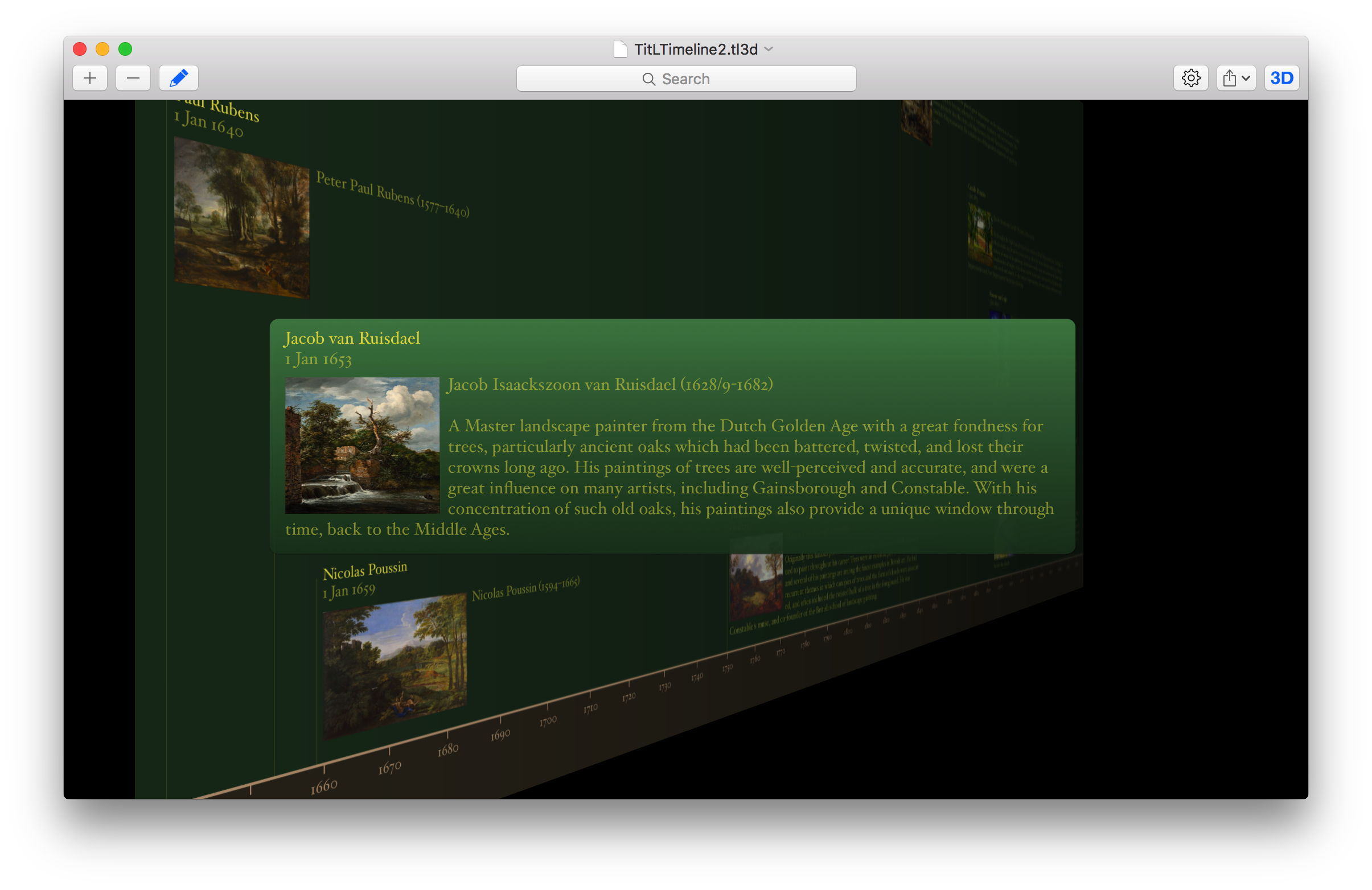
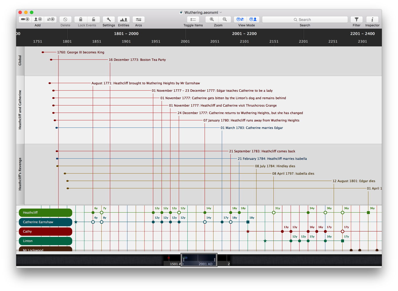
In subsequent articles in this series, I will focus on the use of applications which support the inclusion of rich media, such as images, within timelines, as they are most generally useful, and fewer in number. If you do not need such sophistication, then any of the wide range of project management tools could be suitable, provided that they support an appropriate export format.
Reference
Rosenberg D & Grafton A (2010) Cartographies of Time, A History of the Timeline, Princeton Architectural Press. ISBN 978 1 61689 058 2.
